Minecraft PC IP: play.cubecraft.net

IDKhan

Well-Known Member
Jul 14, 2021
116
253
94
17
Scotland
www.youtube.com
Pronouns
He/Him
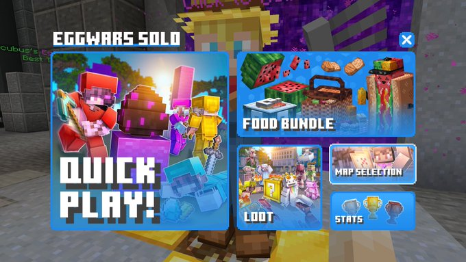
dont get me wrong, the new UI looks amazing and the people who made it did a great job

but i think it should change a little, the bundle and map selection should be changed, its just way to small and the bundle is too big

the main focus of what your looking at will be quick play and maps, so having a massive advertisment is kinda inconvenient and a little annoying

other than that its amazing
1645642671200.png
 

TheMrSpacee

Dedicated Member
Jan 9, 2021
626
1,381
239
16
www.youtube.com
Pronouns
He/Him
dont get me wrong, the new UI looks amazing and the people who made it did a great job

but i think it should change a little, the bundle and map selection should be changed, its just way to small and the bundle is too big

the main focus of what your looking at will be quick play and maps, so having a massive advertisment is kinda inconvenient and a little annoying

other than that its amazing

View attachment 207805
How do you access this interface?
 

BurntCrown8876

Well-Known Member
Nov 9, 2021
332
908
114
My Cat's Basket
allout.org
Pronouns
He/Him
I don't like how when you enter it, such as the Social Menu, you are by default hovering on the X button, if that makes sense. I used to know how many clicks down I need to go, for example go down 2 lines to the Friends list. Now, it's 3 lines you need to go down. What I'm saying is I'd like it so that by default when you enter a menu you are at the top result, not the X. Hope that makes sense!
 
  • Agree
  • Like
Reactions: IDKhan and Silco
Members Online

Latest profile posts

Capitan wrote on Flxen's profile.
Panzoide
Kazwa wrote on Blocky's profile.
happy birthday! 🎉
Daily Question 70! 🎉

What is your opinion on the Minecraft movie?
BicolourSine41 🇺🇦 wrote on 4Moonlightt's profile.
Late...
Happy birthday!
lentjuhhh_ wrote on qCrxfterr's profile.
ty for follow
Top Bottom