Hey fellow Cubecrafters,
Since the new update, a number of things have happened including a new resource pack.
I will just go through them;
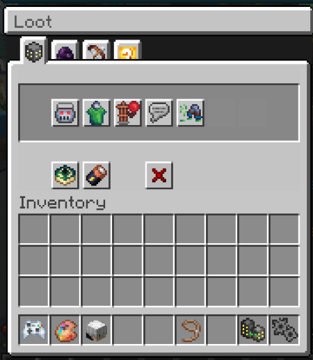
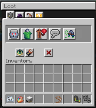
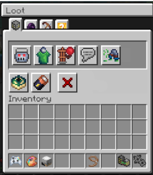
First of all, I would like to change the loot Gui,
Why this? when I opened the menu I didn't really get a good feeling about it, soon I had the idea that the buttons were too small, now I have come up with two solutions.
Menu's


 Next thing I think it could be changed:
Just like the loot menu, I think that the profile and lobby menus could also be a bit bigger with the icons, I think it would be clearer, and make sure the icons stay sharp in high resolution.
Next: settings, the worst thing of the resource pack is by far the settings menu, why, it is incalculable, you have to hover first before you understand the logic of the menu.
I think it's best to redesign it and then ask the community first what they think is the most beautiful and practical.
Name icon & color
The last thing I want to discuss is the colors and the icons before your name.
The icons for your name in tab are very chaotic, they should remove this in my opinion.
The tab is your name with a color of your rank and other things should be left out of it. What would be an option to make it less chaotic is to use the same icons as in Discord and put them there instead of the rank icons that are used right now.
The colors in the chat are very nice together with the icons making it a nice chat
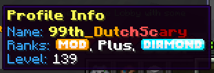
As you see when you hover over someone's name in chat you get the following result:

Now I think this is a very good option to still be able to use the rank icons that are now in the tab. this is an example of a good elaboration
I hope Cubecraft can do something with this and will use.
thanks for reading!!
Nubnub
Since the new update, a number of things have happened including a new resource pack.
I will just go through them;
First of all, I would like to change the loot Gui,
Why this? when I opened the menu I didn't really get a good feeling about it, soon I had the idea that the buttons were too small, now I have come up with two solutions.
Menu's
Just like the loot menu, I think that the profile and lobby menus could also be a bit bigger with the icons, I think it would be clearer, and make sure the icons stay sharp in high resolution.
Next: settings, the worst thing of the resource pack is by far the settings menu, why, it is incalculable, you have to hover first before you understand the logic of the menu.
I think it's best to redesign it and then ask the community first what they think is the most beautiful and practical.
Name icon & color
The last thing I want to discuss is the colors and the icons before your name.
The icons for your name in tab are very chaotic, they should remove this in my opinion.
The tab is your name with a color of your rank and other things should be left out of it. What would be an option to make it less chaotic is to use the same icons as in Discord and put them there instead of the rank icons that are used right now.
The colors in the chat are very nice together with the icons making it a nice chat
As you see when you hover over someone's name in chat you get the following result:
Now I think this is a very good option to still be able to use the rank icons that are now in the tab. this is an example of a good elaboration
I hope Cubecraft can do something with this and will use.
thanks for reading!!
Nubnub


