Creating A Map (From Scratch)
Solo SkyWars - Desserts → By @Nyawh and @Jadeite
Hi! I’m Nyawh!
During the past year, I’ve been working on my own map with the help of several friends. My motivation? Submitting it to the Map Submissions subforum and getting something created by myself released in CubeCraft (excluding my translations work, ofc c:)!
Sadly, the Map Submissions subforum has disappeared and it doesn’t seem it’ll be reopened to map submissions anytime soon. Therefore, I decided to make a thread about this map, Desserts, to show it off to the community, to thank all the people who helped me during the development and to analyze the pros and cons of each version and what we modified each version.
I really enjoy that when comparing the first and final version of the map, the map has improved a lot, and it’s funny to see the various names I’ve given the map!
Before showing the versions, I’d like to give thanks to the following people:
@Jadeite - Basically she’s another creator of the map - thanks for all your help!
@FireExcalibur10 - Thanks for giving me tips, improving the spoon of the ice creams and for suggesting to me the new layout!
@RemiFan, @dumfries, @ForGiveNoWIn, @EntitySplix - Thanks for helping me with earlier stages of the map!
The map was made using WorldEdit and Essentials in a private server network.
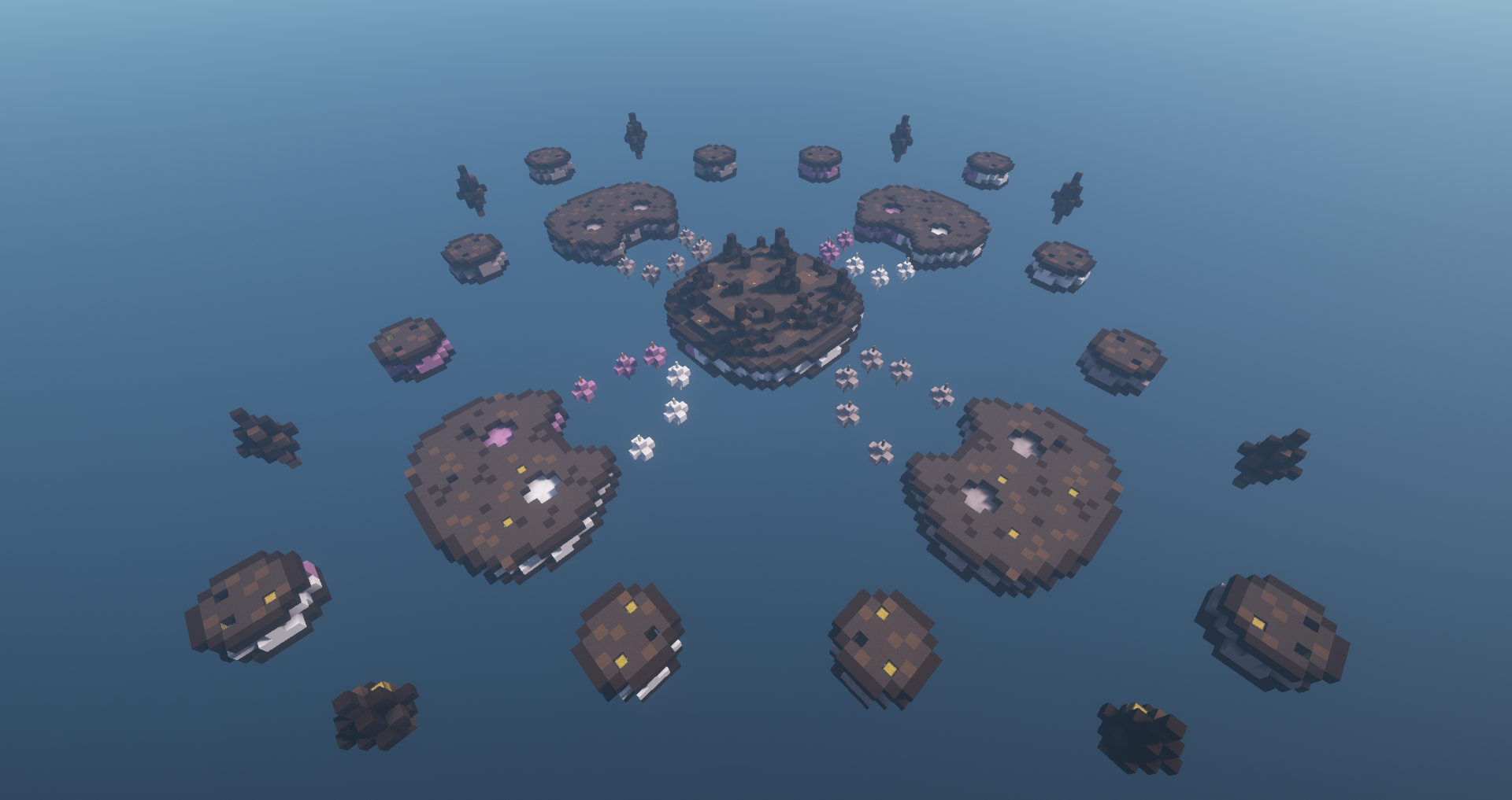
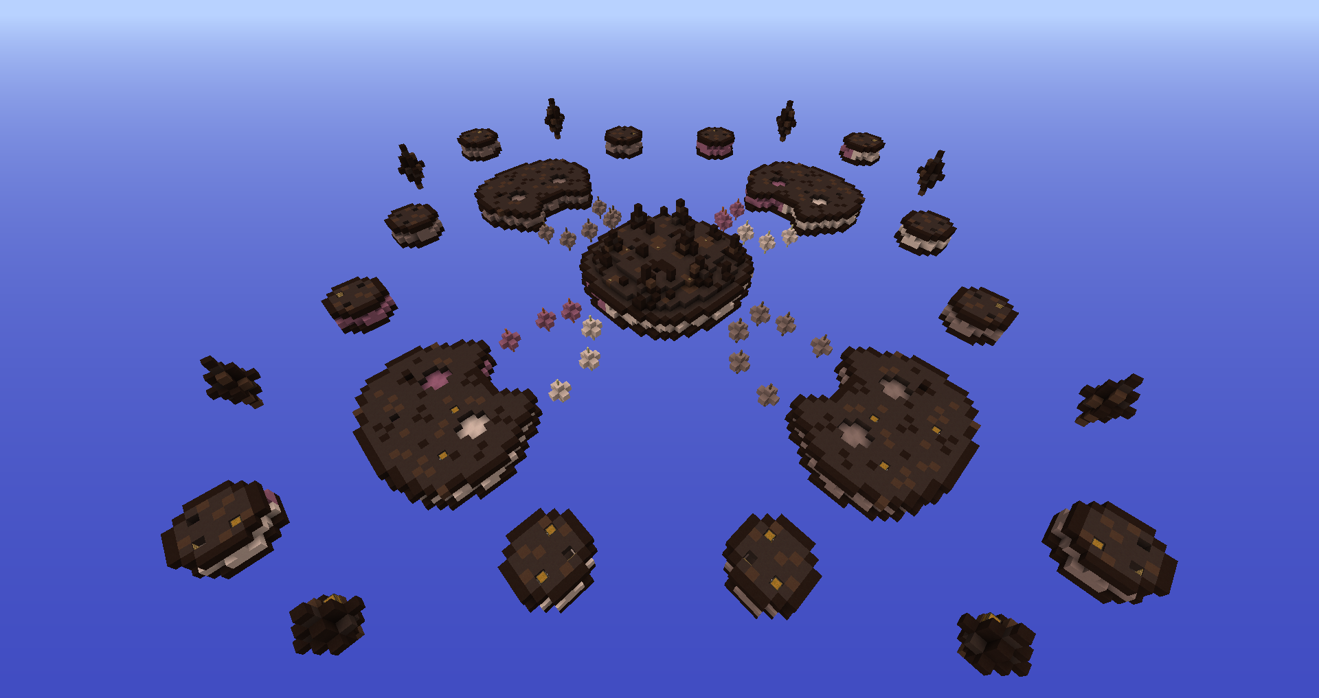
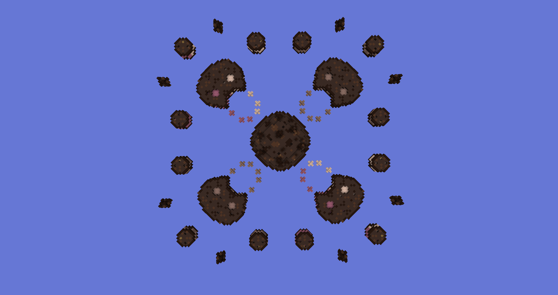
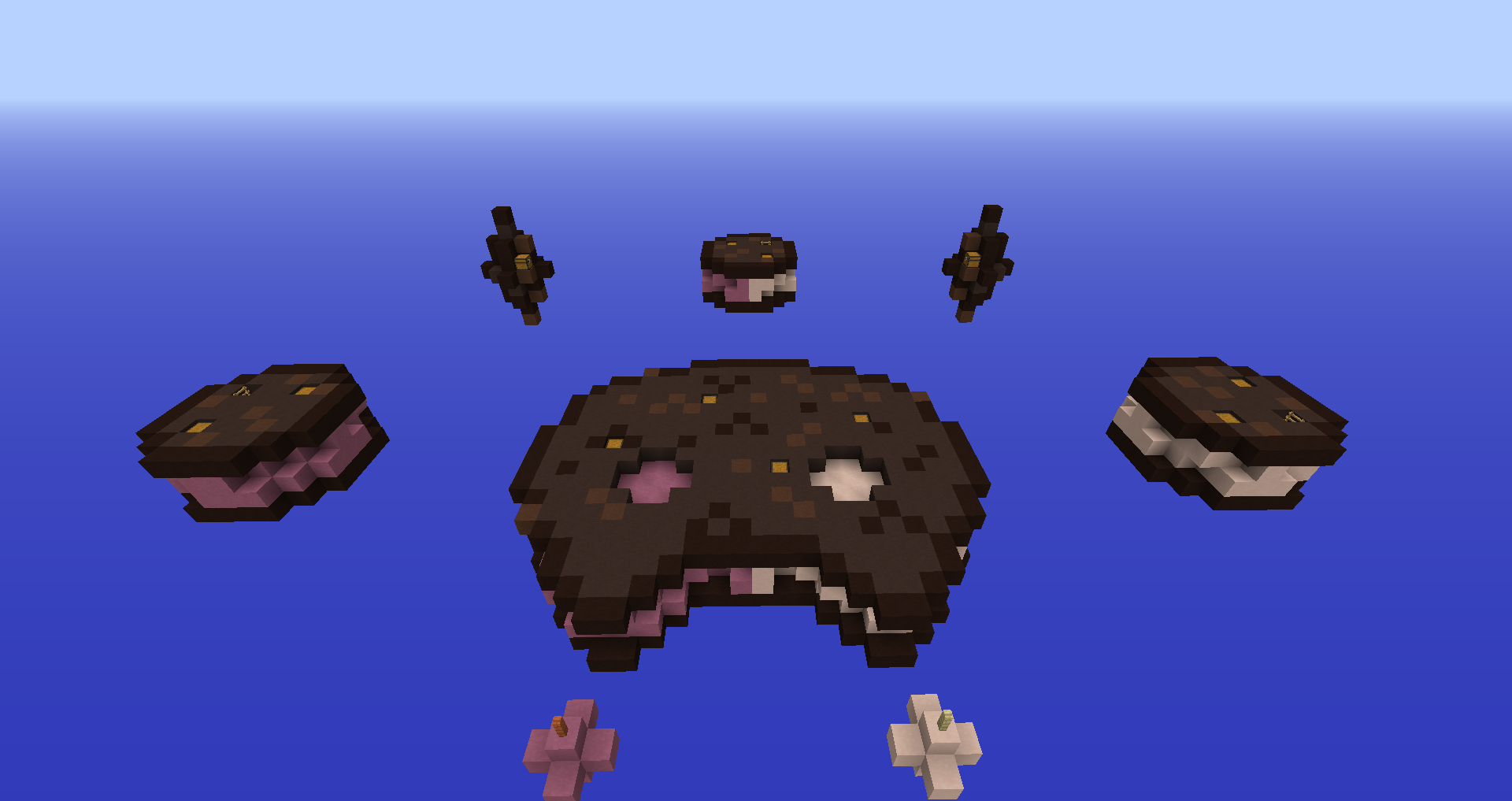
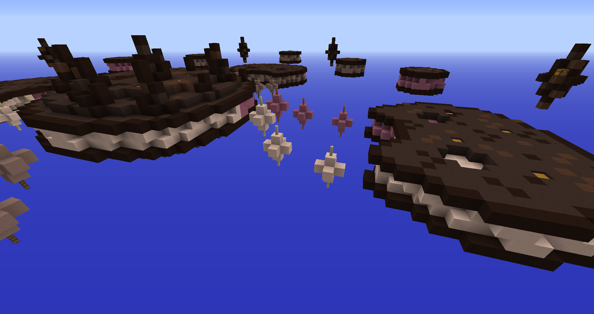
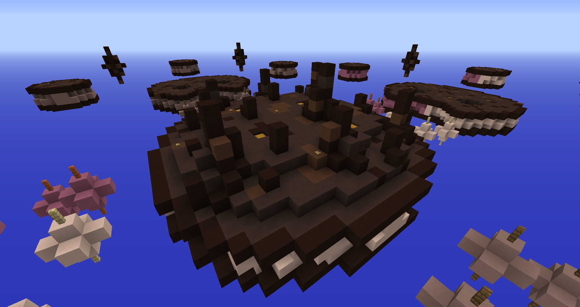
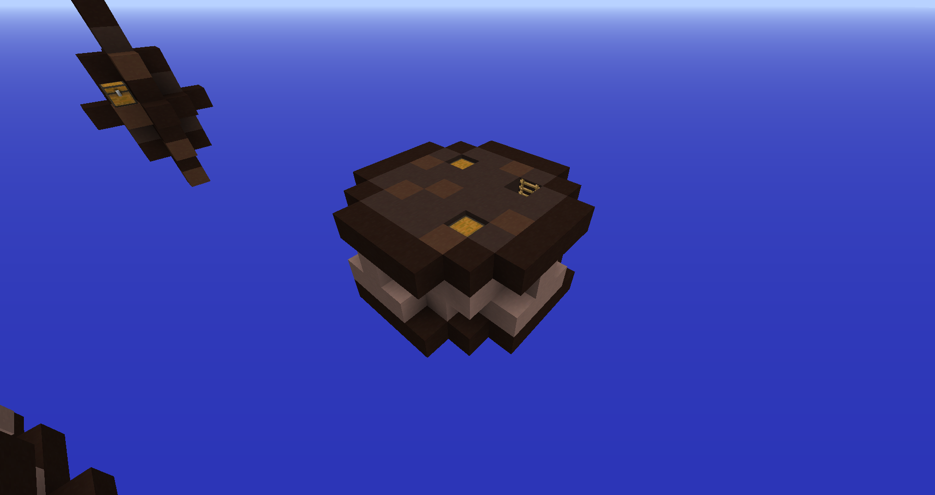
Version 1 - Cookie Cat | 26 - 6 - 2020
The first version of the map. The thing I liked the most were those balls leading to mid.
Though the block selection was very poor, the islands were boring and small (specially the starter ones) and some islands had no purpose.
Click the images to view them with more detail
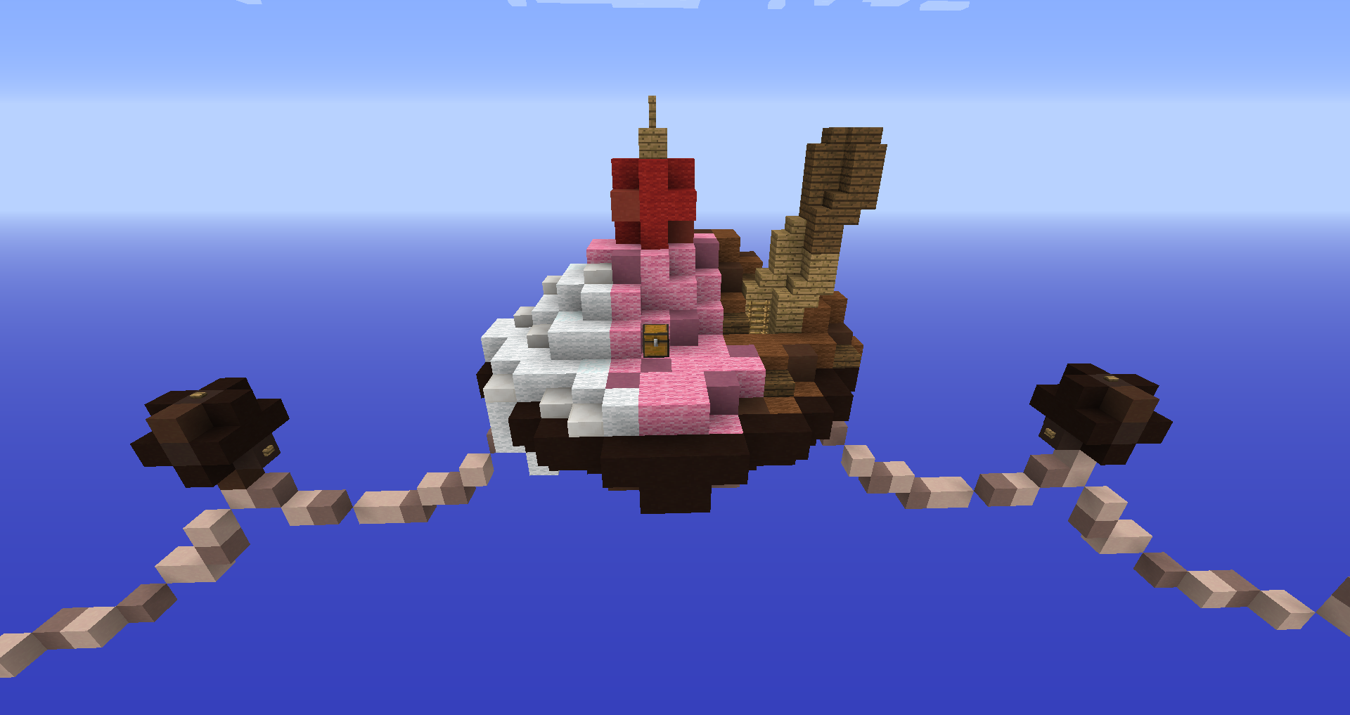
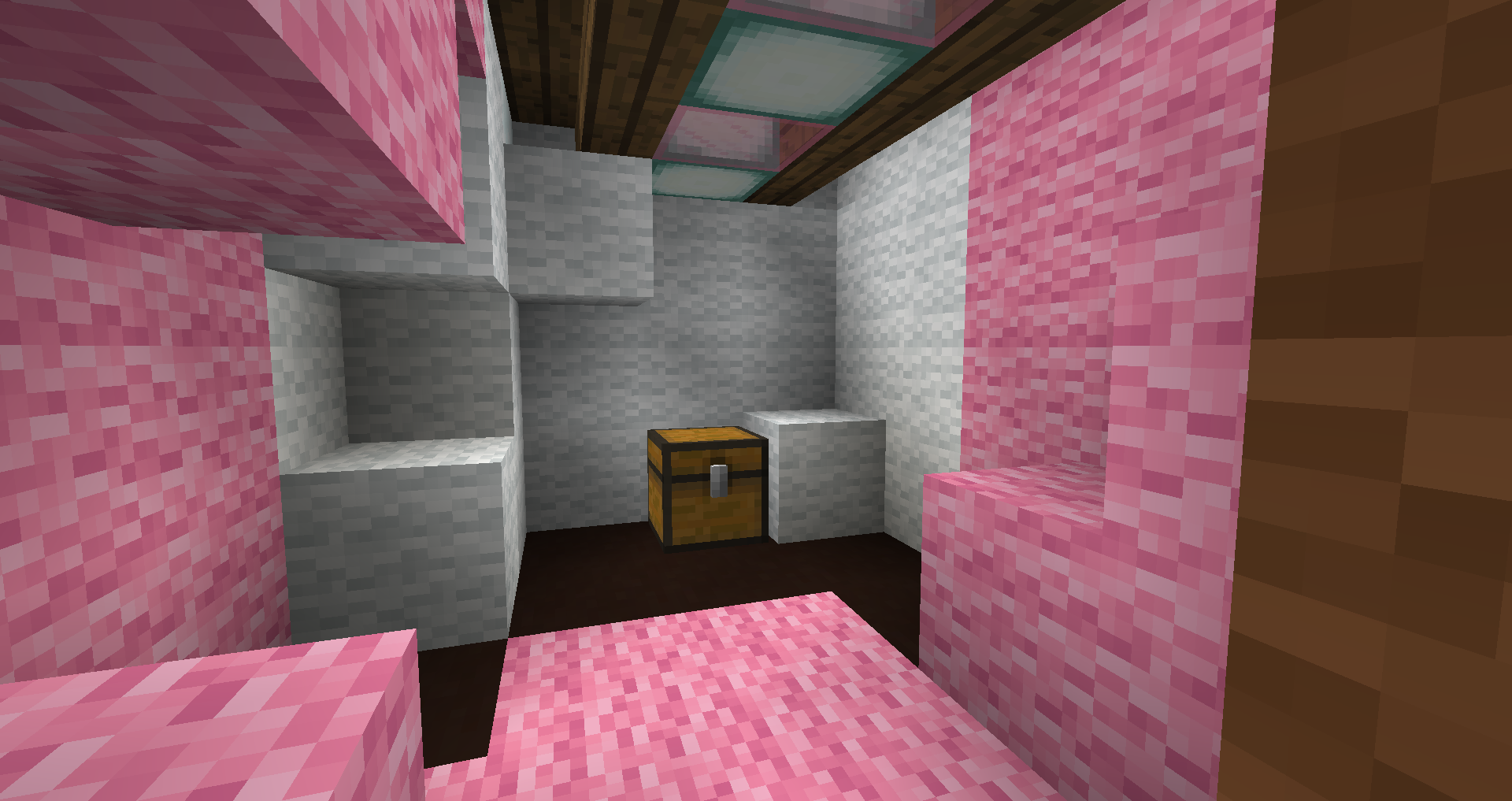
Version 2 - Ice Cream | 11 - 1 - 2021
This version featured bowls of ice cream as starter islands, which added variation to the colour palette and made them bigger. The balls to mid were “merged” into one long bridge and the starter islands were attached to each other with molten chocolate strings to make the map more rushable. Still, the textures weren’t ideal and it was overall boring.
Click the images to view them with more detail
Version 3 - Ice Cream | 9 - 7 - 2021
Since CubeCraft updated to 1.12.2, we were able to use that version’s blocks! Which allowed us to make very good-looking textures. The middle island was decorated with smaller pillars, featuring fences instead of thick blocks only to make it more of an open, PvP-friendly space whilst still looking detailed. We also removed the sub-mid to mid bridges and the molten chocolate between the starter islands because of the designer’s feedback on the previous version. Sadly we couldn’t submit this version.
Click the images to view them with more detail
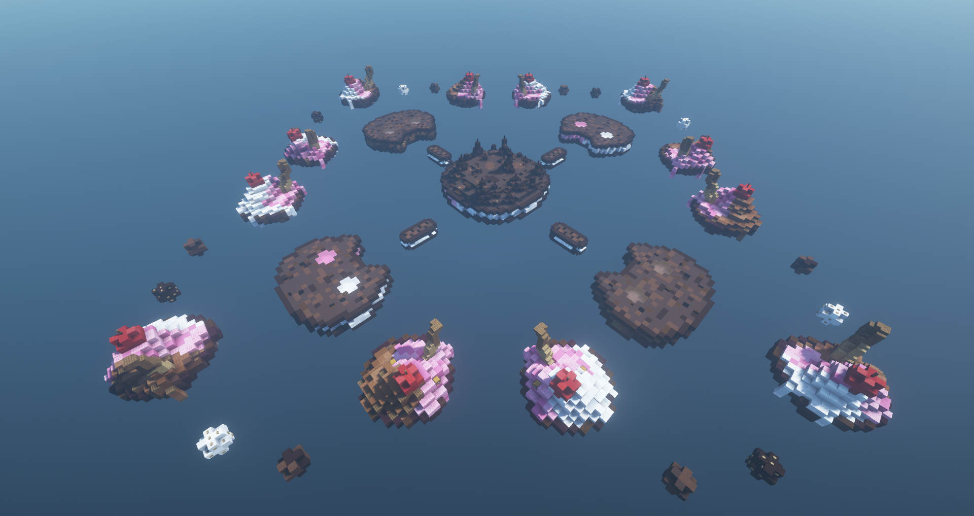
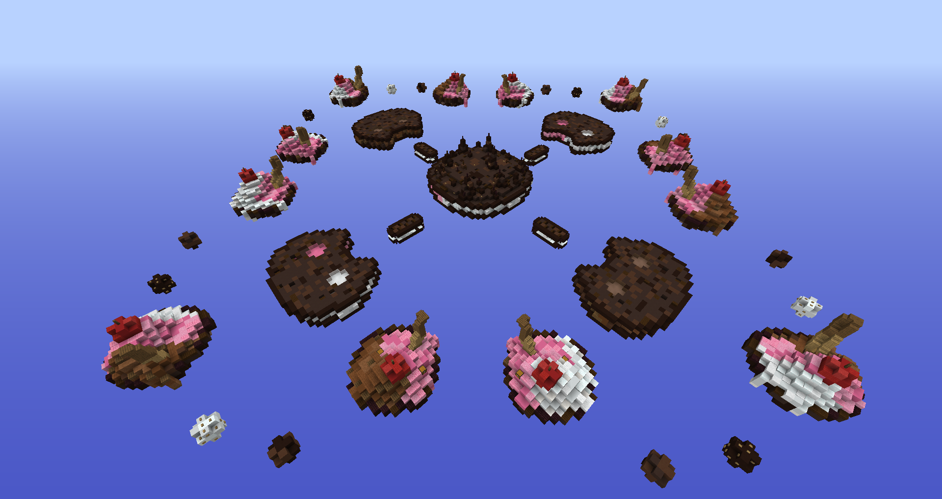
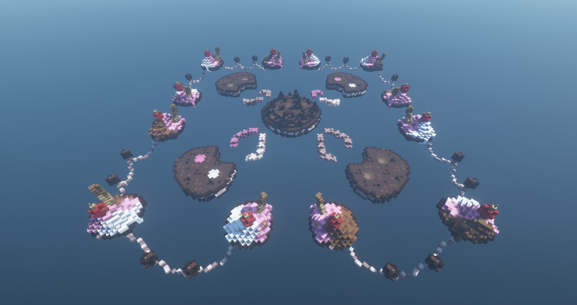
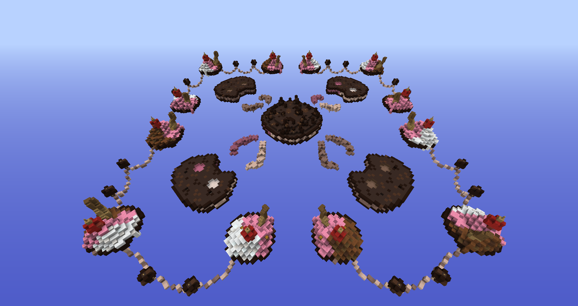
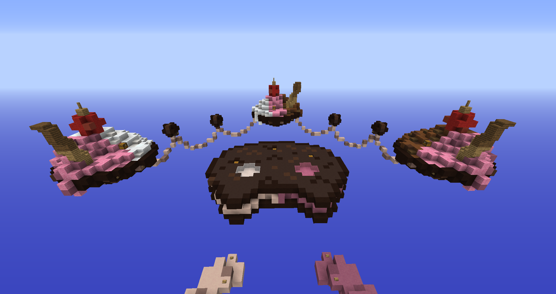
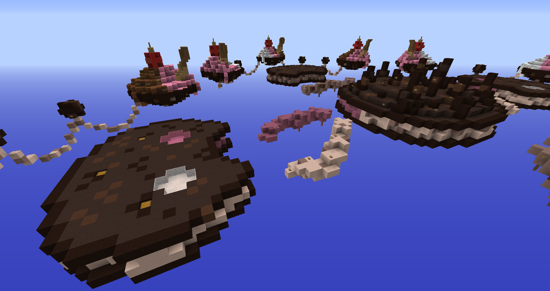
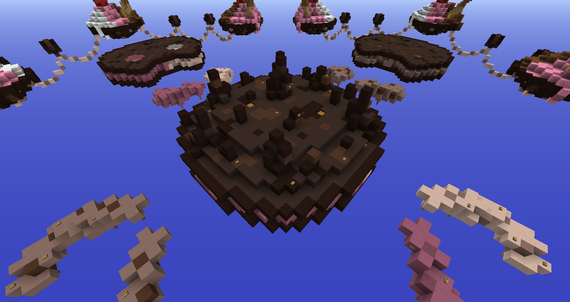
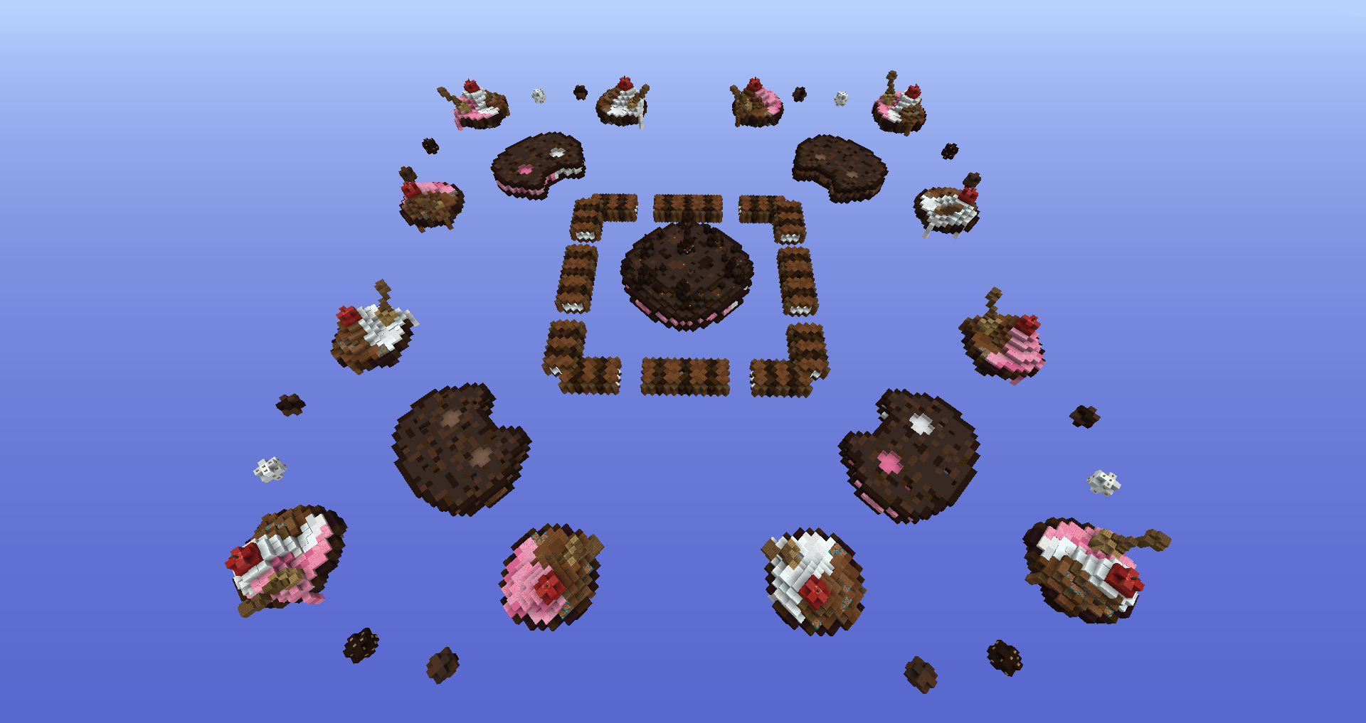
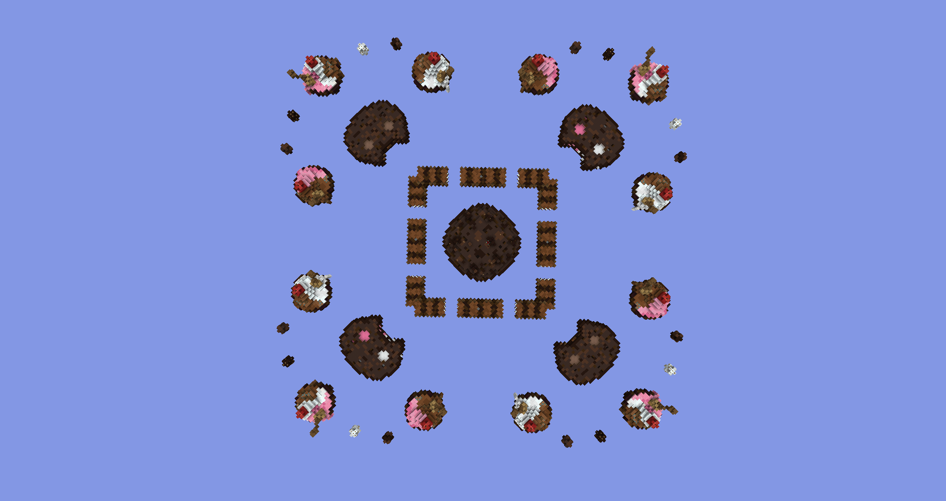
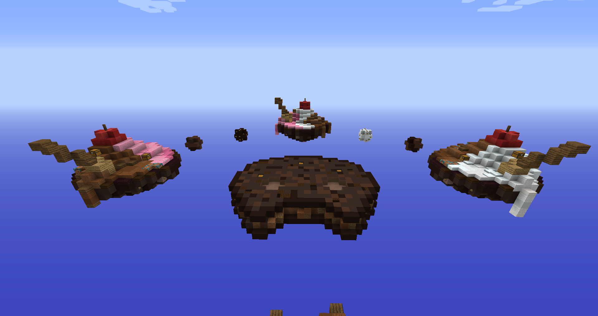
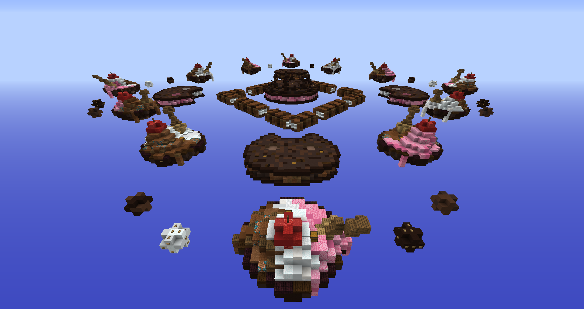
Version 4 - Desserts | 18 - 7 - 2021
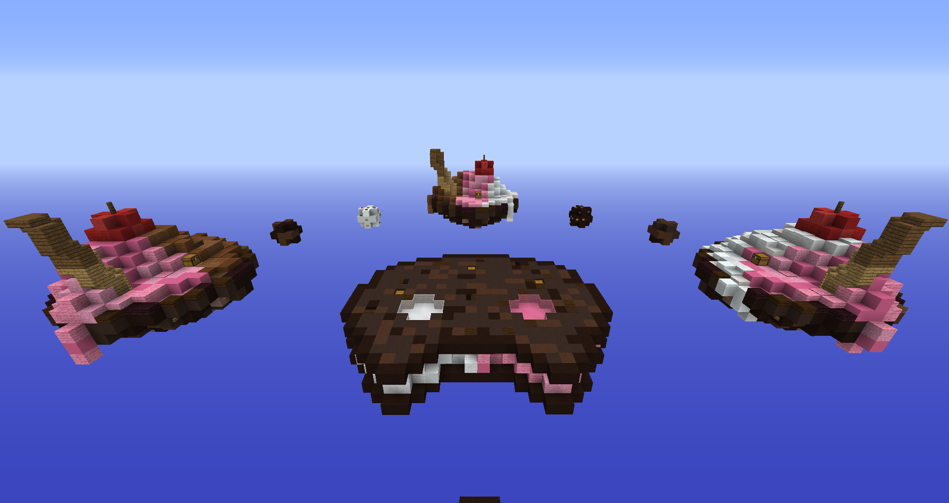
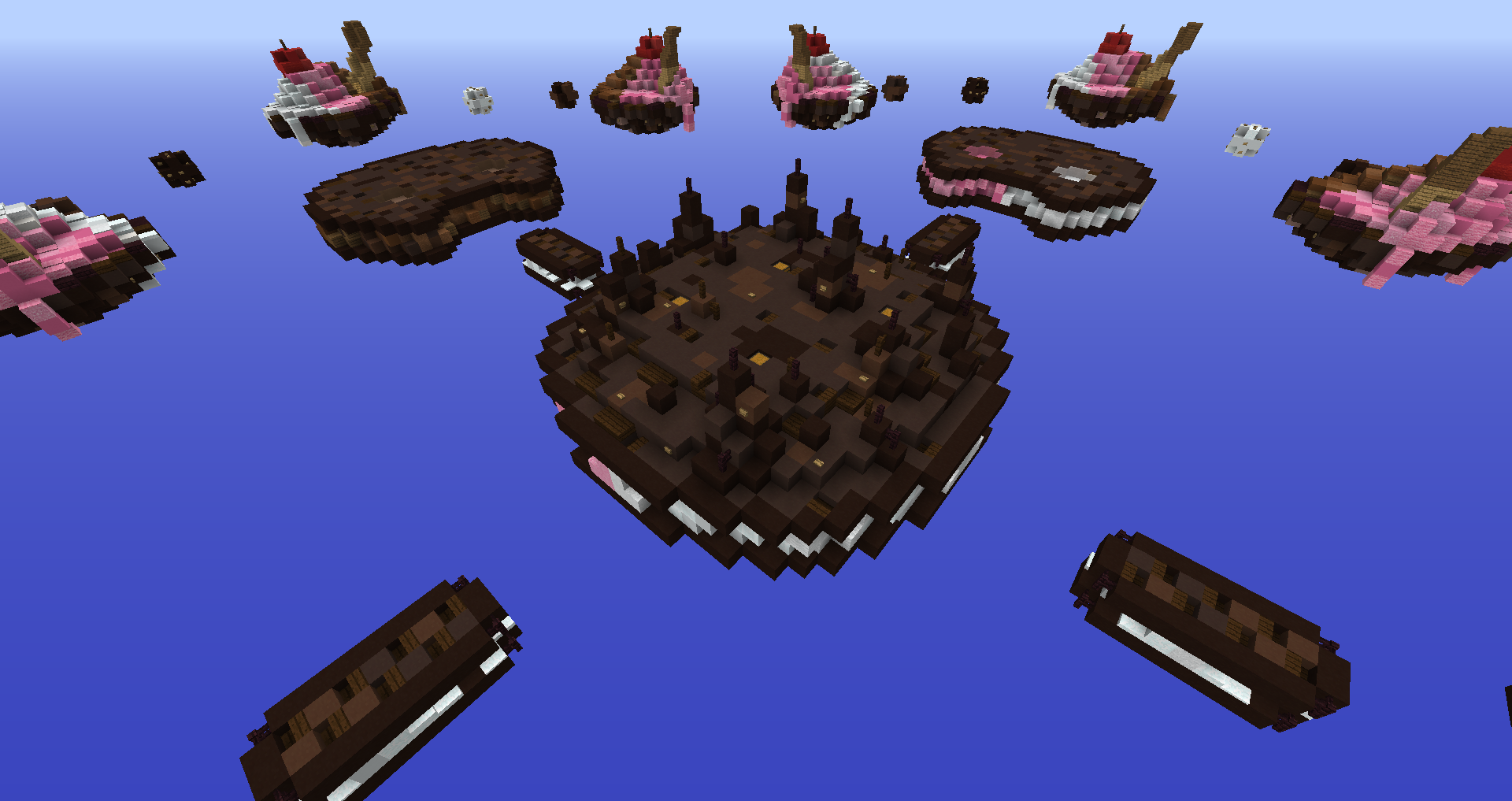
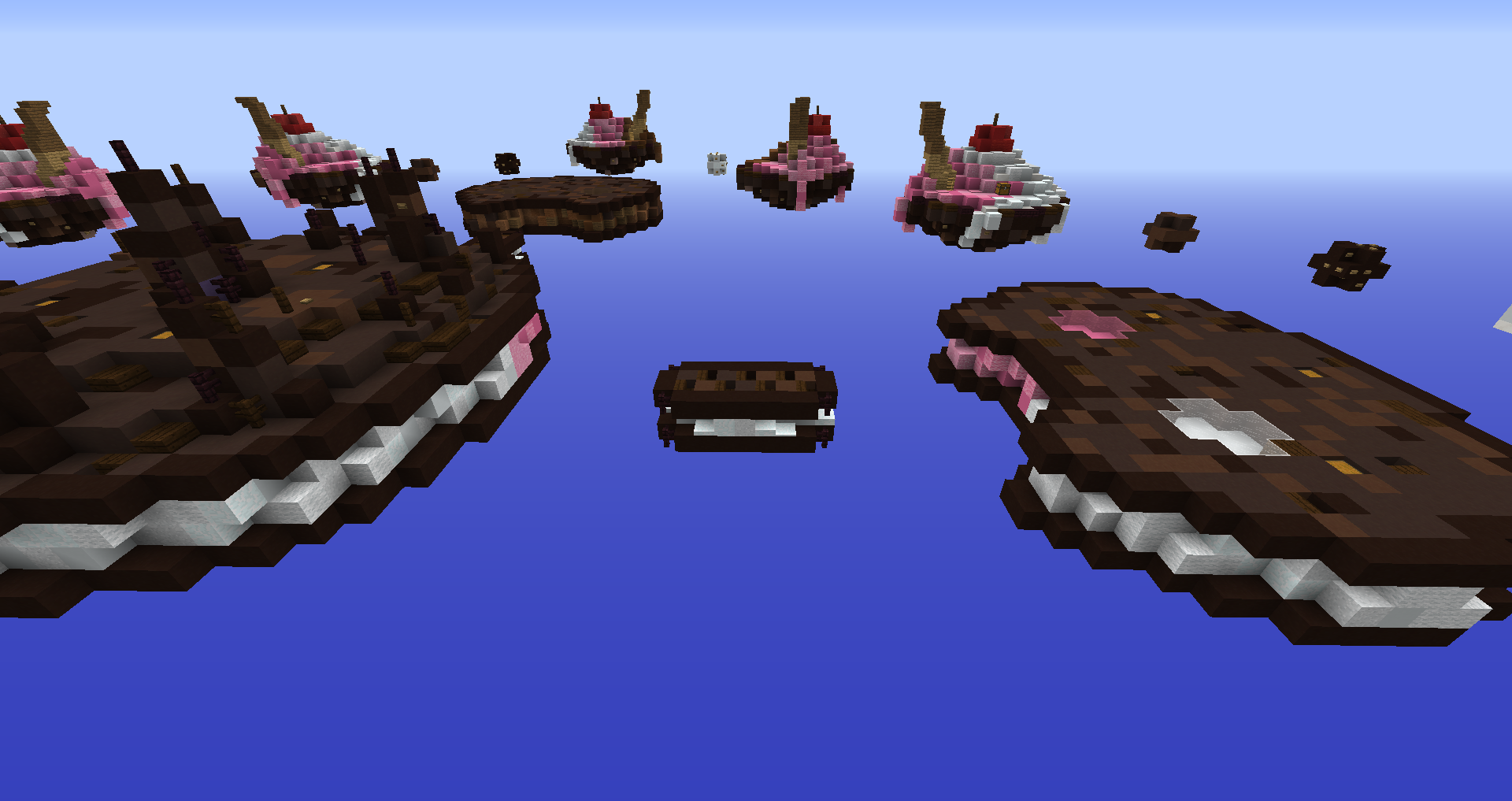
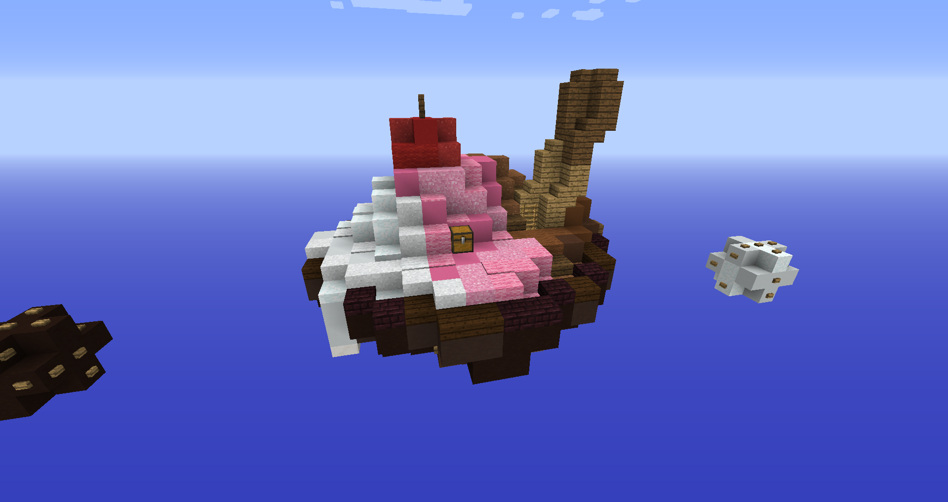
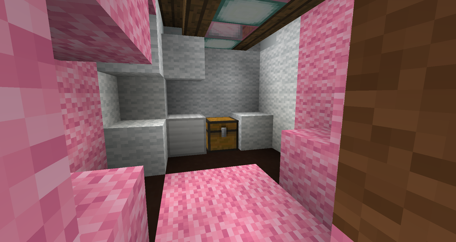
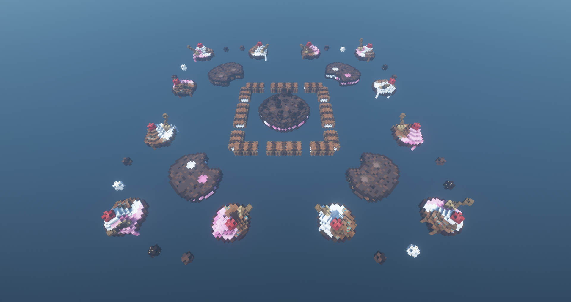
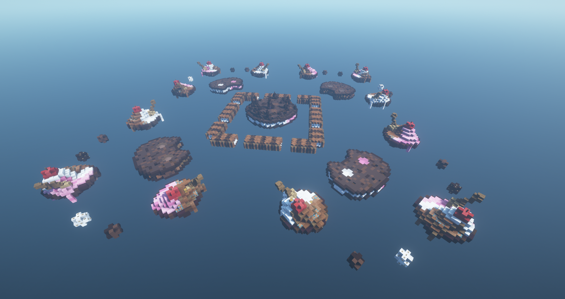
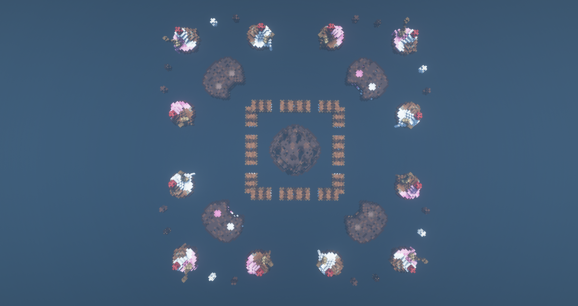
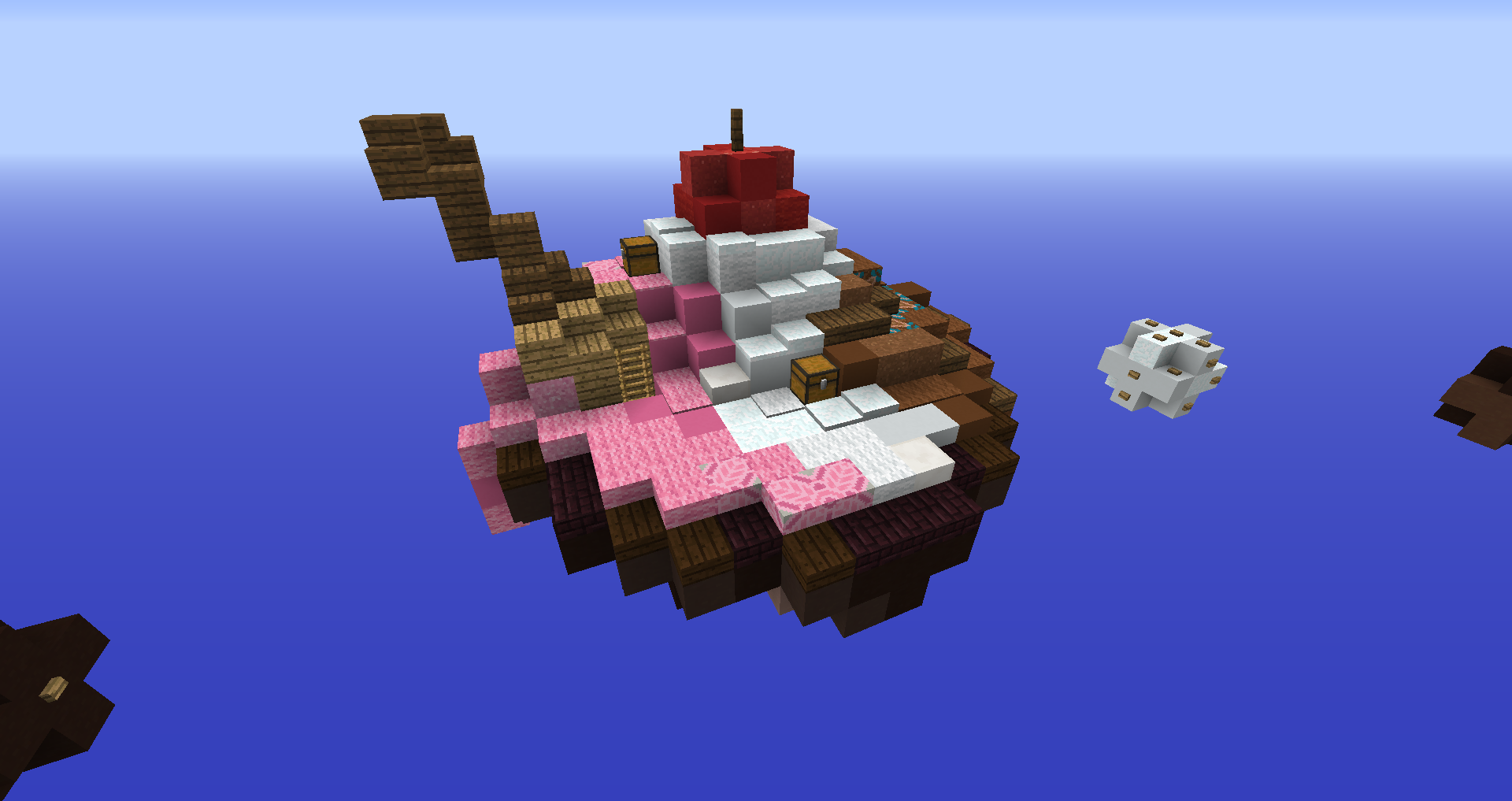
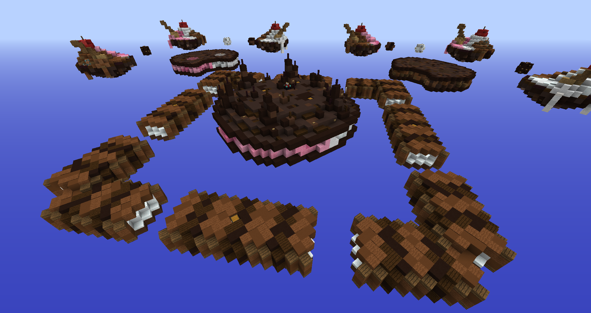
This is the final version, and I’m really happy with it. The ice creams were made a bit more PvP-friendly, and the ring between sub-mid and mid was totally redesigned to chocolate bars instead of tiny ice cream sandwiches.
Overall this is my favourite version of the map.
Click the images to view them with more detail
Thanks for reading! I hope you found this thread helpful or at least entertaining!
Solo SkyWars - Desserts → By @Nyawh and @Jadeite
Hi! I’m Nyawh!
During the past year, I’ve been working on my own map with the help of several friends. My motivation? Submitting it to the Map Submissions subforum and getting something created by myself released in CubeCraft (excluding my translations work, ofc c:)!
Sadly, the Map Submissions subforum has disappeared and it doesn’t seem it’ll be reopened to map submissions anytime soon. Therefore, I decided to make a thread about this map, Desserts, to show it off to the community, to thank all the people who helped me during the development and to analyze the pros and cons of each version and what we modified each version.
I really enjoy that when comparing the first and final version of the map, the map has improved a lot, and it’s funny to see the various names I’ve given the map!
Before showing the versions, I’d like to give thanks to the following people:
@Jadeite - Basically she’s another creator of the map - thanks for all your help!
@FireExcalibur10 - Thanks for giving me tips, improving the spoon of the ice creams and for suggesting to me the new layout!
@RemiFan, @dumfries, @ForGiveNoWIn, @EntitySplix - Thanks for helping me with earlier stages of the map!
The map was made using WorldEdit and Essentials in a private server network.
Version 1 - Cookie Cat | 26 - 6 - 2020
The first version of the map. The thing I liked the most were those balls leading to mid.
Though the block selection was very poor, the islands were boring and small (specially the starter ones) and some islands had no purpose.
Click the images to view them with more detail
Version 2 - Ice Cream | 11 - 1 - 2021
This version featured bowls of ice cream as starter islands, which added variation to the colour palette and made them bigger. The balls to mid were “merged” into one long bridge and the starter islands were attached to each other with molten chocolate strings to make the map more rushable. Still, the textures weren’t ideal and it was overall boring.
Click the images to view them with more detail
Version 3 - Ice Cream | 9 - 7 - 2021
Since CubeCraft updated to 1.12.2, we were able to use that version’s blocks! Which allowed us to make very good-looking textures. The middle island was decorated with smaller pillars, featuring fences instead of thick blocks only to make it more of an open, PvP-friendly space whilst still looking detailed. We also removed the sub-mid to mid bridges and the molten chocolate between the starter islands because of the designer’s feedback on the previous version. Sadly we couldn’t submit this version.
Click the images to view them with more detail
Version 4 - Desserts | 18 - 7 - 2021
This is the final version, and I’m really happy with it. The ice creams were made a bit more PvP-friendly, and the ring between sub-mid and mid was totally redesigned to chocolate bars instead of tiny ice cream sandwiches.
Overall this is my favourite version of the map.
Click the images to view them with more detail
Thanks for reading! I hope you found this thread helpful or at least entertaining!


