Minecraft PC IP: play.cubecraft.net

Please mark all options you think could work out to resolve the problem!

  • Option 1: Remove messages completely

    Votes: 1 5.0%
  • Option 2: add a setting option

    Votes: 16 80.0%
  • Option 3: add a command

    Votes: 1 5.0%
  • Option 4: make messages interactive

    Votes: 5 25.0%

  • Total voters
    20
Status
Not open for further replies.

Blom

Forum Expert
Sep 12, 2018
641
2,256
349
MinerWare Town
www.cubecraft.net
Pronouns
He/Him

PARTY AND TEAM CHAT INFORMATION MESSAGES

❓What is the exact problem?


With the quality of life series of changes CubeCraft implemented lately a problem came. If you are wondering about which changes I am talking:

"Quality of Life Changes - Part 3
- Removed Magic and Mayhem statistics (Java)
- Removed "an" in your friends list when your friend was playing an among slimes game (Java)
- Changed party colour to white (Java) - Added /pi, /pa, /fl, /fa, /ps commands (Java and Bedrock)
- Added colour codes and formatting to /tell and /msg (Java)
- Added Party chat and Team chat. Team chat is enabled by default on team games, use ! to talk in global chat. Use /p chat to enable or disable party chat (Bedrock)
- Party members no longer get pulled out of their games. To join the party owner in their new game, use /hub or /leave to be teleported (Java and Bedrock)"

Now the one but last sentence is the bigger problem, since this also meant 'new' stuff being implemented in Java as well, which I really dislike, and I'll show you why:
Screen Shot 2021-11-16 at 20.52.25.png

Screen Shot 2021-11-16 at 20.53.47.png
Every time you enable or disable party chat you get this annoying message explaining how exactly /p chat works. The experienced community however quite knows how party chat works, and this message only floods the chat and adds nothing. The same is true for the bottom screenshot, which shows how team chat and global chat works, although that one is less annoying.

There should be a way to remove these messages, so the chat gets less flooded when you know how stuff works. It also prevents players from getting distracted due to the overkill of colors in a small space.​

🤔 How can we resolve the problem?

I've come up with a few ideas, listed down below! Please let me know in the poll which of these solutions you think would work!

1️⃣ Remove the messages in general

I totally understand the big downside of completely removing the messages, since a lot of people still struggle with the commands, and it happened more than once I had to tell players to type /p chat so I could vibe in the lobby without being disturbed. I still wanted to leave the option here, since it is theoretically a very effective way of resolving the problem. However, I do think this will be the least viable option.

2️⃣ Add a function inside the profile menu in the hotbar

An option should be added for enabling or disabling these messages, with it being enabled on default. I looked into where this option should be added, and I found the "Chat Menu". (Profile -> Settings -> Chat Settings). This menu has 4 options right now, and I would like a 5th option to be added with which you could enable or disable these reminder instructions. I couldn't totally get it the same as the CubeCraft menu in my own survival world, but it would look something like this
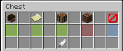
Screen Shot 2021-11-17 at 18.57.54.png

with obviously a text on it that explains what enabling and disabling does. Again, I couldn't do this myself in a default survival world, but I tried my best.
Obviously this option could be on another spot as well, but I thought creating a situation how it could look would be easier.

3️⃣ Add a command to enable or disable these messages

The upside of adding a command for this is that it can be activated everywhere, but that doesn't seem necessary to me. A function to do it though does, and a command could perfectly work it out. The command, which would be something like "/instructions" or something, should clearly state what it does whenever executed. The exact text I cannot come up with when I'm writing this, but that's the same with option 2 as well.

4️⃣ Make the text interactive

This might sound a bit vague, but what I mean with 'interactive' is that you should be able to press the text in order to have something happen (just like the "Play again" button). Upside is that it is super easy to find, but I wouldn't know how you would make it so that you could enable it. Maybe combine it with option 3?

😇 Concluding...

Instruction messages are unnecessary for a big part of the community, and for that matter they should be removed, or there should be a possibility to disable them. There are multiple possibilities of which I stated a few above. If you know any other option, make sure to add it in the comments!

Make sure to click all options you agree with in the poll. If you agree with this suggestion, make sure to add an ":agree:" emoji to this thread! Thanks for reading, have a great day/night! :heart:
 

ShinyArrow

Forum Expert
Aug 31, 2019
1,046
4,792
364
20
The Netherlands
Pronouns
He/Him
I have seen multiple players 'complaining' about this new messages and/or asking in #staff-help if it is possible to turn those messages off. As this proves imo enough that some players (who probably already know how the party system works) don't feel need to see these messages, I agree with having an option to remove the messages. I voted for option 2, as I feel like this would be the best way to implement this suggestion.
1️⃣ Remove the messages in general
I feel like too many players don't know how the party system works, mostly new players, therefore removing this option does not seem like a smart move. It would only make things complicater again and that's something CubeCraft wants to avoid.
2️⃣ Add a function inside the profile menu in the hotbar
This would be the best way imo. Basically because experienced players, who know how the party system works, have an idea about the settings and most likely will discover this feature soon or later without any troubles.
3️⃣ Add a command to enable or disable these messages
In contrast to suggestion 2, I feel like that this option would just become a possibility where players need to try and search for the correct command. This would be way too hard and unnecessary work for the players.

About the fourth suggestion: to be honest, I don't fully understand what you mean with an interactive text. It sounds very vague and if that's true, then I prefer not adding this option because of the reasons mentioned above.
 

ToonBer

Moderator 🍰
Team CubeCraft
🔨 Moderator
May 13, 2021
465
1,441
159
20
The country of beer and chocolate
This will probably disappear in the future. This is new on bedrock and for bedrock players.
If everyone understands how this works, this will certainly disappear. And an option such as number 4 seems clear to me and isn't anoying for the people who understand how it works.

edit: I do agree with ShinyArrow
 
  • Like
Reactions: Blom

ItsNinjaa

Well-Known Member
Nov 22, 2020
214
579
124
19
tbh I don't understand what the cube staff are doing...
Don't fix what is not broken!
For me, it's not that anoying, but it's just useless.
Just /p help and the new people will learn how it works
 
  • Like
Reactions: Blom

Blom

Forum Expert
Sep 12, 2018
641
2,256
349
MinerWare Town
www.cubecraft.net
Pronouns
He/Him
About the fourth suggestion: to be honest, I don't fully understand what you mean with an interactive text. It sounds very vague and if that's true, then I prefer not adding this option because of the reasons mentioned above.
With interactive chat i mean something similar as CubeCraft uses for the 'play again' button, which is text you can press in order for something to happen. In the case of the 'play again' button, it teleports you to a new game lobby. For this situation you can press the text, which will give response by disabling the messages which we discuss. Hope that clears it a bit! :D

This will probably disappear in the future. This is new on bedrock and for bedrock players.
If everyone understands how this works, this will certainly disappear. And an option such as number 4 seems clear to me and isn't anoying for the people who understand how it works.
I definitely dont think so. CubeCraft always attracts new people and new players, and they dont know at all what a party system is or how team chat works. for this reason I think the messages are quite useful for the newer part of the community, but it doesnt mean anything for the older community, who are familiar with the system. Those two groups will always exist and wont grow as one (since it is none)
 
  • Like
Reactions: ShinyArrow

Frontlane

Mod
Team CubeCraft
🔨 Moderator
Jul 20, 2017
338
1,906
234
Hey Blom!
That's quite a nice suggestion you got here that I apparently missed.
My preference would go to option 4.
I would like to see a clickable message in chat, for example, "CLICK HERE if you don't want to see these explanations anymore".
I think that would be the most user-friendly option, as players don't need to search (or ask in #staff-help) for a certain setting, and they immediately know they can disable it.
 
Apr 15, 2020
64
32
24
24
I mean this doesn't affect me at all but I can somewhere find the irritation of this, that's why I think an option to disable party info message or and party chat should be made. What I hope to see is basically a menu with all the settings for things related to a party.

Option 1: Also I am against removing it since you still got new players that might be interested in it.

Option 2: Like discribed at the top I think this is the best out of the 4. But I think a party menu for as a whole is even better.

Option 3: This could be a possibility but I see more use in merging all the party settings in 1 special menu instead of like 800 commands.

Option 4: Not sure how this should be done but this doesn't sound as an option to me.
 

GeoJosh7

Well-Known Member
Feb 25, 2021
405
505
124
Australia
Pronouns
He/Him
Hey Blom!
That's quite a nice suggestion you got here that I apparently missed.
My preference would go to option 4.
I would like to see a clickable message in chat, for example, "CLICK HERE if you don't want to see these explanations anymore".
I think that would be the most user-friendly option, as players don't need to search (or ask in #staff-help) for a certain setting, and they immediately know they can disable it.
Although clicking on it would be good, it's not a plausible option for people playing on Consoles, as they can't click on chat
 

Marieke2001

Forum Professional
Jul 2, 2015
4,115
15,519
679
Hello Blom,

The server team has discussed your suggestion, and we decided to mark it as planned. We did disagree on the options given to improve the system, as we'd rather have it shown an x amount of time and makes it disable itself after a certain frequency.

So for example, a player would join a party for the first time ever, and it shows the message, but every new party that they join won't make the message appear anymore. This way new players still get told how to use the system, but it doesn't require anyone to disable it whatsoever.
 
Status
Not open for further replies.
Members Online

Team online

Latest profile posts

Eli wrote on Flxen's profile.
Flxen appreciation post :)
coolzombiee wrote on Darwin7's profile.
Thank you for the follow! I didn’t notice lol take one back
coolzombiee wrote on Lyriie's profile.
Was community games happening when I saw you , itzjuan, and nightmare in the lobby, with a bunch of other people?
Only nine more "haha's" till I get to 1,000 funnies.
1000048948.png
Reesle wrote on treegirl0194's profile.
Happy Birthday! 🎂
Top Bottom