Minecraft PC IP: play.cubecraft.net

Do you like it?

  • Yeah it's good, keep building it like this

    Votes: 5 33.3%
  • I like the ideas but it needs work

    Votes: 9 60.0%
  • Nah, it looks a bit crap

    Votes: 0 0.0%
  • Dude, why did you even try? (If you choose this I hope don't know how you sleep at night)

    Votes: 0 0.0%
  • ^ Thats supposed to say '(If you choose this I don't know how you sleep at night) I messed up xD

    Votes: 1 6.7%

  • Total voters
    15

DragonSan

Dedicated Member
Sep 1, 2016
524
691
168
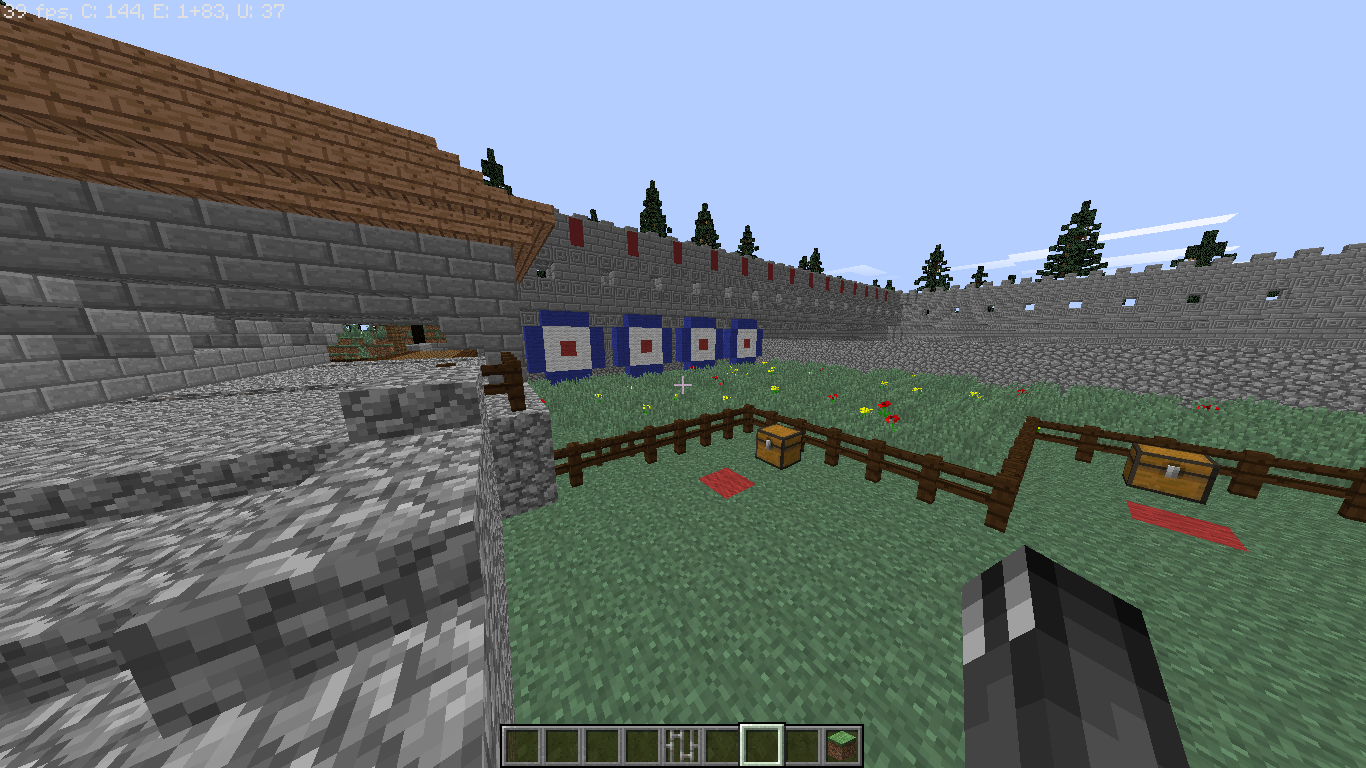
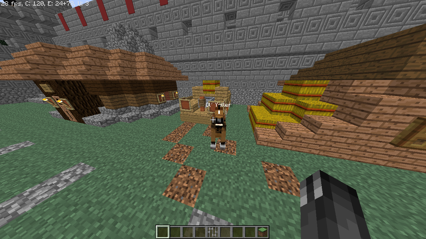
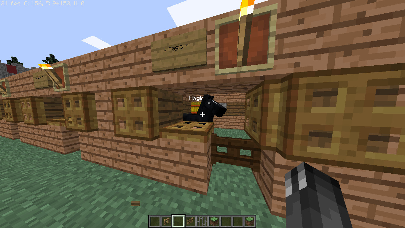
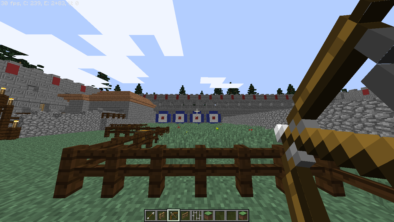
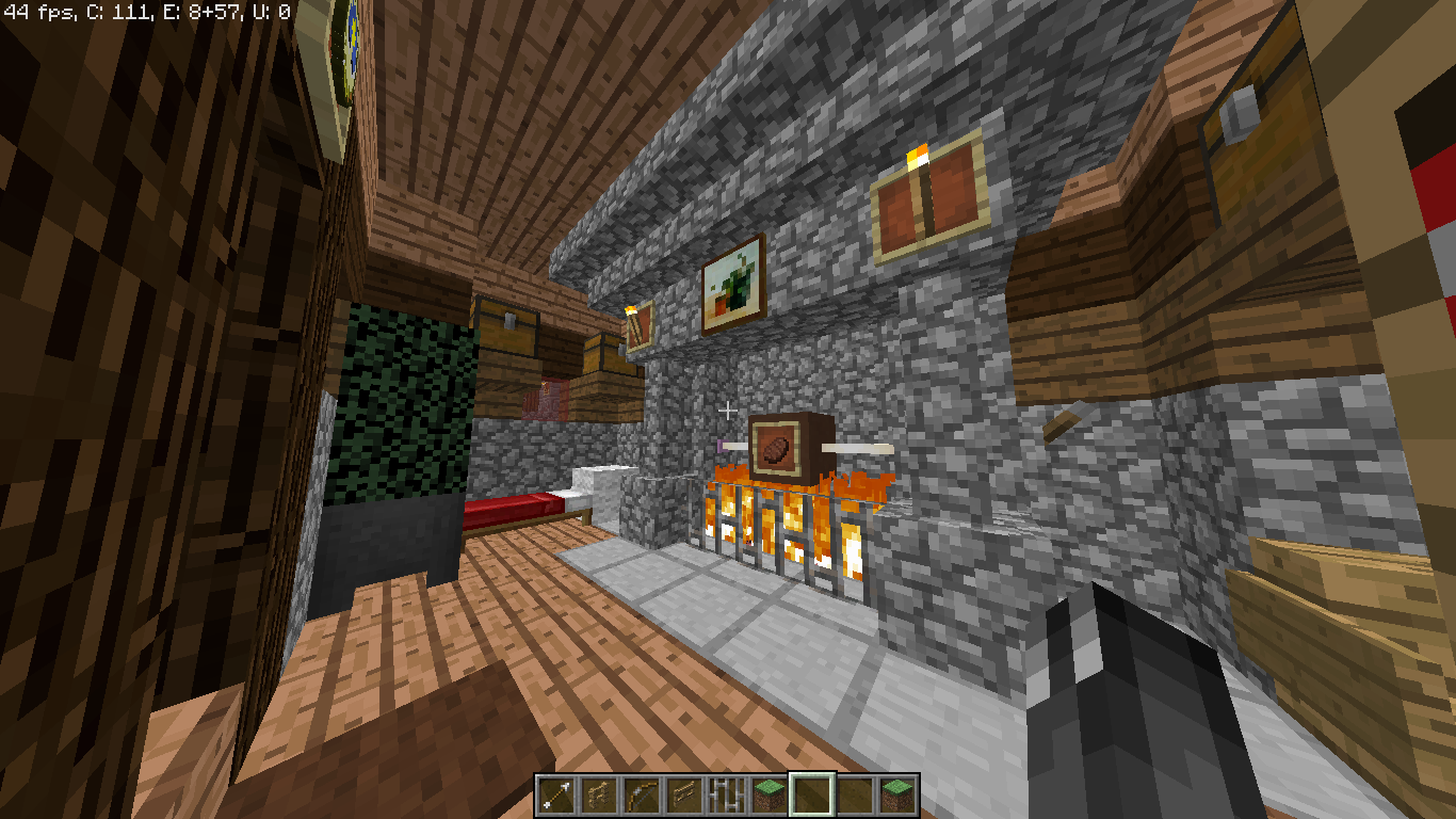
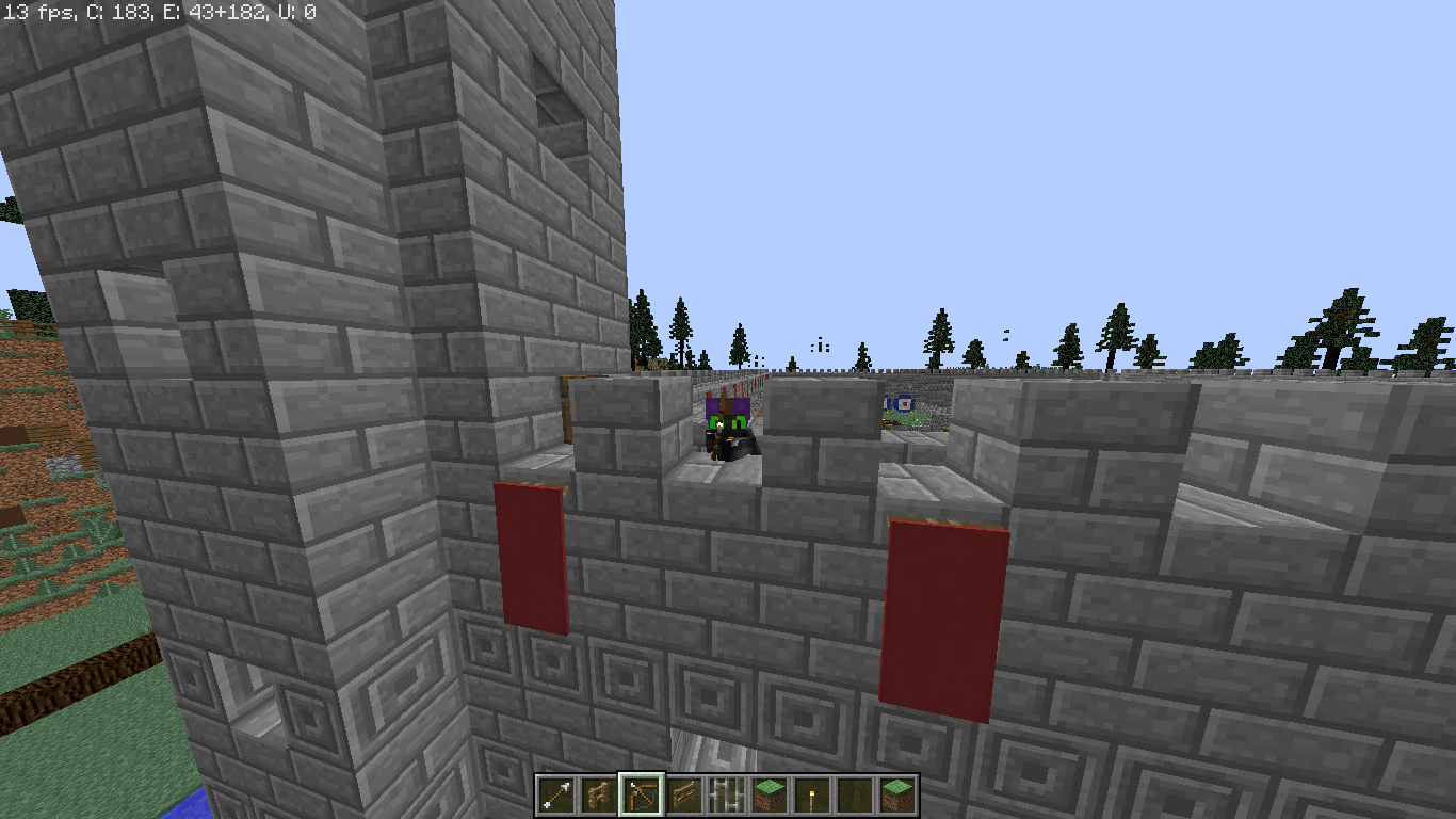
Ok guys I've been working on this build every now and then. It's my first build so I thought 'why not start with a big ol' castle'
: P It's just a hobby not a submission or anything like that, but if you could look over it and give me some feedback that'd be great!
2016-11-14_21.06.50.png
2016-11-14_21.08.08.png
2016-11-14_21.06.50.png
2016-11-14_21.08.08.png
2016-11-14_21.08.35.png
2016-11-14_21.09.25.png
2016-11-14_21.10.32.png
2016-11-14_21.10.58.png
2016-11-14_21.11.24.png
2016-11-14_21.13.58.png


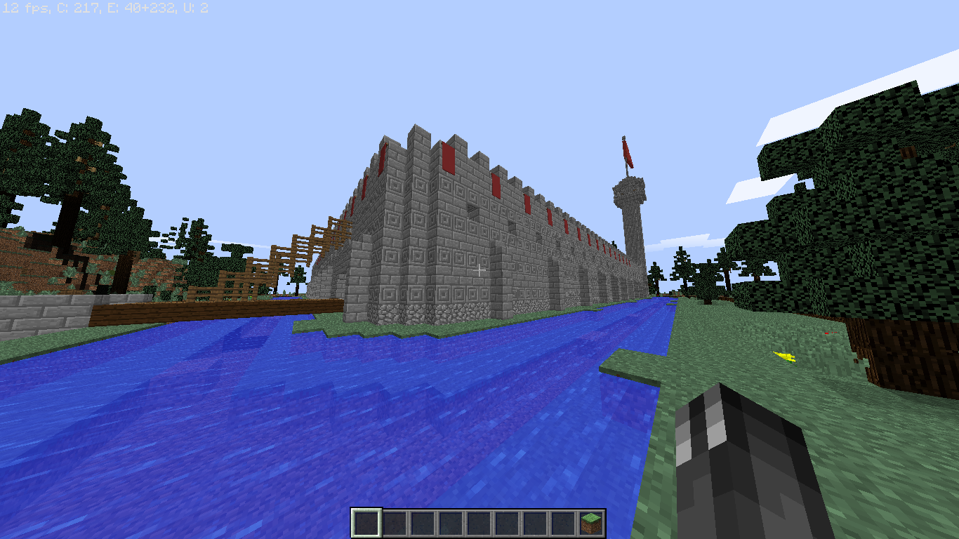
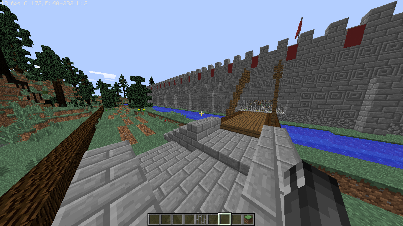
It's nowhere near finished, but I thought I'd post a few screenshots to show progression, development etc. I hope you guys like what I've done so far! If not, give me tips on how to make it better please. I know some parts look a bit dull and bland but I'm not sure how to improve them or what blocks to use without making it look stupid...

There's still a lot of space left, and im still thinking of including a forge and the main bulky section of the castle with a food court, sleeping quarters for the king etc. I'm also going to add 2 more towers on each corner all at different heights.

So what do you think? Any good or should I just scrap it and start something else?

All opinions welcome!

EDIT: Some of the images uploaded twice I know, don't ask me why xD
 
  • Like
Reactions: ThreeaSan

MooTa

Dedicated Member
Jul 25, 2016
1,602
907
188
21
YouTube
In the castle walls there is a second floor, and I'm hoping to add a big stone fort at the back that will have many floors in it : P
oh then ;) but it will be even better to make an castle little higher I think it is kind of low ;) but it still looks cool ;)
 
  • Like
Reactions: DragonSan

DragonSan

Dedicated Member
Sep 1, 2016
524
691
168
oh then ;) but it will be even better to make an castle little higher I think it is kind of low ;) but it still looks cool ;)

Alright, thanks for the suggestion! I might make it higher once I finish some of the other things inside, it does look a little bit low.
 

theTNT1

Well-Known Member
Aug 19, 2016
10
1
78
21
Okay, I'm no building expert, but I think it needs the following:
1. A second floor
2. A verity of blocks on the outer wall (which it does) but i think it needs to be blended better.
3. The walk ways are kinda scrambled, so redone walk ways.
 

DragonSan

Dedicated Member
Sep 1, 2016
524
691
168
I like the idea, some detail with mossy cobble or adding some texture blocks in the mote wouldn't be a bad idea.
Keep it up :D

I forgot about mossy stone, that could work : P thnx for the tip
 

DragonSan

Dedicated Member
Sep 1, 2016
524
691
168
Okay, I'm no building expert, but I think it needs the following:
1. A second floor
2. A verity of blocks on the outer wall (which it does) but i think it needs to be blended better.
3. The walk ways are kinda scrambled, so redone walk ways.

1. I'm gonna try to add more levels soon, and the walls are gonna be raised too.
2. How do I blend them better? I could add more types of stone block but I don't want it to look a mess.
3. Meh, I'm happy enough with the walkways.

Thnx for your input! : D
 

CARDAN18

Dedicated Member
Aug 31, 2015
1,847
1,485
218
25
Cakeland
www.twitch.tv
I love the interior design, very well done. My only issue with this build so far is that I feel there is a lack of depth in the walls. I'm not a builder so it may look better this way, but I feel that the walls look a little bit flat. Over all this looks very good and I can't wait to see the final product (:
 
  • Like
Reactions: DragonSan

DragonSan

Dedicated Member
Sep 1, 2016
524
691
168
I love the interior design, very well done. My only issue with this build so far is that I feel there is a lack of depth in the walls. I'm not a builder so it may look better this way, but I feel that the walls look a little bit flat. Over all this looks very good and I can't wait to see the final product :)

Cheers cake ^-^ Yeh, I'm gonna figure out a way to make the walls a bit more interesting, a few other people have suggested the same.
Thanks for the support though!
 
Members Online

Team online

Latest profile posts

BicolourSine41 wrote on finnyboy300.'s profile.
wait finny is this a new account here?
BicolourSine41 wrote on kfccaleb's profile.
congrats on novice member!
jamesthesignificant wrote on Capitan's profile.
you are cool
Mr Jii Gamer wrote on Pro Gamer672's profile.
Happy birthday
UncleSpect wrote on ssunsett's profile.
hellowss sunn
Top Bottom