Minecraft PC IP: play.cubecraft.net

Should this map be added?


  • Total voters
    52
Status
Not open for further replies.

ItzEnd3r

Forum Expert
Aug 18, 2019
1,353
3,931
384
19
Boulder
www.cubecraft.net
Hello! Recently I decided that I wanted to try to build my first larger scale organic, and like most people that turned out to be a dragon. I really liked the build so I decided to turn it into my first blockwars map submission.
2020-07-24_09.24.42 copy.png

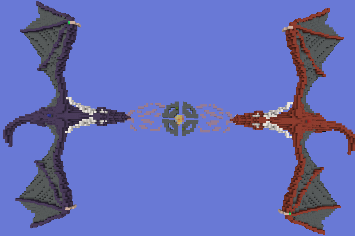
In this overview you can see that the two major pvp spaces would be on that center ring and on the dragons. I tried to leave a lot of open space to give a chance for pvp because in general organic builds dont have a great surface.
2020-07-24_09.24.58.png

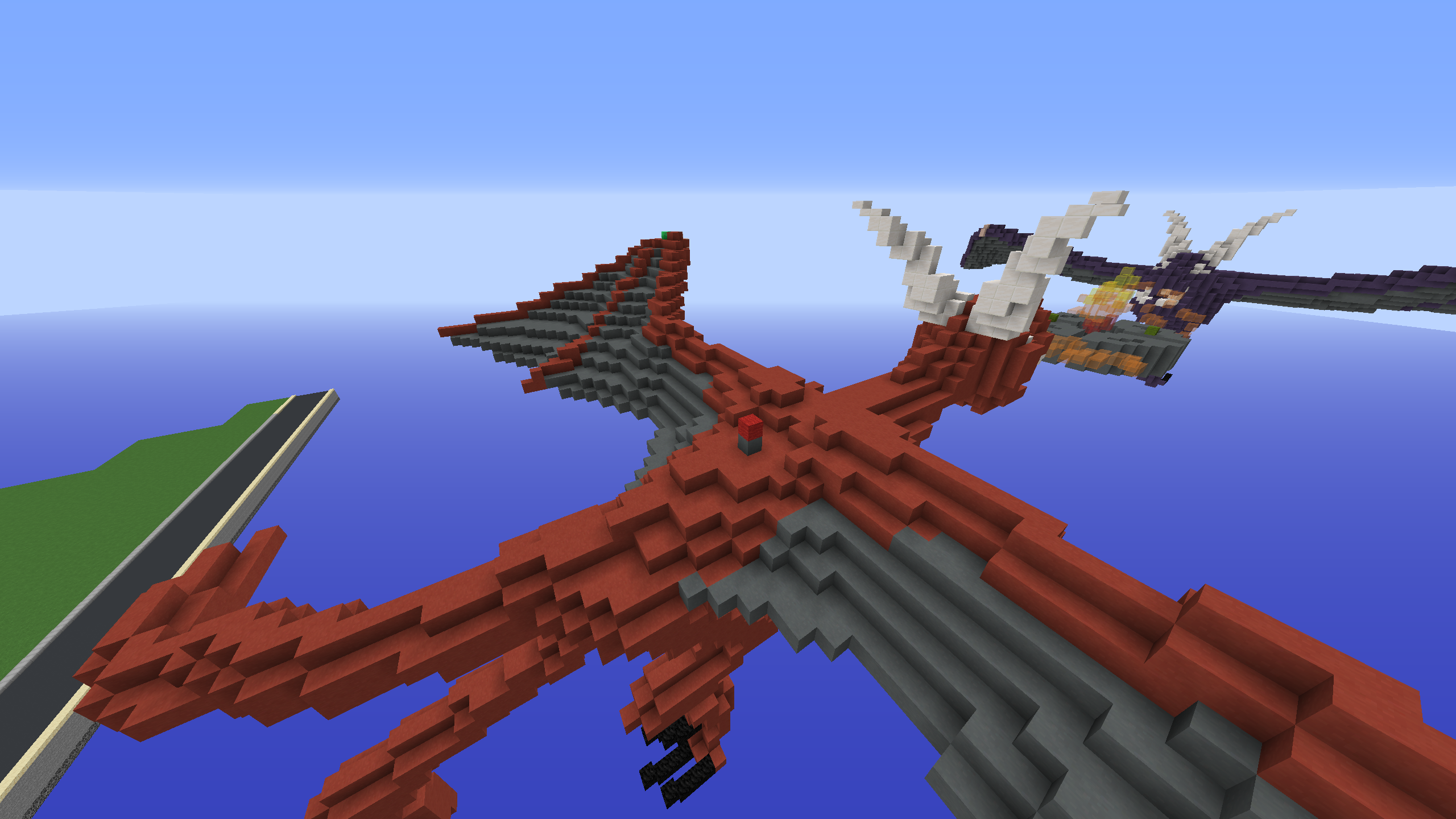
As you can see here the core / flag is placed in the middle of the dragons back, I thought that this would be the best place for it because it is decently far from the other core, but is also quite a ways away from the spawning area on the wing (to prevent respawning and constantly killing people who are attacking the core).
2020-07-24_09.24.52.png

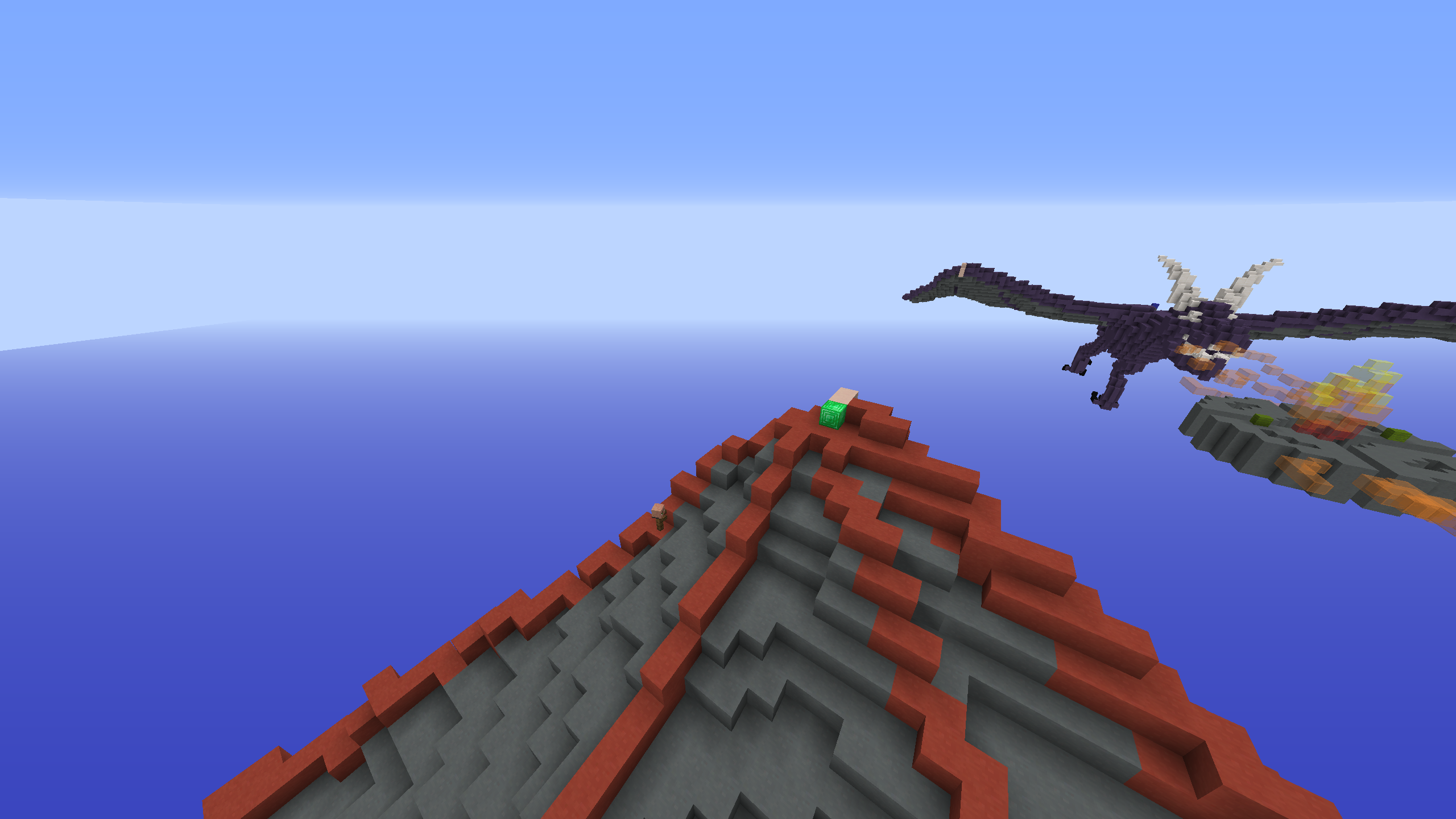
Players spawn on the edge of the wing a ways away form the core, this is to prevent really long games due to constant respawning and camping. The villager is also down-wing a little, keeping it close to the spawn will give players a chance to change their kit without searching the far reaches of the earth looking for that pesky villager.
2020-07-24_09.25.07.png

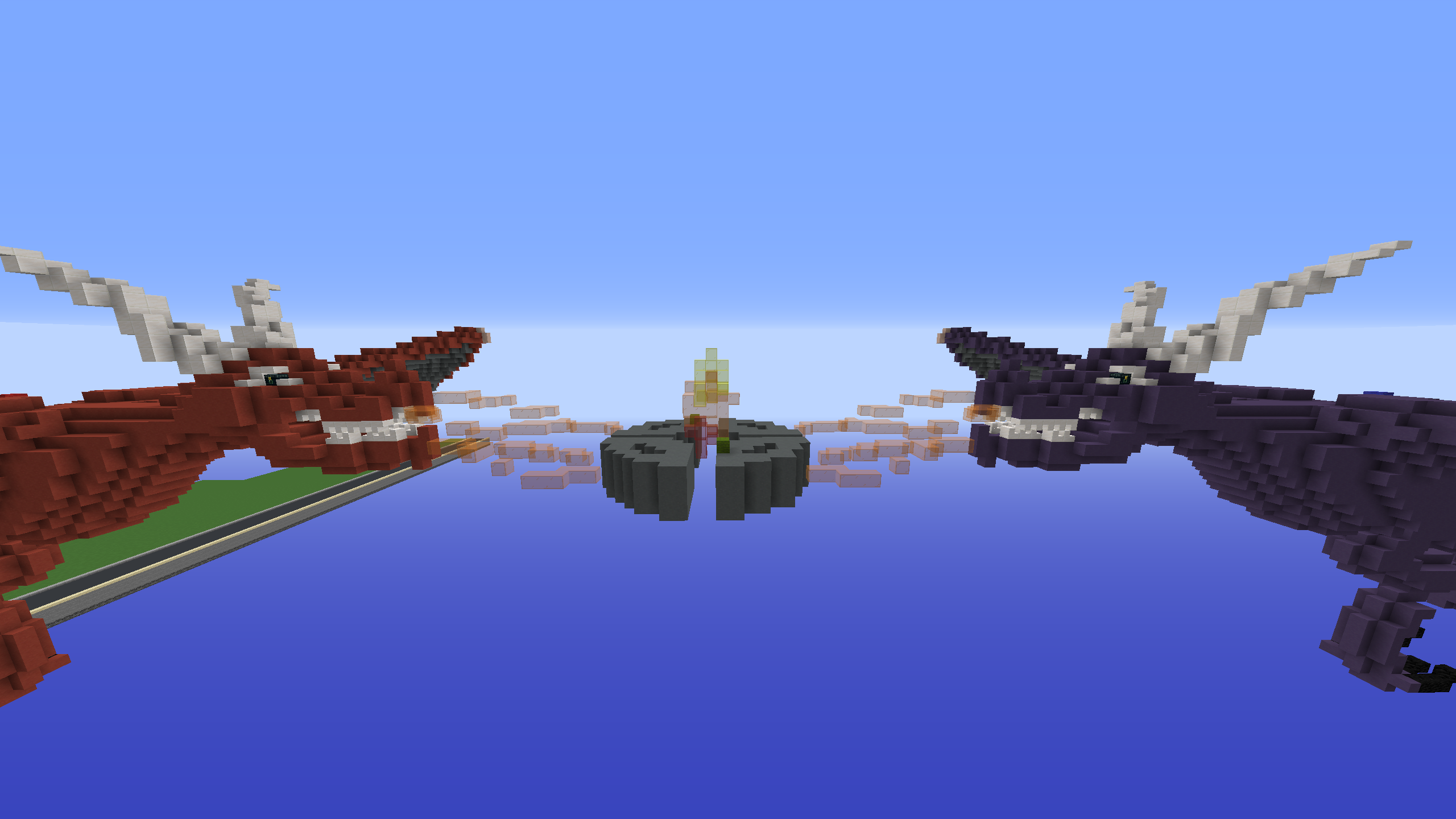
In this view you can see that the powerups will spawn on the green wool. you can also see the parkour that connects the dragons together. I tried to put some openings in the circle so that knocking players into the void could be a viable strategy on this map, I know its annoying but it also helps less skilled players do well :D


Thank You for reading my map submission, I am quite proud of my first dragons so I hope you guys like the map too!

EDIT: Changing mid up to give more pvp space!
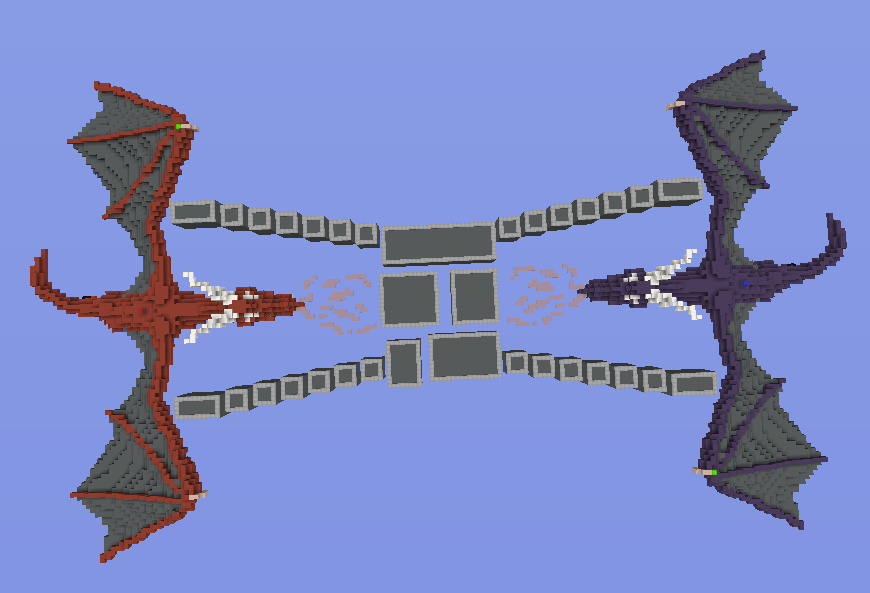
2020-07-24_11.00.48 copy.png
 
Last edited:

nottap6

Member
Jul 23, 2020
25
7
4
19
this is so cool but you need to post it to the map suggestions bit for it to be seen
 

Zathelas

Forum Veteran
Jul 14, 2018
1,136
4,570
404
19
The Netherlands
First of all, this maps looks awesome! Well done about the design. This looks like a dragon! Still, I think there are a few areas for improvement.

If you look at the wings of the dragon you can see that the blocks are going low, I see only a few places where you really don't have enough pvp space. I think that knockback stick kit is going to be overpowered because his body is a bit thin. If you hit from below you have more advantage to hit the other person, there must be a little more space that's flat to get enough pvp space so that it is also a bit fair for both teams. If you want to pvp at that wing of the dragon it would be really difficult to pvp there.

I think if you also have double blocks you have an abundance of blocks, it looks very good but at the middle it is not that wide, what I mean by that is that they do not get through easily but that you still have enough blocks. It is far too good for that blockade if you want to make it. I think you can make more pieces so that it is difficult for the opponent to get through.

Even though, I would say yes! It looks nice, I think this map can be added if you do some edits in the map what I said above. Nice map! :)
 

Maaarijn

Forum Veteran
Mar 12, 2017
2,255
5,126
438
23
het land van kroketten, frikandellen
www.youtube.com
I like your builds @ItzEnd3r ! Keep it up!


I don't know much about building in Minecraft but I have a few small points:
In my opinion it looks like the tail is a bit too small in comparison with the rest of the dragon's body. Maybe you could increase the size of the tail a bit? (Could be because of the point of view in the 1st picture tho. In the second picture it looks a lot better already)

Also I think the middle is a bit small. Most blockwars maps have multiple routes to the middle, in your map there is only one small route. This will be easily blocked with blocks. Maybe somehow make another route to the middle?
 

ItzEnd3r

Forum Expert
Aug 18, 2019
1,353
3,931
384
19
Boulder
www.cubecraft.net
First of all, this maps looks awesome! Well done about the design. This looks like a dragon! Still, I think there are a few areas for improvement.

If you look at the wings of the dragon you can see that the blocks are going low, I see only a few places where you really don't have enough pvp space. I think that knockback stick kit is going to be overpowered because his body is a bit thin. If you hit from below you have more advantage to hit the other person, there must be a little more space that's flat to get enough pvp space so that it is also a bit fair for both teams. If you want to pvp at that wing of the dragon it would be really difficult to pvp there.

I think if you also have double blocks you have an abundance of blocks, it looks very good but at the middle it is not that wide, what I mean by that is that they do not get through easily but that you still have enough blocks. It is far too good for that blockade if you want to make it. I think you can make more pieces so that it is difficult for the opponent to get through.

Even though, I would say yes! It looks nice, I think this map can be added if you do some edits in the map what I said above. Nice map! :)
I like your builds @ItzEnd3r ! Keep it up!


I don't know much about building in Minecraft but I have a few small points:
In my opinion it looks like the tail is a bit too small in comparison with the rest of the dragon's body. Maybe you could increase the size of the tail a bit? (Could be because of the point of view in the 1st picture tho. In the second picture it looks a lot better already)

Also I think the middle is a bit small. Most blockwars maps have multiple routes to the middle, in your map there is only one small route. This will be easily blocked with blocks. Maybe somehow make another route to the middle?
Thank You Guys, I will try to work on those suggestions and give it some more pvp space aswell as a bigger mid
 

Technosword

Forum Expert
Apr 21, 2020
1,761
3,737
324
US
Loving this map, except I have a few criticisms.
1. Not enough room to PvP on some parts of the dragon.
2. Middle seems too small (if you made it a lot bigger so people could have more PvP not just knocking off, then the dragon would be less of an issue
Overall, very nice map!
Edit: didn’t see that you said that you said you would work on it
 
  • Like
Reactions: ItzEnd3r

Savvy

Well-Known Member
Aug 31, 2019
259
168
94
20
I love the map but its going to be very fustrating for gameplay. The dragons are obv my favorite part, but since their breathing fire doing you think their mouths should be open rather than closed? I voted no because this map is hard to pvp on and will get fustrating for me and others.
 

ItzEnd3r

Forum Expert
Aug 18, 2019
1,353
3,931
384
19
Boulder
www.cubecraft.net
I love the map but its going to be very fustrating for gameplay. The dragons are obv my favorite part, but since their breathing fire doing you think their mouths should be open rather than closed? I voted no because this map is hard to pvp on and will get fustrating for me and others.
I understand, did you see the new picture i posted? It give a lot more pvp space :>
 
  • Like
Reactions: Savvy

Savvy

Well-Known Member
Aug 31, 2019
259
168
94
20
I understand, did you see the new picture i posted? It give a lot more pvp space :>
Yes, i saw the new post and glad too see that change, my only concern is the dragon itself. This map is a heaven for archers.
 
  • Like
Reactions: ItzEnd3r

ItzEnd3r

Forum Expert
Aug 18, 2019
1,353
3,931
384
19
Boulder
www.cubecraft.net
Yes, i saw the new post and glad too see that change, my only concern is the dragon itself. This map is a heaven for archers.
yeah, you cant really make a massive amount of space on it or it wouldn't look good anymore, thats why i tried to substitute the space on the dragon with the much larger mid. Its also nice to have some void for less experienced players to have a chance of getting kills. Is there anything else you would like to see changed? i can try to give more space on the dragon but it might not work out :/
 
  • Like
Reactions: Savvy

Savvy

Well-Known Member
Aug 31, 2019
259
168
94
20
yeah, you cant really make a massive amount of space on it or it wouldn't look good anymore, thats why i tried to substitute the space on the dragon with the much larger mid. Its also nice to have some void for less experienced players to have a chance of getting kills. Is there anything else you would like to see changed? i can try to give more space on the dragon but it might not work out :/
I can't think of anything atm that keeps your idea. But my main concern is the void and archer spam. And shouldn't the dragons mouths be open?

My idea but changes a lot of things but keeps the dragons and have good game play is to do something similar to the map Games. Have the dragon there for looks. But this is just my idea and I don't want to change your map completely.
 
  • Like
Reactions: ItzEnd3r

wxzzrd

Dedicated Member
May 30, 2020
1,925
1,705
204
I personally don’t like and don’t play block wars but I have and this looks like a great map

that’s def a yes from me
 
  • Love
Reactions: ItzEnd3r

melkjong3n

Well-Known Member
Apr 20, 2020
322
347
114
19
The Nederlands
this map is sooooo cool but the only issue is that, in the middle there is no pvp area so if you make that bigger its better. further its a good map goodjob.
+1
 
Status
Not open for further replies.
Members Online

Latest profile posts

BicolourSine41 wrote on jamesthesignificant's profile.
Thanks for the follow have it back!!
WorriedSkate940 wrote on Skyninjass's profile.
Happy birthday!!
Can't speak , Can't Share , Can't say , Can't Chat , Can't Talk , Can't Join ....

*sign*
Reesle wrote on obesehamster392's profile.
Happy Birthday!
This just happened 5 mins ago … I don’t even know wth “alto keymapping” even is 🤣
IMG_6785.png
Top Bottom