Hi,
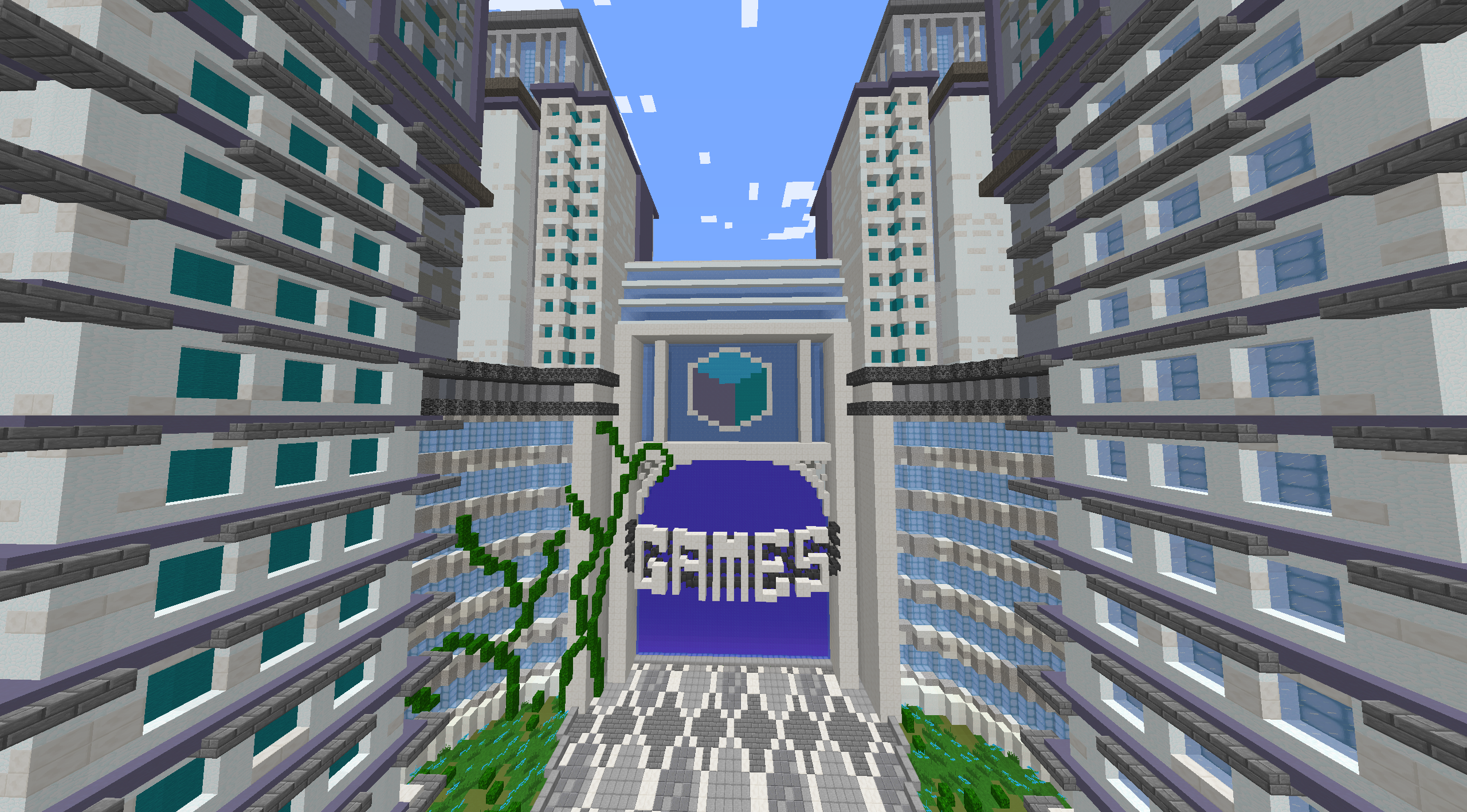
Here's a picture of the main hub building.

You see that bedrock? Really doesn't blend in with the white and blue. Change it to something nicer and brighter, like green or orange.
The white is a bit overwhelming, maybe add another colour in there?
The fact that the building on the far-left has cyan wool and the one on the far-right is ice and sea lantern really bugs me. It should be symmetrical.
Also, I feel like the hoppers behind the games writing is put there as a guide for whoever built it. Looks a bit weird.
Rest of the hub is pretty hot stuff though.
I feel like everyones just gonna say "hey, it looks great", but I asked 4 people about this and they all agreed with me, so hopefully some of you do too.
Thanks for reading and please share your opinion below,
Commissioned
Here's a picture of the main hub building.
You see that bedrock? Really doesn't blend in with the white and blue. Change it to something nicer and brighter, like green or orange.
The white is a bit overwhelming, maybe add another colour in there?
The fact that the building on the far-left has cyan wool and the one on the far-right is ice and sea lantern really bugs me. It should be symmetrical.
Also, I feel like the hoppers behind the games writing is put there as a guide for whoever built it. Looks a bit weird.
Rest of the hub is pretty hot stuff though.
I feel like everyones just gonna say "hey, it looks great", but I asked 4 people about this and they all agreed with me, so hopefully some of you do too.
Thanks for reading and please share your opinion below,
Commissioned


