Minecraft PC IP: play.cubecraft.net
Status
Not open for further replies.

Mighty_Pig

Well-Known Member
May 12, 2016
210
83
103
21
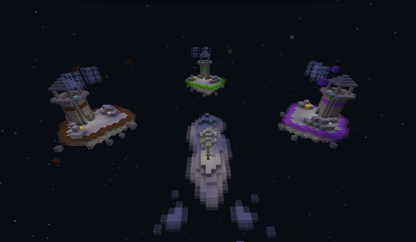
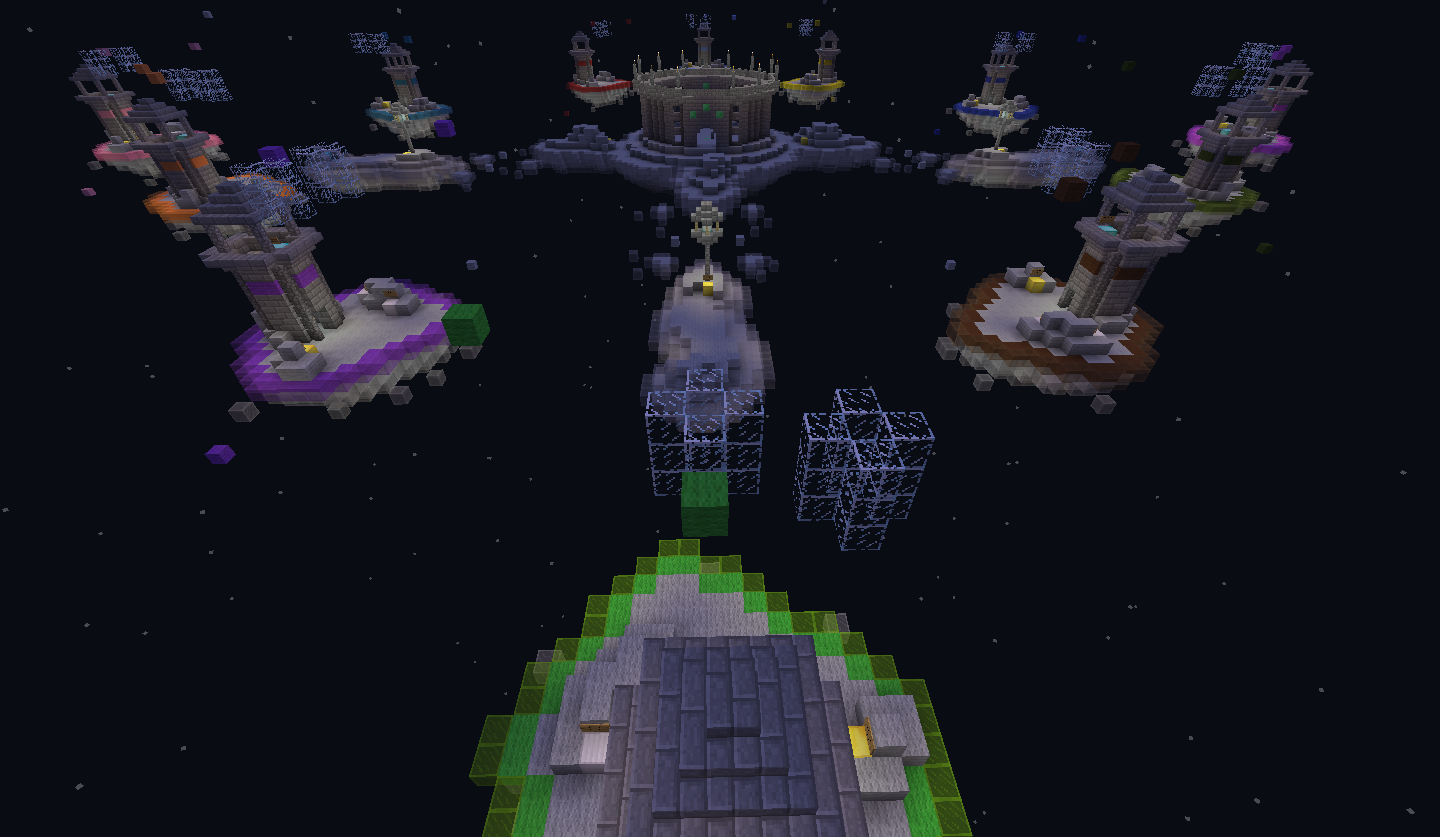
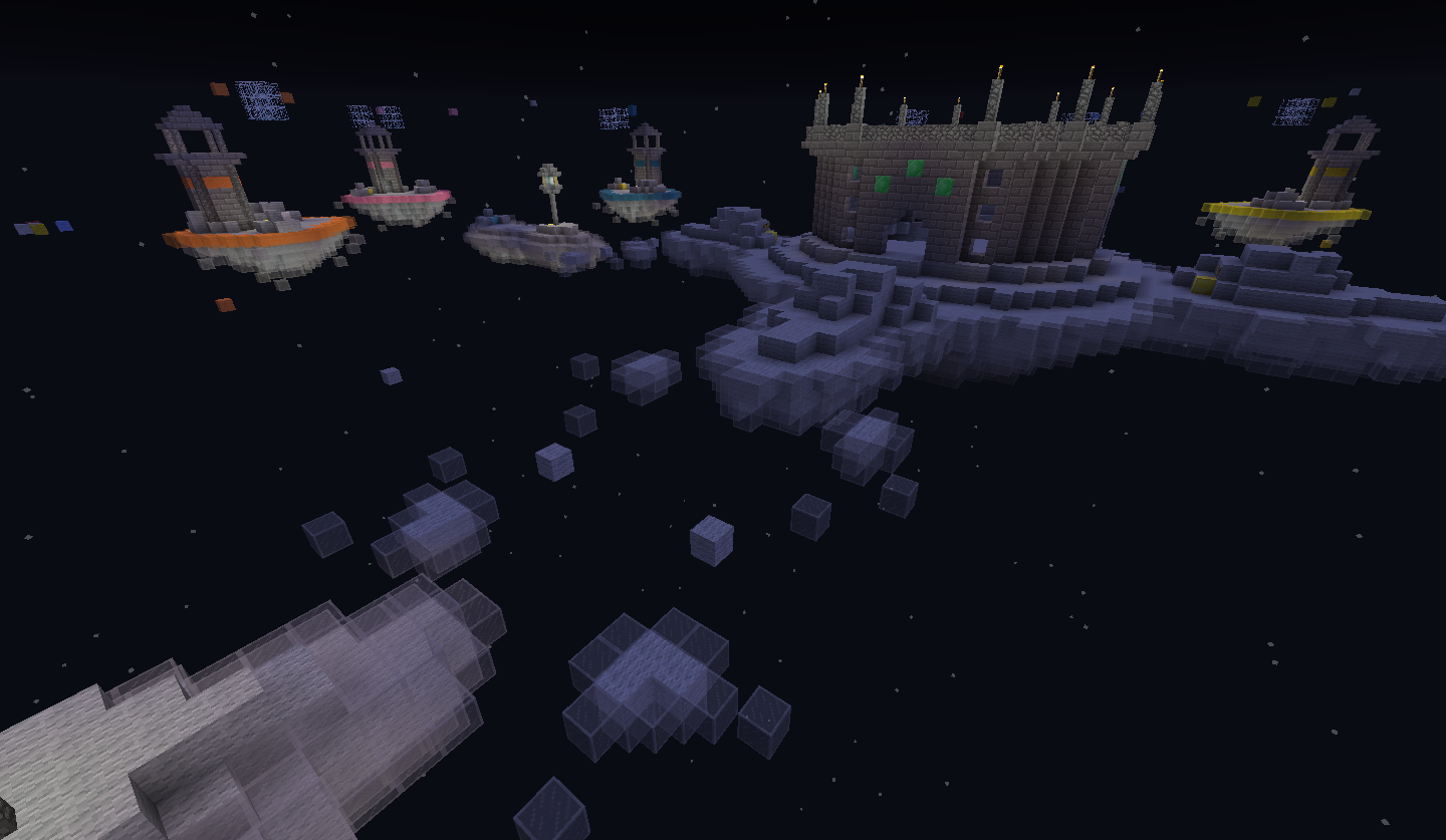
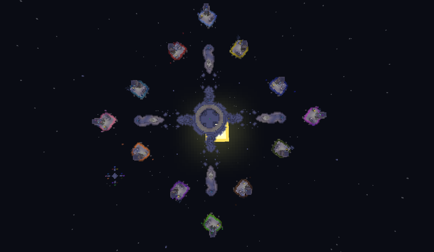
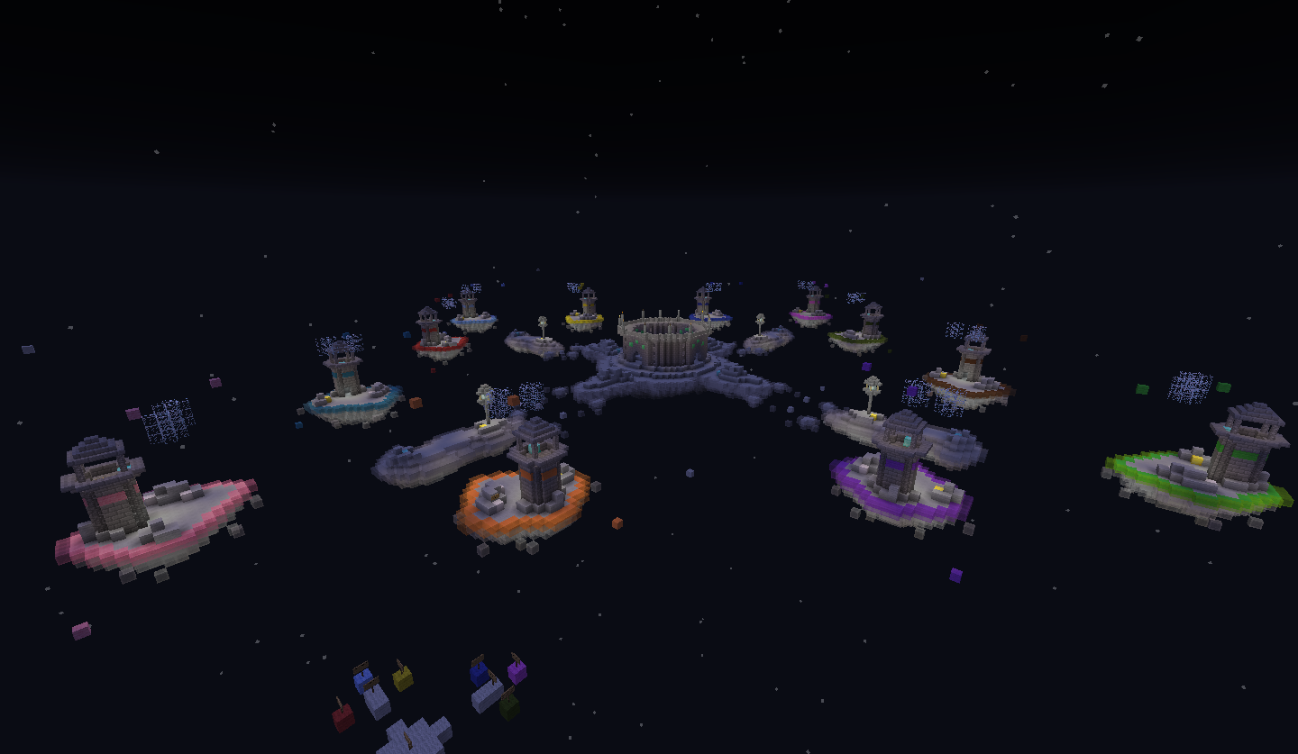
Me and my brother are working on a map for team eggwars. The map has twelve teams with two players each.

The main parts is here, but we want some feedback on the things we should improve. Like maybe balance something.
If you want have a look around you can download the map here, or you can take a look at the screenshots down below.

There are still a few things to do, like elevating the whole map so it's above/in the minecraft clouds. Ignore the floating woolblocks, they are just points for worldedit.

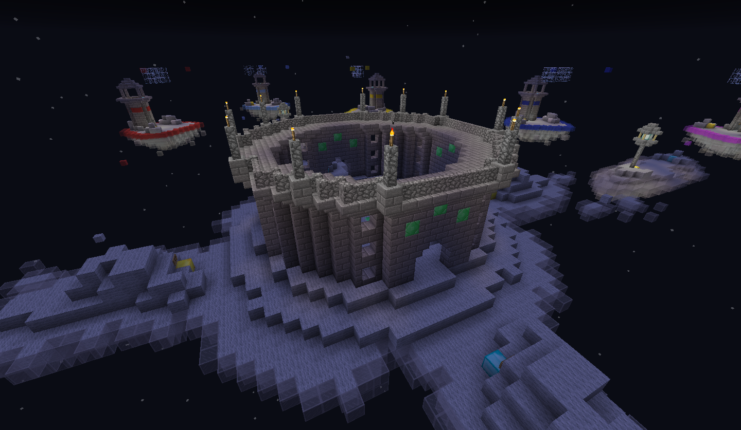
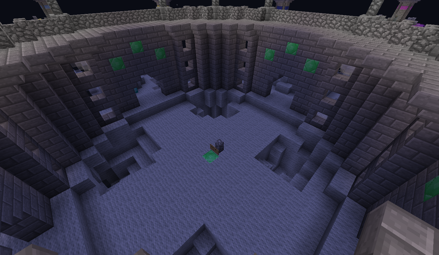
We also would like to know whether it's allowed to have the time at night instead of day? And, if the map contains a emerald generator, are we still allowed to use emerald blocks as decoration shown in picture 4, 5 and 6?
2017-01-02_00.29.18.png
2017-01-02_00.29.32.png
2017-01-02_00.29.57.png
2017-01-02_00.30.06.png
2017-01-02_00.30.24.png
2017-01-02_00.30.39.png
2017-01-02_00.31.04.png
2017-01-02_00.31.25.png
[/S]
 
Last edited:
U

Unipotato

Guest
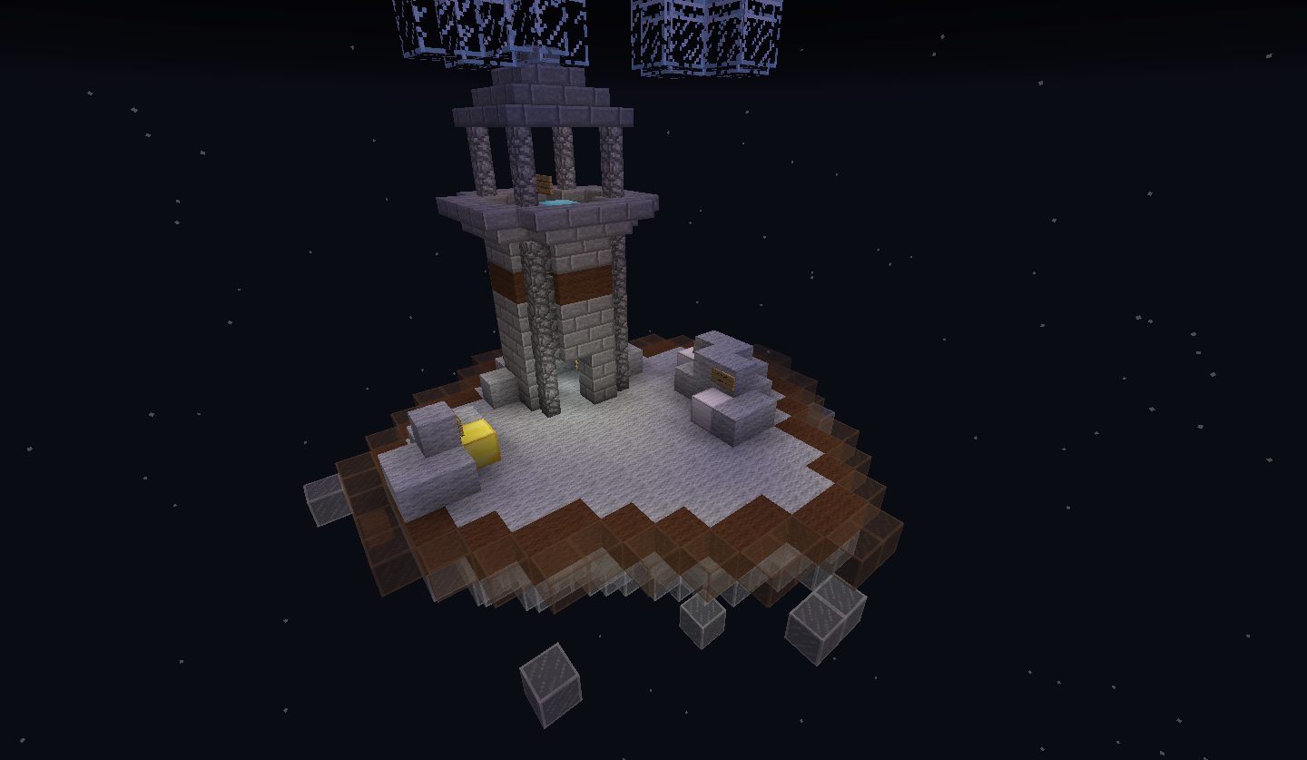
I really like the way it looks but I think each island could be a bit bigger so there is more room for PvP. Nice Job so far!

[EDIT] When I downloaded the map and looked around, I noticed that there were holes in the ground at mid. I'm not sure if I like this or not because it would be easy to fall through the world and since they are close to the emerald generator, it might not be possible to cover the holes.
 

Despacito 2

Forum Professional
Dec 6, 2015
7,508
10,313
564
23
Looks nice I guess...
The terrain is too flat and the structures too square if you know how fix that it would be awesome to play it...
 

ISTY.

Forum Expert
Dec 26, 2016
1,060
2,614
263
London
www.nasa.gov
yes, you might want to make the islands bigger, and if you look at many of the eggwars maps, they some sort of underneath if that makes sense
 

MooTa

Dedicated Member
Jul 25, 2016
1,602
907
188
21
YouTube
I think the terrain is too flat. I think it is unbalanced because some of the islands are closer to mid. The middle should be bigger. It is getting close to perfect, keep it up!
 

Mighty_Squid

Member
Jan 1, 2017
5
2
3
[EDIT] When I downloaded the map and looked around, I noticed that there were holes in the ground at mid. I'm not sure if I like this or not because it would be easy to fall through the world and since they are close to the emerald generator, it might not be possible to cover the holes.

We thought it would be a good idea to put at least something dangerous there so you need to take a risk to get emeralds, and lava doesn't really fit the theme. They aren't close enough to block your ability to cover them.
 

Mighty_Squid

Member
Jan 1, 2017
5
2
3
I think the terrain is too flat. I think it is unbalanced because some of the islands are closer to mid. The middle should be bigger. It is getting close to perfect, keep it up!
Unless people want to build straight to mid, it shouldn't matter, but maybe we can extend the sub-mid part so they are even further.
 

Despacito 2

Forum Professional
Dec 6, 2015
7,508
10,313
564
23
I just wanted to add something to my reply...
Cubecraft doesn't accept Maps with an Download link in their map submision
Think removing it is the best option.
 
  • Like
Reactions: Yamin

Tom25W

Member
Nov 12, 2016
92
13
8
25
sorry,this is not meant to be offensive or hate directed.
The map doesn't have the "theme" ya know.Its just the small and blank ground,the islands have almost nothing and not enough detail
 

Mighty_Squid

Member
Jan 1, 2017
5
2
3
sorry,this is not meant to be offensive or hate directed.
The map doesn't have the "theme" ya know.Its just the small and blank ground,the islands have almost nothing and not enough detail

Yep, totally get that. This is just a very rough first draft but we wanted to get some feedback first before we got to far with it.
 

TheFastBowler

Forum Expert
Jul 26, 2016
1,247
1,736
254
India
hatrex.net
I like the layout of the map and it looks really fancy.
However, I think there is a little less space to PvP and it is too flat, you require the terrain to have some obstacles in PvP related games. If the size of the island could be increased and the terrain changed, this map would be great!
Good building! ;)
 

TNT58907

Member
Dec 28, 2016
5
0
1
23
USA
I honestly believe that this map has a lot of potential. I really like the way you set all of it up. I suggest
  • Making the islands bigger
  • You can easily tell which island is correlated with which colored team but it hides what the theme is
  • Make the theme of the map (clouds) more apparent
  • Not enough terrain or obstacles

P.S. If you put the work in, and take all of the suggestions that have already been given, I can see this having a good shot at being added.

Cheers, TNT58907 (DiddlyDarn)
 

Mighty_Pig

Well-Known Member
May 12, 2016
210
83
103
21
We updated the spawn island and made them bigger. Are they the right size now?
2017-01-02_12.28.46.png
2017-01-02_12.29.01.png
2017-01-02_12.29.10.png
 

Mighty_Pig

Well-Known Member
May 12, 2016
210
83
103
21
Okay, we've listened to your feedback and updated the maps. We made the starter island bigger, and added more clouds for diversity.
We also lowered the amount of team indication on each island. The middle island got more diverse and we put the emerald generator on his own island.

Feedback on the things we should change is allways wanted.
2017-01-02_13.26.02.png
2017-01-02_13.26.12.png
2017-01-02_13.26.22.png
2017-01-02_13.26.37.png
2017-01-02_13.26.46.png
2017-01-02_13.26.58.png
2017-01-02_13.27.20.png
2017-01-02_13.27.55.png
 
Status
Not open for further replies.
Members Online

Team online

Latest profile posts

Watching the sun set... 🌅

1732368294873.png
Hello Guys i had been playing cubecraft for 1 year and 2 months and i got pretty good at it. i am good at games like CTF And Bridges
CalvinxKlein wrote on ItzJxrry's profile.
jerry egril or egirl?
Mappoe wrote on JokeKaedee's profile.
thnak you for the follow kae!! have it back
Top Bottom