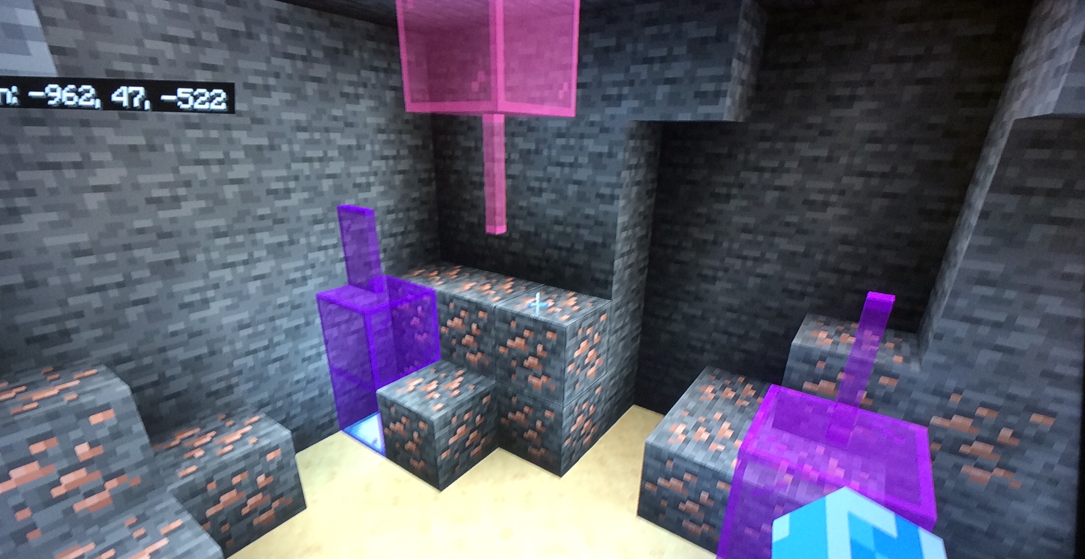
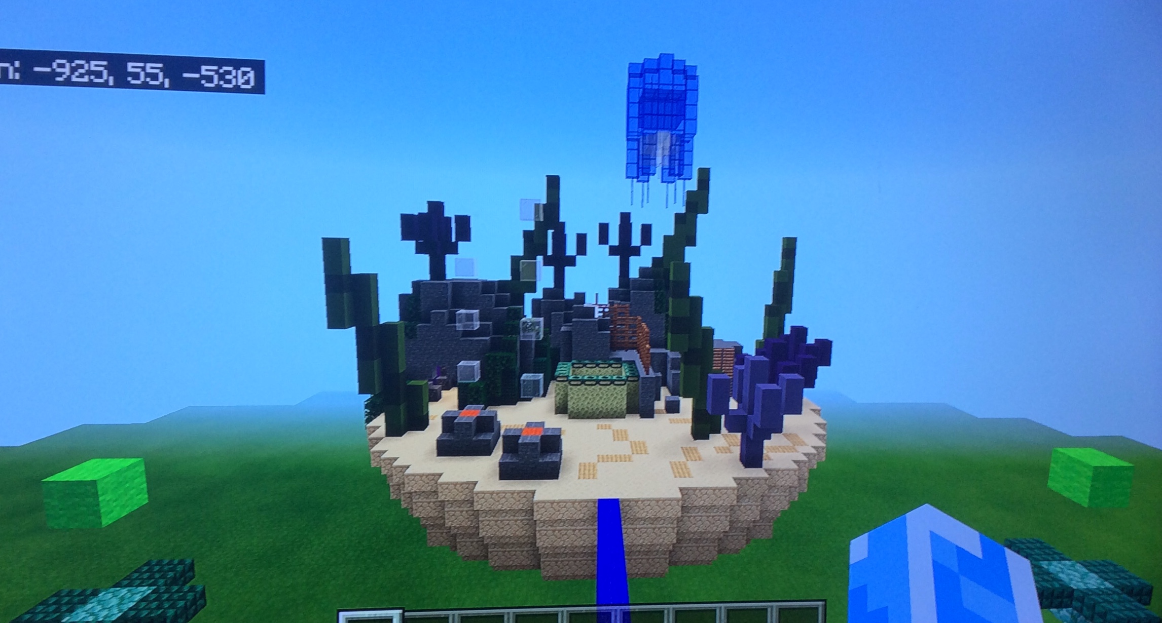
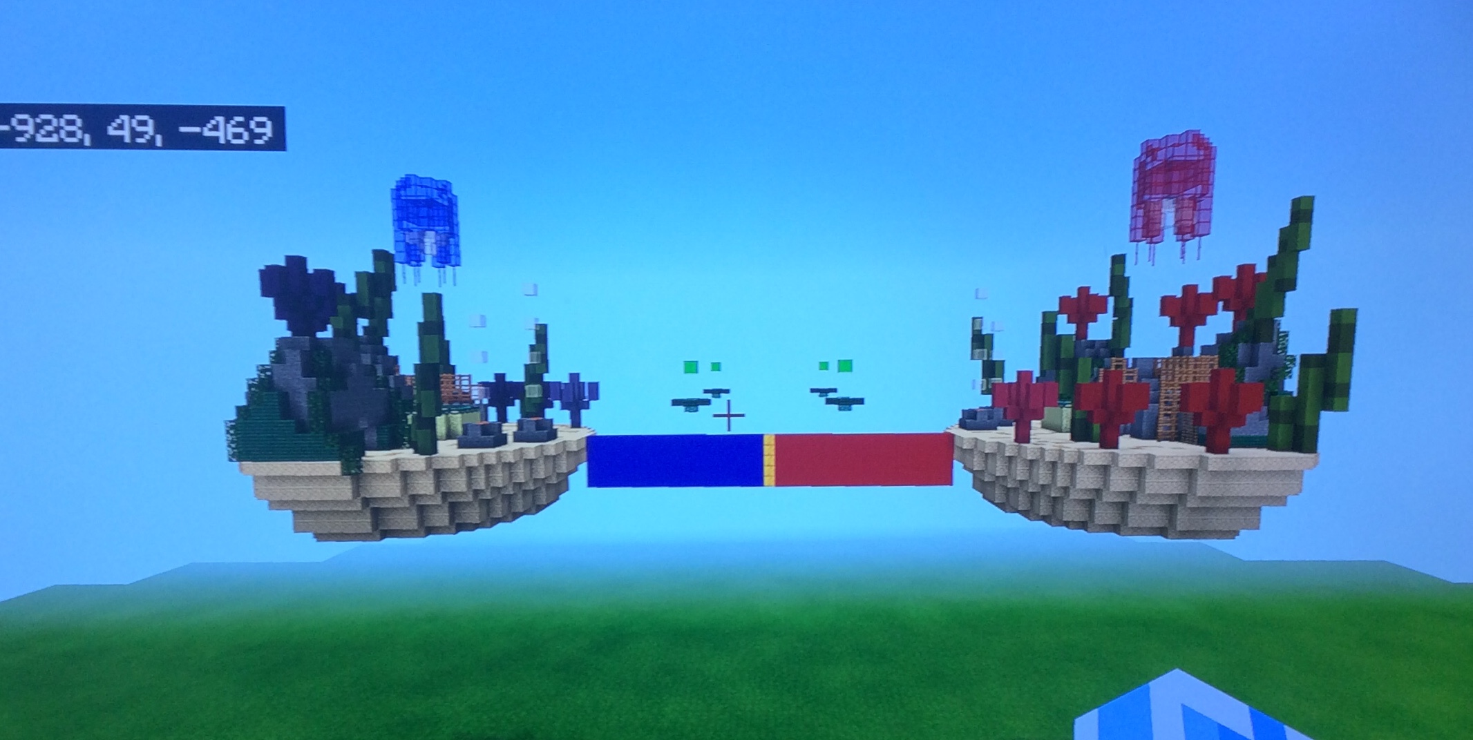
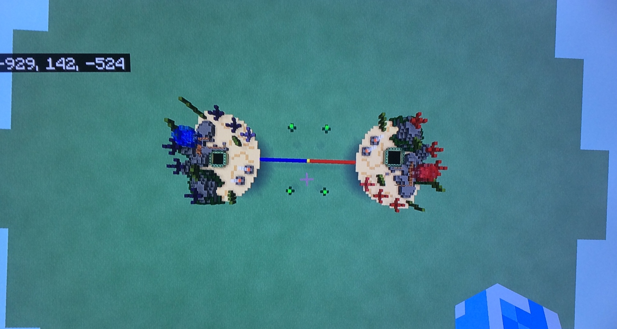
I fixed it.I looked at the feedback to fix it.Green represents items.I also added mines too and fixed the gameplay.There are two ways but in the first one there were two.
Minecraft PC IP: play.cubecraft.net
Not what I’m talking about but ok.
You are using an out of date browser. It may not display this or other websites correctly.
You should upgrade or use an alternative browser.
You should upgrade or use an alternative browser.
Builds Fixed (coral reef)Bridge
- Thread starter Wave Master7S
- Start date
- Status
- Not open for further replies.
_The13thDoctor_
Forum Professional
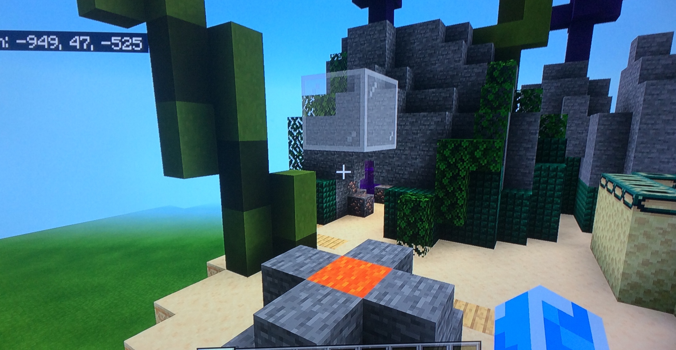
I voted no because the detail is very lacking. The jellyfish looks a little weird, the flower-like structures are odd, and the island bottoms look very basic. Maybe with some improvement, I will change my mind.
I think it’s okay to make it look a bit flat as it’s a pvp game, and I think adding more structures would make it less enjoyable when fighting. I personally like this build, so I’m voting yes. Good job!I voted no because the detail is very lacking. The jellyfish looks a little weird, the flower-like structures are odd, and the island bottoms look very basic. Maybe with some improvement, I will change my mind.
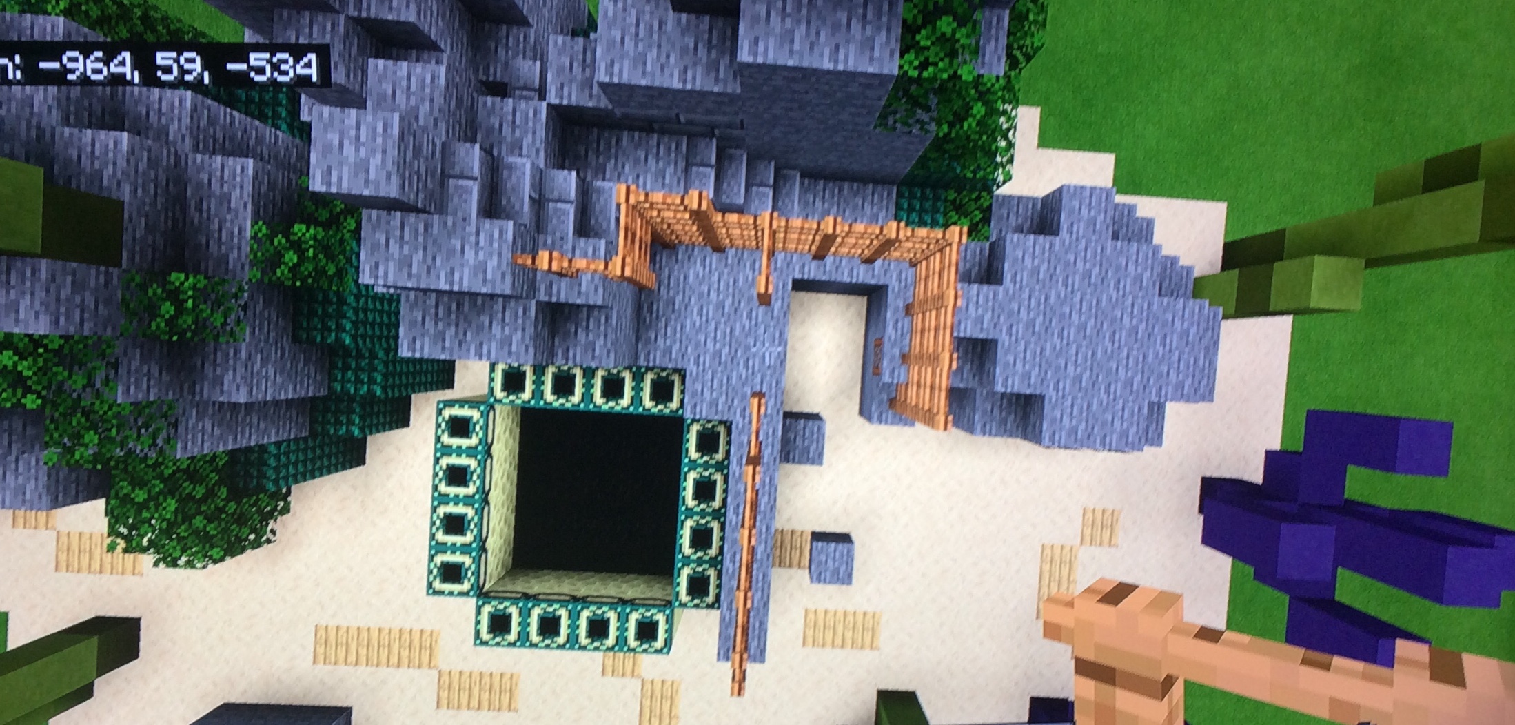
It does look nice, but I still think it lacks some detail, for example a few more corals or the addition of colourful sea pebbles for terrain. Also, I think the portal looks a bit bland right now, I would love to see multiple ways to be able to jump in. Also, some more detail and terrain around the portal too because at the moment it looks very temporarily and doesn't fit in with the rest of the map. Good luck with the improvements!
There are thoIt does look nice, but I still think it lacks some detail, for example a few more corals or the addition of colourful sea pebbles for terrain. Also, I think the portal looks a bit bland right now, I would love to see multiple ways to be able to jump in. Also, some more detail and terrain around the portal too because at the moment it looks very temporarily and doesn't fit in with the rest of the map. Good luck with the improvements!
_The13thDoctor_
Forum Professional
I think it’s okay to make it look a bit flat as it’s a pvp game, and I think adding more structures would make it less enjoyable when fighting. I personally like this build, so I’m voting yes. Good job!
Not what I’m talking about but ok.
Hi!
Awesome that your listening to the feedback we gave :)
The mine:
You added a mine that we gave as feedback, pretty cool place for that ''Iron'' mine.
The only thing you need to add in the mine is a Crafting Table.
The ''Portal''
I can't say something about the ''Feedback'' for the ''Portal'' we gave at the previous map submission.
You made the ''Portal'' wider and better for the gameplay... Perfect!
Voted Yes.
Hello, thank you for your efforts in submitting this.
Unfortunately, collectively the design team have decided to deny this map submission due to the following reasons:
-Organics need reworked
-Island texturing can be improved
Please do not be disheartened by the above comments, we hope you enjoyed the building process!
Unfortunately, collectively the design team have decided to deny this map submission due to the following reasons:
-Organics need reworked
-Island texturing can be improved
Please do not be disheartened by the above comments, we hope you enjoyed the building process!
- Status
- Not open for further replies.
Similar threads
- Replies
- 7
- Views
- 665
- Poll
- Replies
- 3
- Views
- 262
- Replies
- 3
- Views
- 650
- Replies
- 4
- Views
- 970
Team online
-
EliModerator
Members online
Total: 403 (members: 9, guests: 394)
Latest profile posts
New predictions based on the news we got this week:
- New Snowman Survival maps are most likely releasing sometime next week
- OG EggWars update is releasing in a couple of weeks according to Cam through Discord (screenshot below).
A couple of weeks is usually 2 weeks but sometimes can be 3 weeks.

- New Snowman Survival maps are most likely releasing sometime next week
- OG EggWars update is releasing in a couple of weeks according to Cam through Discord (screenshot below).
A couple of weeks is usually 2 weeks but sometimes can be 3 weeks.
ty for the following !!!
have a totally epic birthday!!! 


