Minecraft PC IP: play.cubecraft.net
Status
Not open for further replies.

HackersDontWin

Partner
🤝 Partner 💜
(I literally called my world "IWasBored" :P)
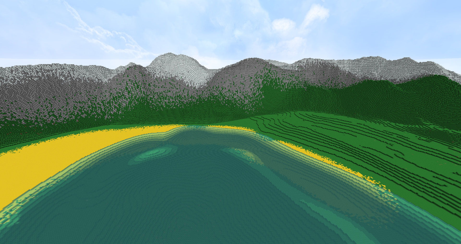
2017-01-30_20.47.28.png


There's not much to it, just wanted to hear opinions on how to improve :)
 

Younisco

Forum Professional
May 13, 2014
8,008
19,695
669
22
london
I like it :D But perhaps add some things to the right of the picture, as it seems like a big grass patch. I suppose that's what you were going to add though. ;)

Nice work though! :D
 
  • Like
Reactions: Twania
D

Deleted member 37078

Guest
Hello. It’s good to see that you attempt to make a landscape. My overall opinion is: U tried.

First of all, the colour of the sand. If you want that yellow spot to resemble a beach, please use another colour. It might be your texture pack that makes that colour look terrible, but at least change it to make it look more realistic.
Secondly, if I sneeze on a rock, it would look exactly the same as your green squirted parts on the mountain. By the way, there is usually a layer between grass and stone that’s called ‘Dirt’ and it makes the change from green to grey proper.
Thirdly, the transition from flat to steep looks awful to me. But what’s even worse, is that on the right bit there are some levels and on the left bit none… Weird.
Finally, I don’t know what those weird spots under the water are, but I think they are mistakes, so please delete them.

I would advise to pay a little bit more attention in geography lessons and practice a lot more with worldpainter,

Thanks.
 
Status
Not open for further replies.
Members Online

Team online

Latest profile posts

Apparently I hack IN PARKOUR LOLOLOL
IMG_6919.png

😂🤣

After uttering those 3 words, the dude left and gave me a free win xD
A picture of my cat sleeping having kitty dreams
1000053259.jpg
kfccaleb wrote on WayneX4's profile.
You can now have a follow after I played with you!
How do you make spoilers with a name?
Top Bottom