Minecraft PC IP: play.cubecraft.net

Which one you'd like to see implemented?

  • I really like it as it is now!

    Votes: 0 0.0%

  • Total voters
    18
D

Deleted member 469419

Guest
Hi everyone,

Today I joined out cubecraft and noticed that the loot menu it's quite simple to be honest and it could be better imo. Overall, the developers has done a really nice job, with everything. But I do think that a change would be really appreciated by community members. I'm quite sure that this won't probably like everyone although it's a nice idea that don't hurt anyone. So let's begin with the suggestion:

It's important to note that what I'm suggesting would be applicable to everything on the loot menu, it's basically change it a bit and make it bit more ordened and it also makes it look better. I'm aware that this has been suggested few times before (Including myself months ago) but I'd like to explain it again and better.

I'll divide the suggestion per parts to know players' thoughts (You can vote in the poll to let all us know what do you think about it).

The first thing to add, is why I've decided to make this suggestion and why I'd personally like to see this implemented:

The current loot menu, overall, looks quite good tbh (even though it's a bit simple) but I really think that it needs a change to the best, so I'll suggest three small-suggestions with can be going perfectly together:
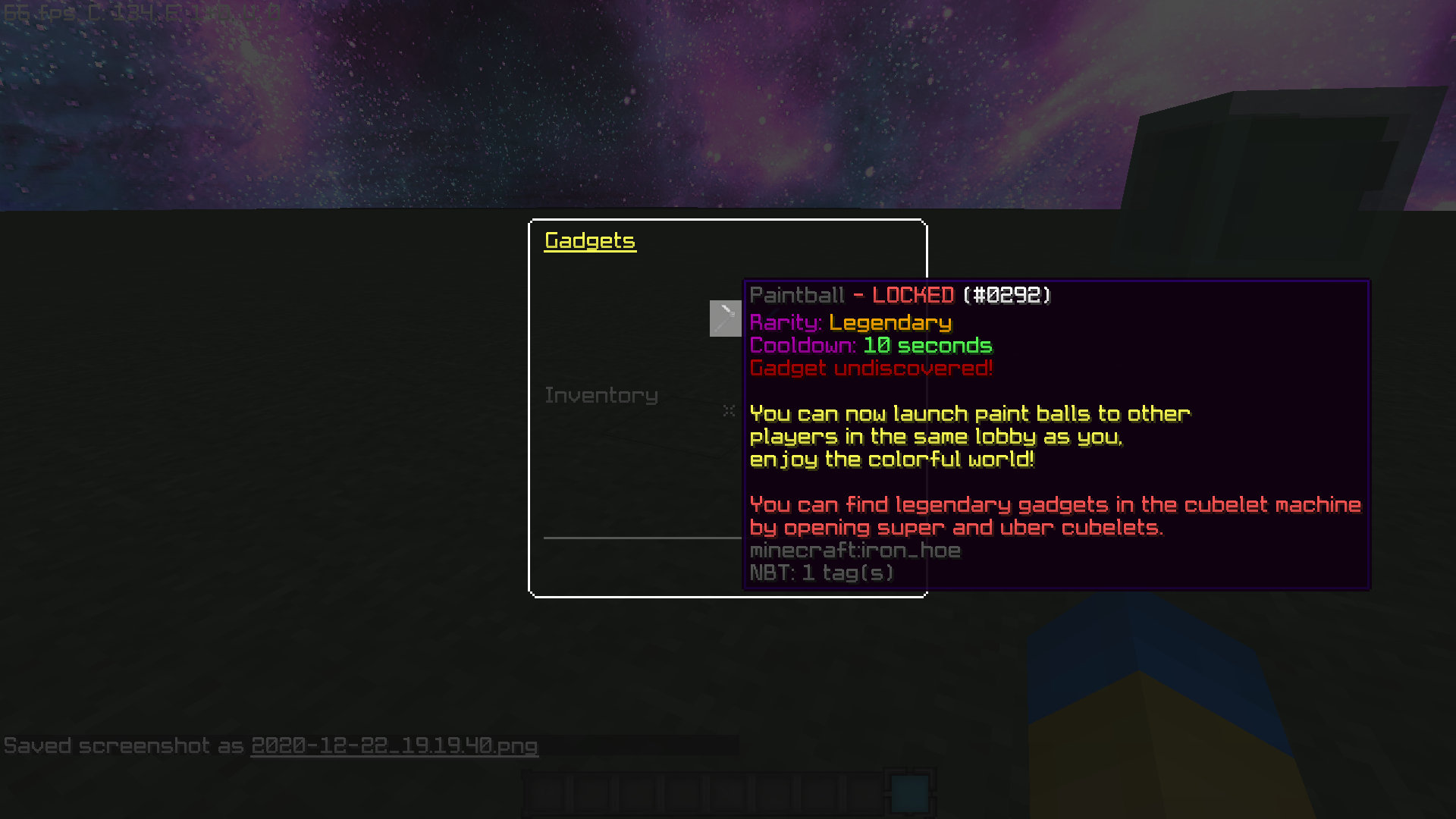
  1. The first thing I'd like to see implemented is: let us be able to see everything on the loot menu to know what things I can find on cubelets/let us see the locked stuff too. (This one was what I suggested not so long ago, but unfortunately the thread didn't get forwarded and it get lost). This would help players to know what stuff are available to get on the cubelets and if they like something, it probably would increase the sales on cubelets since it can motivate them to get something.
  2. I'd also like to see a description of every each gadget/win effect/hat etc to know what does it; this one together with the first one (make everything visible on the loot menus to know what kind of stuff are available to get on the cubelets). Even though I can understand this one may be a bit laborious to developers, but there is no need to make it now.
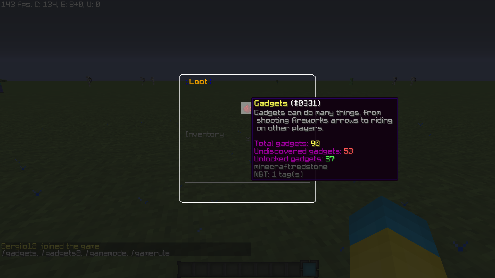
  3. I'd like to see in each sub-menu in the loot section; how many unlocked gadgets do I have, how many there's in total and how many I have unlocked (this one already implemented).

Then I'll leave you two examples of what I'm meaning:
1.png

2.png

2020-12-22_19.48.19.png

Above there's a poll, I'll leave you three options to vote for, even though you'll be able to vote for the three ones in the relevant option. Just choose what you'd personally like to see implemented. Thanks for reading it out and don't forget to let your feedback below!
 

Fesa

Quality Assurance
Team CubeCraft
🧪 Quality Assurance
💌 Customer Support
Oct 17, 2016
1,512
4,096
349
Yoitsu
Pronouns
She/Her
I absolutely agree with the first one! I've been trying to figure out how many of each loot item there is in the Christmas loot but the forums are wrong soo... this would be amazing!! Furthermore, I'd like to see it added as an extra ordering settings. "Not unlocked"

The second one, no, thank you I just don't feel like they would be any good. The description feel like it would make it too much when hovering over them

Third one, yes! Same reasons as first

Change poll such that I can vote on sperate things
 

Ben5124

Well-Known Member
Jun 5, 2020
201
435
84
The UK
I would only like the first one if you could dis-able it. I really like the simplicity of everything, but would also be nice to see what else I can get. Stuff like hypixel's version is horrible as it is hard to tell what you have unlocked and what isn't. I hope cube keeps it simple. Or at least lets you turn it off if example 3 was added. But nice suggestion!
 
D

Deleted member 469419

Guest
I would only like the first one if you could dis-able it
I'm really thankful you've given your feedback about the suggestion! But I think you should read it again to be honest. I personally wouldn't like the first option would be something toggleable since it can turn quite boring. The first option basically consists about show the whole content, this mean, show every item available on cubecraft regardless if it's locked or unlocked to you, this would help you let you know how many items there are in total and which are them. So, this mean that adding an option like just to turn it on/off just would make it unnecessarily messy.

Stuff like hypixel's version is horrible as it is hard to tell what you have unlocked and what isn't.
I also dislike the shape that this server development team has given to their cosmetics menu, it turns quite boring to find anything out, also it's quite messy everything.

But this wouldn't be like that at all, since you could order it by rarity, time found, unlocked items, locked items (as you do now).

I hope cube keeps it simple. Or at least lets you turn it off if example 3 was added
Example 3 it's non-negotiable. This would be always turned on, I can't understand how this can disturb anyone tbh. An example of this would be the "Example 3" located above on the original post and it would be for each loot menu.

But nice suggestion!
Thanks for sharing with us your feedback!
 

Lutorix

Member
Dec 11, 2020
2
3
4
To my mind, the second idea is fine but not definitely necessary at all!
The first and third suggestion, however, are more interesting, in my opinion, but still I have a question regarding these two:
How should the server deal with seasonal items the players can't get anymore? Will they still be visible as an unlocked item and will count in the total number of gadgets (or anything else?) or will they be hidden?
 
D

Deleted member 469419

Guest
How should the server deal with seasonal items the players can't get anymore?
If I'm not wrong; seasonal items do never go away completely. These appear again in the cubelets in their own season. Anyway if they'd still go away, I'd personally still like to see them in the menus, to see more details about them!

Will they still be visible as an unlocked item and will count in the total number of gadgets (or anything else?) or will they be hidden?
Good questions! Yes, they will be visible and they will count on total gadgets since they're still gadgets. Or perhaps could be added an information message like <<Seasonal items: X>>
 

Hoshi

Speedy Wing Rush Gonzales
Aug 4, 2017
1,278
9,378
409
18
The Netherlands
youtube.com
Pronouns
She/Her
I must say, these are some very simplistic ideas which the loot menu definitely has been missing out on.

Overall, this is a well-structured suggestion. You immediately are able to understand what all different parts of the thread are about. Now onto each part individually:

The first thing I'd like to see implemented is: let us be able to see everything on the loot menu to know what things I can find on cubelets/let us see the locked stuff too.
Yes, please! Myself and a lot of other people I know have been waiting for such a feature to be implemented for what seems like eons and it still has yet to be implemented.

In my opinion, a good solution to prevent the menu from being messy because you would see all the items is very simple. Just replace the item icons which you do not have with a simple icon like grey dye. You would still be able to hover over the dye in the menu to view the item information such as ‘obtained from: X’ or ‘rarity: X’.

Considering you can still get legendary+ items from normal cubelets, the ‘obtained from: X’ could mention each possible way it can be obtained. An example would be:

‘Obtained from a Cubelet
Obtained from a Super Cubelet
Obtained from an Uber Cubelet’

If a certain loot item you have yet to unlock wouldn’t be possible to get from a regular cubelet, it would instead only mention the last two ways to obtain it.

I'd also like to see a description of every each gadget/win effect/hat etc to know what does it; this one together with the first one (make everything visible on the loot menus to know what kind of stuff are available to get on the cubelets). Even though I can understand this one may be a bit laborious to developers, but there is no need to make it now.
Shorly said, such an addition will just be a waste of the developers’ precious time. The names of the loot items usually are self-explanatory and otherwise the players can just use the item and find out what it does by themselves. Not many people will read these descriptions anyways, considering you just go into the loot menu to find the item, equip it, and then continue playing the games or hanging around in the lobby.

I'd like to see in each sub-menu in the loot section; how many unlocked gadgets do I have, how many there's in total and how many I have unlocked (this one already implemented).
I agree with this last suggestion as well. It, again, is something the loot menu is lacking: It’s lacking information.

Yes, the menu says how many you have unlocked, but it doesn’t say how many you have yet to unlock. This could be crucial when you’re deciding if you want to spend money (or loot points) on, let’s say, Uber Cubelets to get the last items you are missing. If you find out you aren’t missing anything at all, you did all that for nothing.

It would also just generally be fun to know how many out of how many loot items you have in a specific category. Perhaps your amount of unlocked loot items could also possibly be shared through your in-game profile others are able to view? I think that it might be very fun to see what other people have unlocked.
 

Am4er

Dedicated Member
Dec 6, 2018
335
1,292
199
20
VA, USA
Pronouns
He/Him
Hi everyone,

Today I joined out cubecraft and noticed that the loot menu it's quite simple to be honest and it could be better imo. Overall, the developers has done a really nice job, with everything. But I do think that a change would be really appreciated by community members. I'm quite sure that this won't probably like everyone although it's a nice idea that don't hurt anyone. So let's begin with the suggestion:

It's important to note that what I'm suggesting would be applicable to everything on the loot menu, it's basically change it a bit and make it bit more ordened and it also makes it look better. I'm aware that this has been suggested few times before (Including myself months ago) but I'd like to explain it again and better.

I'll divide the suggestion per parts to know players' thoughts (You can vote in the poll to let all us know what do you think about it).

The first thing to add, is why I've decided to make this suggestion and why I'd personally like to see this implemented:

The current loot menu, overall, looks quite good tbh (even though it's a bit simple) but I really think that it needs a change to the best, so I'll suggest three small-suggestions with can be going perfectly together:
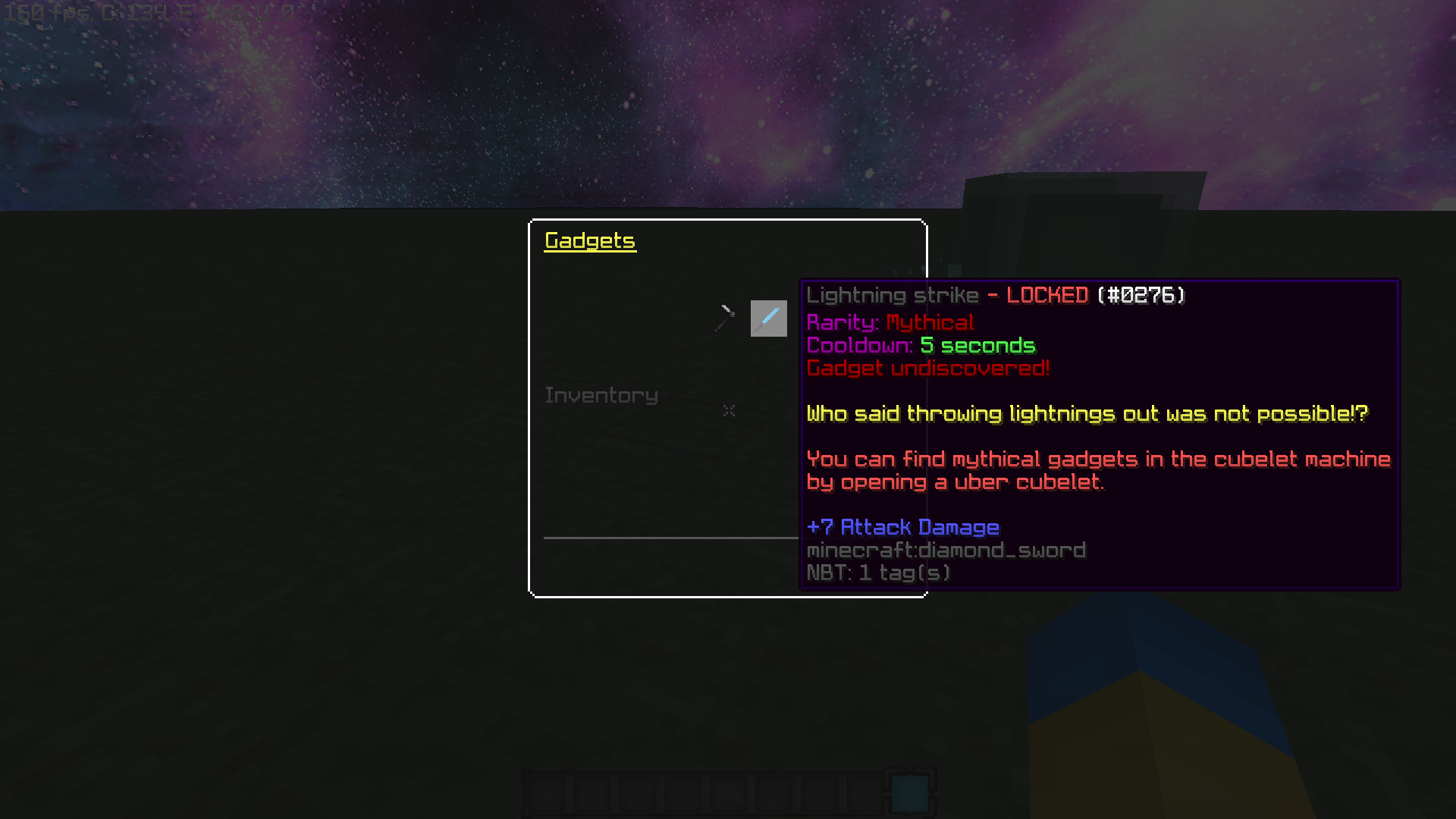
  1. The first thing I'd like to see implemented is: let us be able to see everything on the loot menu to know what things I can find on cubelets/let us see the locked stuff too. (This one was what I suggested not so long ago, but unfortunately the thread didn't get forwarded and it get lost). This would help players to know what stuff are available to get on the cubelets and if they like something, it probably would increase the sales on cubelets since it can motivate them to get something.
  2. I'd also like to see a description of every each gadget/win effect/hat etc to know what does it; this one together with the first one (make everything visible on the loot menus to know what kind of stuff are available to get on the cubelets). Even though I can understand this one may be a bit laborious to developers, but there is no need to make it now.
  3. I'd like to see in each sub-menu in the loot section; how many unlocked gadgets do I have, how many there's in total and how many I have unlocked (this one already implemented).

Then I'll leave you two examples of what I'm meaning:


Above there's a poll, I'll leave you three options to vote for, even though you'll be able to vote for the three ones in the relevant option. Just choose what you'd personally like to see implemented. Thanks for reading it out and don't forget to let your feedback below!
Hi, There!
I certainly agreed with your suggestion and I have liked all of them as the way as I see in my opinions your suggestion need to be added, it gives the player a goal with trying to get cubelets, to take those stuff are locked.
I completely suggest you to keep the amazing suggestions, it is really an amazing suggestion.
 
D

Deleted member 469419

Guest
Hi, There!
I certainly agreed with your suggestion and I have liked all of them as the way as I see in my opinions your suggestion need to be added, it gives the player a goal with trying to get cubelets, to take those stuff are locked.
I completely suggest you to keep the amazing suggestions, it is really an amazing suggestion.
Hey, thank you so much for your support! In order to inform you; You have accidentally voted no above on the poll.

It also happens me sometimes so no worries.
 
  • Like
Reactions: Am4er
D

Deleted member 469419

Guest
Overall, this is a well-structured suggestion. You immediately are able to understand what all different parts of the thread are about. Now onto each part individually:
I agree with this last suggestion as well. It, again, is something the loot menu is lacking: It’s lacking information.
Thank you so much for your support Hoshi and for this amazing feedback that you've made!

I'll only reply to one thing that I'd like to let it clear since I didn't on the original post:

Shorly said, such an addition will just be a waste of the developers’ precious time. The names of the loot items usually are self-explanatory and otherwise the players can just use the item and find out what it does by themselves. Not many people will read these descriptions anyways, considering you just go into the loot menu to find the item, equip it, and then continue playing the games or hanging around in the lobby.

I partly agree with this feedback. At the time of making the suggestion I had to add something more to let an extra suggestion to see other members' thoughts and to let the suggestion bit more fuller. Even though this is true that would waste the time of developers' could be an useful thing to add to the locked items. As you yourself said, if someone want to test a gadget or any other thing, then they'll do it, but what about the locked items? You can't test them out.

But in the other hand, I thought that it would be little anti-aesthetic so that's why I suggested it for both locked and unlocked items.

I'll like to hear you feedback again about this new point that I've mentioned above!
 
  • Like
Reactions: Hoshi

Ben5124

Well-Known Member
Jun 5, 2020
201
435
84
The UK
I'm really thankful you've given your feedback about the suggestion! But I think you should read it again to be honest. I personally wouldn't like the first option would be something toggleable since it can turn quite boring.
The thing is, lots of players like simplicity, like me. We don't want our menus to be overcrowded with everything we don't have, especially since there are so many items in Cubecraft, it would be messy and un clean. But, it would be also nice to see what all of them are. If it is toggleable it would let you have both to see what everything is, as well as being able to clearly see what you already have. Aswell as this, if it was toggleable then the players who want it can have it and the players who don't, won't. And how would it be boring if you could turn it off. There is a difference to simplicity and boring-ness.

I don't understand why people are against something that you can change to your own personal preference. If you want this feature, It doesn't concern you if you want others to turn it off or not. You aren't even going to use the setting so why are you stopping others who don't want to have it?
 
D

Deleted member 469419

Guest
The thing is, lots of players like simplicity, like me.
Now that I think better, I think that you're partly right. Releasing a new filter would avoid unnecessary items content. I haven't been able to join to the game so I couldn't represent it graphically. Perhaps it would be nice to add a slot onto the menu/GUI that allow you to make an easier and quicker search. You could order it by unlocked items, locked items and their rarity.

Nice feedback, and apologies for having realized it later. I'd like to hear the other members' thoughts about this nonetheless.
 
  • Like
Reactions: Ben5124

Ben5124

Well-Known Member
Jun 5, 2020
201
435
84
The UK
Now that I think better, I think that you're partly right. Releasing a new filter would avoid unnecessary items content. I haven't been able to join to the game so I couldn't represent it graphically. Perhaps it would be nice to add a slot onto the menu/GUI that allow you to make an easier and quicker search. You could order it by unlocked items, locked items and their rarity.

Nice feedback, and apologies for having realized it later. I'd like to hear the other members' thoughts about this nonetheless.
Yeah of course. Everyone can have their own opinions!
 
  • Like
Reactions: Jiadi_

Hoshi

Speedy Wing Rush Gonzales
Aug 4, 2017
1,278
9,378
409
18
The Netherlands
youtube.com
Pronouns
She/Her
Thank you so much for your support Hoshi and for this amazing feedback that you've made!

I'll only reply to one thing that I'd like to let it clear since I didn't on the original post:


I partly agree with this feedback. At the time of making the suggestion I had to add something more to let an extra suggestion to see other members' thoughts and to let the suggestion bit more fuller. Even though this is true that would waste the time of developers' could be an useful thing to add to the locked items. As you yourself said, if someone want to test a gadget or any other thing, then they'll do it, but what about the locked items? You can't test them out.

But in the other hand, I thought that it would be little anti-aesthetic so that's why I suggested it for both locked and unlocked items.

I'll like to hear you feedback again about this new point that I've mentioned above!
Although it may seem like a good idea at first, I personally don’t think they should add descriptions for gadgets. As I said before, the names usually are already self-explanatory and I believe explanations of how the gadget works and what it does would be overexcessive. It would be a lot to take in and read at first sight which clearly isn’t appealing.
 
D

Deleted member 469419

Guest
Gonna bump this since it's a nice suggestion and I'd like to players interact with this! Feel free to let your thoughts out!
 
Members Online

Members online

Latest profile posts

Hello Guys i had been playing cubecraft for 1 year and 2 months and i got pretty good at it. i am good at games like CTF And Bridges
CalvinxKlein wrote on ItzJxrry's profile.
jerry egril or egirl?
Mappoe wrote on JokeKaedee's profile.
thnak you for the follow kae!! have it back
New predictions based on the news we got this week:
- New Snowman Survival maps are most likely releasing sometime next week
- OG EggWars update is releasing in a couple of weeks according to Cam through Discord (screenshot below).
A couple of weeks is usually 2 weeks but sometimes can be 3 weeks.
1732356369106.png
Lxk5z wrote on NADER KANAAN's profile.
Happy Birthday pro gamer!!!
Top Bottom