Minecraft PC IP: play.cubecraft.net

Anneum

Dedicated Member
Jan 4, 2020
292
2,694
224
19
The Avatar Universe
Pronouns
She/Her
Hello everyone!

@Skoedel and me have been working on a Lucky Islands Map called Circus. We don't wanna submit it as a map submission since it's not quite ready and not good enough for CubeCraft (yet). We would like some feedback on it before possibly submitting it (Mainly for the middle). We would appreciate if you could leave some feedback or tips to improve the map! :)
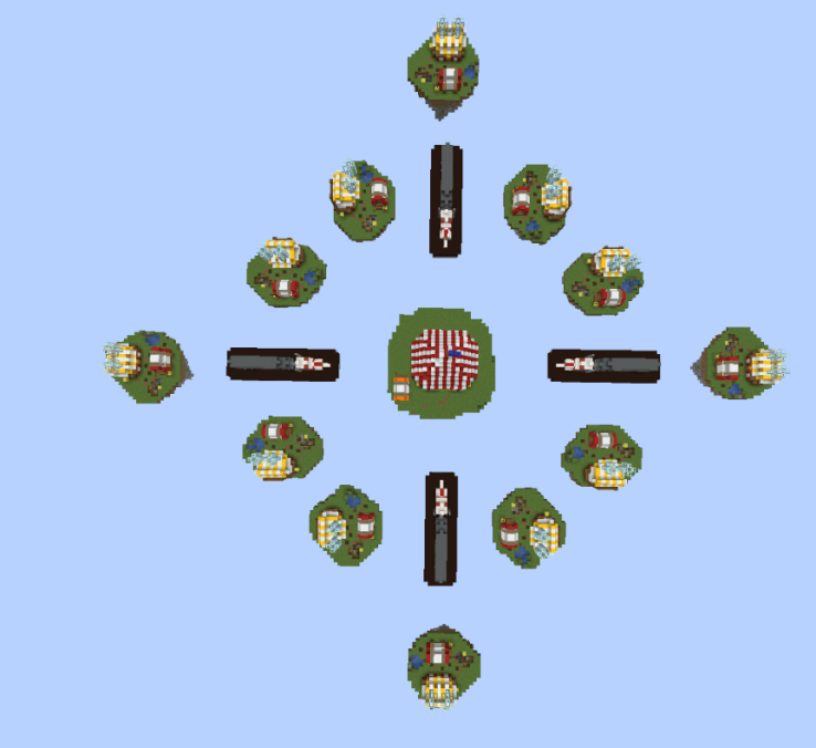
Players: 24
Teams of: 2
Lucky blocks starter island: 9
Lucky blocks submid: 3
Lucky blocks mid: 9
1609009674719.png

1609009812161.png

1609009833637.png

1609009858887.png

1609009883847.png

1609009906528.png

1609009925044.png

1609009947041.png
 

Egg🥚

Gameplay Engineer
Jul 12, 2020
1,019
1,462
179
18
The Netherlands
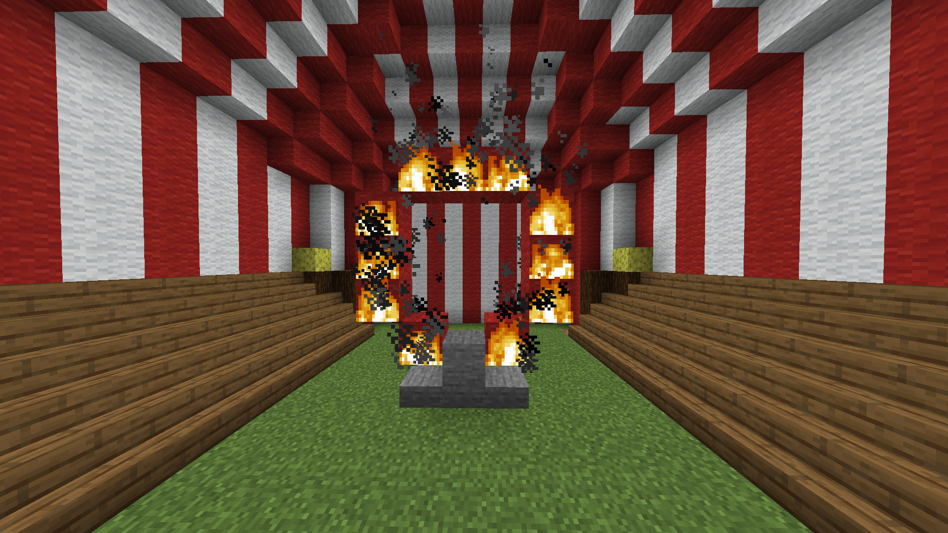
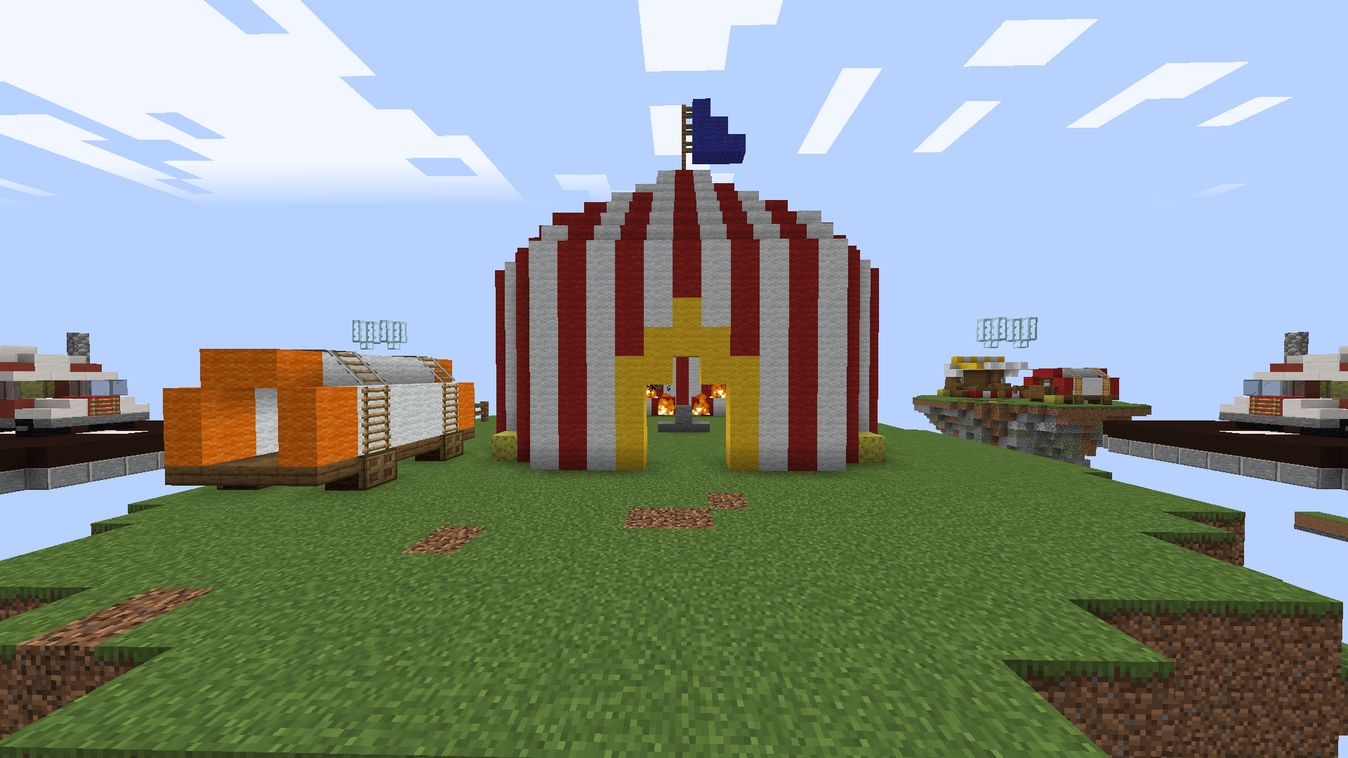
The tent is much better now, but do you think it’s possible to keep that fire on as firetick is enabled on cubecraft?
 

Ge1ster

Dedicated Member
Apr 16, 2020
425
3,328
239
20
Lampland
I really like the design of this map, very well done you two! But I think the starting island could be bigger, it looks like a solo island :P
 
  • Like
Reactions: Anneum

Diav

( ͡° ͜ʖ ͡°)
Jan 16, 2020
255
1,049
159
22
Venice
Hope I'm not too late for this :monkeylookaway:

I think the map concept is good but I'm sure you can still improve it: In the first pics the thing that really needed to be upgraded was the depth of the map, it looked to flat, especially the middle island and its tent.

https://www.cubecraft.net/threads/5-weeks-of-summer-part-3-☀.253968/ This is the link of Circus map for Bedrock skywars, you can see the map has more depth and looks less empty.

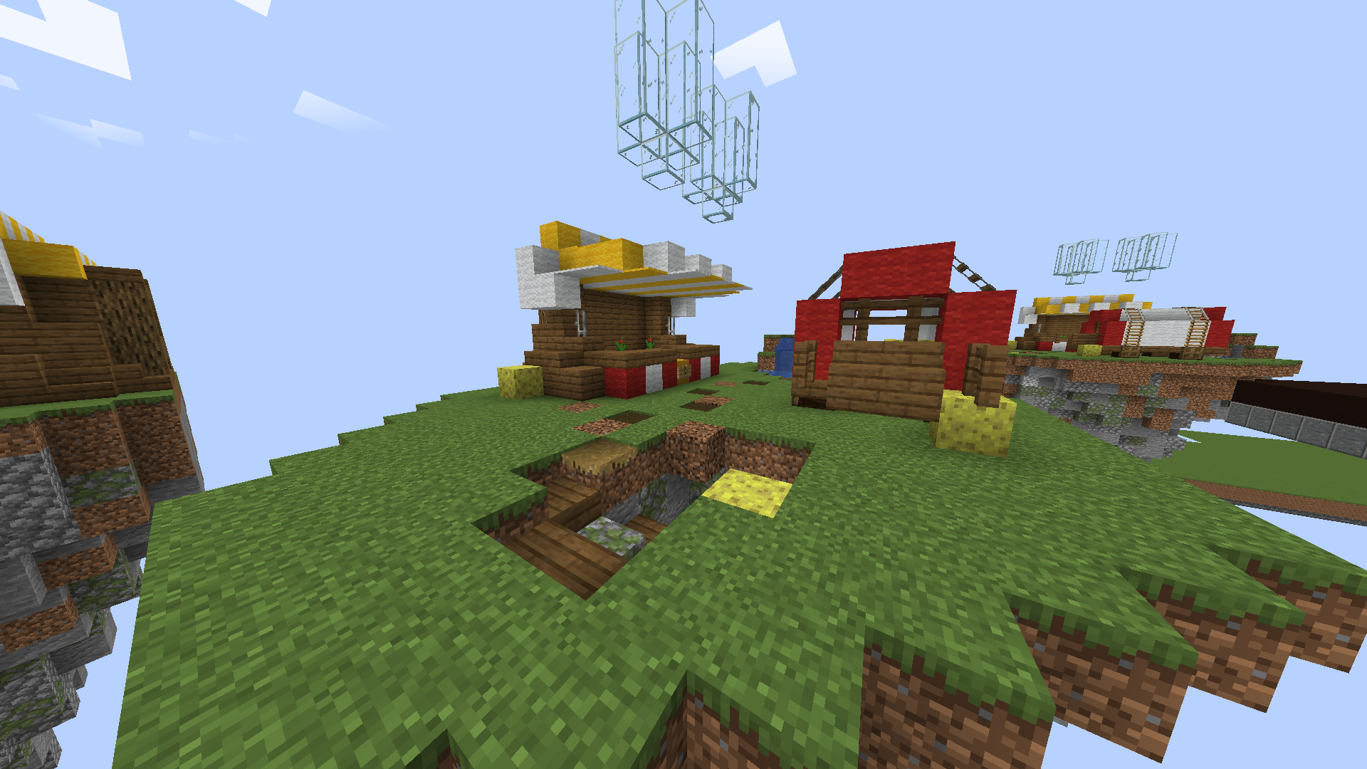
I can see you made some good improvements but there still are things that can be improved: the terrain looks basic and a bit boring, you should smooth it better and add some more textures to make it more interesting.

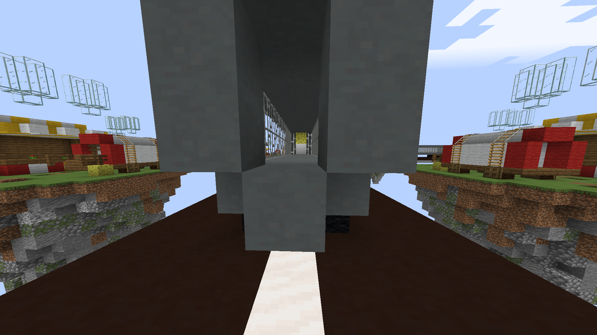
The layout should be slightly changed because as you can see there are 8 islands that are right next to eachother and it wouldn't require many blocks to get there easily. (I'm talking about the islands put in oblique)

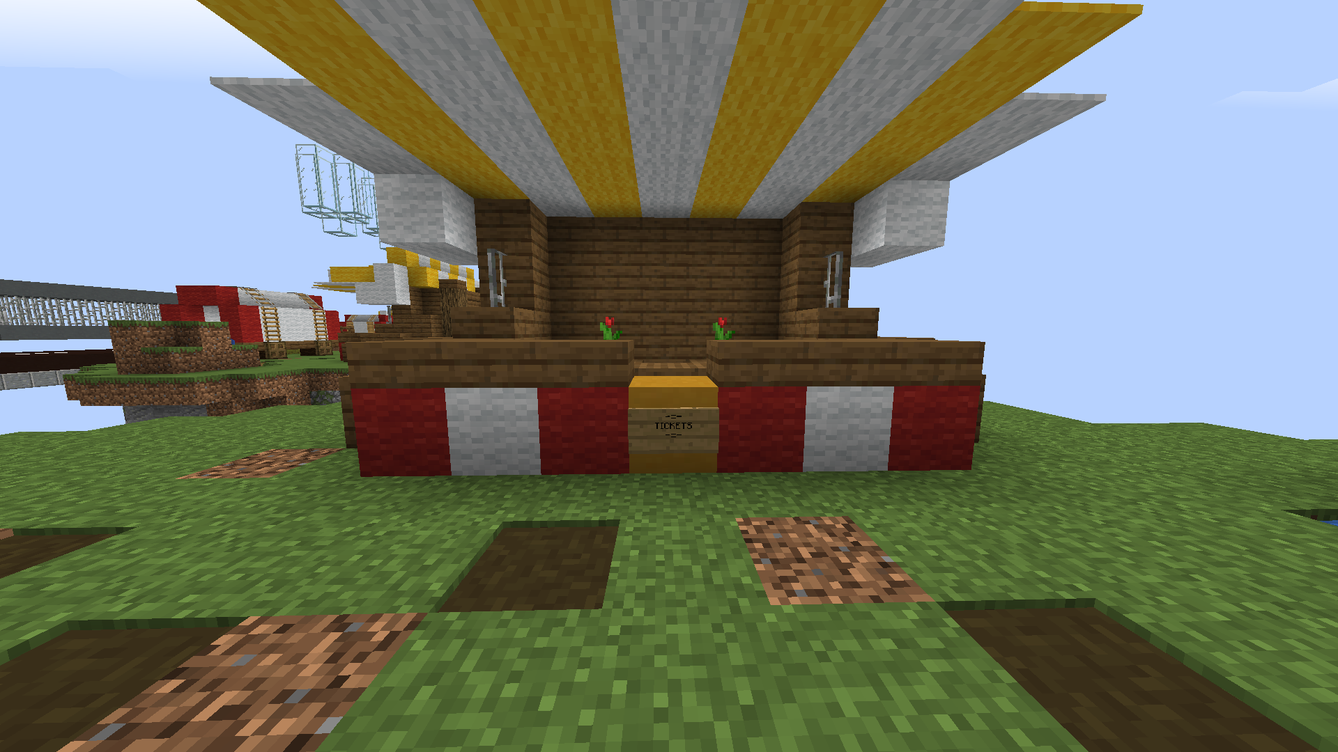
The starter islands as said before needs an improvement to the terrain, it looks too squary right now and would be better if you smooth it to give it some nicer shapes and also add some more textures with different blocks. I'd also add other things rather than just a shop and a "cart"(I don't know what's the right word in english lol), it looks kinda empty at the moment.

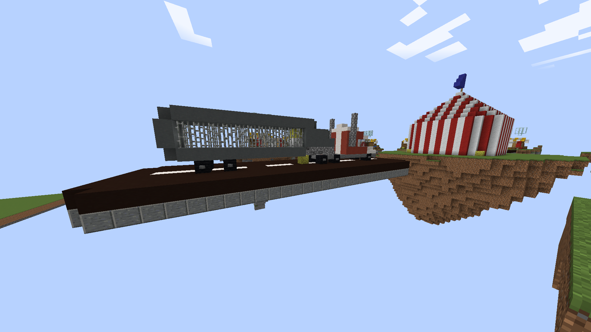
The sub-middle islands look alright even if I suggest you to change the black clay into cyan clay, the colour is more similiar to real life streets, and then change the cyan clay of the truck into another gray colour. I'd also suggest you to make the truck 4 blocks wide becuase with 3 it looks too thin.

I think the gameplay of the middle island could be improved, same thing for the tent itself. I'd remove the truck and carts because imo they don't fit really well in there.

In the end, I'm sure you can improve the map because right now it looks too raw: add some smoother and nicer shapes and colours to it without forgetting about the map's gameplay. I hope you won't take this as a rude comment but more like a constructive criticism. Good luck with the map :)
P.s. If you have any questions you can dm me on discord :D
 
Members Online

Team online

Latest profile posts

How do you make spoilers with a name?
Reesle wrote on ZachTart26's profile.
Welcome to the Official Cubecraft Forums! If you need help with something, feel free to DM me or a staff member anytime! Have a great day! :D
Reesle wrote on CalvinxKlein's profile.
Happy Birthday! 🎂
Top Bottom