Minecraft PC IP: play.cubecraft.net


Thanms, James Lawrence
You are using an out of date browser. It may not display this or other websites correctly.
You should upgrade or use an alternative browser.
You should upgrade or use an alternative browser.
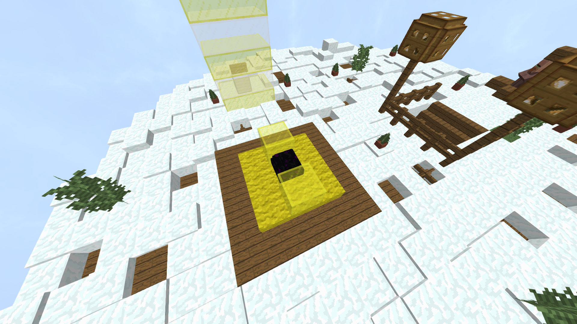
I like the map, but it just looks to plain to me. Try and add some texture to the floors e.g slabs. It's a good concept, but in my idea it definitely needs some development.
Good work though, keep it up, if I could build even nearly as good as you I'd be very proud
Thanks. James Lawrence
Good work though, keep it up, if I could build even nearly as good as you I'd be very proud
Thanks. James Lawrence
The basic premise of this map is good. Please try to:
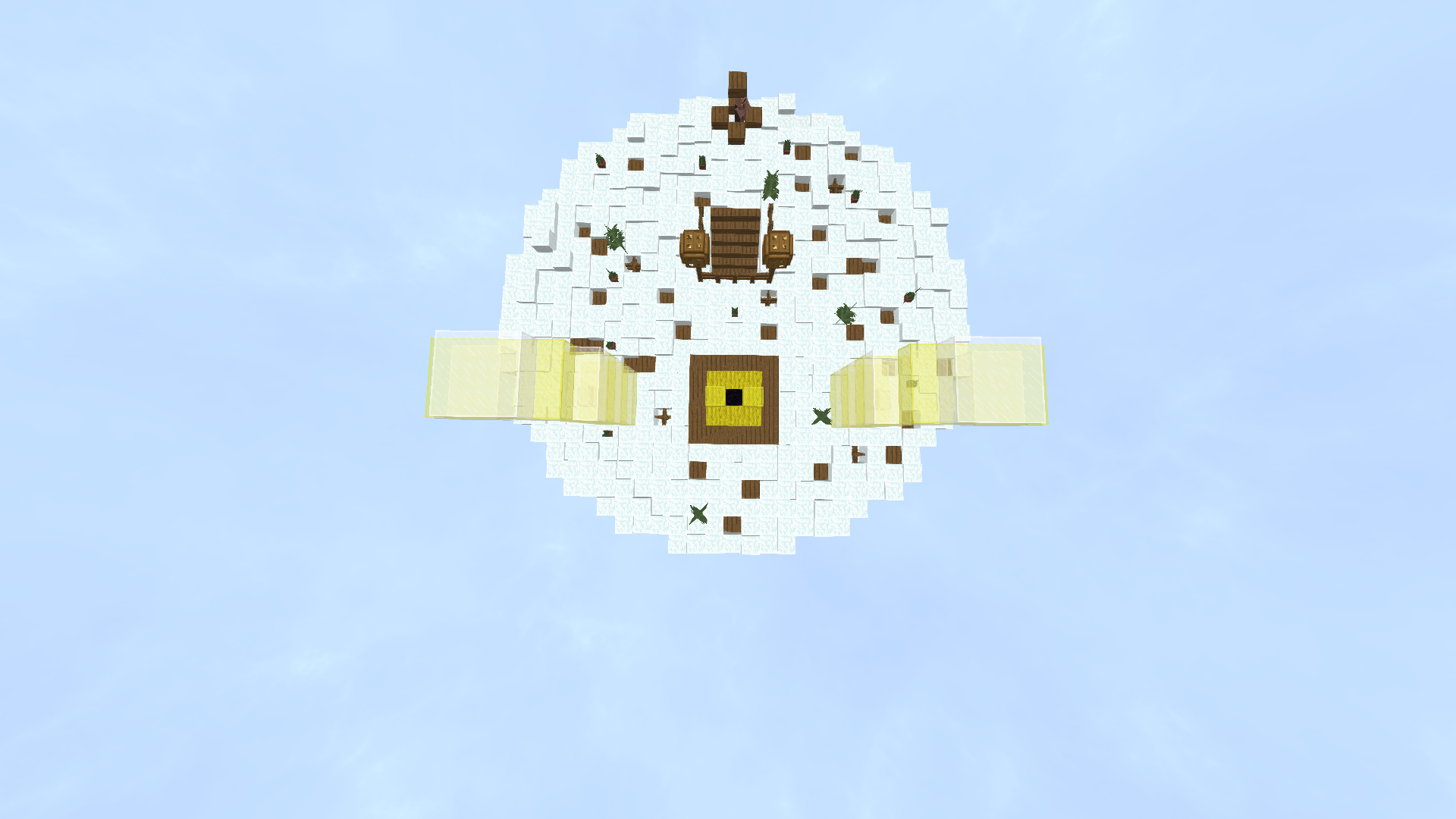
• Not make the islands flat. Try and learn VoxelSniper or Worldedit to know how to in fuller detail.
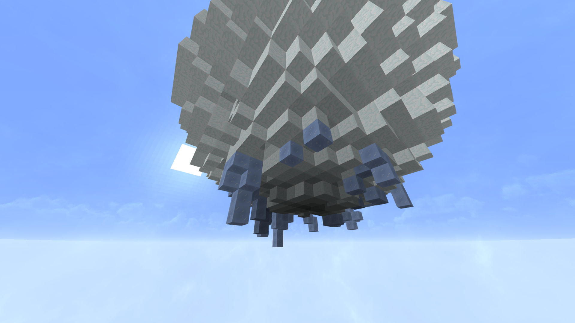
• Add terraforming under the islands. Again, look into VoxelSniper or Worldedit.
• Try not to use PixelArt as a main feature of an island. It is very bland and lacks detail. You can transform the PixelArt of Santa in a stocking into an actual organic. :P
Hope this helps!
Thanks for the advice, I will make the amendments! :DThe basic premise of this map is good. Please try to:
• Not make the islands flat. Try and learn VoxelSniper or Worldedit to know how to in fuller detail.
• Add terraforming under the islands. Again, look into VoxelSniper or Worldedit.
• Try not to use PixelArt as a main feature of an island. It is very bland and lacks detail. You can transform the PixelArt of Santa in a stocking into an actual organic. :p
Hope this helps!
Thank you for you suggestion, I'll try adding more detail to improve the look.I like the map, but it just looks to plain to me. Try and add some texture to the floors e.g slabs. It's a good concept, but in my idea it definitely needs some development.
Good work though, keep it up, if I could build even nearly as good as you I'd be very proud
Thanks. James Lawrence
I have a few tips for you. First off I wouldn't use pixelart because it really only looks good from two sides. And since you can play on the entire map you could improve this by building in 3 dimensions. Also don't use worldedit for the bottom of islands; make it unique. I like that you use a colour palette, but don't use blocks that have very different colours. It kinda defeats the purpose of a palette, because a palette should add slight differences in colour to a big area. I like some block choises though, as you used end staffs in the christmas tree. Really cool idea.
Anyways keep practicing because this is not up to the standards of Cubecraft yet, but if you keep improving your maps you could reach it one day.
Anyways keep practicing because this is not up to the standards of Cubecraft yet, but if you keep improving your maps you could reach it one day.
Last edited:
It's a cool theme, but it could use a little more detail and there's a reason cubecraft maps don't use pixelart! Sure it looks good from a side view, but as you move around the map it begins to look kind of stupid. But thats just my opinion. Other than that great job building this!
It needs much more detail imo. to make it to the map selection.
Like other have said...
More detail and terraforming.
Also, The islands are way to flat! Add a little snow pile or something.
It's a cool theme, but it could use a little more detail and there's a reason cubecraft maps don't use pixelart! Sure it looks good from a side view, but as you move around the map it begins to look kind of stupid. But thats just my opinion. Other than that great job building this!
The basic premise of this map is good. Please try to:
• Not make the islands flat. Try and learn VoxelSniper or Worldedit to know how to in fuller detail.
• Add terraforming under the islands. Again, look into VoxelSniper or Worldedit.
• Try not to use PixelArt as a main feature of an island. It is very bland and lacks detail. You can transform the PixelArt of Santa in a stocking into an actual organic. :p
Hope this helps!
Is this better detail guys?I like the map, but it just looks to plain to me. Try and add some texture to the floors e.g slabs. It's a good concept, but in my idea it definitely needs some development.
Good work though, keep it up, if I could build even nearly as good as you I'd be very proud
Thanks. James Lawrence
I like how it's got more texture, but I still think it's a bit plain. I'm liking the improvements you have made though!
Thanms, James Lawrence
i would like to see the map on eggwars i love it i love your theme i hope it becomse a map on cubecraft
It looks like the Netherlands... flatwow this is one cool, map I personally think it would be more balanced, against hackers, who fly and hide behind other, claustrophobic maps.
Good Idea ParpiaJr
and any admins here, please consider this map, would be awesome for christmas as well.
Ps: Love the pixel art :p
Looks pretty cool! It could be better if you added a bit less snow, you added loads and loads of snow everywhere, so no matter how much detail you add, the snow stands out too much and all I can notice is snow. Other than that, it looks fab ;D
Similar threads
- Replies
- 7
- Views
- 322
- Replies
- 10
- Views
- 606
Team online
-
FlxenMeowderator
Latest posts
-
-
-
-
I asked you what your favorite thanksgiving food is! Here are the results!
- Latest: lorilambthecoolgamer


