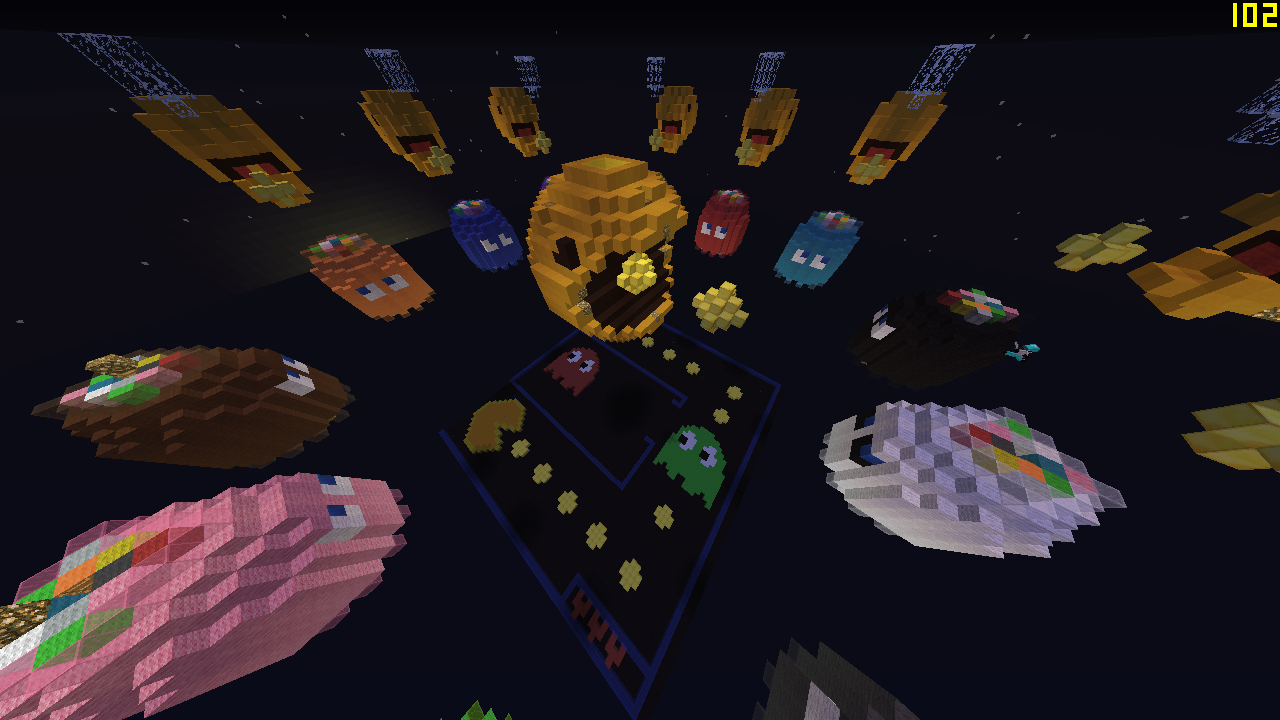
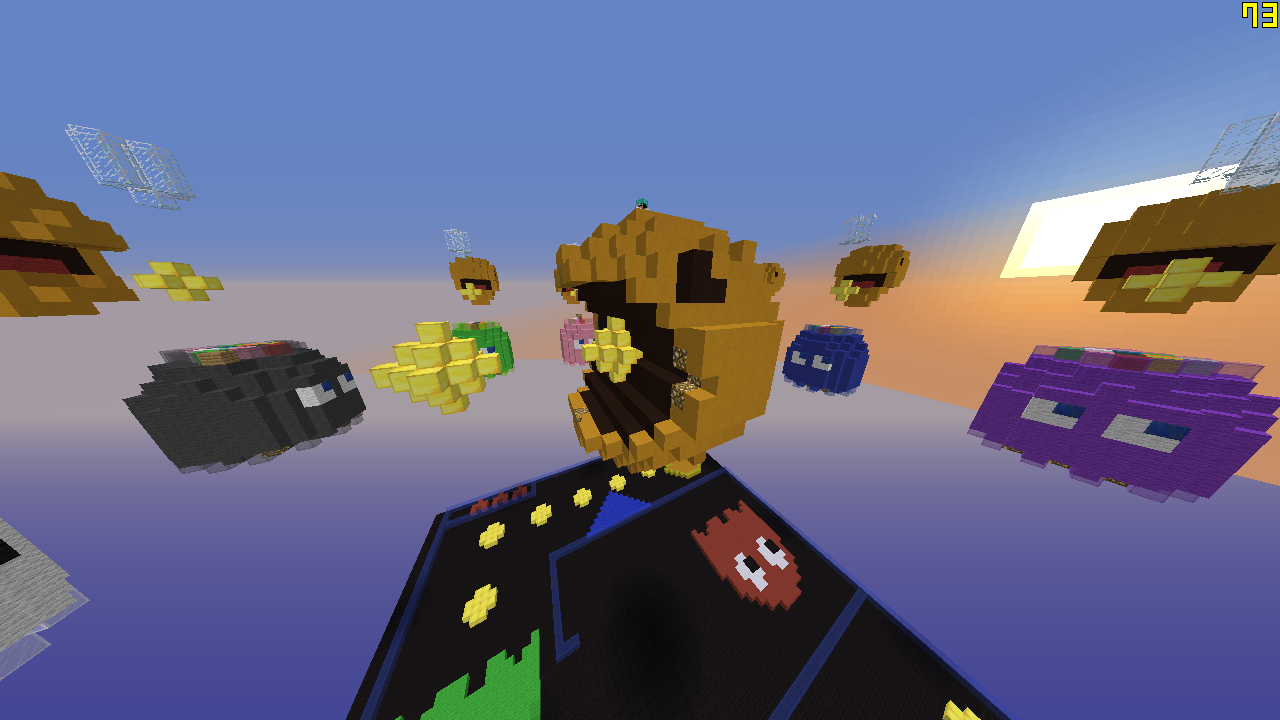
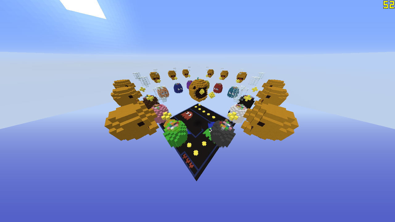
Here I bring you a map that is in TeamSkywars but Now is at Skywars, tell me what you think about it!
Minecraft PC IP: play.cubecraft.net
You are using an out of date browser. It may not display this or other websites correctly.
You should upgrade or use an alternative browser.
You should upgrade or use an alternative browser.
Builds Skywars Map Pacman 12 persons
- Thread starter Lalo_Marlin
- Start date
Comments:
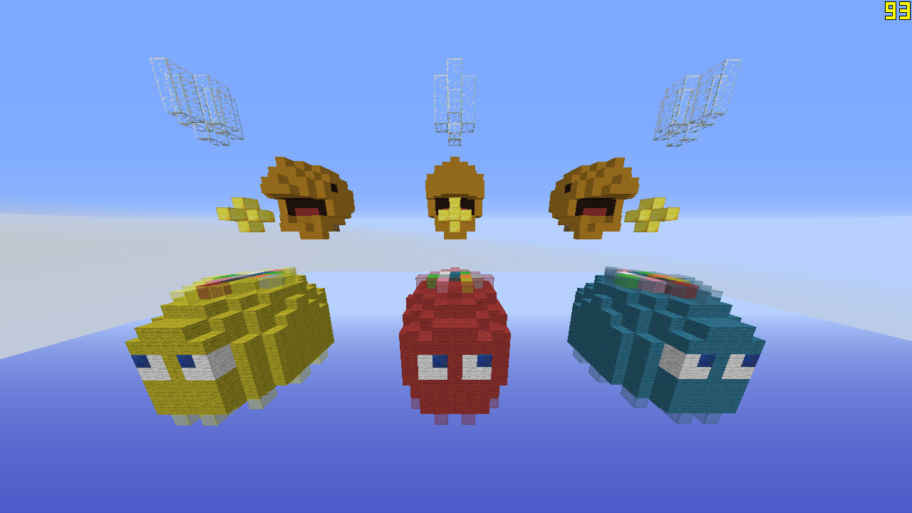
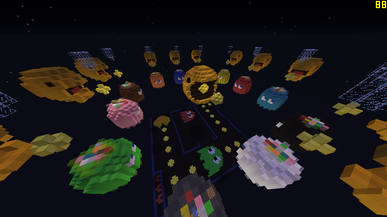
What's the use of the pixel art down bellow? I feel it's inappropriate for the game Skywars due to the platform down bellow. Also I feel that pixel art is typically bad and should be rarely be used in maps, these are bellow the standards and you need to change that immediately. Another thing is that of the center, you overused the pacman trademark in the game there can be multiple ghost but never multiple Pacmans (except the girl versions, but never the original). It's either change the center Pacman or change/take out the others. The points or the yellow/gold circles in the center give an unfair advantage to the island nearest to it (also very displeasing to the eyes when not round). Ghost's heads have this weird rainbow pattern, very unimportant. Pacman heads around the islands are not alike to the one in the middle (why doesn't have a tongue?).
Questions:
Did you copy/base it from the one in TeamSW? - if yes have a little originality
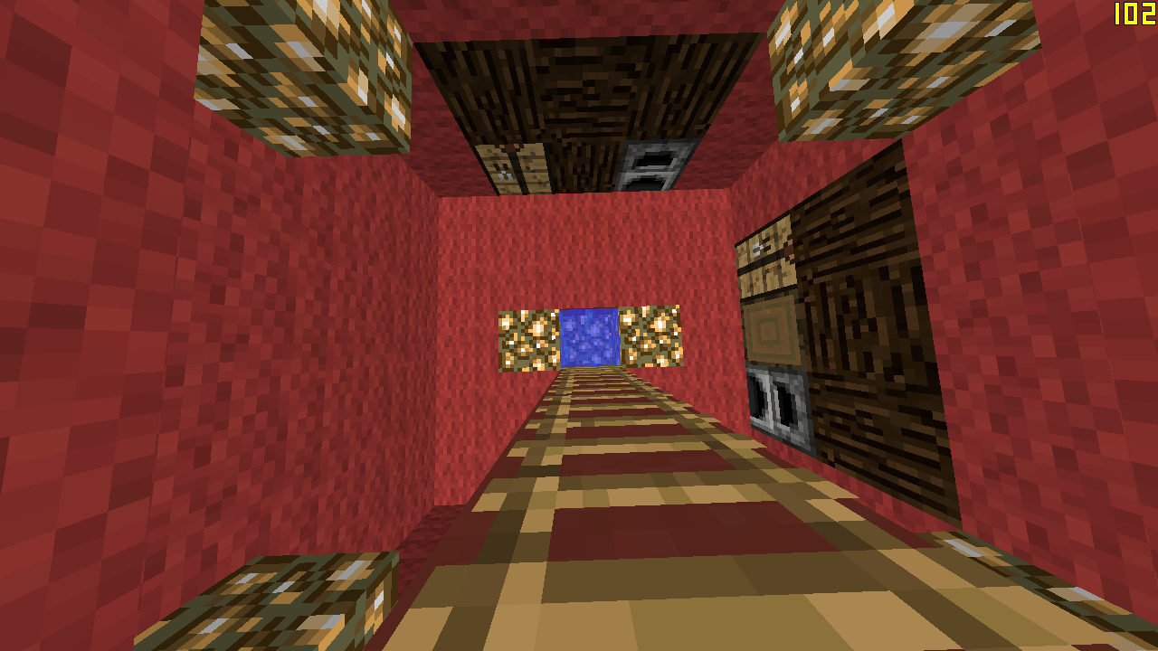
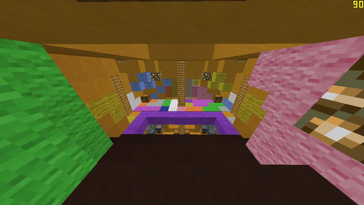
Spacing between each island?
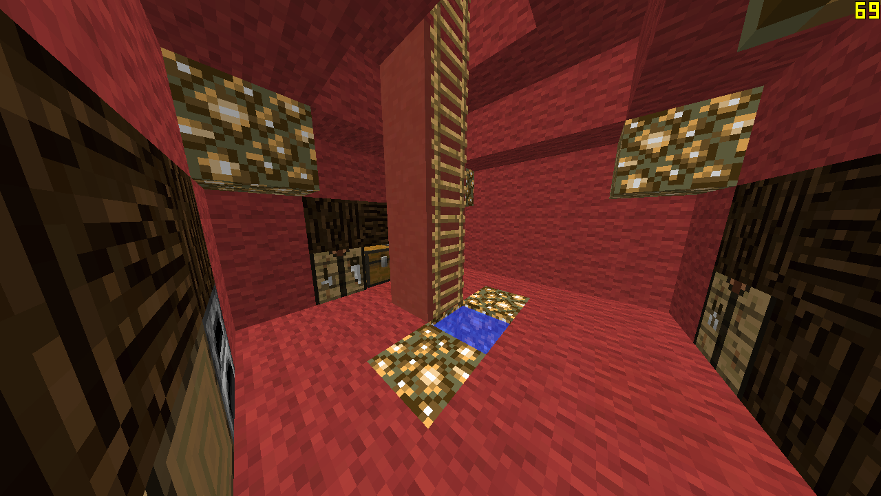
Chest in each island including the center?
Note:
I gotta say this is a rough start I think the chess map would've been a better idea then his but it your choice if you want to continue it or not. Don't give up so quack-ly :P
I never gave up about the chess map I stopped the reconstruction of it because this must look better, well I thought.
Try to make the pixel art below better, with organics instesd of one block drawings. The pac mans are great, but they look a bit strange, try to make them a bit bigger.
I had an idea, move the pixel art above, next to the figures, so players could walk on it, without dying. Maybe quit some blocks and make little islands with it.
It is a good map, but you have to put a lot of effort on it.
I recomend you to concentrate on building only one mAp at the time and not trying to build 3.
Have you seen my Team Skywars Space Invaders map submission?, I ve been working on it for a long time since I posted the first image.
Good Luck bro!
looks good so far. Why the colors on top of the ghosts? and i would suggest removing gold blocks as they could be use for notch apples
That is the purpose of it! Like in Sundae or Flowerslooks good so far. Why the colors on top of the ghosts? and i would suggest removing gold blocks as they could be use for notch apples
D
Deleted member 15612
Guest
Some blocks can be used for notch apples, and, being a small map, it ruins it.
The mini Pacmans look so weird and bad.
Middle island doesn't have enough details, and it does looks so bad too.
Those rainbows on the Ghosts looks really bad.
Middle pacman doesn't look good.
The middle-down island thingy looks really bad, without details, and it wouldn't be fair/funny if you fell without dying.
All islands are the same (Into them), try adding different things.
Try to add details, there are more items/things on the Original Pac-Man game.
que clase de mrd es esta :v hago mejor uno yo sin ver o con un pto ojo tapado :v


