Minecraft PC IP: play.cubecraft.net

Should this map be added?

  • Yes

    Votes: 10 47.6%
  • No

    Votes: 11 52.4%

  • Total voters
    21

Zhypo

Dedicated Member
Jun 3, 2015
760
994
168
25
Happyland
Map name:
Treasure Island

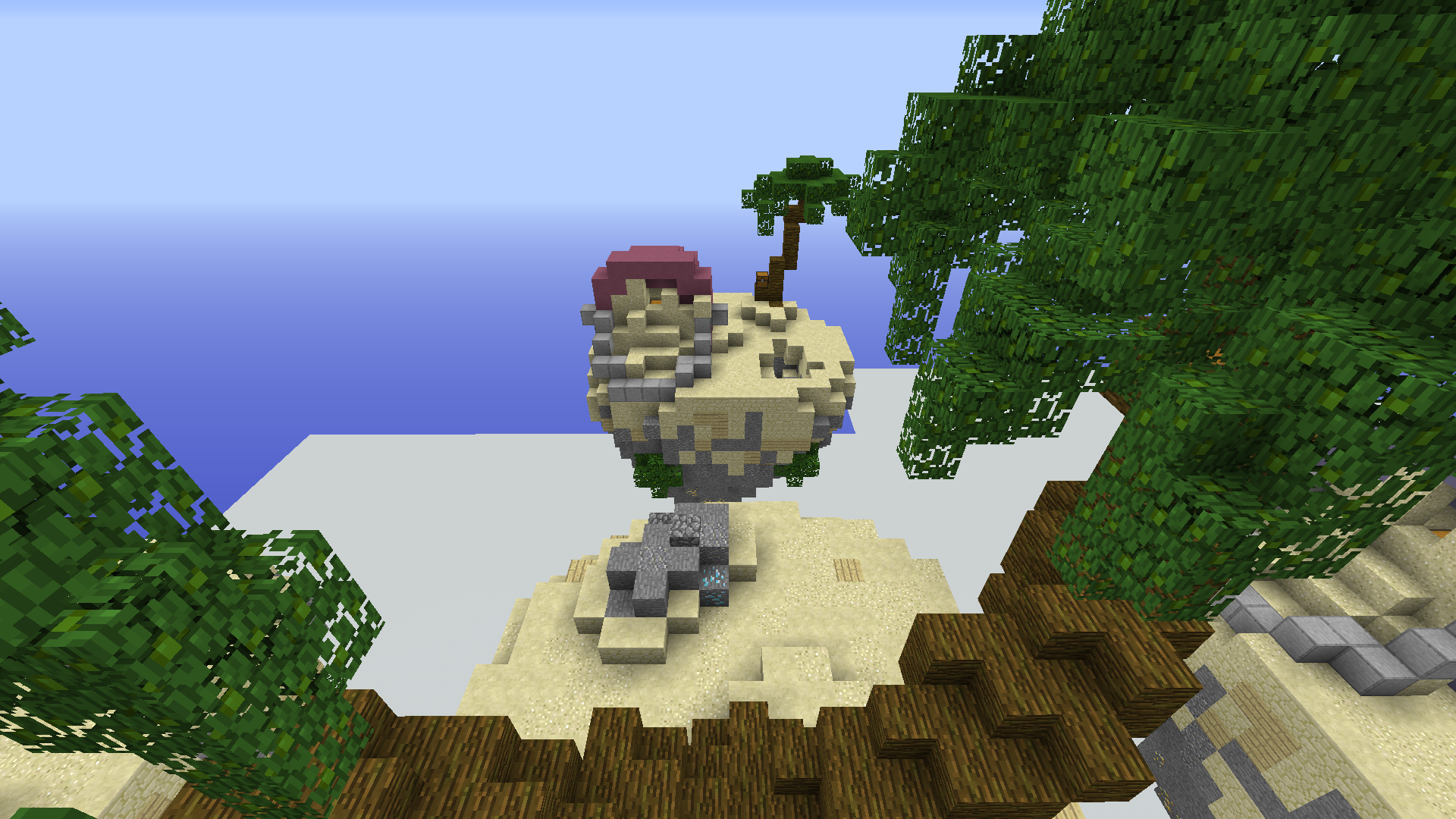
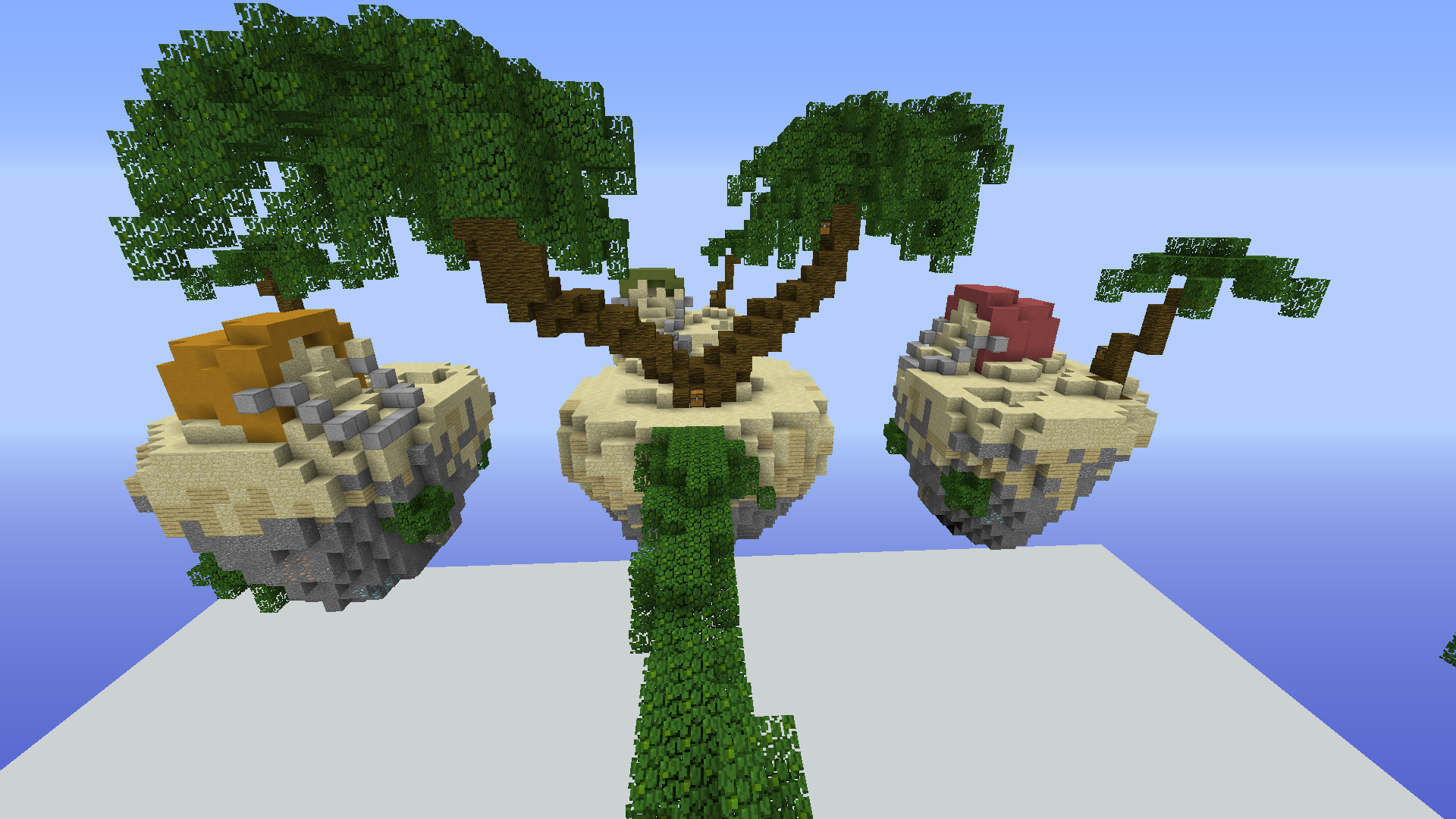
Arrr! Looking like a pirate my friend. Welcome on this island where we're trying to get to the treasure... can you find us where the X is?

Creator:
@Zhypo

Description:
- 12 players
- 3 chest on the starter island
- 3 chest on sub-mid
- 6 chest in mid


2020-06-10_16.34.06.png
2020-06-10_16.34.34.png
2020-06-10_16.34.06.png
2020-06-10_16.34.34.png
 
  • Like
Reactions: FireExcalibur10

Diav

( ͡° ͜ʖ ͡°)
Jan 16, 2020
255
1,049
159
22
Venice
You put the same picture twice and there isn't a picture of the mid but for what I can see the palms on the sub-middle islands looks a bit weird and the leaves path looks strange, at least to me.
The starting islands look alright but the whole map reminds me a lot of a Solo Skywars map that is already on the server, I forgot the name since I don't play it a lot.
 
Jun 3, 2020
86
28
19
Its Great i vote yes But i would like to see more pictures of this map But the chest in the bucket seems Hard to reach it will be fun to play in this map
 

colinverp

Well-Known Member
May 5, 2020
222
362
114
20
Helmond netherlands
I've voted no because:
1. I have no clear pictures so I can't judge that well
2. the layout isn't originally anymore.
3. there is a lot oh hight difference on the sub-mids with the rocks and the trees, this can be really annoying when pvping
4.the leave paths are to dence I think, it should be air gaps between I think.
I hope you can do something with my feedback!
 

Vict0r

Well-Known Member
Jun 5, 2020
259
330
79
I've voted no because:
1. I have no clear pictures so I can't judge that well
2. the layout isn't originally anymore.
3. there is a lot oh hight difference on the sub-mids with the rocks and the trees, this can be really annoying when pvping
4.the leave paths are to dence I think, it should be air gaps between I think.
I hope you can do something with my feedback!
I agree with you and I would vote no too.
 

Zhypo

Dedicated Member
Jun 3, 2015
760
994
168
25
Happyland
You put the same picture twice and there isn't a picture of the mid but for what I can see the palms on the sub-middle islands looks a bit weird and the leaves path looks strange, at least to me.
The starting islands look alright but the whole map reminds me a lot of a Solo Skywars map that is already on the server, I forgot the name since I don't play it a lot.
2020-06-10_16.35.23.png

I've voted no because:
1. I have no clear pictures so I can't judge that well
2. the layout isn't originally anymore.
3. there is a lot oh hight difference on the sub-mids with the rocks and the trees, this can be really annoying when pvping
4.the leave paths are to dence I think, it should be air gaps between I think.
I hope you can do something with my feedback!
1. Ask for some more pictures.
2. Yup..
3. I only play SW and if you see some maps (that are on CCG atm) it isn't bad with hights, tried playing it myself with a couple friends.
4. I don't think it'd look nice if it has random parts missing, seems strange thinking about it in my head

I don't know where it went wrong with the pictures, here is the top vieuw (hopefully)
 
  • Like
Reactions: FireExcalibur10
Members Online

Team online

Members online

Latest profile posts

UncleSpect wrote on Mustafa Varlık's profile.
Doğum günün kutlu olsun!
UncleSpect wrote on -_ghost28_-'s profile.
Happy birthday!
I MADE 2 SUCCESSFULL REPORTS!!!!


rEPORT.png
report 2.png
SlinkyGnu05604 wrote on -_ghost28_-'s profile.
Happy birthday!
Top Bottom