Minecraft PC IP: play.cubecraft.net

Should this map be added?


  • Total voters
    26
Status
Not open for further replies.
D

Deleted member 492126

Guest
WIP

Map name:
Waterfalls


Creator of the map: Spuuuni


Description of the map:

This is the first map I've ever built. I'm very noob at building, I downloaded world edit yesterday

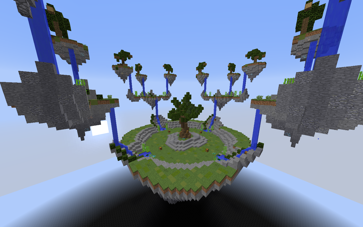
There is a tree, a few ores, a crafting table and a furnace in each island. There are diamond and gold blocks hidden underwater, somewhere in the map.

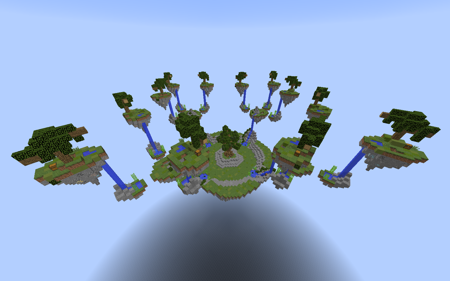
There are 12 islands, 4 sub-mid islands (with 3 small islands surrounding each) and 1 middle island. Each group is located at a different Y level. It's easy to go to the middle of the map, but rather difficult to go back to your island.

(I'm aware it probably needs more detailing, your feedback is appreciated)
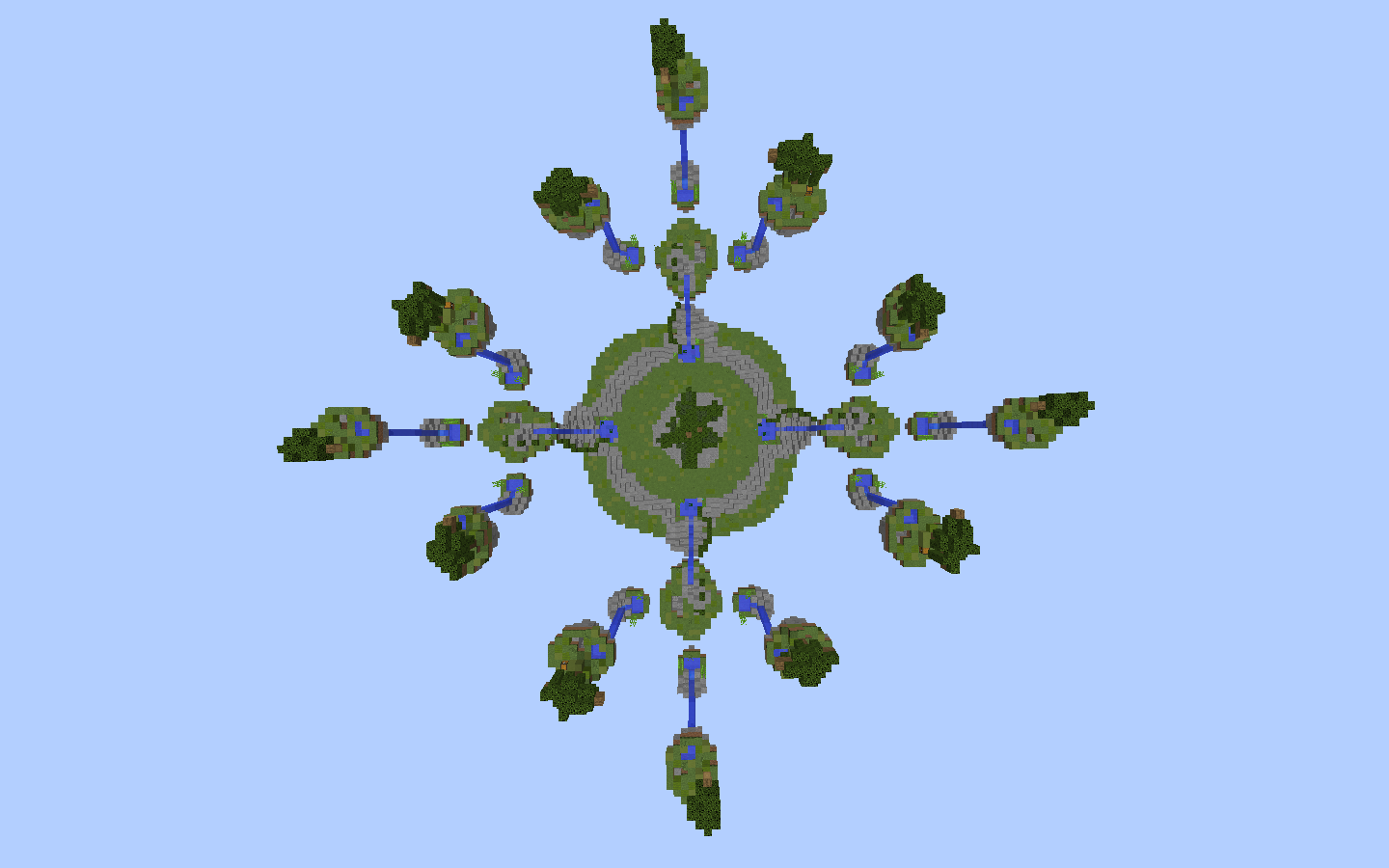
overview.png

all.png

all2.png


Spawn Islands
(Click the images)
spawnislands1.png spawnislands2.png spawnislands3.png

Sub-mid Islands
submid1.png submid2.png submid3.png

Mid
mid1.png mid2.png mid3.png


Here's a vid

(I'm aware it probably needs more detailing, your feedback is appreciated)
Edit: oh yes and thanks @_The13thDoctor_ for giving me some advice
 

Andyyy

Forum Expert
Dec 7, 2016
1,038
2,065
308
21
Blockwars
Maybe swap out the bark ends with 6 sides logs. Id is 17:12. Also I'd say to use two or three different tree designs so it doesn't all look exactly the same and to use some overhanging/deeper dirt in some places because it's one layer over the top.
 

Robbedz

Designero
Jan 16, 2018
57
372
134
22
a robbery D:
Heyy, the map look pretty good so far. The idea is original, i just would like you to change a bit the way you executed it.
It seems wayyy too easy to get to the mid, just 2 jumps and no fall damage bc of the water, i would fix that by turning some of the water into blue glass, maybe only the one which leads to the mid. I know some people just like to rush so if you want to make that people happy you might move the starter islands closer to eachother.
Also, the painting, this is just an opinion, , personally, i don't like it when the palate is just grass, stone and its variations, i would try testing painting one island and when i am happy with the result just copying and pasting.

The rest of the map is good, the theme and gameplay are very original, i really like it!!
I hope you take some of my feedback so i will be the happiest possible in case this is accepted.
Keep the great work!! :Ddd
 

Andyyy

Forum Expert
Dec 7, 2016
1,038
2,065
308
21
Blockwars
I’ve noticed that every map you look at you vote no. Why is that?
Maybe he just want's all necessary improvements to be made before voting yes on a map and wants to see the final design before making an informed decision?
I'd consider that better than just voting yes at a quick glance like many people do as long as the creator knows how and what to change.
 

_The13thDoctor_

Forum Professional
Jul 23, 2016
6,089
14,319
629
20
Chicago, Illinois
www.cubecraft.net
Pronouns
He/Him
Maybe he just want's all necessary improvements to be made before voting yes on a map and wants to see the final design before making an informed decision?
I'd consider that better than just voting yes at a quick glance like many people do as long as the creator knows how and what to change.

Thanks, but I’d like to hear from him myself. Just curious.
 

FireExcalibur10

Forum Expert
Jul 3, 2016
973
1,890
293
23
Andromeda
Maybe he just want's all necessary improvements to be made before voting yes on a map and wants to see the final design before making an informed decision?
I'd consider that better than just voting yes at a quick glance like many people do as long as the creator knows how and what to change.
Exactly haha. For example with Sancookie's map I first voted no and gave him reasons. Then he changed some things and I changed my vote.
 

_The13thDoctor_

Forum Professional
Jul 23, 2016
6,089
14,319
629
20
Chicago, Illinois
www.cubecraft.net
Pronouns
He/Him
There are some things that are not at my personal choice. Is that highly relevant?

Exactly haha. For example with Sancookie's map I first voted no and gave him reasons. Then he changed some things and I changed my vote.

Ok, just curious because sometimes you do respond or not but I meant nothing by my responses about this. :P
 

Marieke2001

Forum Professional
Jul 2, 2015
4,115
15,519
679
Hello Spuuni you cute little guy.
First of all, I really love the creativity behind it. It’s an original idea, I just think that there isn’t enough PvP space. You can get easily knocked off your island. Also I think that the stones you used underneath the island need a bit more variation. Might wanna try to use gravel or cobblestone. I like it more when used 3 types of stone instead of 2. But it’s a really good first map!
Bye cutie xoxo
 

Yamin

Forum Veteran
May 8, 2016
1,064
4,119
409
the sushi bar
Hey, for your first time building a map it looks very good, but sadly not good enough yet. There is still some things that can be improved on. I really like the lay-out, but it can become pretty unfair for the players on the middle player islands: the player spawning on the islands closer to the middle can just jump down to it if they find a bucket of water in on of their chests. Also the map looks very similar to Trees. By Changing your pallete this can be avoided.
So the only things I think this map needs are some improvements in the builds and bit of change in the gameplay. If you need help or get stuck with building I bet there are a ton of people willing to help!
 

xXTheZeusXx

Member
Jul 11, 2018
4
1
9
24
Guayaquil-Ecuador
www.youtube.com
Idea original, es un complemento que debes tener siempre presente al momento de realizar tus creaciones y no olvidarlo. Es verdad, la falta algunos detalles ya mencionados por las personas más enteradas del tema, pero a mí parecer has iniciado de una manera muy convincente. Éxitos, sigue mejorando.;):cubo:
 
Status
Not open for further replies.
Members Online

Team online

Latest profile posts

Reesle wrote on veliallast's profile.
Welcome to the Forums! Hope you enjoy your time here! Cool pfp btw! :)
Reesle wrote on slimebuster120's profile.
Happy Birthday! 🎂
Eli wrote on eldanissss's profile.
Thank you for the follow!
My friend said he has the best texturepack.
What is THAT???
„This is a golden apple“, he said.

🤯🤯🤯

IMG_3493.jpeg
IAmEclipsy wrote on slimebuster120's profile.
Happy birthday!
Top Bottom