So, as promised I said I'd be making a clear tutorial for how to start building as well as making your builds look better if you already have a concept on how to build. So I'm going to go through the 5 minecraft dos, maybe in a later post I'll go through 5 donts. We'll be going through planning, theme, block palette, pattern, and depth. We'll go straight down the list starting with planning. I will try to put together a video explaining everything as well so make sure to check the very bottom of all this.

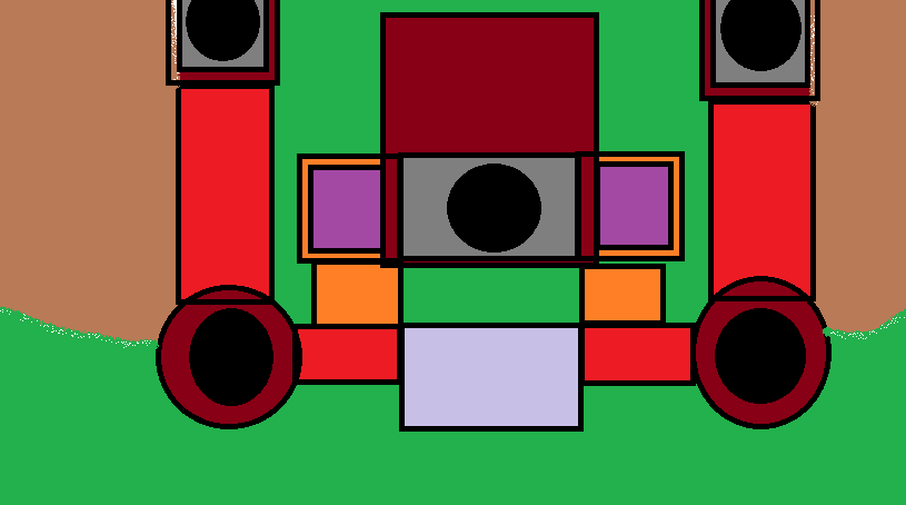
So planning is one of the MOST important things to do when building when you build some of the best builds are always the ones that are planned out. Why? Well because most of the time when you sort of just freely build on say a palace it'll turn out very sloppy because you'll have towers, random wall panels, and overall just in the end be making a mess. You could be an amazing builder but if you make a terrible Pattern with how you lay out your walls then it's going to turn out terrible obviously. How do you make this Plan you may ask well the way I go about making my plans is with something as simple as Microsoft paint, here's an example.

This may just look like a bunch of colors and a giant mess to you but this to me this is a complete palace layout. The darker colors representing the the highest points on the palace black being the tallest.The purplish color would be what we call a gate with every palace it need an entrance. The green area and green area represent Terra meaning mountains and trees and any small little details. But that pretty much concludes the planning part of a build. Let me make a small scale build representing what this picture means. incase the worded explanation isn't good enough.
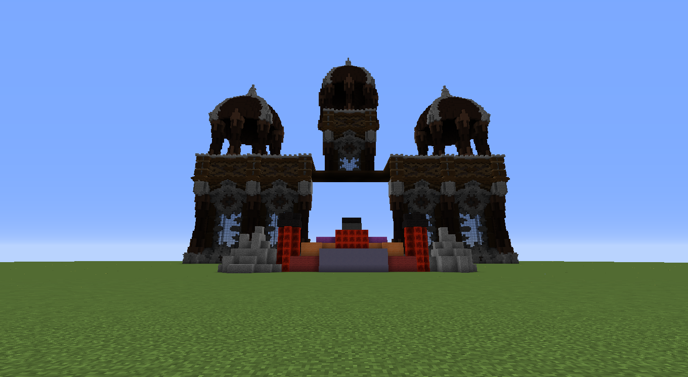
Here's the built version of the small scale build above. ( Sorry it's poorly done just sort of threw things together ) The Theme of this build is gothic/midevil. I removed the gate for purposed of being able to see the layers in the back.

This concludes the planning portion.

After planning your build you need to plan what theme you'd like to make your picture you've made either in game or in whatever program you use to make your planner. With themes skies the limit you can honestly make it whatever you want some examples being fantasy, gothic, modern, space, etc. When searching for inspiration for your theme you want to keep within the same theme though you don't want to have a gothic map going into a modern map unless you have the creativity to make it work. Lets take the picture above you example it's mostly gothic, how can that be determined? Well everyone has their own interpretations of how certain styles and themes should be done. For me spikes and dark colors really show a build to be gothic and that's my interpretation of how it should be. That's the amazing thing about building you can create and make your own versions of styles to make your very own build style. That concludes theme in my opinion it's very hard to cover a topic that is so vast can can be done several different ways.

Once you've made your plan and determined what theme you want to take on you want to create yourself a palette. A palette is basically blocks you'd like to use in your build, there's good and bad blocks to use depending on what type of build you're making and how experimental you are with trying to make your builds unique. For example lets take the build I've started above and make a block palette for the walls I've created.

This block palette shows every block used in the walls in the build. As you can see I used things that typically don't really work well together but all of these blocks are very similar in terms of color which makes them look very good together in whatever you make. That's what you want to do when you make your own palette, don't put for example pink,blue,and bedrock together. Obviously it'd create a very hard clash between the colors and make it very ugly. Pick colors that complement each other and make them look good together, go out of your comfort zone look through all of the blocks and use everything, you'd be surprised what can look good. You see it may seem weird but terra ( I will go over terra deeper in a separate post because of how complex it is and how it could honestly make or break your maps ) also has its own palette and can be done several ways. For example here's some good colors to put together for when you create islands or when you do mountains and how to do cliffs.

All of these blocks look very good together when creating larger scale terraforming the darks and lights obviously would look good being the ground or dirt beneath the more grassy blocks which would be the greens that are shown on the left. The greens don't all go together that's just me showing you what greens could be used to create a nice grassy or dirt area from the tops of your islands or cliffs. This concludes the palette section.

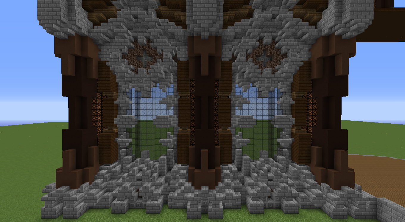
Depth is one of the BIGGEST things you want to worry about when building something. Depth is what makes either your build a flat wall or a magnificent wall panel. Depth is very easily done and probably is one of the easier things to do when doing builds.This picture will show how much depth really is in that wall I made for the planning of this build. There is over 10 blocks of just depth in the wall from it having curves spikes and small details.

Now here's the thing with this build to is that from this angle you might say wow that looks super harsh and has way to much detail but that's where perspective comes in. You always want to look from the perspective from what people are looking at your build from, for example why would you spend hours creating another tower that players can't see? it'd be pointless to create a completely new tower that people can't see outside your map. But if you look in the screenshots in the planning section this looks a hole lot better because it's being looked at from the perspective it was meant to be looked at. Depth is huge when you build even pushing back a wall even back one block will make a HUGE impact. This concludes the depth portion ( If you have any questions PLEASE ask depth is HUGE and I could go forever on it. )

Patterns are also very important when doing a build because if you make a very fantasy like pattern and put it on a gothic map it'd obviously look very out of place and look not so good. If you look at the image above the wall panels are placed in a pattern to create a wall. Patterns can be used everywhere even when making your palace what you're making is a pattern your planner is a pattern, a pattern you made to basically lay out your map and show how you want it. This is very simple and easy to do it's just a matter of following your original plan you had made to make your map. This concludes how to create a map.
In the future I will go more in-depth and going step by step with you in a video. Just keep your eyes out on this post if you're interested and I'll eventually include it in the bottom of this post. Hope this somewhat gives you guys an idea on how to make maps that look better. All of these steps can apply to anything you want too not just palaces I just used a palace as a reference because it's easiest to explain and easiest to understand. If you have any questions feel free to ask or message me. If you'd like to see a completed build make sure to tell me I sort of just take some random stuff I built and threw it together for this build. Thanks hope you guys found this useful. :)
So planning is one of the MOST important things to do when building when you build some of the best builds are always the ones that are planned out. Why? Well because most of the time when you sort of just freely build on say a palace it'll turn out very sloppy because you'll have towers, random wall panels, and overall just in the end be making a mess. You could be an amazing builder but if you make a terrible Pattern with how you lay out your walls then it's going to turn out terrible obviously. How do you make this Plan you may ask well the way I go about making my plans is with something as simple as Microsoft paint, here's an example.
This may just look like a bunch of colors and a giant mess to you but this to me this is a complete palace layout. The darker colors representing the the highest points on the palace black being the tallest.The purplish color would be what we call a gate with every palace it need an entrance. The green area and green area represent Terra meaning mountains and trees and any small little details. But that pretty much concludes the planning part of a build. Let me make a small scale build representing what this picture means. incase the worded explanation isn't good enough.
Here's the built version of the small scale build above. ( Sorry it's poorly done just sort of threw things together ) The Theme of this build is gothic/midevil. I removed the gate for purposed of being able to see the layers in the back.
This concludes the planning portion.
After planning your build you need to plan what theme you'd like to make your picture you've made either in game or in whatever program you use to make your planner. With themes skies the limit you can honestly make it whatever you want some examples being fantasy, gothic, modern, space, etc. When searching for inspiration for your theme you want to keep within the same theme though you don't want to have a gothic map going into a modern map unless you have the creativity to make it work. Lets take the picture above you example it's mostly gothic, how can that be determined? Well everyone has their own interpretations of how certain styles and themes should be done. For me spikes and dark colors really show a build to be gothic and that's my interpretation of how it should be. That's the amazing thing about building you can create and make your own versions of styles to make your very own build style. That concludes theme in my opinion it's very hard to cover a topic that is so vast can can be done several different ways.
Once you've made your plan and determined what theme you want to take on you want to create yourself a palette. A palette is basically blocks you'd like to use in your build, there's good and bad blocks to use depending on what type of build you're making and how experimental you are with trying to make your builds unique. For example lets take the build I've started above and make a block palette for the walls I've created.

This block palette shows every block used in the walls in the build. As you can see I used things that typically don't really work well together but all of these blocks are very similar in terms of color which makes them look very good together in whatever you make. That's what you want to do when you make your own palette, don't put for example pink,blue,and bedrock together. Obviously it'd create a very hard clash between the colors and make it very ugly. Pick colors that complement each other and make them look good together, go out of your comfort zone look through all of the blocks and use everything, you'd be surprised what can look good. You see it may seem weird but terra ( I will go over terra deeper in a separate post because of how complex it is and how it could honestly make or break your maps ) also has its own palette and can be done several ways. For example here's some good colors to put together for when you create islands or when you do mountains and how to do cliffs.

All of these blocks look very good together when creating larger scale terraforming the darks and lights obviously would look good being the ground or dirt beneath the more grassy blocks which would be the greens that are shown on the left. The greens don't all go together that's just me showing you what greens could be used to create a nice grassy or dirt area from the tops of your islands or cliffs. This concludes the palette section.
Depth is one of the BIGGEST things you want to worry about when building something. Depth is what makes either your build a flat wall or a magnificent wall panel. Depth is very easily done and probably is one of the easier things to do when doing builds.This picture will show how much depth really is in that wall I made for the planning of this build. There is over 10 blocks of just depth in the wall from it having curves spikes and small details.
Now here's the thing with this build to is that from this angle you might say wow that looks super harsh and has way to much detail but that's where perspective comes in. You always want to look from the perspective from what people are looking at your build from, for example why would you spend hours creating another tower that players can't see? it'd be pointless to create a completely new tower that people can't see outside your map. But if you look in the screenshots in the planning section this looks a hole lot better because it's being looked at from the perspective it was meant to be looked at. Depth is huge when you build even pushing back a wall even back one block will make a HUGE impact. This concludes the depth portion ( If you have any questions PLEASE ask depth is HUGE and I could go forever on it. )
Patterns are also very important when doing a build because if you make a very fantasy like pattern and put it on a gothic map it'd obviously look very out of place and look not so good. If you look at the image above the wall panels are placed in a pattern to create a wall. Patterns can be used everywhere even when making your palace what you're making is a pattern your planner is a pattern, a pattern you made to basically lay out your map and show how you want it. This is very simple and easy to do it's just a matter of following your original plan you had made to make your map. This concludes how to create a map.
In the future I will go more in-depth and going step by step with you in a video. Just keep your eyes out on this post if you're interested and I'll eventually include it in the bottom of this post. Hope this somewhat gives you guys an idea on how to make maps that look better. All of these steps can apply to anything you want too not just palaces I just used a palace as a reference because it's easiest to explain and easiest to understand. If you have any questions feel free to ask or message me. If you'd like to see a completed build make sure to tell me I sort of just take some random stuff I built and threw it together for this build. Thanks hope you guys found this useful. :)


