Given that we are on the forums, I am going to assume that the people reading this, are all familiar with the basic concept of Tower Defence.
We have all had teammates who have no idea what they are doing. They don't know how sending troops works, but most importantly, they have absolutely no idea how to place towers correctly.

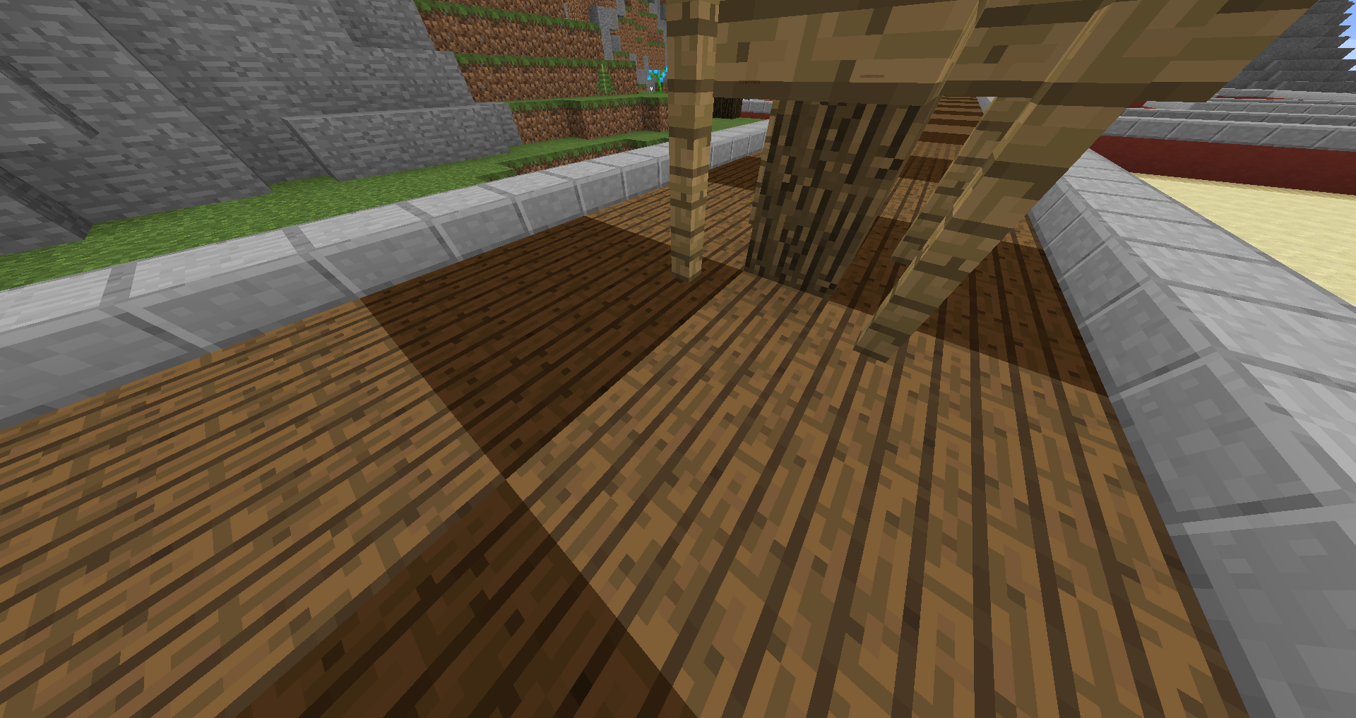
Now I know that this is annoying, but let's cut them some slack. It's not their fault that they have yet to master the game of TD, because they haven't played it before or for whatever reason. But, however innocent these players are, towers placed as shown in the picture above, sure are annoying as hell.
What I am wondering, is why this is an issue at all. I am going to try to show you all what I mean with this extremely basic suggestion, using the help of my good ol' friend Paint. If you are colorblind, this is going to be a tiny bit harder to comprehend.

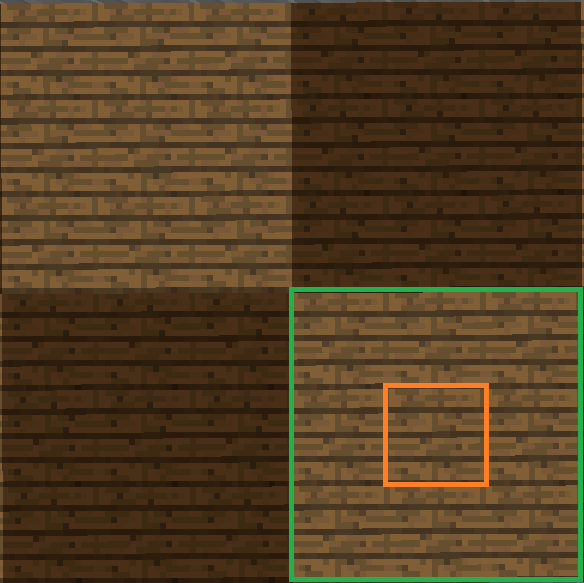
You all know that if you want to place a tower the right way, you have to right-click the orange-marked square. The tower will then be placed on top of the green-marked square.

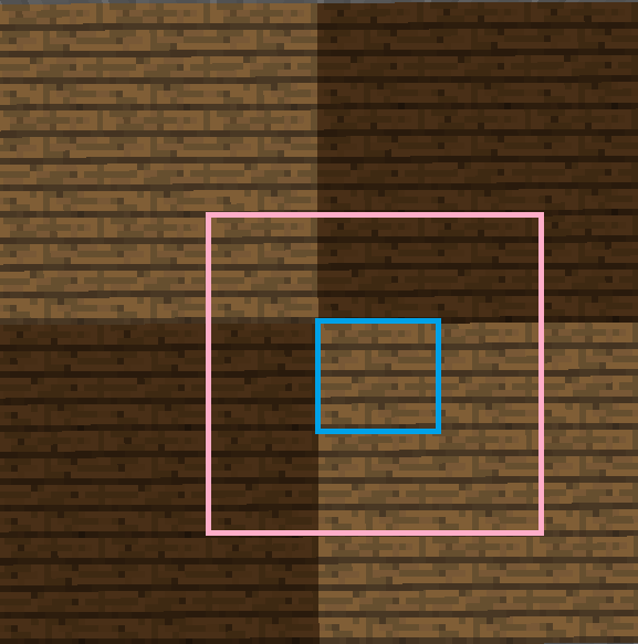
This also means that if you right-click the wrong block, in this case the blue-marked one, the tower will also be placed in the wrong way, in this case on top of the pink-marked square.
But why not make it impossible to mess up placing towers in the first place? Why not make it, so that if you click any block in the orange-marked square, the tower is placed upon said square, instead of the 1-block radius around it?

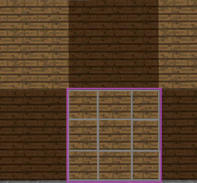
Let's also put this into visual perspective. I mean that if you click any of the grey-marked blocks, that the tower will always be placed on top of the purple-marked square?
I genuinely hope that I have been able to make my stream of thoughts comprehensible.
That'll be it for today. I have to do some grocery shopping.
(edited)
We have all had teammates who have no idea what they are doing. They don't know how sending troops works, but most importantly, they have absolutely no idea how to place towers correctly.
Now I know that this is annoying, but let's cut them some slack. It's not their fault that they have yet to master the game of TD, because they haven't played it before or for whatever reason. But, however innocent these players are, towers placed as shown in the picture above, sure are annoying as hell.
What I am wondering, is why this is an issue at all. I am going to try to show you all what I mean with this extremely basic suggestion, using the help of my good ol' friend Paint. If you are colorblind, this is going to be a tiny bit harder to comprehend.
You all know that if you want to place a tower the right way, you have to right-click the orange-marked square. The tower will then be placed on top of the green-marked square.
This also means that if you right-click the wrong block, in this case the blue-marked one, the tower will also be placed in the wrong way, in this case on top of the pink-marked square.
But why not make it impossible to mess up placing towers in the first place? Why not make it, so that if you click any block in the orange-marked square, the tower is placed upon said square, instead of the 1-block radius around it?
Let's also put this into visual perspective. I mean that if you click any of the grey-marked blocks, that the tower will always be placed on top of the purple-marked square?
I genuinely hope that I have been able to make my stream of thoughts comprehensible.
That'll be it for today. I have to do some grocery shopping.
(edited)
Last edited:


 I’ll always be grateful to you. You accepted my helper app, got me here.. and that meant alooot for me. Will miss you so much!! You’ve had such a positive impact on so many of us. Take care and stay amazing
