Minecraft PC IP: play.cubecraft.net

Younisco

Forum Professional
May 13, 2014
8,008
19,695
669
22
london
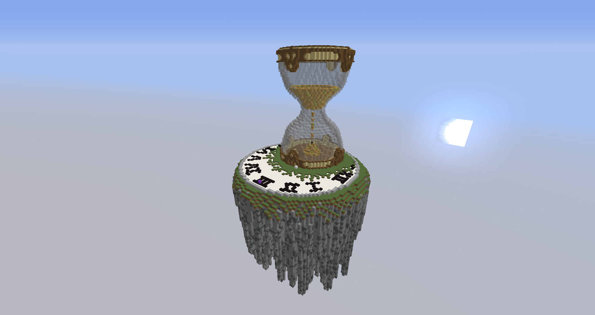
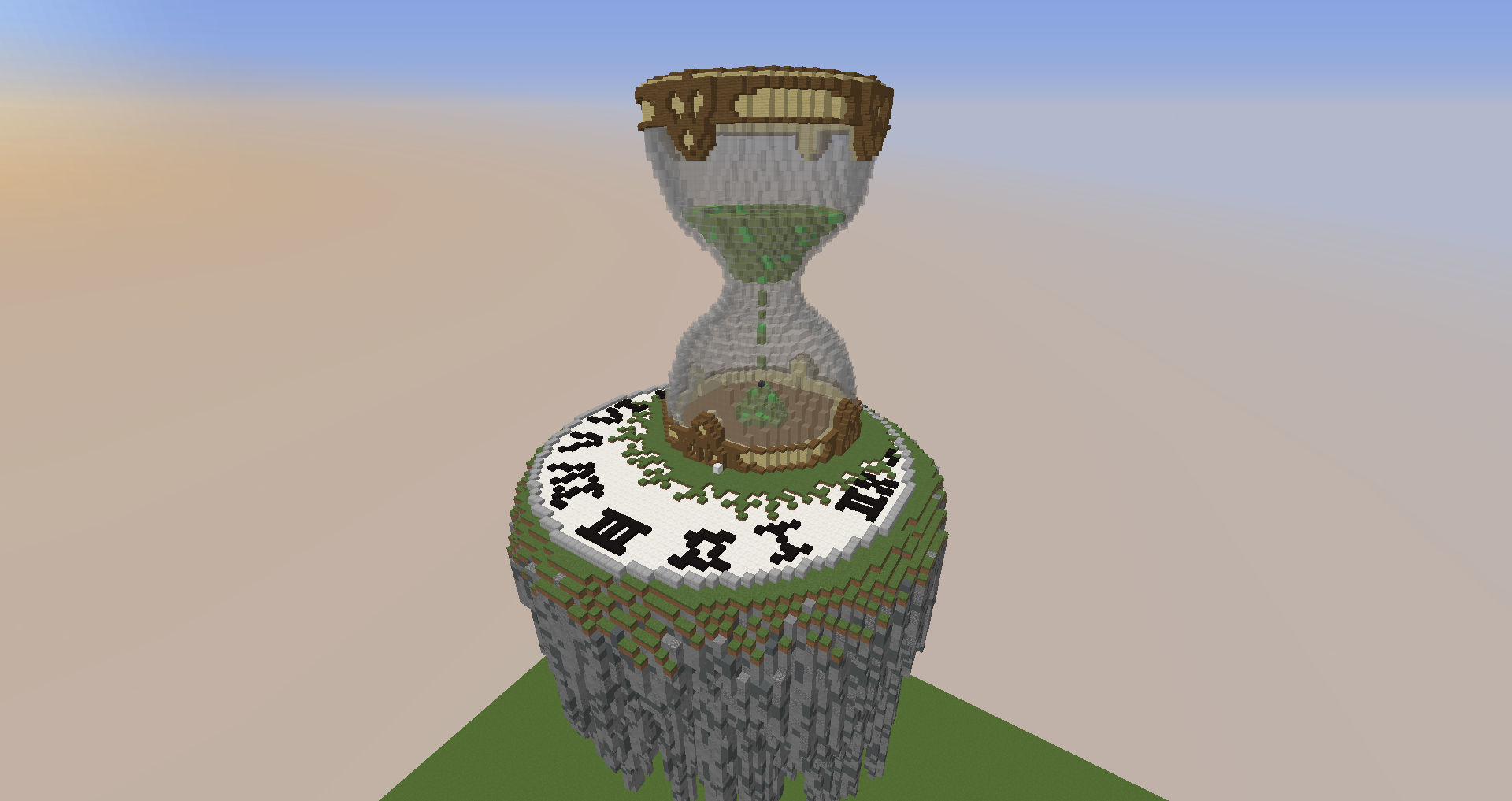
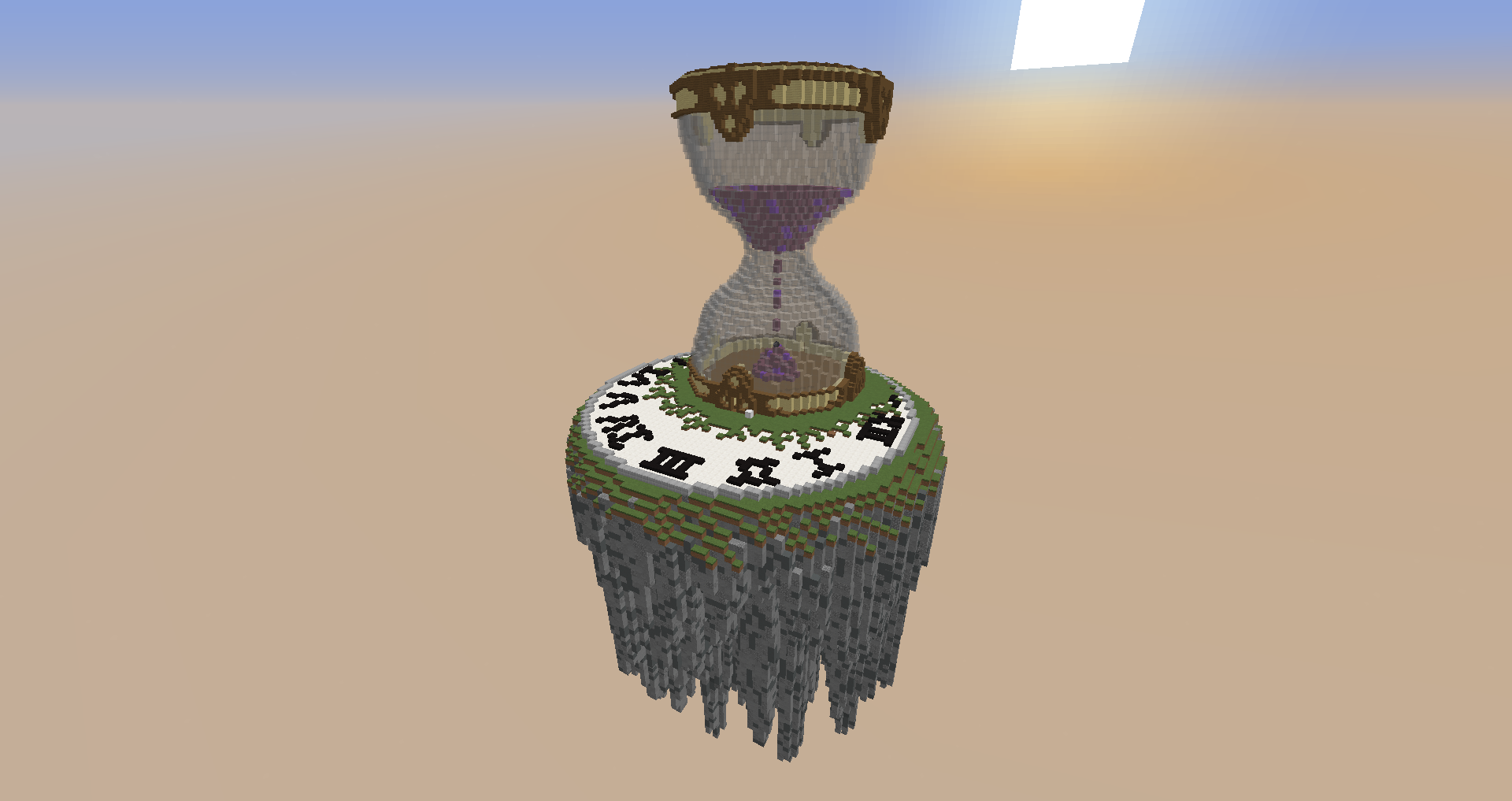
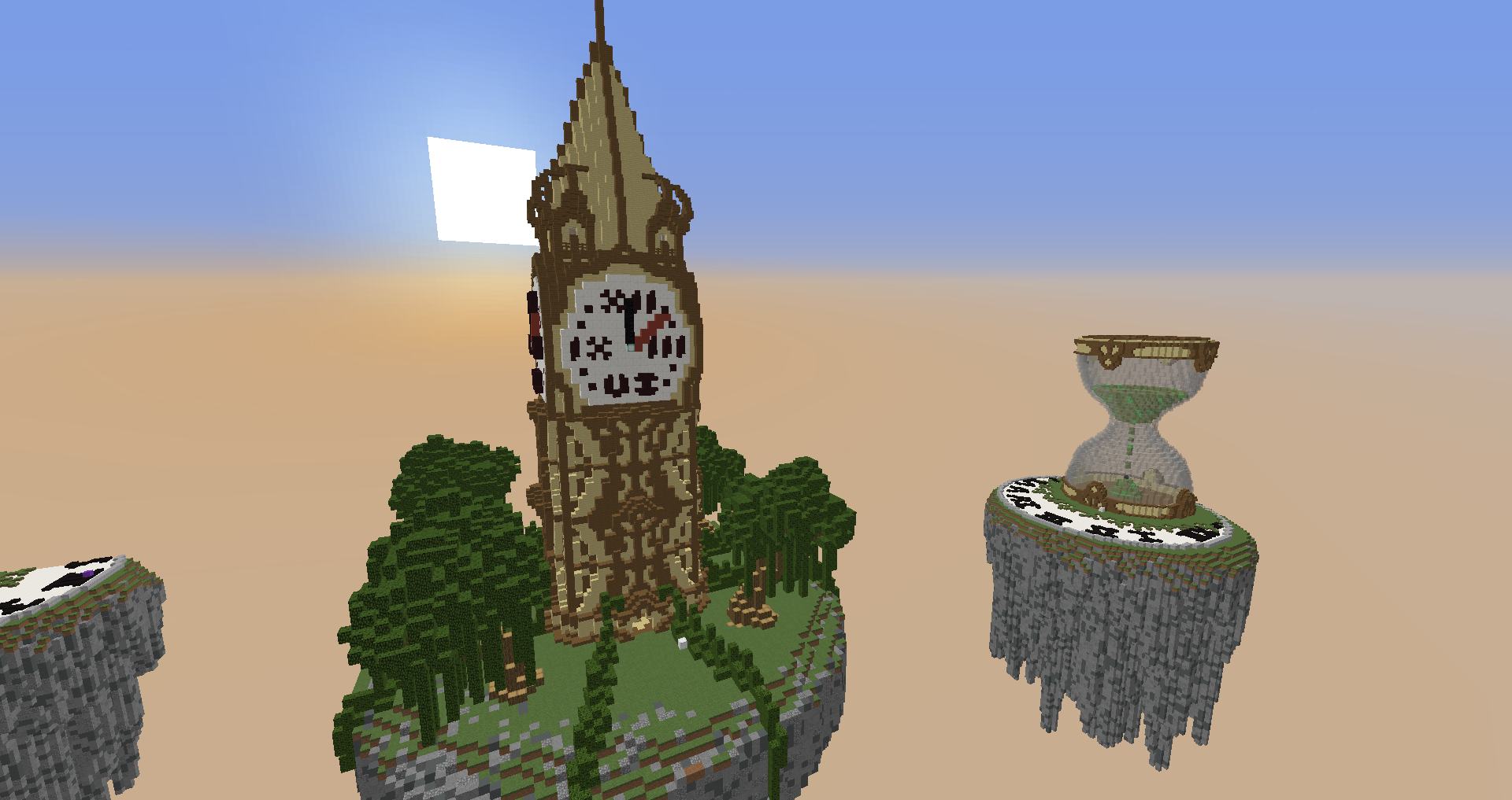
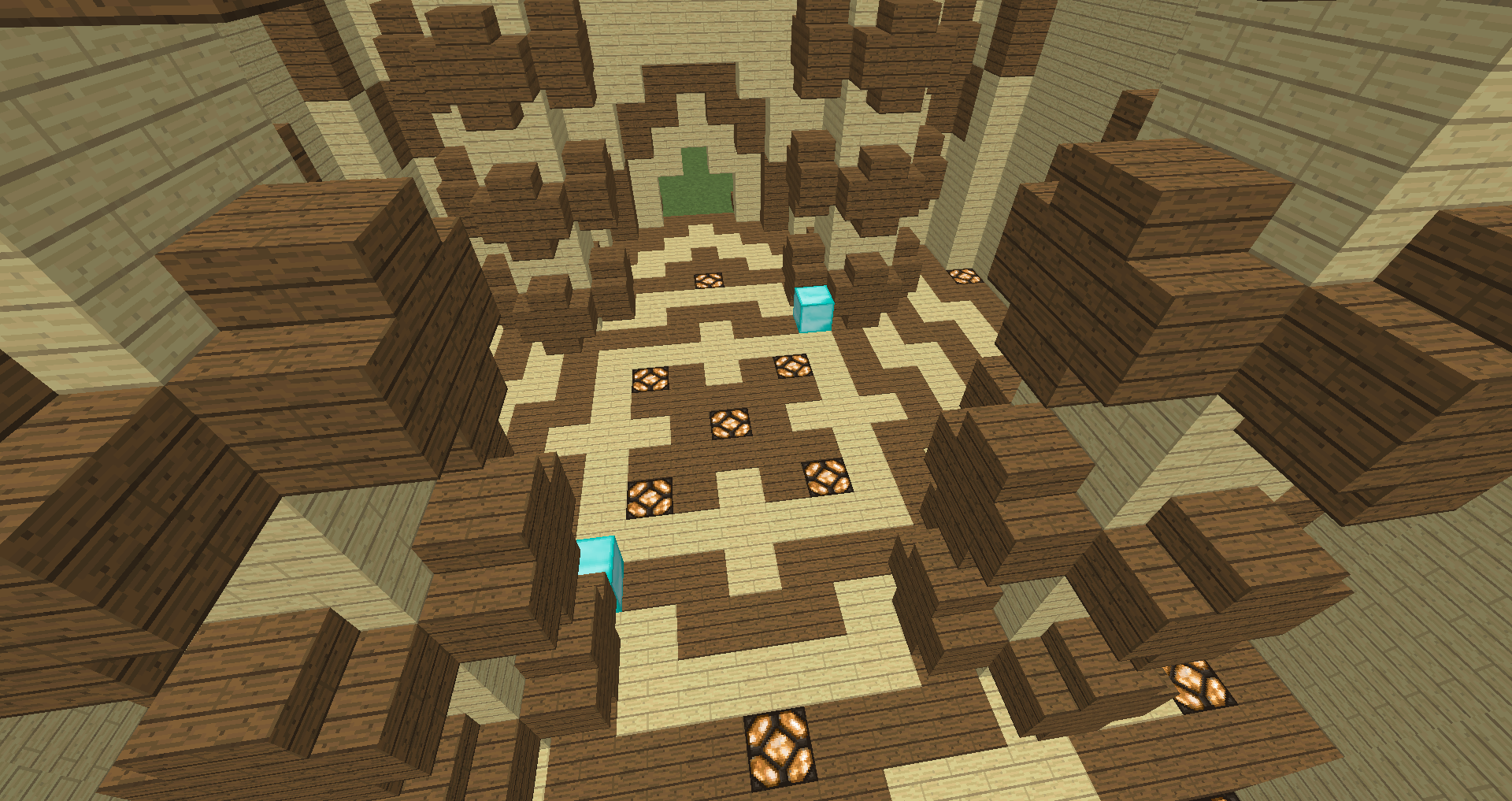
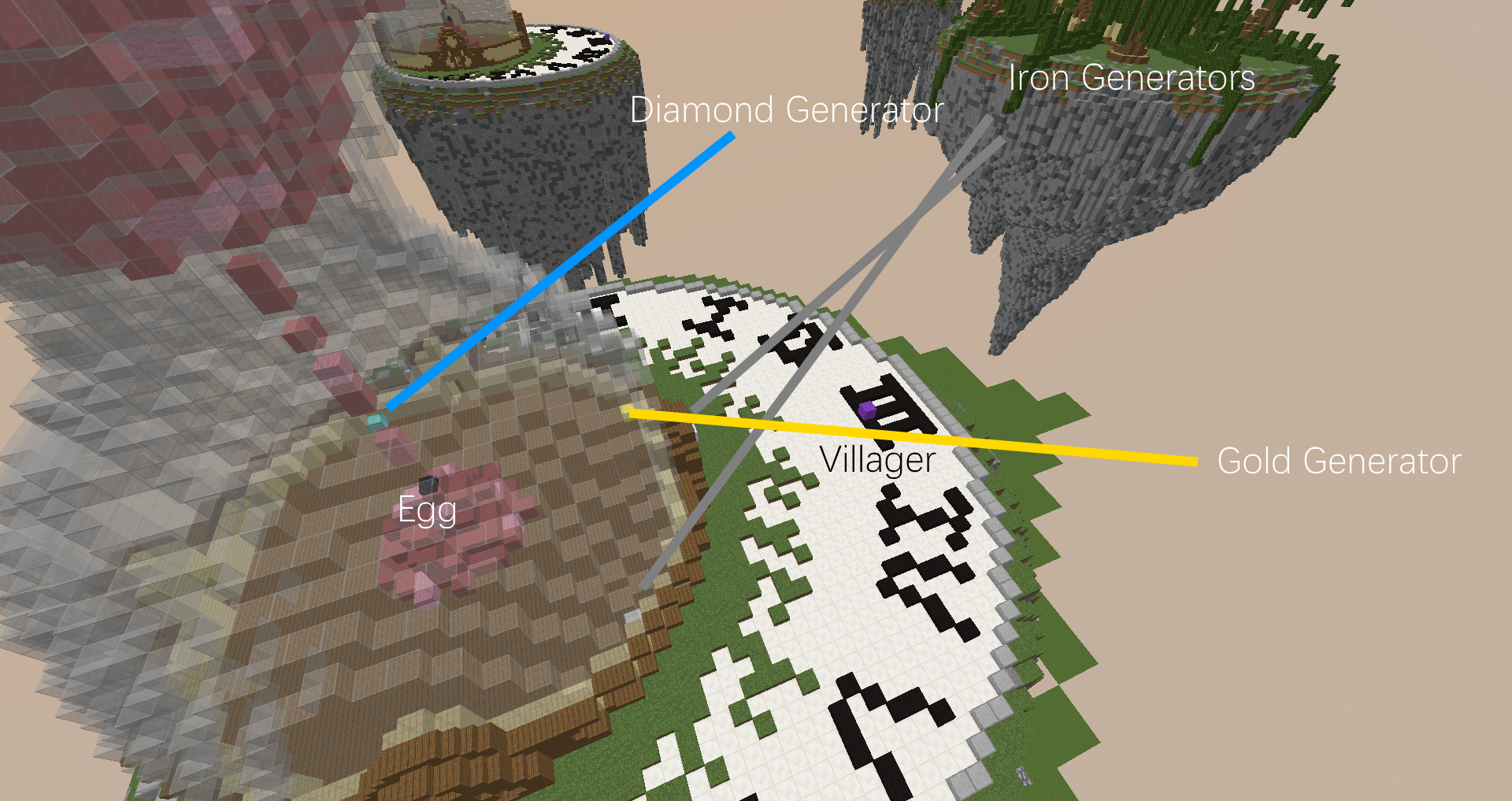
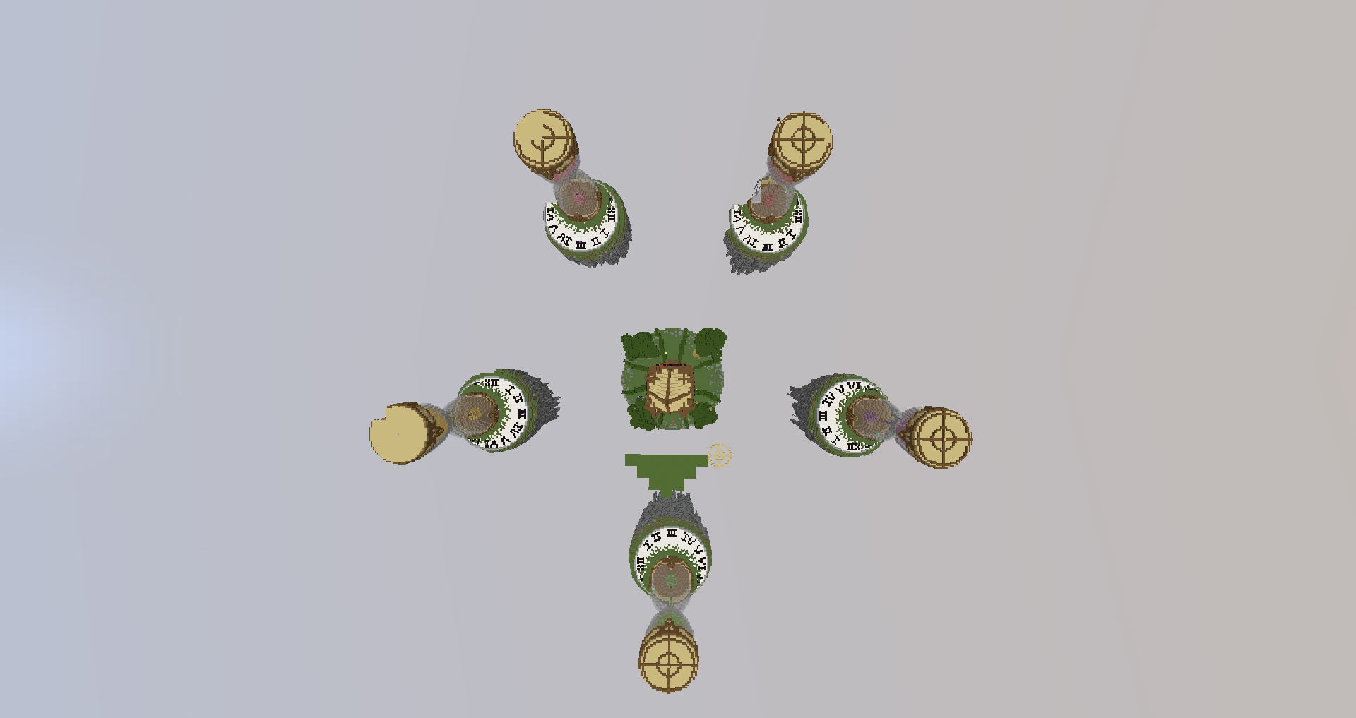
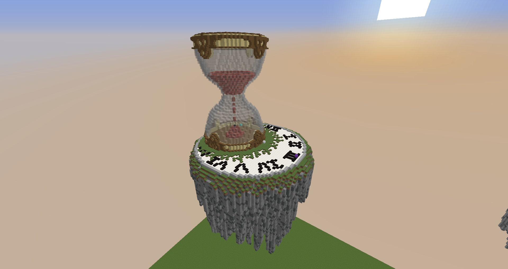
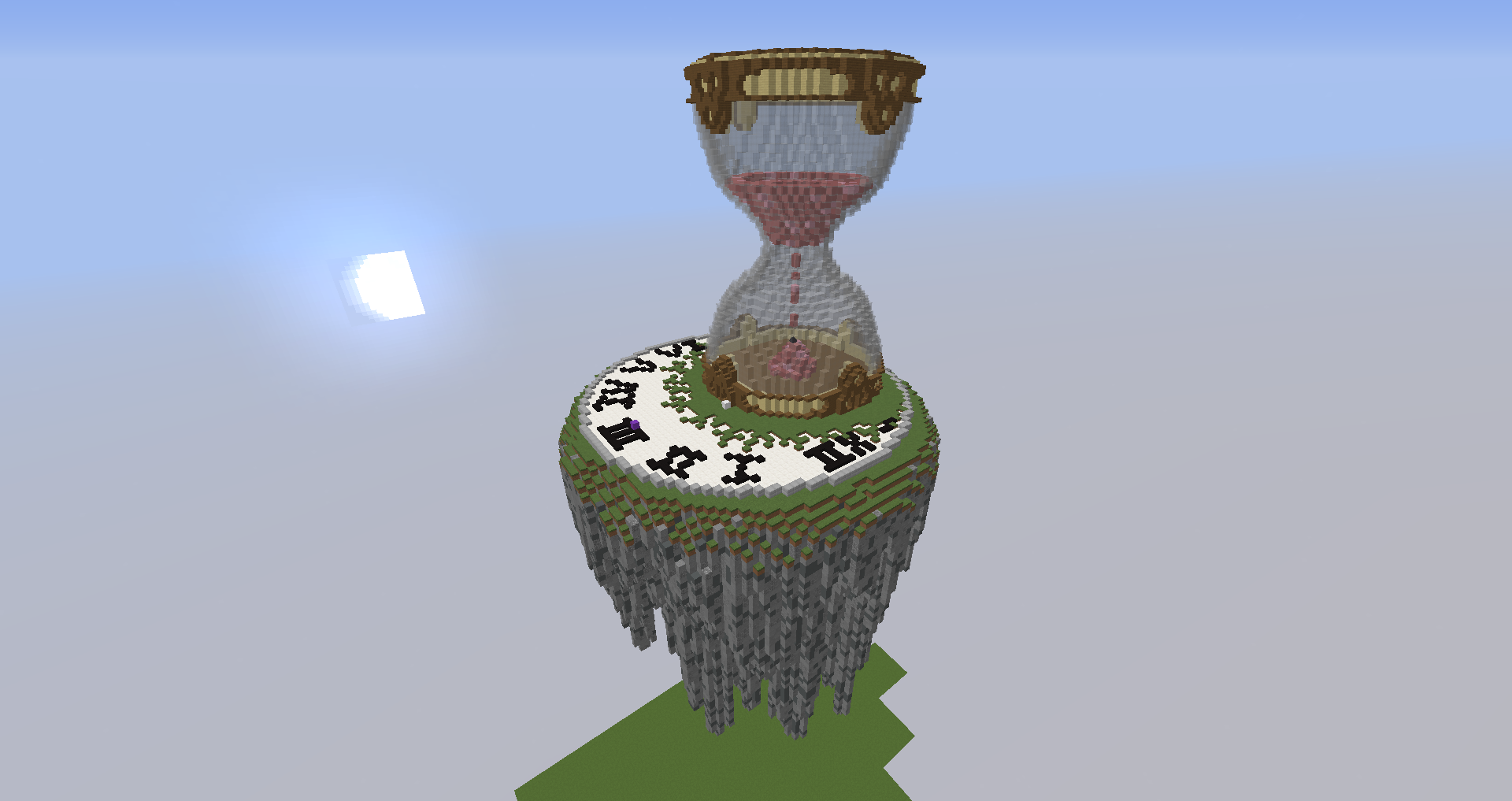
Aloha. I am here to show you a map I've been working on for about three weeks now, called Time. there is a total of 5 teams with 5 players each, 2 iron generators, 1 gold generator, and 1 diamond generator. The villager is marked by a purple wool -- Middle has 2 iron generators, 2 gold generators and 2 diamond generators. :]
2016-10-10_20.20.58.png
2016-10-10_20.21.02.png
2016-10-10_20.21.09.png
2016-10-10_20.21.51.png
2016-10-10_20.22.01.png
2016-10-10_20.23.45.png
2016-10-10_20.24.00.png
2016-10-10_20.24.15.png
2016-10-10_20.58.04.png
@johnyestaloca , @xMegaCoolx , @telegamer , @iLoveYouu , and my two wonderful friends Akagodai and Quids. All of you are awesome and I couldn't have done it without y'all. <3
All feedback will be taken into consideration and be edited into a changelog in this post. :]
- Youn[/spoiler]
 
Last edited:

Qin Shihuangdi

Forum Expert
Nov 11, 2015
4,753
3,296
343
The Orange House
This map looks amazing! The issue is that the map looks very camper friendly with the high rises and far distances between islands. My suggestion is to either A. Move the diamond generator higher / remove it from home islands or add a small connector path that goes a third of the way to mid.
 

Younisco

Forum Professional
May 13, 2014
8,008
19,695
669
22
london
Would work a bit on terra, but I really like player islands!
I agree to be honest, but after about 10 attempts at terraforming, I just gave up. :P
This map looks amazing! The issue is that the map looks very camper friendly with the high rises and far distances between islands. My suggestion is to either A. Move the diamond generator higher / remove it from home islands or add a small connector path that goes a third of the way to mid.
I will probably add a series of gears towards the middle. However, I do understand that the distances are very far from middle, which is a big problem.
 
  • Like
Reactions: Qin Shihuangdi

RynezDev

Forum Professional
Dec 1, 2015
5,279
6,619
568
21
test
Looks really good! :)
Enough place to PvP! :D

You can always ask me to help on maps i ferry goet builder xd
Kappa
 

Pandaa

Forum Expert
The terrain needs some work, it looks a bit dull. Especially the middle island.
2016-10-10_20.23.45.png

As you can see here. There is an open space there which looks kind of dull. Don't overdo it. Maybe add some type of floor pattern, or something that looks timewise good.

Also, on the trees I noticed you didn't use //replace log log:12 this will change all the logs to six-sided logs and will not have that ugly look.

I love the rooves of the center clockhouse it looks amazing, however underneath it, it could use some depth, maybe bring it out by one to give it that little pinch of sparkling dust which will make it stand out more.

I love the idea of the surrounding islands, well done on that! However on the front of the island, it looks a bit plain. If I were you, I would raise the the bit of a clock one up by each new hour. If you understand what I mean, it would be better gameplaywise (imo) and lookwise if thats even a word.

The underneath of the island looks excellent and very well-done, however IMO the cyan stained clay looks a bit out of place. Maybe add something that blends in more and don't use //replace . Use the worldedit brush and make some cool pattern on it.

I also noticed that inside that time measuring thingy (don't know the english word) the dust dropping could be a bit wider and more *unnatural*. However, the rest looks great and this is a very original idea.

NOTE: This is just my opinion. If you feel like something I said isn't right, you don't need to change it :p
 
  • Like
Reactions: Younisco

Younisco

Forum Professional
May 13, 2014
8,008
19,695
669
22
london
As you can see here. There is an open space there which looks kind of dull. Don't overdo it. Maybe add some type of floor pattern, or something that looks timewise good.
I will try to add some more variation in the floor definitely! Thanks. :]
Also, on the trees I noticed you didn't use //replace log log:12 this will change all the logs to six-sided logs and will not have that ugly look.
Oh lord, I forgot to do that. Thanks. xD
I love the rooves of the center clockhouse it looks amazing, however underneath it, it could use some depth, maybe bring it out by one to give it that little pinch of sparkling dust which will make it stand out more.
Don't really understand you mean by that.. Could you explain a little more?
I love the idea of the surrounding islands, well done on that! However on the front of the island, it looks a bit plain. If I were you, I would raise the the bit of a clock one up by each new hour. If you understand what I mean, it would be better gameplaywise (imo) and lookwise if thats even a word.
I get you, will definitely see how it looks.
The underneath of the island looks excellent and very well-done, however IMO the cyan stained clay looks a bit out of place. Maybe add something that blends in more and don't use //replace . Use the worldedit brush and make some cool pattern on it.
I'll definitely try. (Seeing a trend? xD)
 

mc_minecraft_procube

Well-Known Member
Oct 7, 2016
2
0
77
26
Aloha. I am here to show you a map I've been working on for about three weeks now, called Time. there is a total of 5 teams with 5 players each, 2 iron generators, 1 gold generator, and 1 diamond generator. The villager is marked by a purple wool -- Middle has 2 iron generators, 2 gold generators and 2 diamond generators. :]
@johnyestaloca , @xMegaCoolx , @telegamer , @iLoveYouu , and my two wonderful friends Akagodai and Quids. All of you are awesome and I couldn't have done it without y'all. <3
All feedback will be taken into consideration and be edited into a changelog in this post. :]
- Youn[/spoiler]
It's the best
 

Gainfullterror

Forum Professional
Mar 24, 2016
5,040
10,898
624
22
Breakfast for Dinner Club HQ
www.cubecraft.net

But the fact that there are 5 islands, makes it a bit unbalanced. A strategic pick would be:
Red or pink. For rushing purposes
Green for being isolated,so either you could: bridge to mid in peace, or you can automatically notice rushers since they pretty much come head on.
 
Members Online

Team online

Latest profile posts

Reesle wrote on ZachTart26's profile.
Welcome to the Official Cubecraft Forums! If you need help with something, feel free to DM me or a staff member anytime! Have a great day! :D
Reesle wrote on CalvinxKlein's profile.
Happy Birthday! 🎂
Watching the sun set... 🌅

1732368294873.png
Top Bottom