Minecraft PC IP: play.cubecraft.net

AlexCreeper25

Member
Dec 9, 2016
6
1
19
22
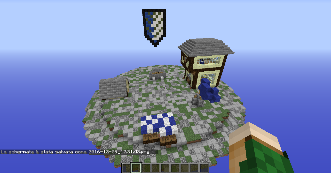
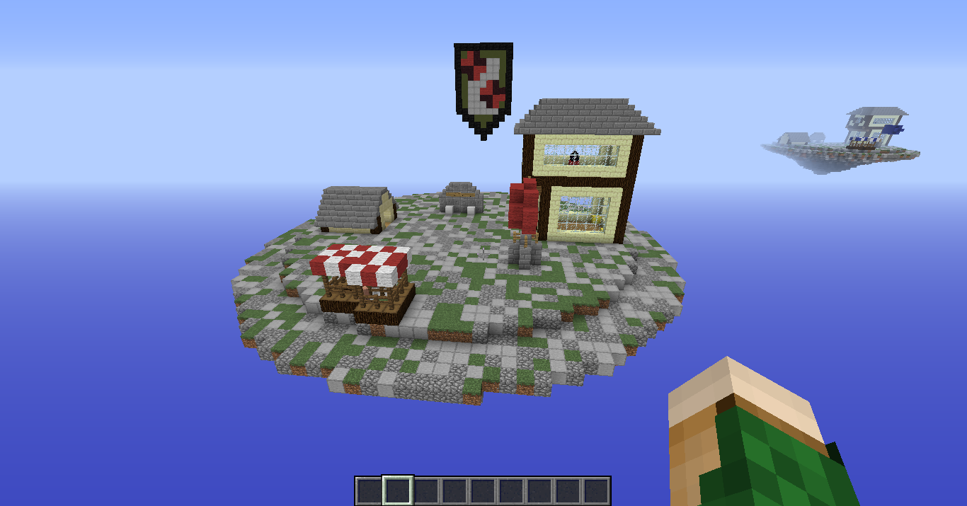
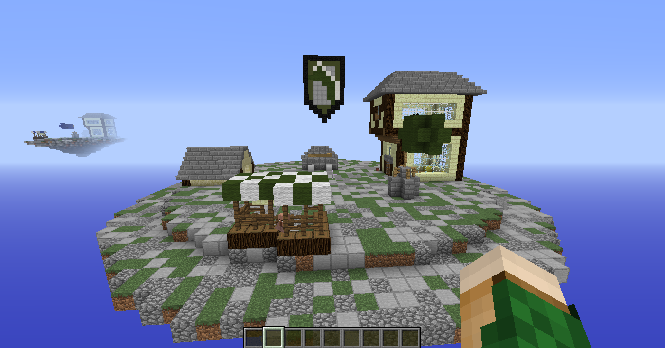
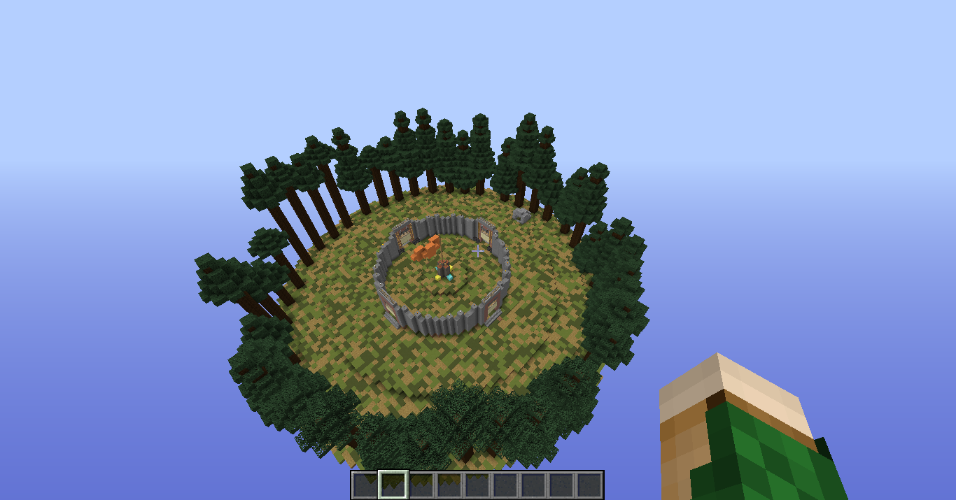
Hey Cubecraft team, i have just created a map in style of attack on titan. It's a 3 teams map, and I thought that every team could have from 6 to more players. I'd really like if you will accept it. And also, if it will be accepted i will be very happy to update it. Hope you will like the map;)
it wouldn't be SO much, but it's really big and full of contents. It also has an emerald gen
Screenshots:
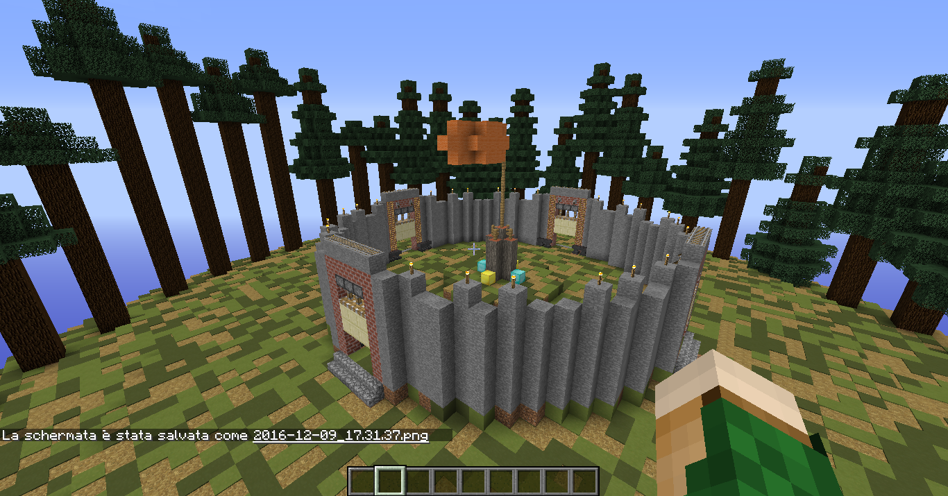
2016-12-09_17.31.37.png
2016-12-09_17.31.43.png
2016-12-09_17.31.50.png
2016-12-09_17.32.06.png
2016-12-09_17.32.28.png
 
  • Like
Reactions: Rainbowaffelz
N

Nikboo

Guest
Thread moved to Map Submissions.
~ Moved

As for the map, it looks good for a start but it needs a lot more detail for it to become a Cubecraft map.
 

Ping Ether

Forum Veteran
Jun 2, 2016
2,713
6,170
459
20
Italy
The islands are plain.
The islands are too far away.
The scale compared to the original subject (the town in Attack on Titans) is too extreme.
A palette is close to nonexistent: the map looks like it's colors put all over the place.
The vanilla trees are ugly. They need to be custom.
The islands are flat, they should look like parts of terrain floating, not discs.

MA SEI ITALIANO PURE TU?!?!?!
 
  • Like
Reactions: Gainfullterror

Vickay

Dedicated Member
Aug 18, 2016
171
947
168
England
This is such a nice idea for a map, very original! :D
(I love AOT too :3)
But, as commented before, Cubecraft builders have set very high standards for maps with much more detail and precision. Keep working though, and I'm sure you'll improve <3
 

Gainfullterror

Forum Professional
Mar 24, 2016
5,040
10,898
624
22
Breakfast for Dinner Club HQ
www.cubecraft.net
The islands are plain.
The islands are too far away.
The scale compared to the original subject (the town in Attack on Titans) is too extreme.
A palette is close to nonexistent: the map looks like it's colors put all over the place.
The vanilla trees are ugly. They need to be custom.
The islands are flat, they should look like parts of terrain floating, not discs.

MA SEI ITALIANO PURE TU?!?!?!

+It looks like you used the world edit randomization tool with the discs from //circle...
There's not much effort put into this and the buildings are too random to fit in.
 
  • Like
Reactions: Ping Ether

_The13thDoctor_

Forum Professional
Jul 23, 2016
6,089
14,319
629
20
Chicago, Illinois
www.cubecraft.net
Pronouns
He/Him
The islands are plain.
The islands are too far away.
The scale compared to the original subject (the town in Attack on Titans) is too extreme.
A palette is close to nonexistent: the map looks like it's colors put all over the place.
The vanilla trees are ugly. They need to be custom.
The islands are flat, they should look like parts of terrain floating, not discs.

MA SEI ITALIANO PURE TU?!?!?!
THX for saying what I could not
 

AlexCreeper25

Member
Dec 9, 2016
6
1
19
22
The islands are plain.
The islands are too far away.
The scale compared to the original subject (the town in Attack on Titans) is too extreme.
A palette is close to nonexistent: the map looks like it's colors put all over the place.
The vanilla trees are ugly. They need to be custom.
The islands are flat, they should look like parts of terrain floating, not discs.

MA SEI ITALIANO PURE TU?!?!?!
Si sono italiano xD
 
Members Online

Team online

Latest profile posts

WorriedSkate940 wrote on Flxen's profile.
Congrats my guy!!
Amacchi wrote on domiiyyi's profile.
Happy bday!!! 🎂
Amacchi wrote on _EliteNightmare's profile.
Happy bday!!! 🎂
Amacchi wrote on GhostBoy's profile.
Happy bday!!! 🎂
IAmEclipsy wrote on GhostBoy's profile.
Happy birthday!
Top Bottom