So I built this map as a commission for a server where I am builder. As you can see I wanted it to have a very simple but effective design: I used mostly clay and tried to give it like a cartoonish vibe. I didn't want to add too many details cause I've been playing eggwars for so long and I know that very detailed maps could be annoying for the gameplay so I chose to make a flat terraforming that is very good for the pvp.
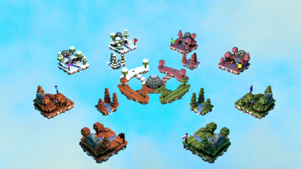
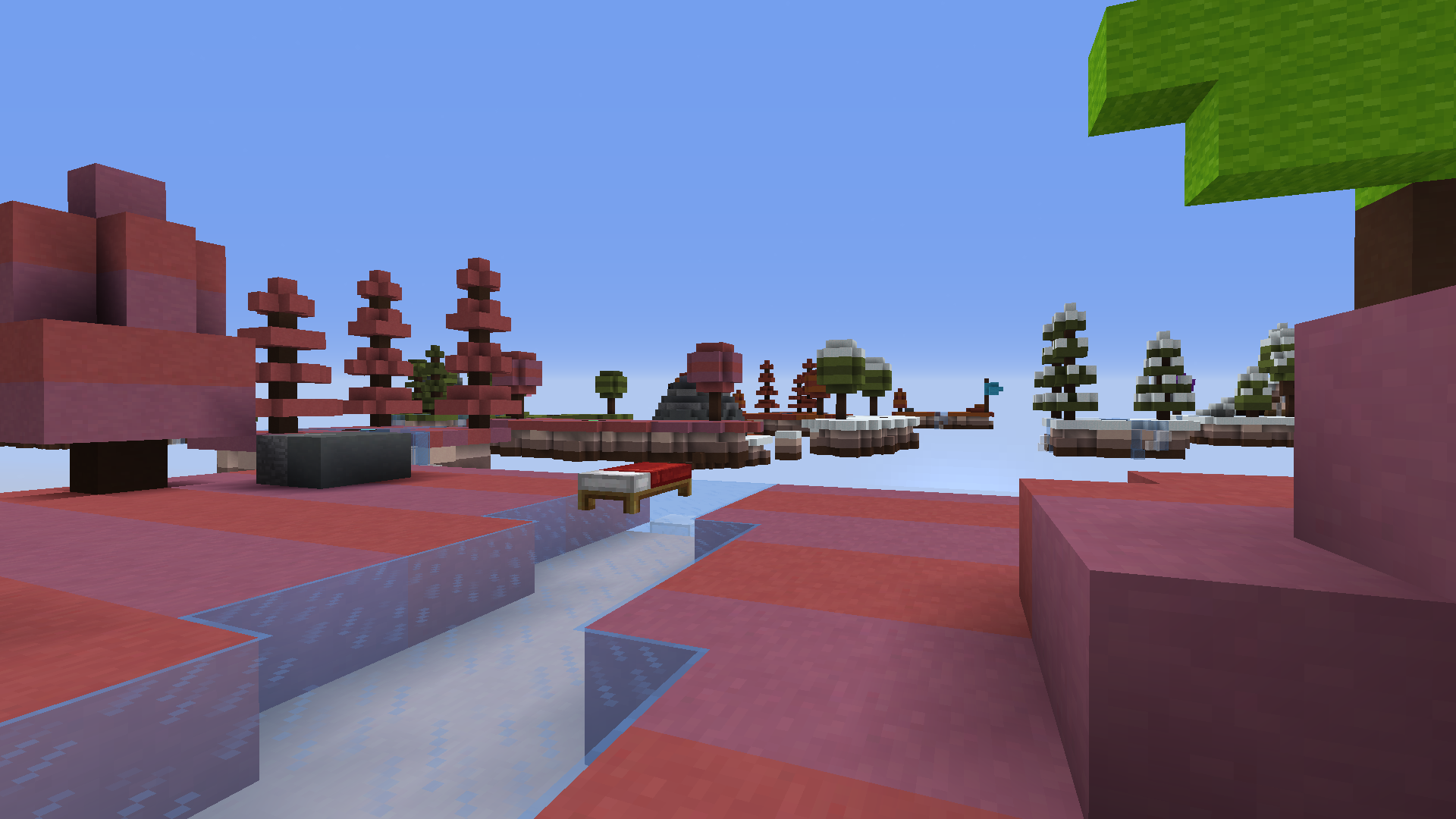
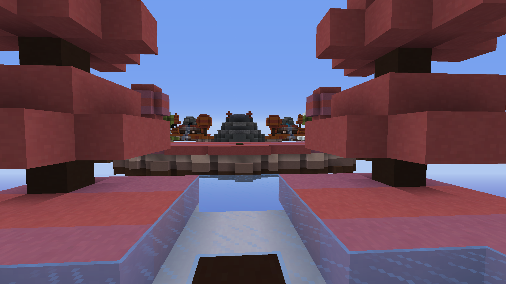
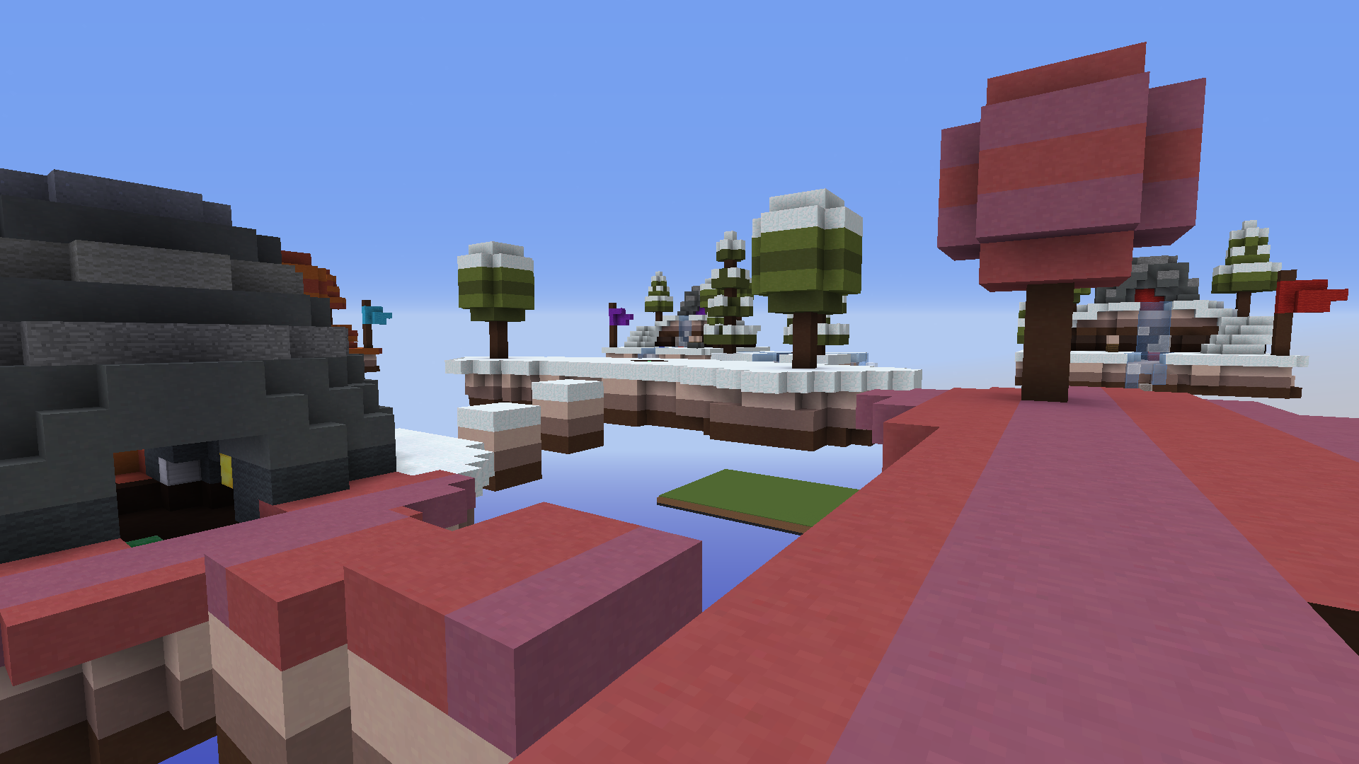
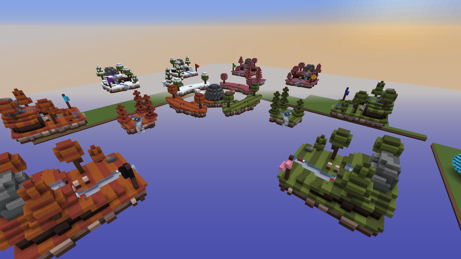 I like how it turned out and I can't wait to know what you think about it (Obviously the pieces of grass that you can see in the background will be removed).
Minecraft PC IP: play.cubecraft.net
(some of them are how the map is, probably not only my opinion)
You are using an out of date browser. It may not display this or other websites correctly.
You should upgrade or use an alternative browser.
You should upgrade or use an alternative browser.
D
Deleted member 347571
Guest
It is not a bad map, for me it is just to much clay (i get that you want a cartoonish style). For me it is simply just not what i like as person, other people might like it because everyone has their own taste. The different colors on each island are well done, maybe you should try to make it more seasonal if you get what i mean.. the rest is fine and good luck with your map! :p
Basics, layout and block choices look great, but please get some custom trees in there, those trees look like the normal spruce trees, but with clay instead of leaves. So try and make them look a little bit more custom.
Thank you for your feedback c:It is not a bad map, for me it is just to much clay (i get that you want a cartoonish style). For me it is simply just not what i like as person, other people might like it because everyone has their own taste. The different colors on each island are well done, maybe you should try to make it more seasonal if you get what i mean.. the rest is fine and good luck with your map! :p
There aren't many other ways to make a sprouce tree using only clay and giving it a cartoonish vibe, if you tell me to make more customs like using other blocks you didnt get what I wanted by the map. Thank you tho.Basics, layout and block choices look great, but please get some custom trees in there, those trees look like the normal spruce trees, but with clay instead of leaves. So try and make them look a little bit more custom.
Nice dude. Thank you for making that proposal. That would make us out a lot if all playerswould do that. Thanks again You have shown the good example.
----------------------------------------------------------------------------------------------------------------------------------------------------------------------------------------------------------------------------
----------------------------------------------------------------------------------------------------------------------------------------------------------------------------------------------------------------------------
_The13thDoctor_
Forum Professional
I'm sad that this isn't for Egg Wars, cause if so that would be sweeeeeet.
Nice dude. Thank you for making that proposal. That would make us out a lot if all playerswould do that. Thanks again You have shown the good example.
----------------------------------------------------------------------------------------------------------------------------------------------------------------------------------------------------------------------------
Thank you c:I'm sad that this isn't for Egg Wars, cause if so that would be sweeeeeet.
I wanted to give it a very simple design with not many details as you can seeMaps looks nice and clean, could use a bit more detail though.
(Eggwars)
Looks still nice though :PThank you c:
I wanted to give it a very simple design with not many details as you can see
Looks like a map to me yeah.
BUT
-I think it looks weird that there are visible "stripes" on every island.
-The sub-mid islands are very small. You would most likely get hit off it with one hit.
-The starting islands have the square shape.
-The islands have the 1 block overhang + they bottom of them is boxy and small. (I play eggwars a lot and I like to block clutch, in this map it's impossible)
-The flags look weird, they have a thick pole and a very small flag (Not that my flags would look better either)
-The trees, especially the trees with the ball on top, /br s 159:x 2 on top of a 1 block thick trunk, added a few stripes on the leaves.
-Playing in the middle would be painful as it's a very little area
Sorry if I'm a bit critical with this, I know you probably are better than me in some things as you're a member on builders refuge and I'm not.
Otherwise, it looks nice especially the render, I can't do those :D
Thank youThat would be a really cool map! +1
Uhm I don't agree with some things but I appreciate your feedback :pLooks like a map to me yeah.
BUT
-I think it looks weird that there are visible "stripes" on every island.
-The sub-mid islands are very small. You would most likely get hit off it with one hit.
-The starting islands have the square shape.
-The islands have the 1 block overhang + they bottom of them is boxy and small. (I play eggwars a lot and I like to block clutch, in this map it's impossible)
-The flags look weird, they have a thick pole and a very small flag (Not that my flags would look better either)
-The trees, especially the trees with the ball on top, /br s 159:x 2 on top of a 1 block thick trunk, added a few stripes on the leaves.
-Playing in the middle would be painful as it's a very little area
Sorry if I'm a bit critical with this, I know you probably are better than me in some things as you're a member on builders refuge and I'm not.
Otherwise, it looks nice especially the render, I can't do those :D
Not everyone can agree with others' opinions. :)Thank you
Uhm I don't agree with some things but I appreciate your feedback :p
(some of them are how the map is, probably not only my opinion)
Similar threads
- Replies
- 2
- Views
- 285
Members online
Total: 706 (members: 10, guests: 696)
Latest profile posts
Can u necropost in the sticky/pinned threads on the forums part?


