Minecraft PC IP: play.cubecraft.net

Should this map be added?

  • Yes

    Votes: 10 35.7%
  • No

    Votes: 18 64.3%

  • Total voters
    28
Status
Not open for further replies.

LonelyNartyta

Well-Known Member
Apr 10, 2017
319
891
124
23
Catalonia
Map: The Paths

Creators: _Dreamlike & NartytaUnicorn

Description: First of all, we do not know if they will take into account the maps sent from the current featured games, but here we go.

For those who don't play as much blockwars and for those who do, you will know that blockwars maps can be as complex and large as: nuclear, pirates, icy peaks, brigde, etc.

But they can also be as simple and small as retro99, greenzone, palette, positive, blockarena, (these were the maps that inspired us to create this map, since personally they are the best).

All have something in common, and is that they are built with blocks of quartz and stained hardened clay.

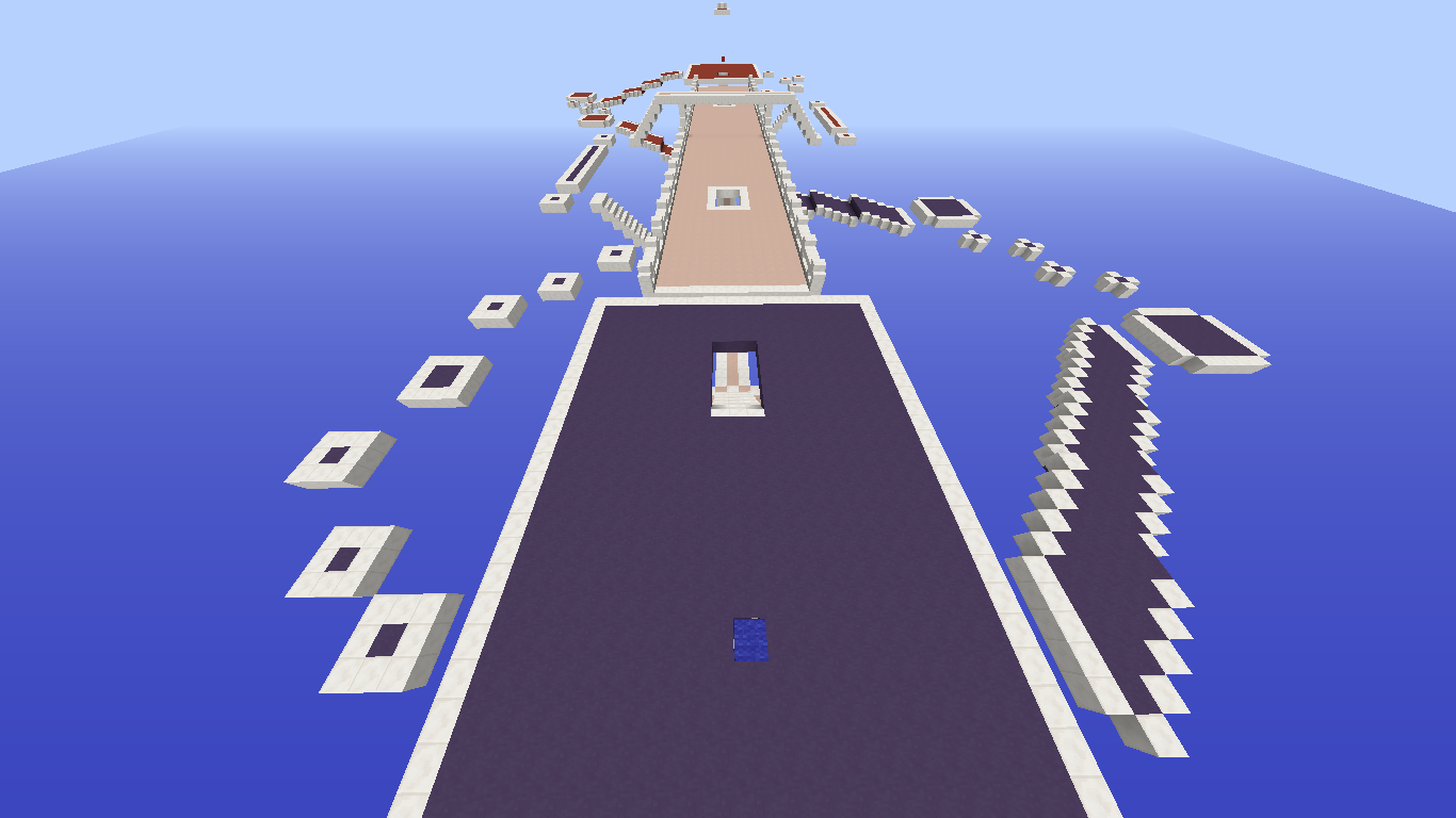
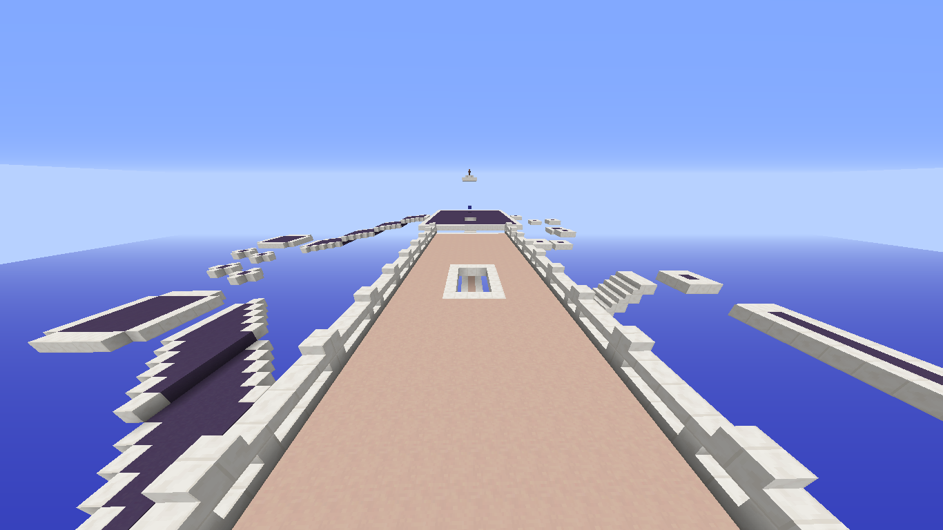
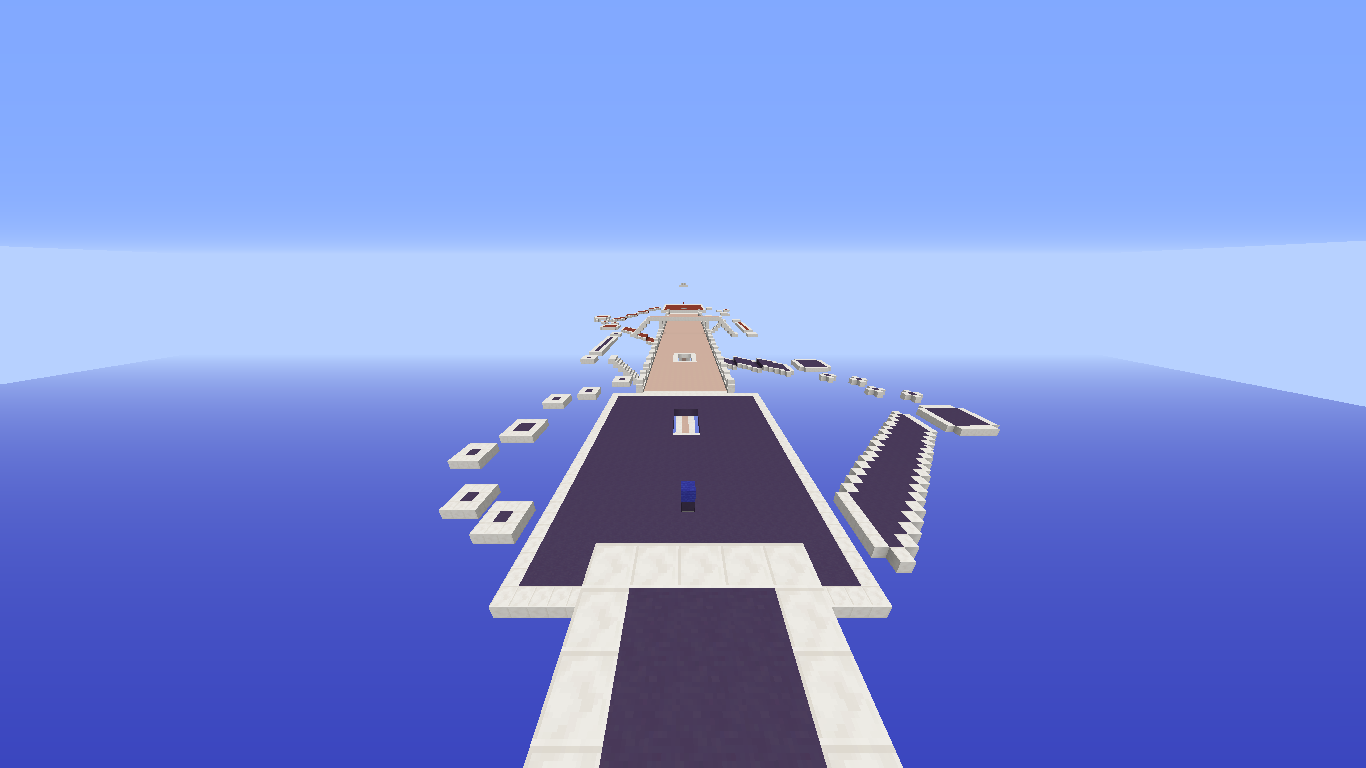
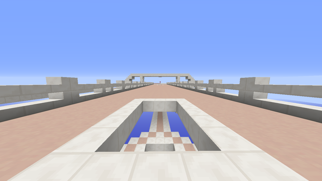
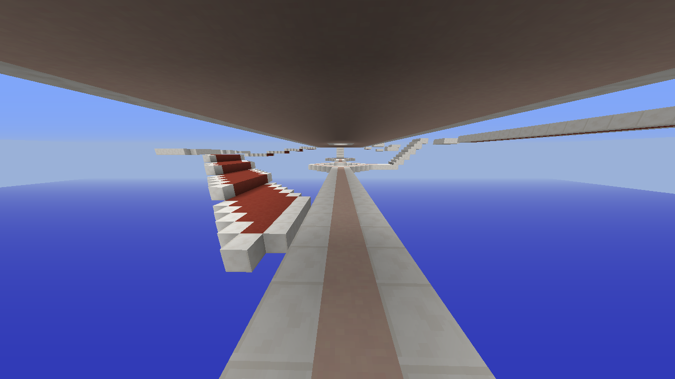
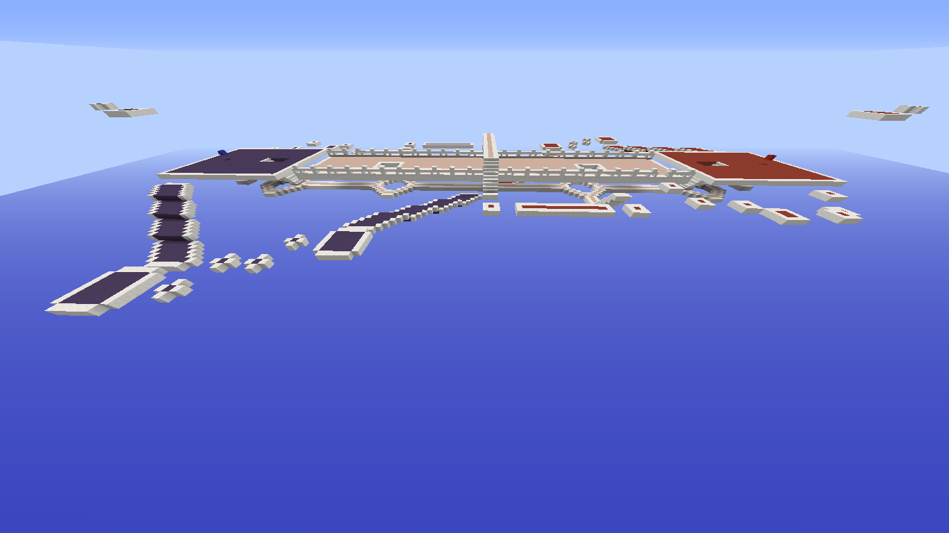
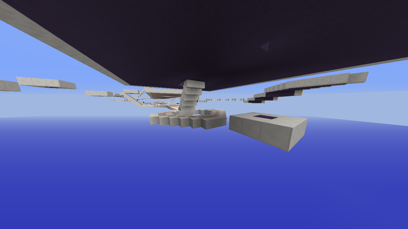
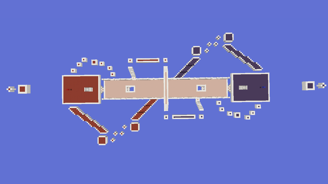
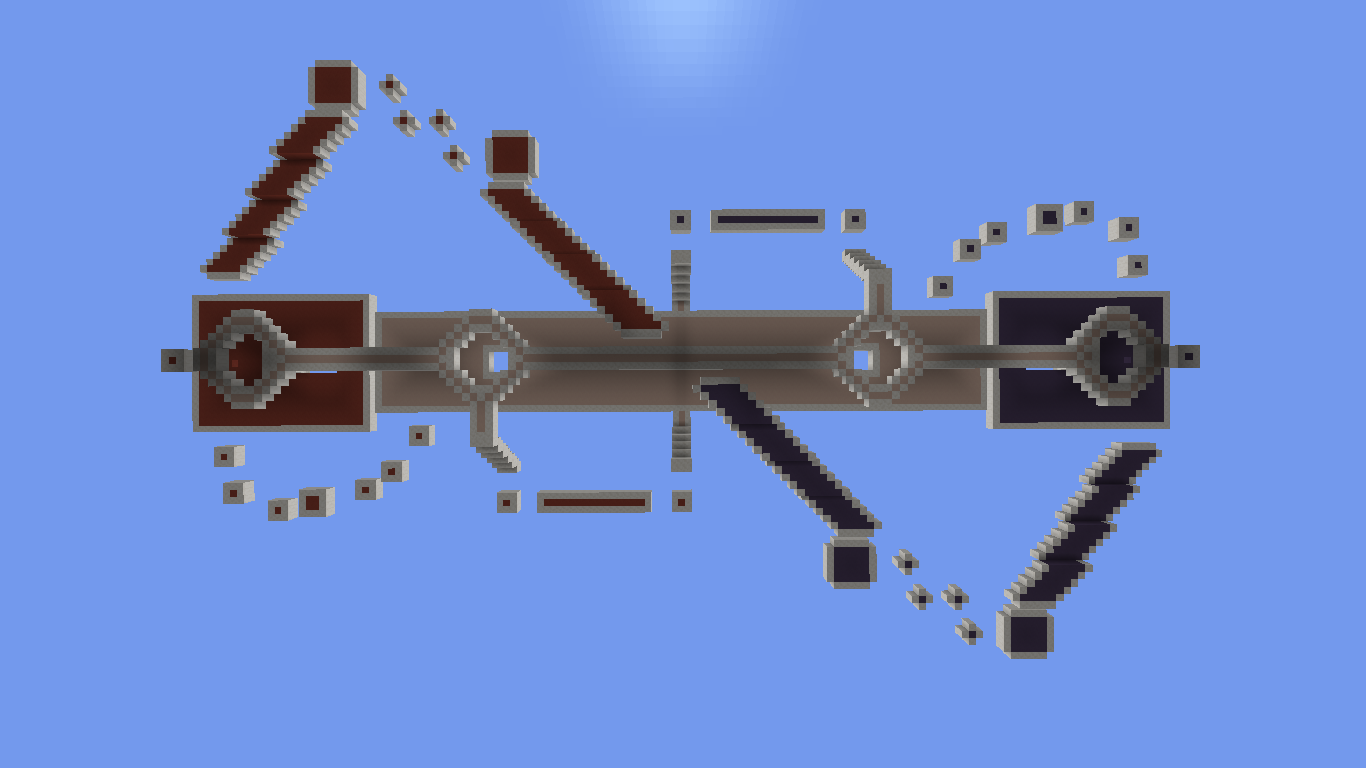
The difference that this map has with respect to the others (since it would be the same and would not make sense), are the different ways it has to reach the enemy flag, merging some paths of the mentioned maps and creating completely different ones, such as the path of stairs (under the map) that goes directly to the enemy flag, the bridge in the middle of the map, or the two side paths that leave you less than 10 blocks of the enemy flag.

I hope you like this map, any kind of feedback is well received, thank you for reading.
The Paths 1.png

The Paths 2.png
The Paths 4.png

The Paths 5.png


The Paths3.png
The Paths 10.png
The Paths 9.png
The Paths 8.png
The Paths 7.png
The Paths 6.png
 

Marieke2001

Forum Professional
Jul 2, 2015
4,115
15,519
679
Err I don’t really like it. It seems to plain to me. You’re forced to go trough mid and might get lucky to use the side tracks, but I think that’s to easy. I would like to see some more side tracks, where it’s harder to chase the enemy, because now you can wait till they come to you.
 
  • Like
Reactions: LonelyNartyta

Eli

Moderator
Team CubeCraft
🔨 Moderator
Dec 25, 2017
1,437
7,899
408
19
Bogota, Colombia
Pronouns
He/They
Map: The Paths

Creators: _Dreamlike & NartytaUnicorn

Description: First of all, we do not know if they will take into account the maps sent from the current featured games, but here we go.

For those who don't play as much blockwars and for those who do, you will know that blockwars maps can be as complex and large as: nuclear, pirates, icy peaks, brigde, etc.

But they can also be as simple and small as retro99, greenzone, palette, positive, blockarena, (these were the maps that inspired us to create this map, since personally they are the best).

All have something in common, and is that they are built with blocks of quartz and stained hardened clay.

The difference that this map has with respect to the others (since it would be the same and would not make sense), are the different ways it has to reach the enemy flag, merging some paths of the mentioned maps and creating completely different ones, such as the path of stairs (under the map) that goes directly to the enemy flag, the bridge in the middle of the map, or the two side paths that leave you less than 10 blocks of the enemy flag.

I hope you like this map, any kind of feedback is well received, thank you for reading.
View attachment 153687
View attachment 153685 View attachment 153686
View attachment 153688

View attachment 153689 View attachment 153690 View attachment 153691 View attachment 153692 View attachment 153693 View attachment 153694
Eurm no, the map lacks a lot of detail and isn’t very aesthetically pleasing. It seems too plain and rushed in my opinion, plus it’s almost the same thing as Retro99 with the main path and the additional paths on the sides that involve parkour.
Retro99 at least has an interesting gameplay aspect which is the lower level for the main path in the center.
In my opinion this map doesn’t propose much variation for gameplay and feels like simply playing on a square in the middle of the void.
It’s lacks obstacles and terrain variation.
The small platforms at the sides involve too much of tedious parkour for anyone to find it a viable way of transport (just like the parkour in palette).
In my opinion, this shouldn’t be added because it lacks creativity.
 

_The13thDoctor_

Forum Professional
Jul 23, 2016
6,089
14,320
629
20
Chicago, Illinois
www.cubecraft.net
Pronouns
He/Him
Map: The Paths

Creators: _Dreamlike & NartytaUnicorn

Description: First of all, we do not know if they will take into account the maps sent from the current featured games, but here we go.

For those who don't play as much blockwars and for those who do, you will know that blockwars maps can be as complex and large as: nuclear, pirates, icy peaks, brigde, etc.

But they can also be as simple and small as retro99, greenzone, palette, positive, blockarena, (these were the maps that inspired us to create this map, since personally they are the best).

All have something in common, and is that they are built with blocks of quartz and stained hardened clay.

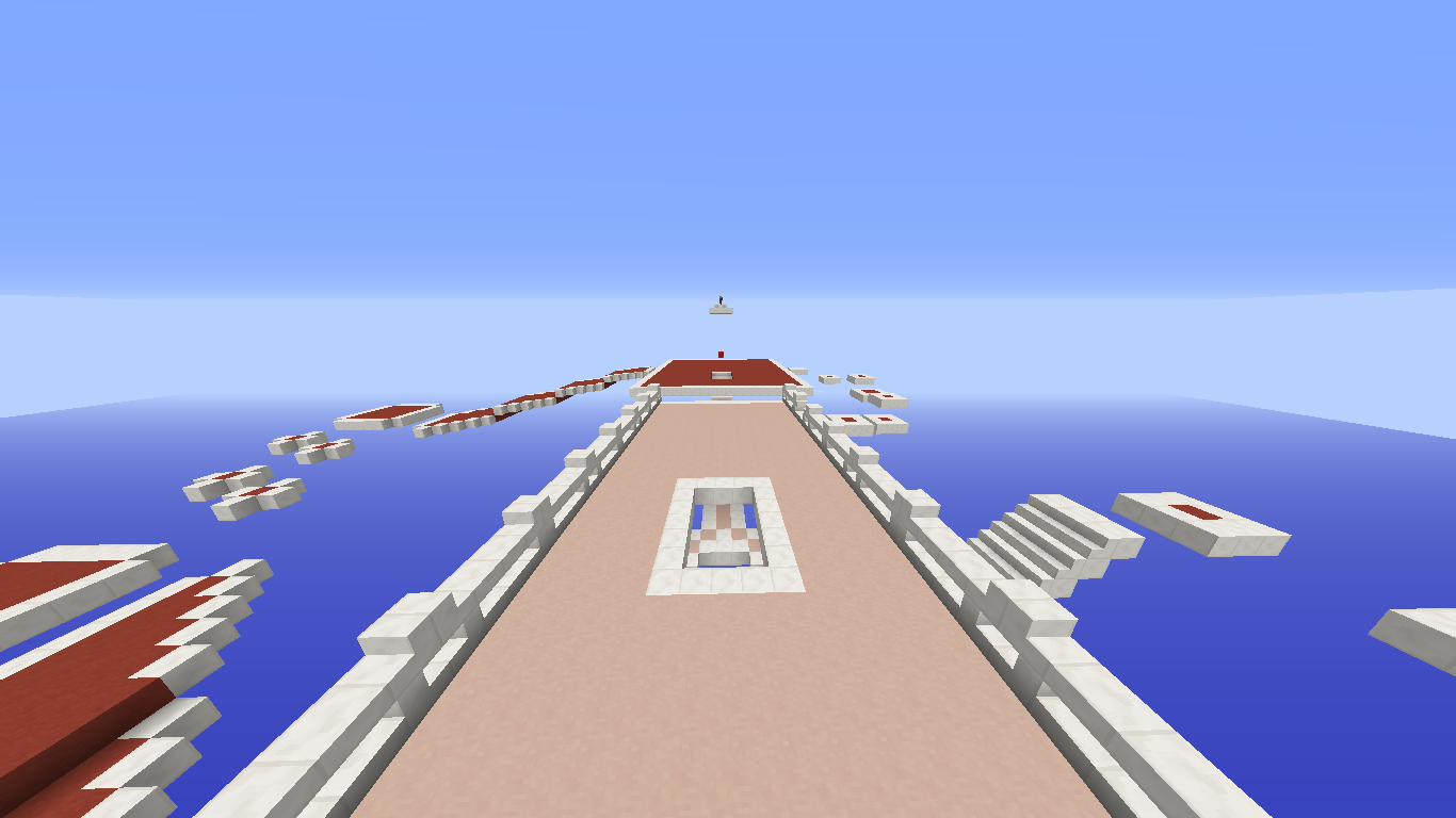
The difference that this map has with respect to the others (since it would be the same and would not make sense), are the different ways it has to reach the enemy flag, merging some paths of the mentioned maps and creating completely different ones, such as the path of stairs (under the map) that goes directly to the enemy flag, the bridge in the middle of the map, or the two side paths that leave you less than 10 blocks of the enemy flag.

I hope you like this map, any kind of feedback is well received, thank you for reading.
View attachment 153687
View attachment 153685 View attachment 153686
View attachment 153688

View attachment 153689 View attachment 153690 View attachment 153691 View attachment 153692 View attachment 153693 View attachment 153694

I don't like it but you should totally submit that Unicorn one you posted a long time ago.
 
  • Like
Reactions: LonelyNartyta

Efcluke94

👀
Oct 20, 2013
3,000
9,470
678
Is this the 4 or 5th blockworks map that has been submitted, pls. Compared to other BW maps I've looked at this just seems too basic just when I first looked at it didn't make me go "oh damn this map needs to be added right now", I pretty much typed my first thoughts..
It's basically a direct copy of an already existing map. The only difference is the outside of the map

The way it looks definitely isn't pleasing me and all in all this map doesn't seem to offer anything new

Yah this ^ I get that you wanted to make a simple map but if you put this next to those other maps and I played all of them consecutively I probably wouldn't be able to tell the difference. Locking since this won't be added and you're 10 to 18. Sorry but maybe try to use a more creative theme next time to stand out and pick a different game
 
Status
Not open for further replies.
Members Online

Team online

Members online

Latest profile posts

Thank you for 6.1K! ❤️
Apparently I hack IN PARKOUR LOLOLOL
IMG_6919.png

😂🤣

After uttering those 3 words, the dude left and gave me a free win xD
A picture of my cat sleeping having kitty dreams
1000053259.jpg
kfccaleb wrote on WayneX4's profile.
You can now have a follow after I played with you!
How do you make spoilers with a name?
Top Bottom