Minecraft PC IP: play.cubecraft.net

Should this be Implemented?


  • Total voters
    10

Eli

Moderator
Team CubeCraft
🔨 Moderator
Dec 25, 2017
1,437
7,899
408
19
Bogota, Colombia
Pronouns
He/They
I have been having an extremly difficult time trying to understand what in my feed is new and what isn't. It has lead me to missing out on so many things because it's basically impossible to remember or tell by the minimal colour difference that I've already seen some of these notifications. And I end up reviewing content that I've already seen for a second time. So I'm suggesting to please change the background colour of already seen notifications to something VERY noticeable because the current one is just impossible to distinguish.

The first notification is new, and the rest are old. Do you see how the colour is barely different? It's really hard to tell, I hope this is changed soon c:
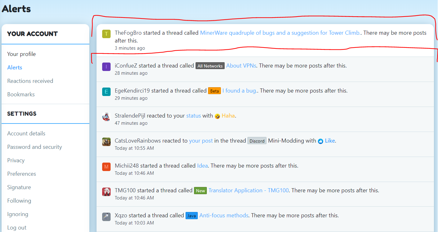
wqfqwgqwg.PNG
 

LordSidi0us

Forum Expert
Mar 1, 2019
2,447
2,096
254
Coruscant
I have been having an extremly difficult time trying to understand what in my feed is new and what isn't. It has lead me to missing out on so many things because it's basically impossible to remember or tell by the minimal colour difference that I've already seen some of these notifications. And I end up reviewing content that I've already seen for a second time. So I'm suggesting to please change the background colour of already seen notifications to something VERY noticeable because the current one is just impossible to distinguish.

The first notification is new, and the rest are old. Do you see how the colour is barely different? It's really hard to tell, I hope this is changed soon c:
View attachment 167956
It's a bit of an issue for me as well, and it's a bit annoying, I can agree.
Changing the colour to something like bright red will make things more understandable and easier to read.
That's the colour that I suggest.
 
  • Like
Reactions: Eli

Gson

Novice Member
Feb 19, 2020
79
41
34
England
github.com
Either, implementing colour codes or potential tags will allow for players to figure out which is which. I can see and understand that this can be an issue.
 
  • Like
Reactions: Eli

Savvy

Well-Known Member
Aug 31, 2019
259
168
94
20
I agree, with the old cubecraft website I was lost on everything. But the new update made it much better but needs improvement on new/seen messages. Maybe adding color to help tell the difference between the two or adding an obvious [Seen] or [New] bar in the corner or something.
 
  • Like
Reactions: Eli
Members Online

Team online

Latest profile posts

Watching the sun set... 🌅

1732368294873.png
Hello Guys i had been playing cubecraft for 1 year and 2 months and i got pretty good at it. i am good at games like CTF And Bridges
CalvinxKlein wrote on ItzJxrry's profile.
jerry egril or egirl?
Mappoe wrote on JokeKaedee's profile.
thnak you for the follow kae!! have it back
New predictions based on the news we got this week:
- New Snowman Survival maps are most likely releasing sometime next week
- OG EggWars update is releasing in a couple of weeks according to Cam through Discord (screenshot below).
A couple of weeks is usually 2 weeks but sometimes can be 3 weeks.
1732356369106.png
Top Bottom