Minecraft PC IP: play.cubecraft.net

Do you think this map should be added?

  • Yes

    Votes: 4 20.0%
  • No [Tell me why]

    Votes: 16 80.0%

  • Total voters
    20

Injunction

Forum Expert
Sep 2, 2016
8,702
6,120
353
In A Box In San Francisco
After about 3-4 hours and a few breaks the big one being to have lunch and watch a short documentary called Atlantis Found
by the way if you like Myths and Legends i would Highly recommend it anyways i made a team map called camp
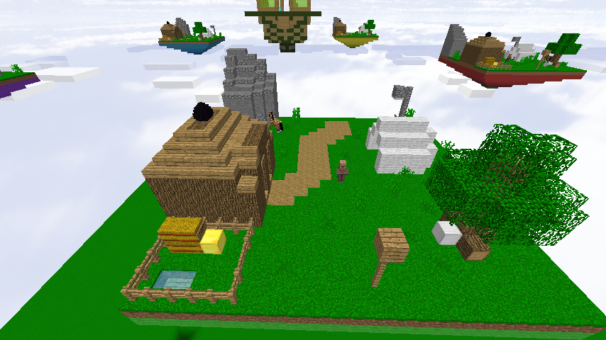
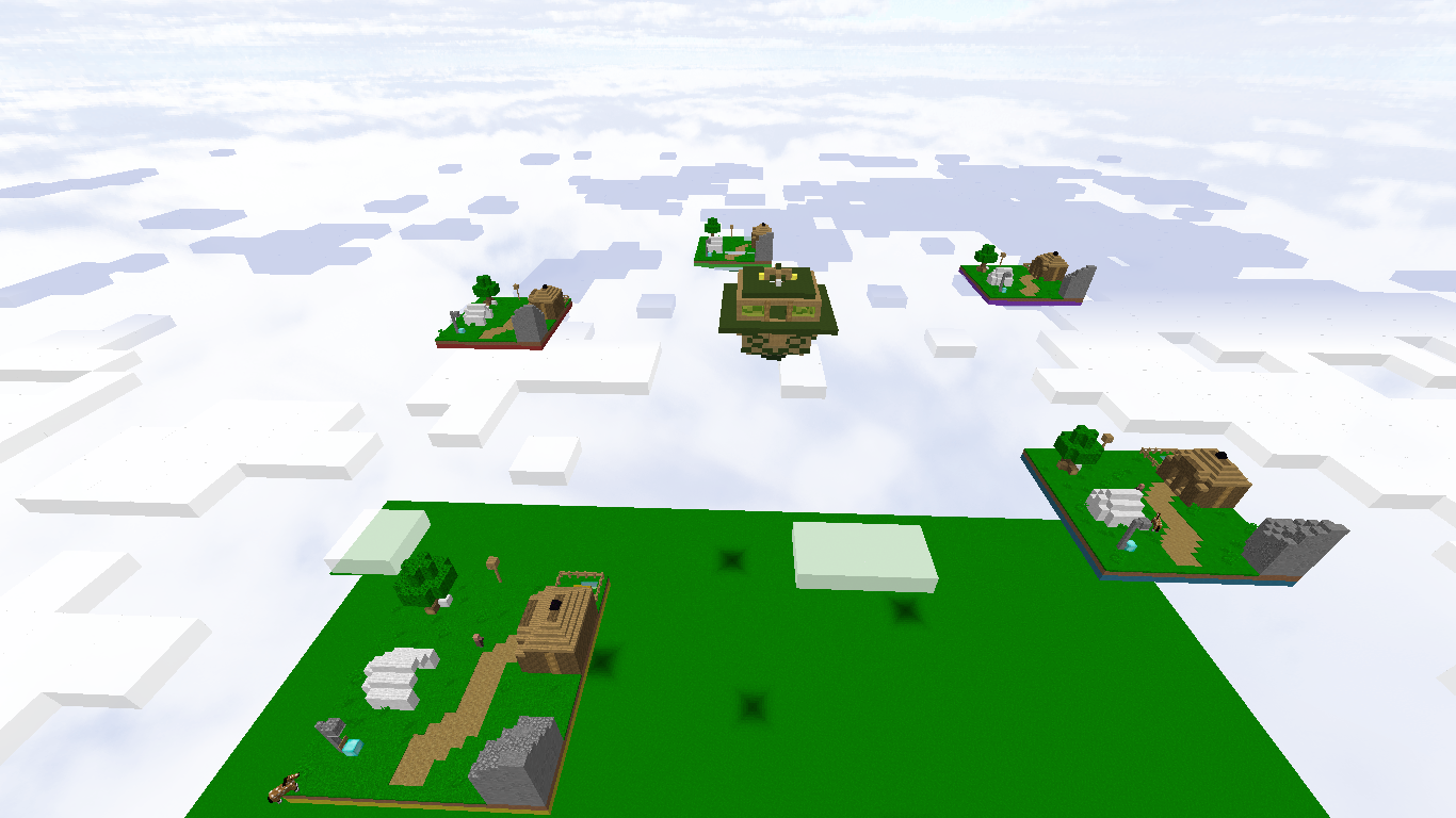
Teams: I made 5 but feel free to change it to 6 if you want but only 5-6 islands would makes sense
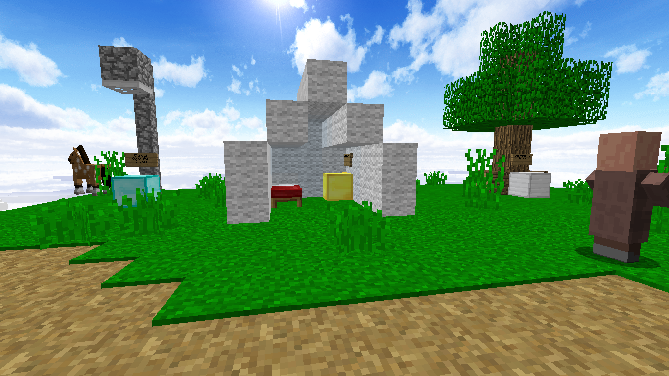
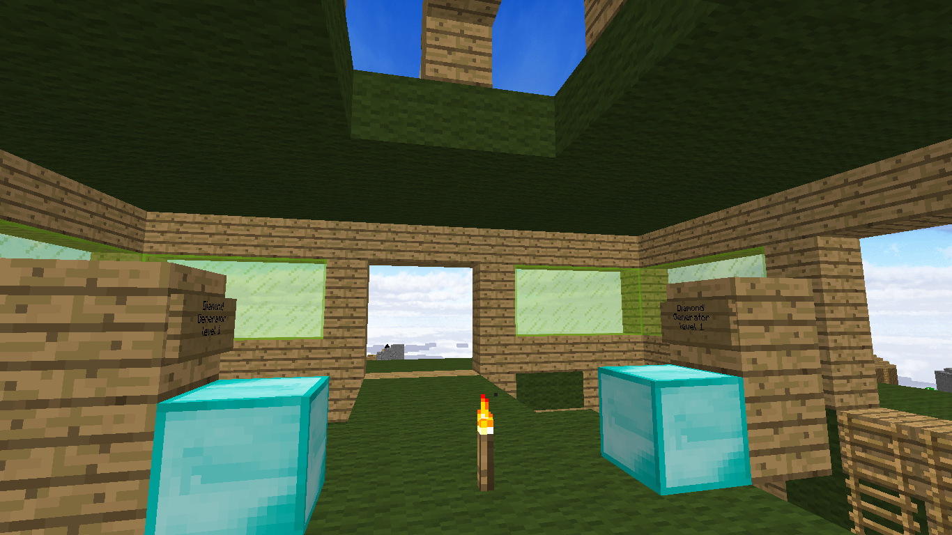
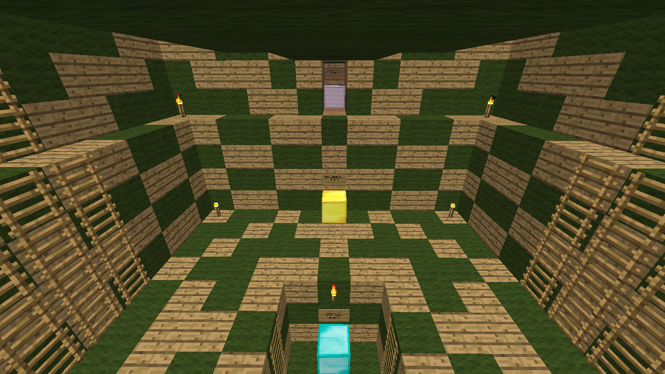
Generators: Player's Island - 3 lvl 2 Iron, 2 lvl 1 gold, 1 broken diamond - Middle island - 2 lvl 2 and 2 lvl 4 iron, 2 lvl 2 and 2 lvl 3 gold, diamond 2 lvl 2 and 2 lvl 1
Players: 3 per team
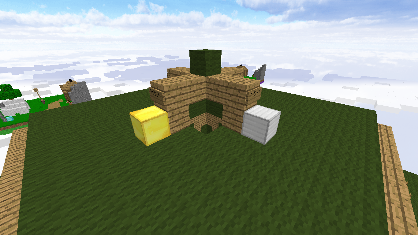
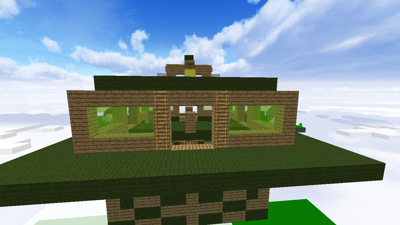
every thing is symmetrical in the middle island

the reason for less detail but i forgot to type that my reason is because i couldn't think of any other ideas
of what to put and i knew somebody would bring that up but i simply couldn't think of something to add

I worked really hard on it I hope you like it
2016-10-01_16.54.29.png
2016-10-01_17.31.28.png
2016-10-01_16.54.56.png

2016-10-01_16.55.08.png

2016-10-01_16.55.25.png

2016-10-01_16.55.36.png

2016-10-01_16.55.48.png
2016-10-01_16.56.32.png
 

Attachments

  • 2016-10-01_16.54.56.png
    2016-10-01_16.54.56.png
    411.5 KB · Views: 44
Last edited:

Younisco

Forum Professional
May 13, 2014
8,008
19,695
669
22
london
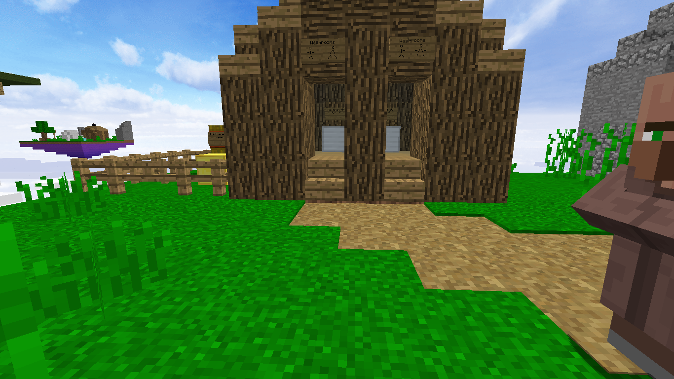
I like the theme idea, however SO much more detail can be put into this. For instance, the tents can be bigger, there can be custom dead trees, etc. Plus, I think there's already a camp-type Solo Eggwars map; Teepee. :P
 

Injunction

Forum Expert
Sep 2, 2016
8,702
6,120
353
In A Box In San Francisco
I like the theme idea, however SO much more detail can be put into this. For instance, the tents can be bigger, there can be custom dead trees, etc. Plus, I think there's already a camp-type Solo Eggwars map; Teepee. :p
first of all thank you for reminding me i was gonna explain the reason for less detail but i forgot to type that my reason is because i couldn't think of any other ideas
of what to put and i knew somebody would bring that up but i simply couldn't think of something to add second of all there is a reason that it is it's size is because I was originally going to make it a player map but some technical difficulties got in the way third of all dead trees is a good idea but if they use it they will have to add them for i don't know where the game was i fell into the void and lost it i will eventually find it tho finally Tee-pee is in solo egg wars not team and Tee-Pee is based off of Native Indians not Campers
 

Cynamooo

Forum Veteran
Aug 26, 2015
2,659
6,336
463
22
It's looks a little bit flat and boring in my opinion, I didn't say it's bad because the concept is really funny but I miss detail. If you add more details like: Bigger house, more decoration on the island and even the downside of the island is too flat in my opinion. Adding details is the main key to succes in this case, but the idea is cool :)
 

Thaus

Forum Expert
Jul 6, 2016
2,719
2,063
273
In a chicken coop
Honestly, this needs more work. There aren't very many terrain like stuff and is sort of lacking the "wow' factor. The details are all sort of plain and your center could use a lot more color. I would also like there to be more texture in the starting islands. Not just the middle.
 

Yamin

Forum Veteran
May 8, 2016
1,064
4,119
409
the sushi bar
I like the concept too, but like the otters Said: its too simple.
Maybe add a campfire and give the tent and the house some more detail.
BTW, I recommand using world edit, Voxel Sniper and Go Brush: they're verry usefull when making maps like these.
 

RockBob4

Dedicated Member
May 14, 2016
1,539
544
188
The islands are too square. I really like the theme and the fact that it's a three player map. Keeping working on maps!
 

TheQueenWaddle

Dedicated Member
Jan 3, 2016
959
572
168
After about 3-4 hours

the reason for less detail but i forgot to type that my reason is because i couldn't think of any other ideas
of what to put and i knew somebody would bring that up but i simply couldn't think of something to add
Sorry to break it to you, but "not being able to think of more" is not an excuse.
I really don't care how much time you put into (putting it bluntly). If someone can make a godly map in 10 minutes, I'd accept it. If someone spent 6 weeks on a map that doesn't meet standards, I'd reject it.
 

Injunction

Forum Expert
Sep 2, 2016
8,702
6,120
353
In A Box In San Francisco
Sorry to break it to you, but "not being able to think of more" is not an excuse.
I really don't care how much time you put into (putting it bluntly). If someone can make a godly map in 10 minutes, I'd accept it. If someone spent 6 weeks on a map that doesn't meet standards, I'd reject it.
oh i am sorry it isn't my fault from how old i am Ms. perfect

Tip think before you act
 

Yamin

Forum Veteran
May 8, 2016
1,064
4,119
409
the sushi bar
Not just the middle.
half the time spent building was done on the middle there shall be no changing of the middle the wall paturns are so detailed it is the other islands that aren't[/QUOTE]
I think you really should make Some changes in the middle, this is the kind of detail where everyone is talking about,
https://www.google.com/search?q=min...ei=CznwV6j6IcPcaNiKjoAC#imgrc=f89qfbl32v53OM:
just making a patern with wool doesnt make it more detailed at al
BTW, the islands dont even have the same distance from the middle
 

Yamin

Forum Veteran
May 8, 2016
1,064
4,119
409
the sushi bar
Sorry to break it to you, but "not being able to think of more" is not an excuse.
I really don't care how much time you put into (putting it bluntly). If someone can make a godly map in 10 minutes, I'd accept it. If someone spent 6 weeks on a map that doesn't meet standards, I'd reject it.
I think you're a little bit hard, I mean if you dont like it say it, but this is a little bit rude
 

rediscovered

Well-Known Member
Oct 3, 2015
64
6
84
also i used world edit
If you used world edit why is the the boom of the island lacking tons of detail, also the middle is shapped weird the mountains are messed up and the tree isn't custom and looks ugly and doesn't seem to be standards of the regular eggwars maps and also theres no void
 

Thaus

Forum Expert
Jul 6, 2016
2,719
2,063
273
In a chicken coop
If you used world edit why is the the boom of the island lacking tons of detail, also the middle is shapped weird the mountains are messed up and the tree isn't custom and looks ugly and doesn't seem to be standards of the regular eggwars maps and also theres no void

Don't be to harsh and also add tips please.
 
Members Online

Members online

Latest profile posts

Thank you for 6.1K! ❤️
Apparently I hack IN PARKOUR LOLOLOL
IMG_6919.png

😂🤣

After uttering those 3 words, the dude left and gave me a free win xD
A picture of my cat sleeping having kitty dreams
1000053259.jpg
kfccaleb wrote on WayneX4's profile.
You can now have a follow after I played with you!
How do you make spoilers with a name?
Top Bottom