Actualy the hotbar have 3 interfaces of information and colleccionables: loot, profile, shop and 2 items, the update boock and the lobby selection. Also the gadget spawn in the middle (slot5) and the ballon in slot 6.


the hotbar can be better but in my opinion is correct, but the problem and why i decided made this post are the interfaces
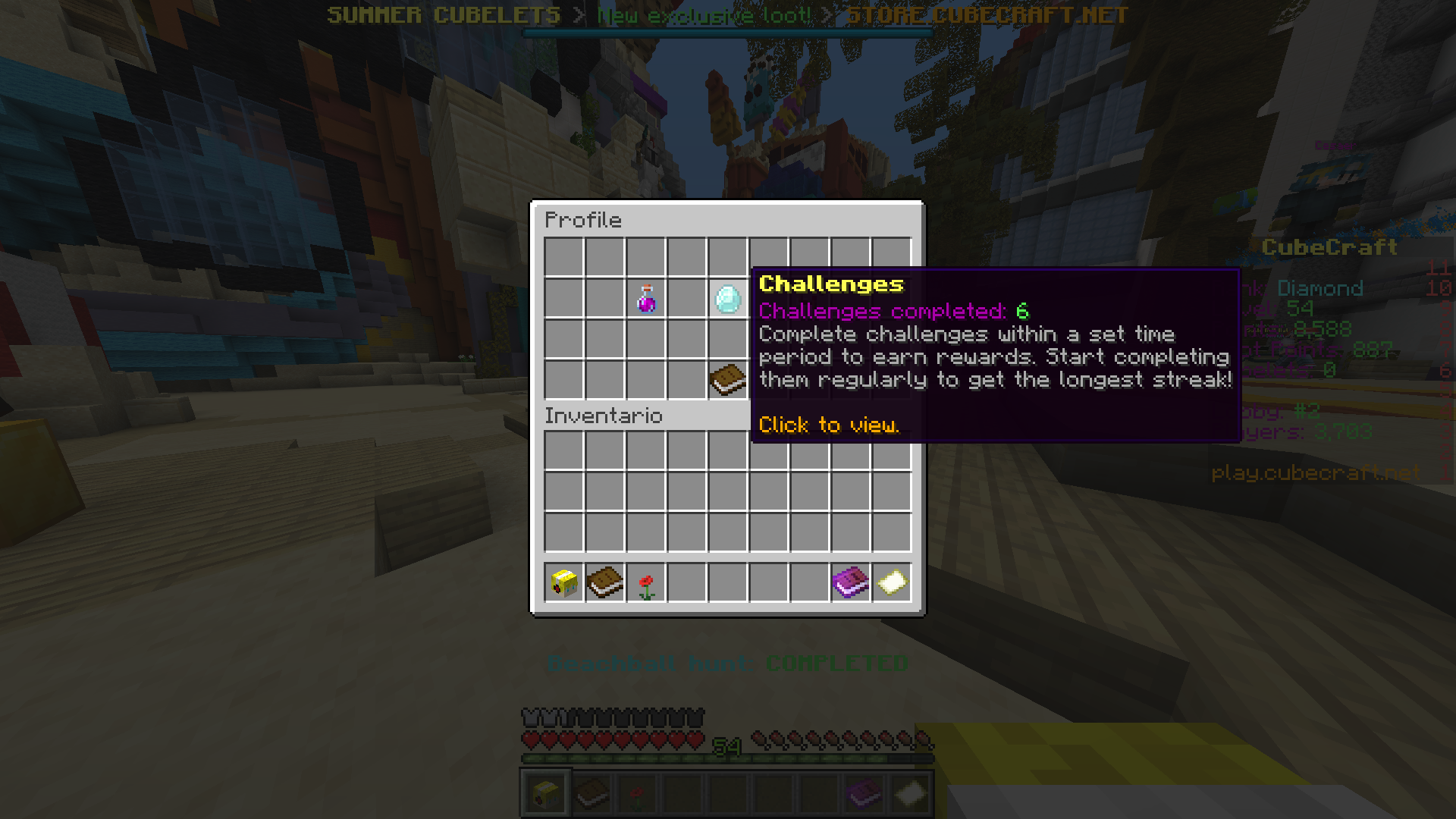
1.Challenges and achievements
The challenges and achievements are located in the profile menu..... why?
it make no sense, challenges give you rewards like cubelets points and experience, in my opinion any of the 3 interfaces has the same relation with challenges/achievements: cubelets have relation with loot, exp with profile and points with coins, so i think than the correct is give it his own interface with a diamond in the hotbar like it was or add an NPC idk use your imagination.
2.Player stats
players stats are located in loot and shop and not in profile, i dont want to explain this, is obiously than the stats of your EXP and points must be on your profile.
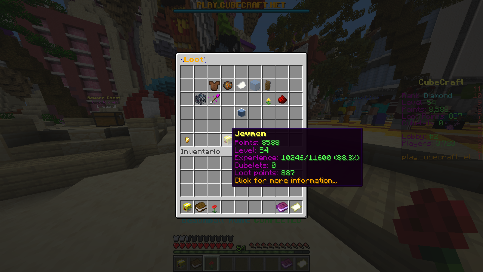
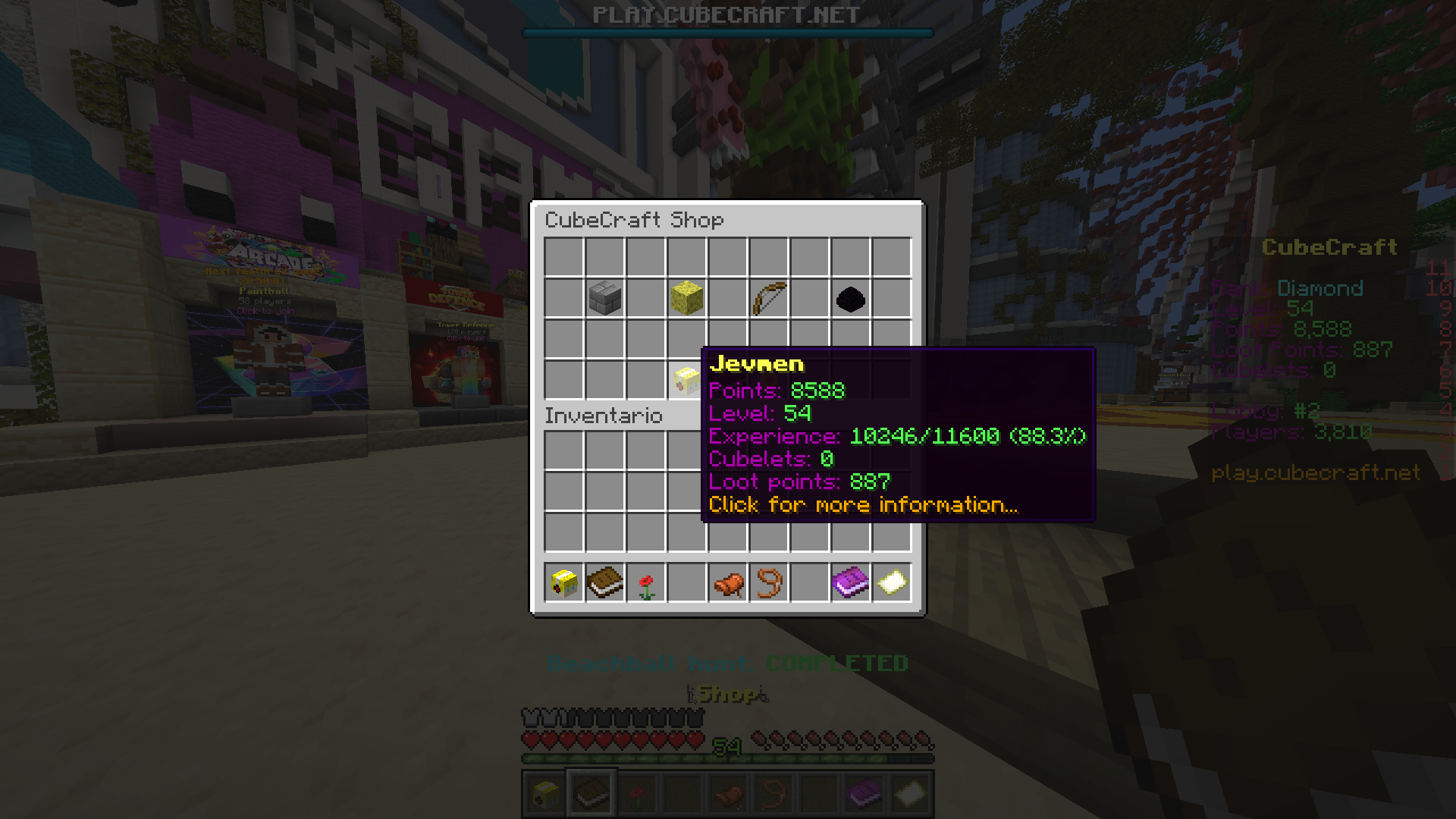
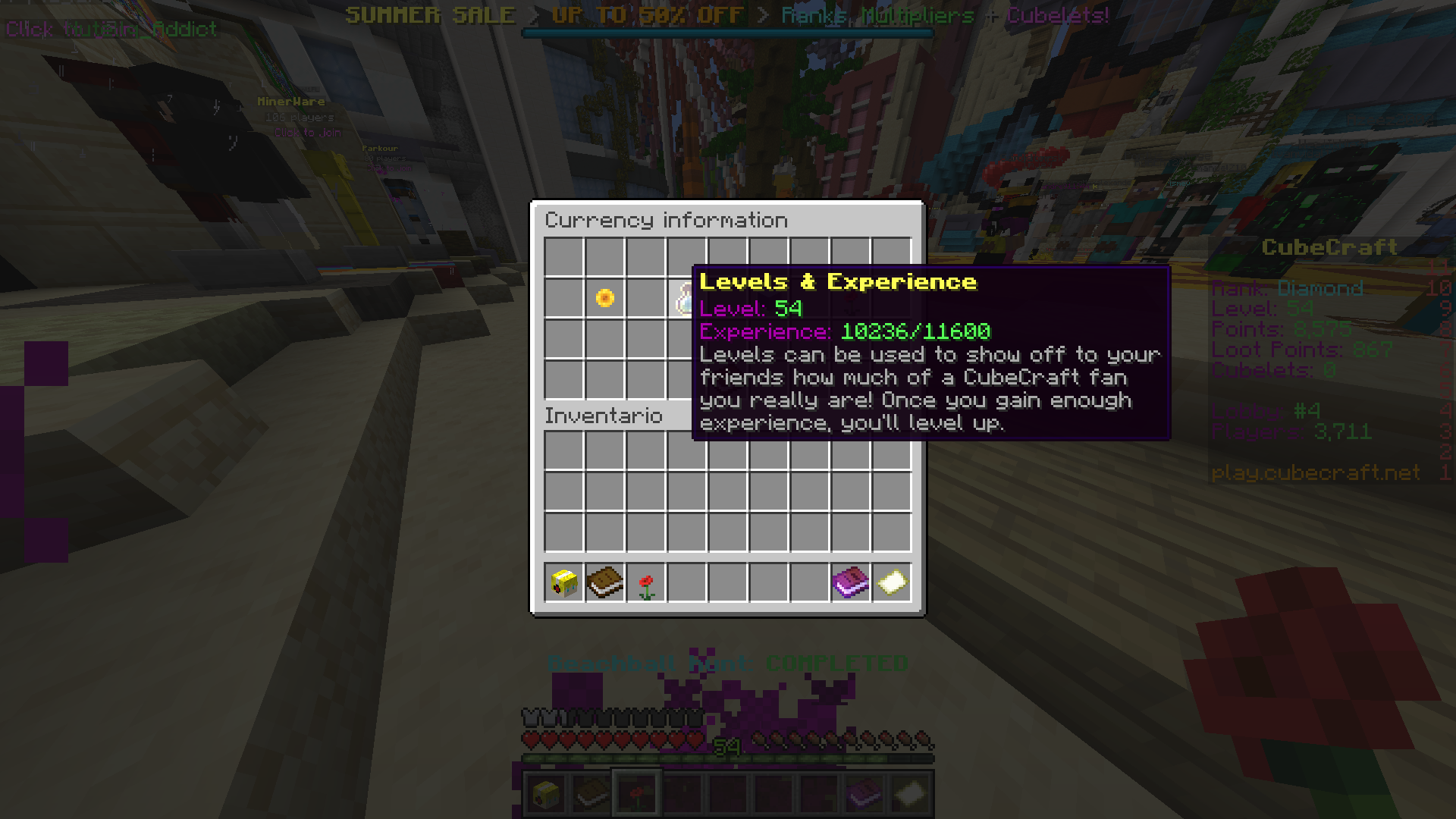
The easy way to fix this is just add a extended version of the stats to the profile menu and profile will be a little interesting because actualy only have settings and challenges/achievements than are bad located also in the point multiplayer where stats are actualy located
3.loot menu
the loot menu is very decent and good ordered but points boosters are not related to loot because give you points and exp not lootpoints or cubelets, boosters must be on shop because you buy them
And i have a question, why the loot look like this?
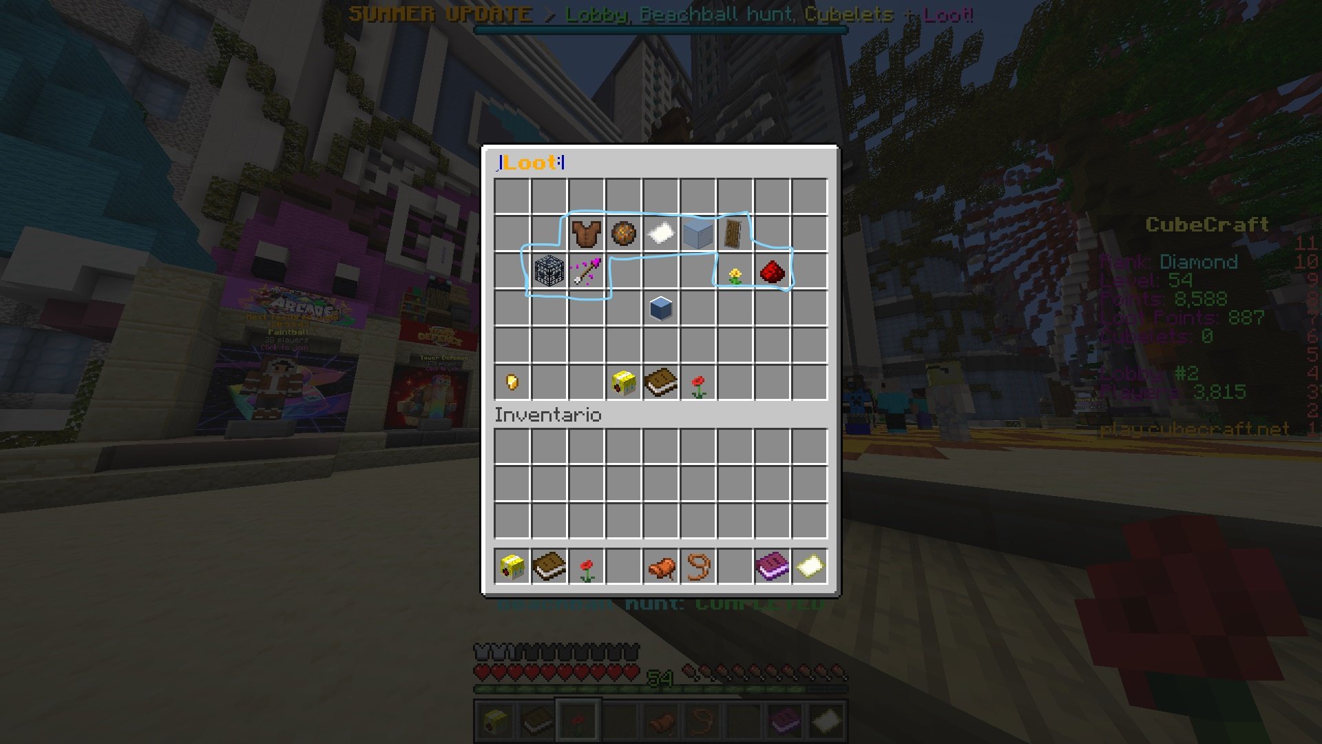 there are a lot of ways to order 9 items and you choosed this position, it look cool but why not place a 3x3 or a 9x1
4Lobby selection
actualy lobby selection is represented with a empty map, in my opinion this is bad because the empty map is activated when you use it so you will hear a small souns and the map will appear and dissapear, this is not very problematic but if you have some lag you will se the map appear before the travel menu
5Shop
the shop can be as correct as can be a shop, only 4 games use shop so is correct, but seriously, do something nobody use this because you can buy kits ingame. idk add new things to buy like cosmetic things with lootpoints because actualy lootpoints are useless (this give me a great idea :))
also is fun to see the store link everywhere except in the shop XD
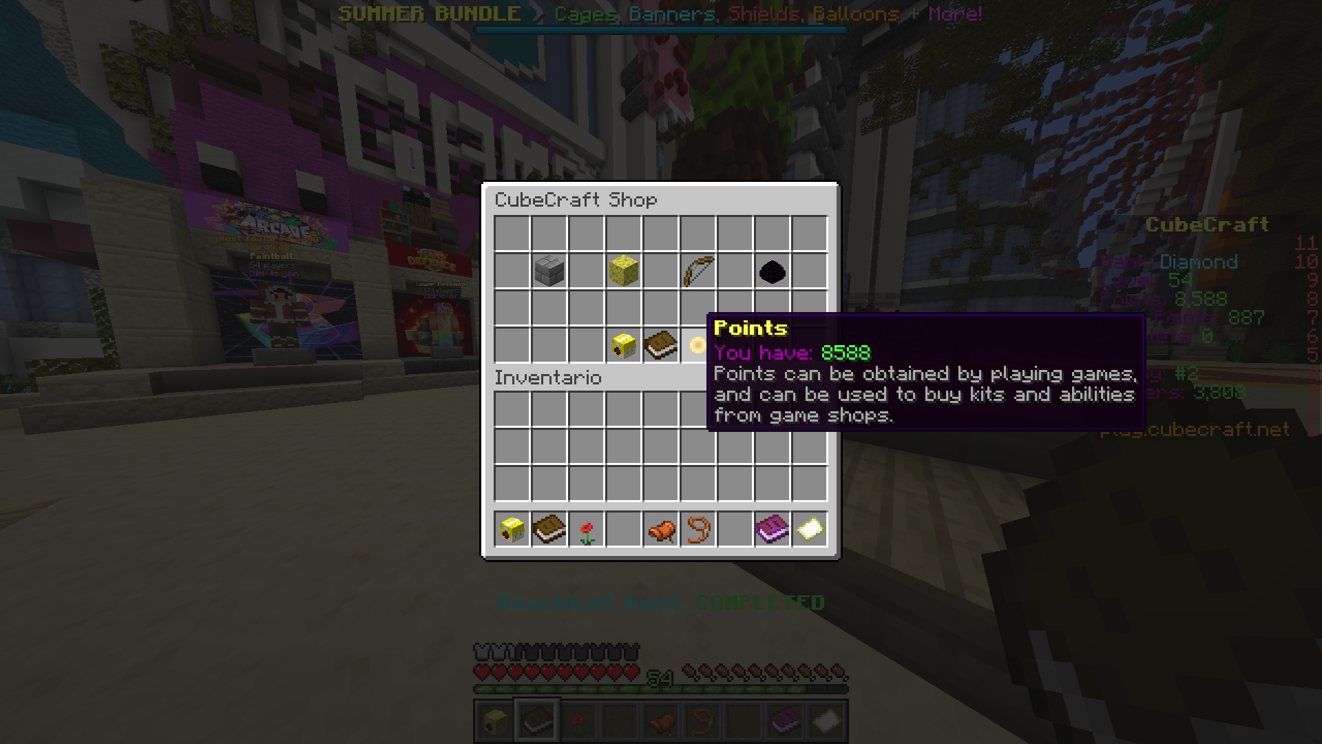
6update book
seriously, you consume one slot of the hotbar for the book? it can be anywhere or be a link somewhere in chat anouncements.
if i want to see the updates i can go to the forums, is not as important for have a slot in the hotbar
basicy i think than a good order is this: the paper is the lobby selection
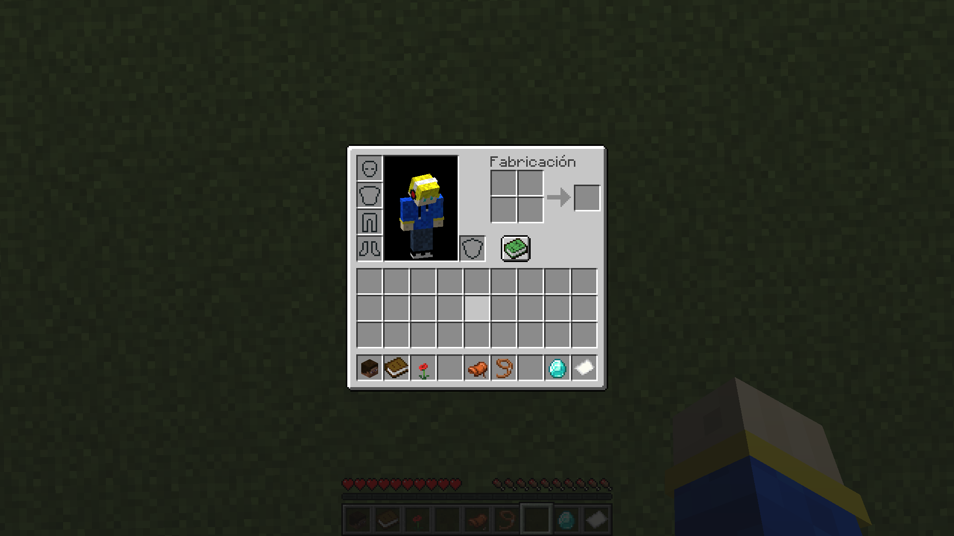
shop: the the letter is the shop link
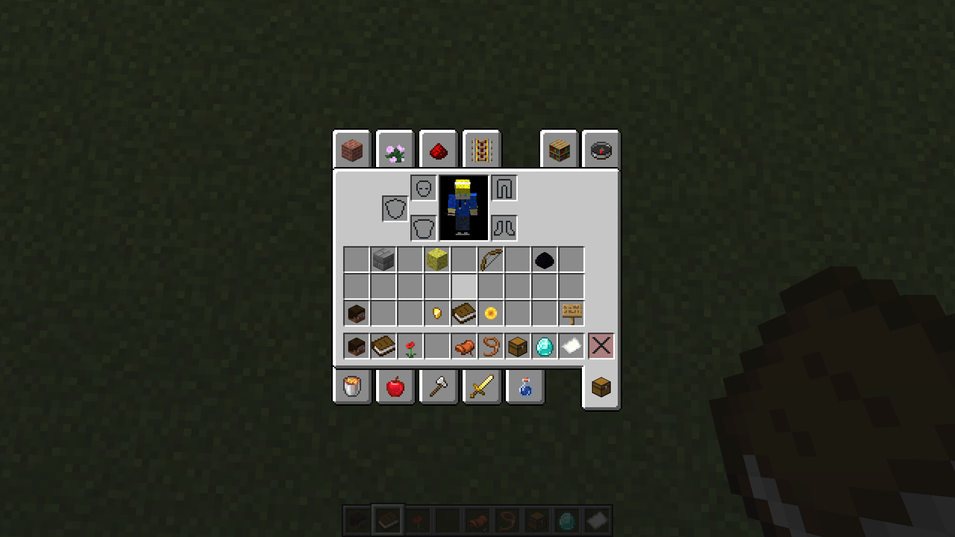
profile:
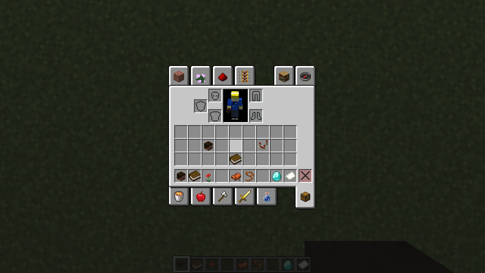
challenges: blaze powder are the special challenges like the summer challenges
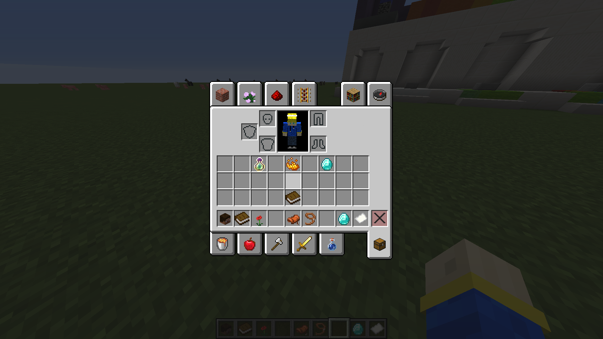
Ok this was all my opinion thanx for your time, i only wanted to say this problem of the server because most of time i forget where are the things, and new users will need a lot of time for learn how this work.
sorry for my bad english
you are free to say what you want or post better position for interfaces
and YES THIS IS USELESS AND NOT NECESARY BECAUSE WE ACTUALY HAVE A HOTBAR!
thanx for your time :)
the hotbar can be better but in my opinion is correct, but the problem and why i decided made this post are the interfaces
1.Challenges and achievements
The challenges and achievements are located in the profile menu..... why?
it make no sense, challenges give you rewards like cubelets points and experience, in my opinion any of the 3 interfaces has the same relation with challenges/achievements: cubelets have relation with loot, exp with profile and points with coins, so i think than the correct is give it his own interface with a diamond in the hotbar like it was or add an NPC idk use your imagination.
2.Player stats
players stats are located in loot and shop and not in profile, i dont want to explain this, is obiously than the stats of your EXP and points must be on your profile.
The easy way to fix this is just add a extended version of the stats to the profile menu and profile will be a little interesting because actualy only have settings and challenges/achievements than are bad located also in the point multiplayer where stats are actualy located
3.loot menu
the loot menu is very decent and good ordered but points boosters are not related to loot because give you points and exp not lootpoints or cubelets, boosters must be on shop because you buy them
And i have a question, why the loot look like this?
4Lobby selection
actualy lobby selection is represented with a empty map, in my opinion this is bad because the empty map is activated when you use it so you will hear a small souns and the map will appear and dissapear, this is not very problematic but if you have some lag you will se the map appear before the travel menu
5Shop
the shop can be as correct as can be a shop, only 4 games use shop so is correct, but seriously, do something nobody use this because you can buy kits ingame. idk add new things to buy like cosmetic things with lootpoints because actualy lootpoints are useless (this give me a great idea :))
also is fun to see the store link everywhere except in the shop XD
6update book
seriously, you consume one slot of the hotbar for the book? it can be anywhere or be a link somewhere in chat anouncements.
if i want to see the updates i can go to the forums, is not as important for have a slot in the hotbar
basicy i think than a good order is this: the paper is the lobby selection
shop: the the letter is the shop link
profile:
challenges: blaze powder are the special challenges like the summer challenges
Ok this was all my opinion thanx for your time, i only wanted to say this problem of the server because most of time i forget where are the things, and new users will need a lot of time for learn how this work.
sorry for my bad english
you are free to say what you want or post better position for interfaces
and YES THIS IS USELESS AND NOT NECESARY BECAUSE WE ACTUALY HAVE A HOTBAR!
thanx for your time :)


