Hello all! I have an idea about the important information and others. I had this problem before and I need enough of help until found out what everyone try to tell me.
maybe your asking what I'm talking about? I'm talking about important messages or how to apply for staff member and others, will divide this topic into 2 parts.
1.Report rules
2.apply for staff
1.Report rules
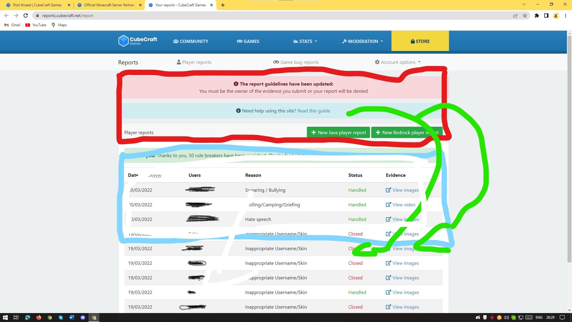
When you're reporting there are two really Important messages that you need to see before you report, but this messages are smaller than everything other in there so enough of people miss them.

They can be sawed but most of the people ignore them, my idea is to make it little large because they are important than the players you have reported, I mean names can be little smaller and the important messages bigger:

This make the chance of them to be sawed because right now it looks like that:
You must be the owner of the evidence you submit or your report will be denied
Need help using this site? Read this guide.
00/00/00 someone use of illegal clients - other Handled View images
2.Aplication for staff member
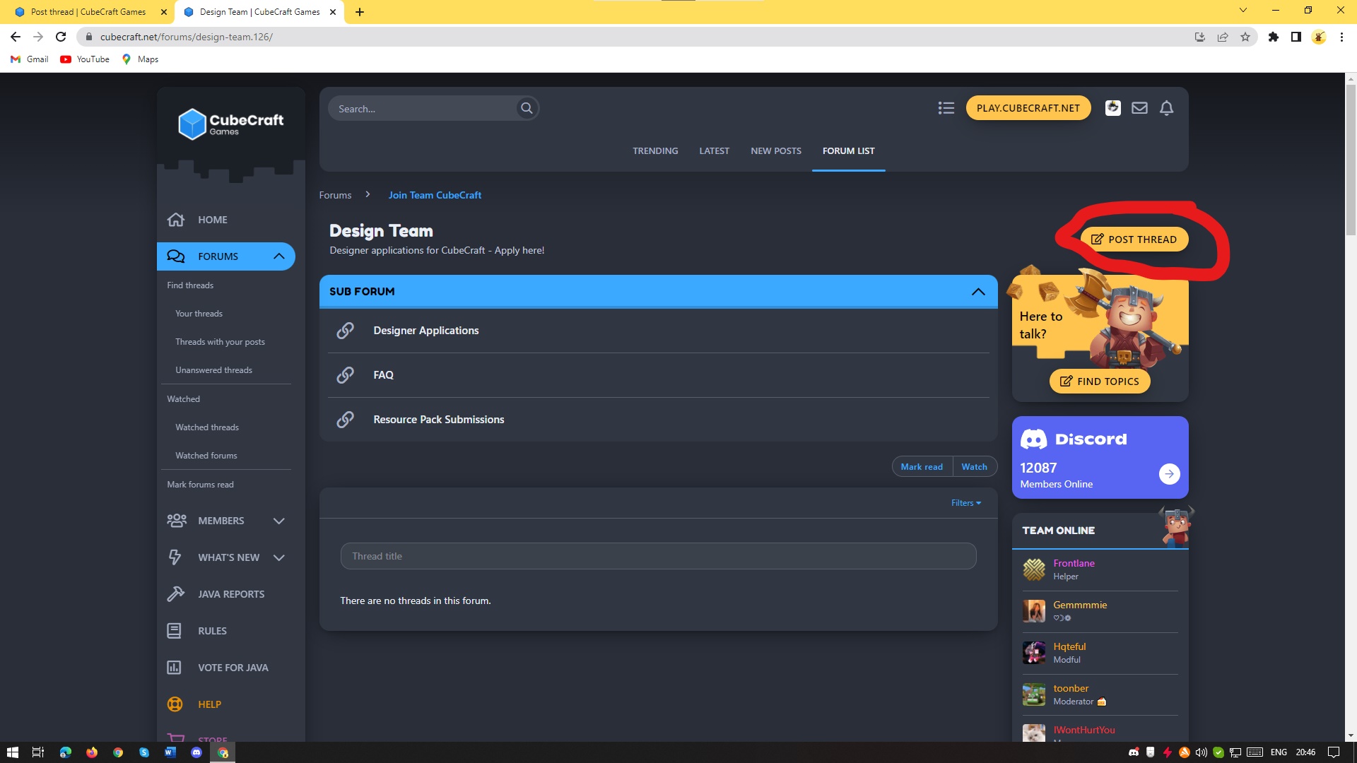
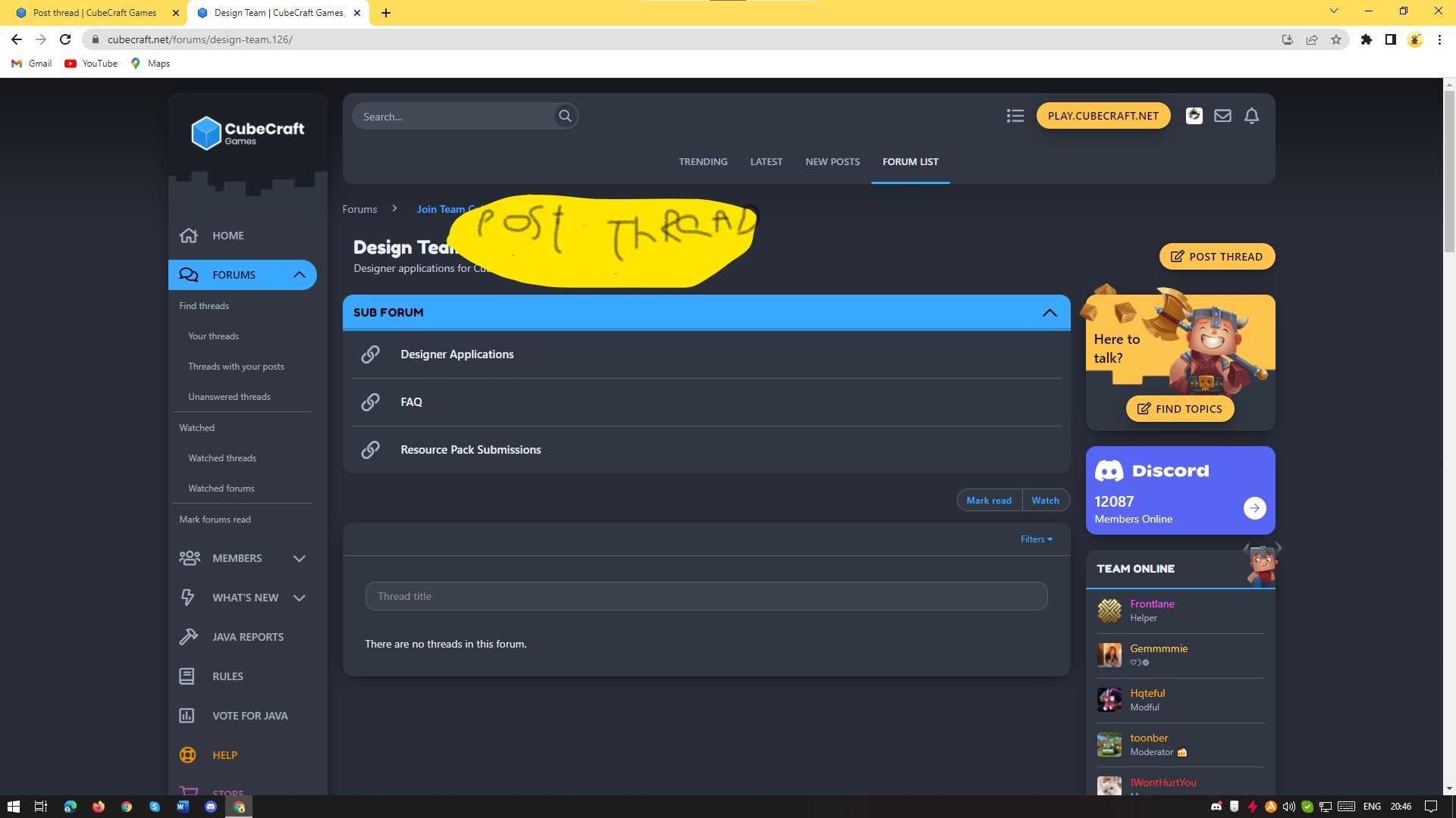
enough of people don't know where to apply. here's what I mean

It's really hard to see this if nobody show you. you can make it bigger or move it to the middle or both:

maybe your asking what I'm talking about? I'm talking about important messages or how to apply for staff member and others, will divide this topic into 2 parts.
1.Report rules
2.apply for staff
1.Report rules
When you're reporting there are two really Important messages that you need to see before you report, but this messages are smaller than everything other in there so enough of people miss them.
They can be sawed but most of the people ignore them, my idea is to make it little large because they are important than the players you have reported, I mean names can be little smaller and the important messages bigger:
This make the chance of them to be sawed because right now it looks like that:
You must be the owner of the evidence you submit or your report will be denied
Need help using this site? Read this guide.
00/00/00 someone use of illegal clients - other Handled
 View images
2.Aplication for staff member
enough of people don't know where to apply. here's what I mean
It's really hard to see this if nobody show you. you can make it bigger or move it to the middle or both:


