Minecraft PC IP: play.cubecraft.net

Do you think it is a good idea?


  • Total voters
    28
Status
Not open for further replies.

Ben5124

Well-Known Member
Jun 5, 2020
201
435
84
The UK
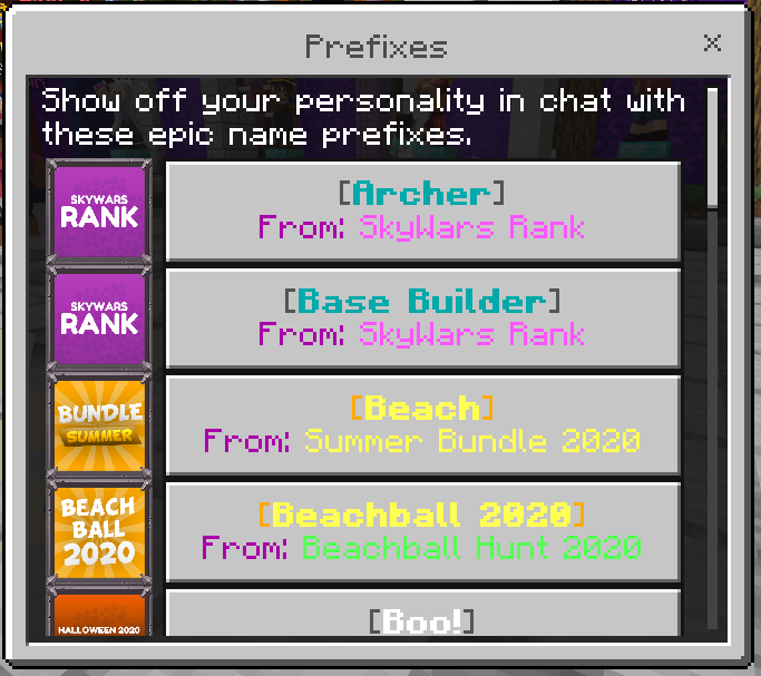
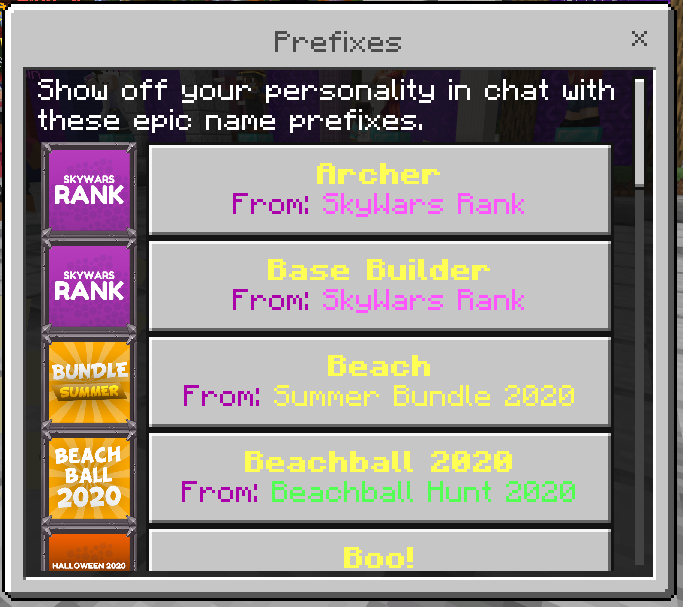
With the current system, it is hard to figure out what prefixes have what colours, what they look ect. This can be very annoying if going for a new look. This is why I am suggesting a new loot menu for prefixes. It would allow you to see what the look like before you try them on.

Before:
1611243091886.png


After:
1611243810431.png


Not only this looks cleaner than the generic yellow text, it shows you what colour is on which prefix as well as the brackets colour. It gives you a good indication of what it will actually look like. On top of this. I don't know why this shouldn't be a thing. You should be able to see the prefix when selecting it instead of just the name.

Let me know what you all think of this!
 

Modulo

Well-Known Member
Dec 30, 2019
246
629
99
22
Great idea! Aside from just being able to preview prefixes in the loot menu like that, perhaps all cosmetics could have some sort of preview in the menu as an indication of what they look like as well.

Edit: This already exists I'm blind lol. But that's even more of a reason that prefixes should be preview-able as well.
 
  • Love
  • Like
Reactions: Andyyy and Ben5124

Saffyyyyy

Novice Member
Jul 14, 2020
30
106
34
With the current system, it is hard to figure out what prefixes have what colours, what they look ect. This can be very annoying if going for a new look. This is why I am suggesting a new loot menu for prefixes. It would allow you to see what the look like before you try them on.

Before:
View attachment 184674

After:
View attachment 184675


Not only this looks cleaner than the generic yellow text, it shows you what colour is on which prefix as well as the brackets colour. It gives you a good indication of what it will actually look like. On top of this. I don't know why this shouldn't be a thing. You should be able to see the prefix when selecting it instead of just the name.

Let me know what you all think of this!
Yeah, it's a really annoying to keep having to scroll through :(
+1
 
  • Like
Reactions: Ben5124

xcanadiaa

Well-Known Member
Sep 27, 2020
131
274
114
Canada
Pronouns
He/Him
With the current system, it is hard to figure out what prefixes have what colours, what they look ect. This can be very annoying if going for a new look. This is why I am suggesting a new loot menu for prefixes. It would allow you to see what the look like before you try them on.

Before:
View attachment 184674

After:
View attachment 184675


Not only this looks cleaner than the generic yellow text, it shows you what colour is on which prefix as well as the brackets colour. It gives you a good indication of what it will actually look like. On top of this. I don't know why this shouldn't be a thing. You should be able to see the prefix when selecting it instead of just the name.

Let me know what you all think of this!
looks hype to me!
 
  • Like
Reactions: Ben5124

Story

Forum Professional
Jan 30, 2014
4,574
18,905
679
24
Glasgow
letterboxd.com
Hey, thanks for the suggestion!

Currently we're prepping a lot of big changes for the Bedrock loot system in order to support future additions and changes to the network, this includes a lot of polishing and I think this idea would fit really nicely alongside it, I'm happy to mark this as planned and have it added when we get down to working on the rest of the changes.

So yes I have marked this as planned and thanks again for your suggestion! :]
 
Status
Not open for further replies.
Members Online

Team online

Latest profile posts

Time for gaming setup delayed, so same for YouTube channel
jamesthesignificant wrote on Hulk_'s profile.
Epic profile picture
jamesthesignificant wrote on Capitan's profile.
Hey Capitan, by any chance could you make it rain cats on some secret page or something?
Thanks For Novice Member!
Top Bottom