Minecraft PC IP: play.cubecraft.net

What's your rating now?

  • 1/10

    Votes: 4 26.7%
  • 2/10

    Votes: 0 0.0%
  • 3/10

    Votes: 1 6.7%
  • 4/10

    Votes: 0 0.0%
  • 5/10

    Votes: 4 26.7%
  • 6/10

    Votes: 0 0.0%
  • 7/10

    Votes: 1 6.7%
  • 8/10

    Votes: 1 6.7%
  • 9/10

    Votes: 2 13.3%
  • 10/10

    Votes: 2 13.3%

  • Total voters
    15

Ruisdier

Forum Expert
Oct 26, 2017
821
1,821
288
19
your basement
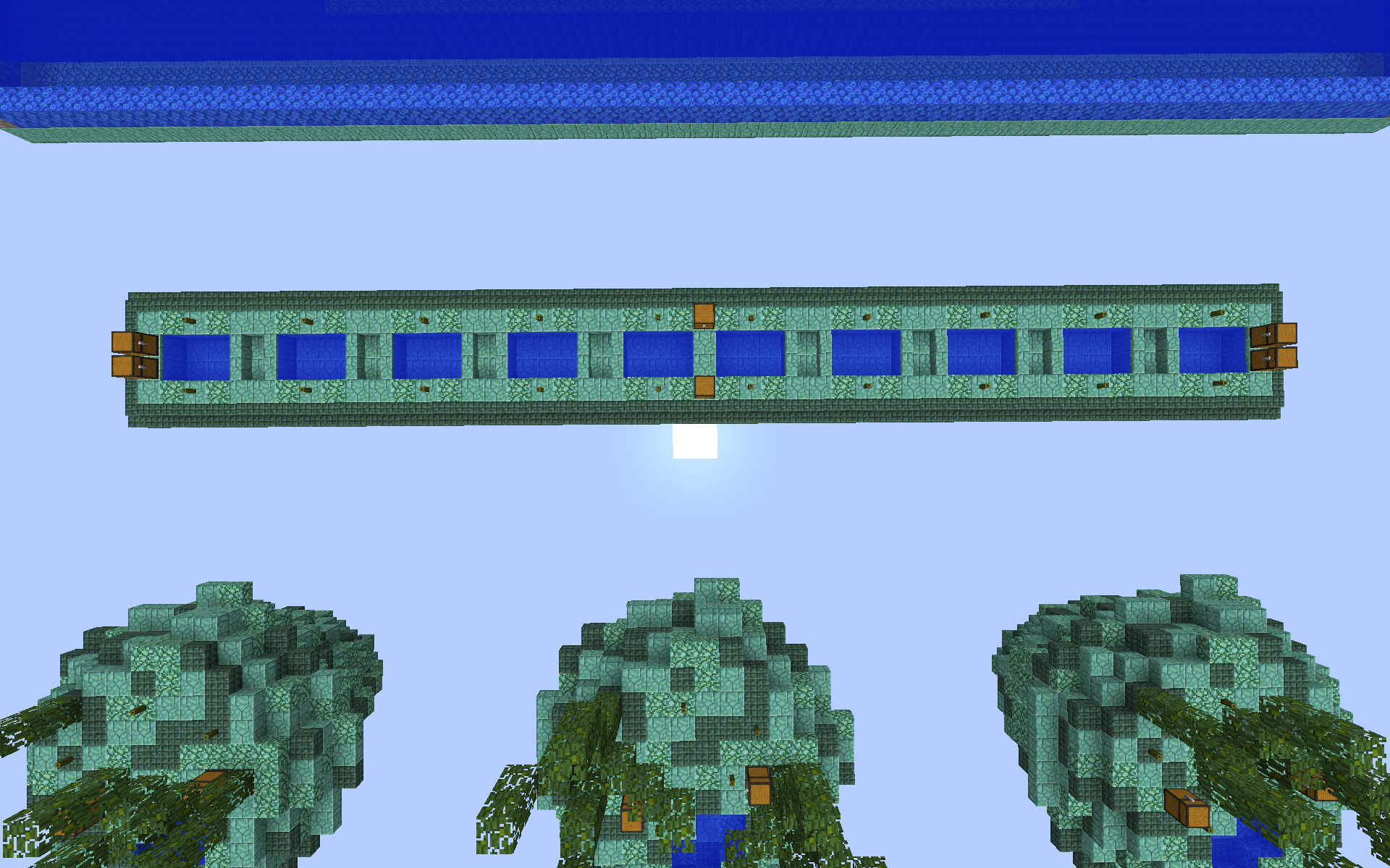
Hello! Earlier this day I made a thread about my skywars map, it wasn't perfect so here is an updated version. (:

Starter Islands
Nothing changed.

Half Mid

I removed one water pool on each side so the Island is less long

Previous design:
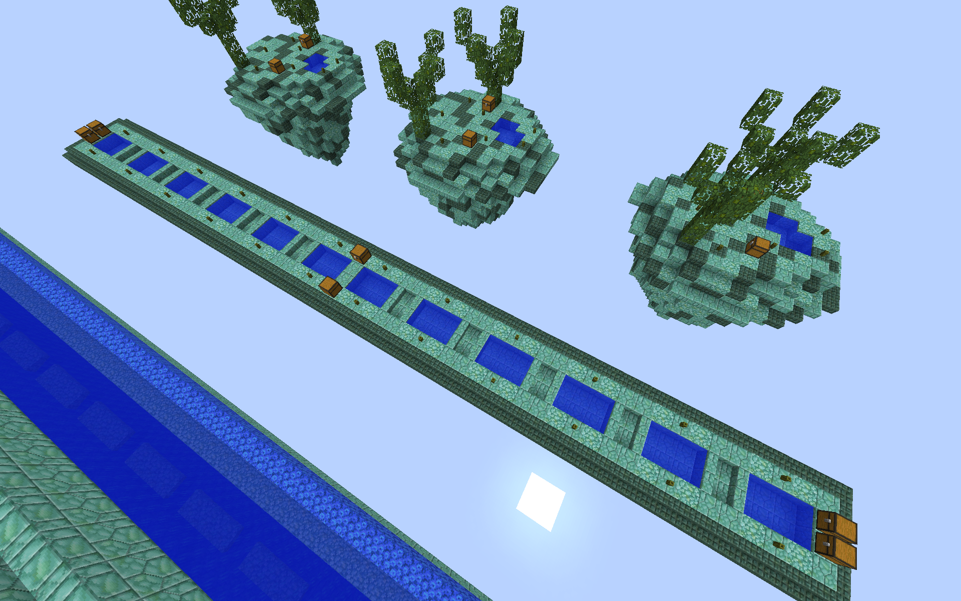
2018-04-22_13.13.20.png


New Design:
2018-04-22_18.27.27.png


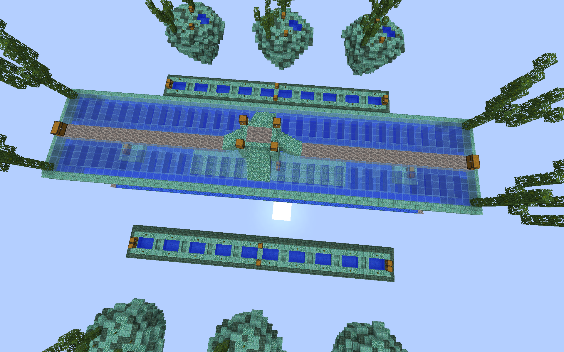
Mid Layer 1
I made it a lot easier for PvP. There is now a platform in the center with a parkour on each side leading to another platform with 2 chests.

Previous design:
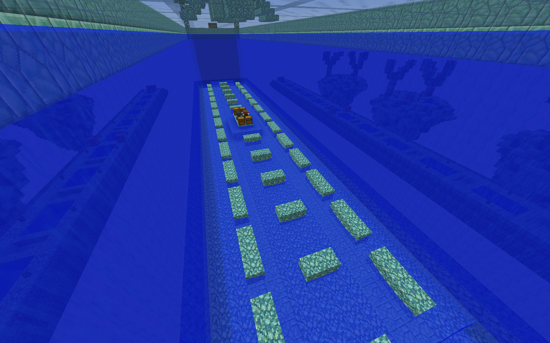
2018-04-22_13.13.38.png


New Design:
2018-04-22_18.27.18.png


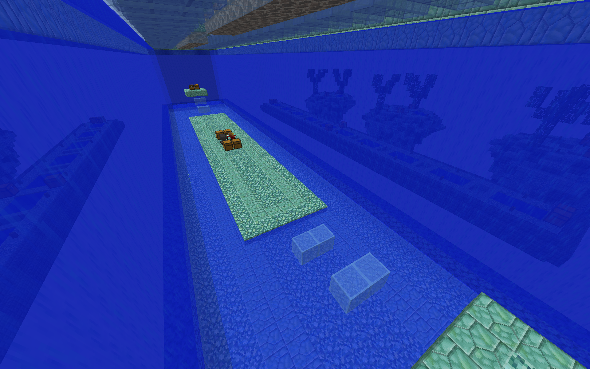
Mid Layer 2
This place was kinda ugly. Now there are dead Coral paths leading to the double chests and there is a pattern with dark and light blue glass to make it look cooler.

Previous Design:
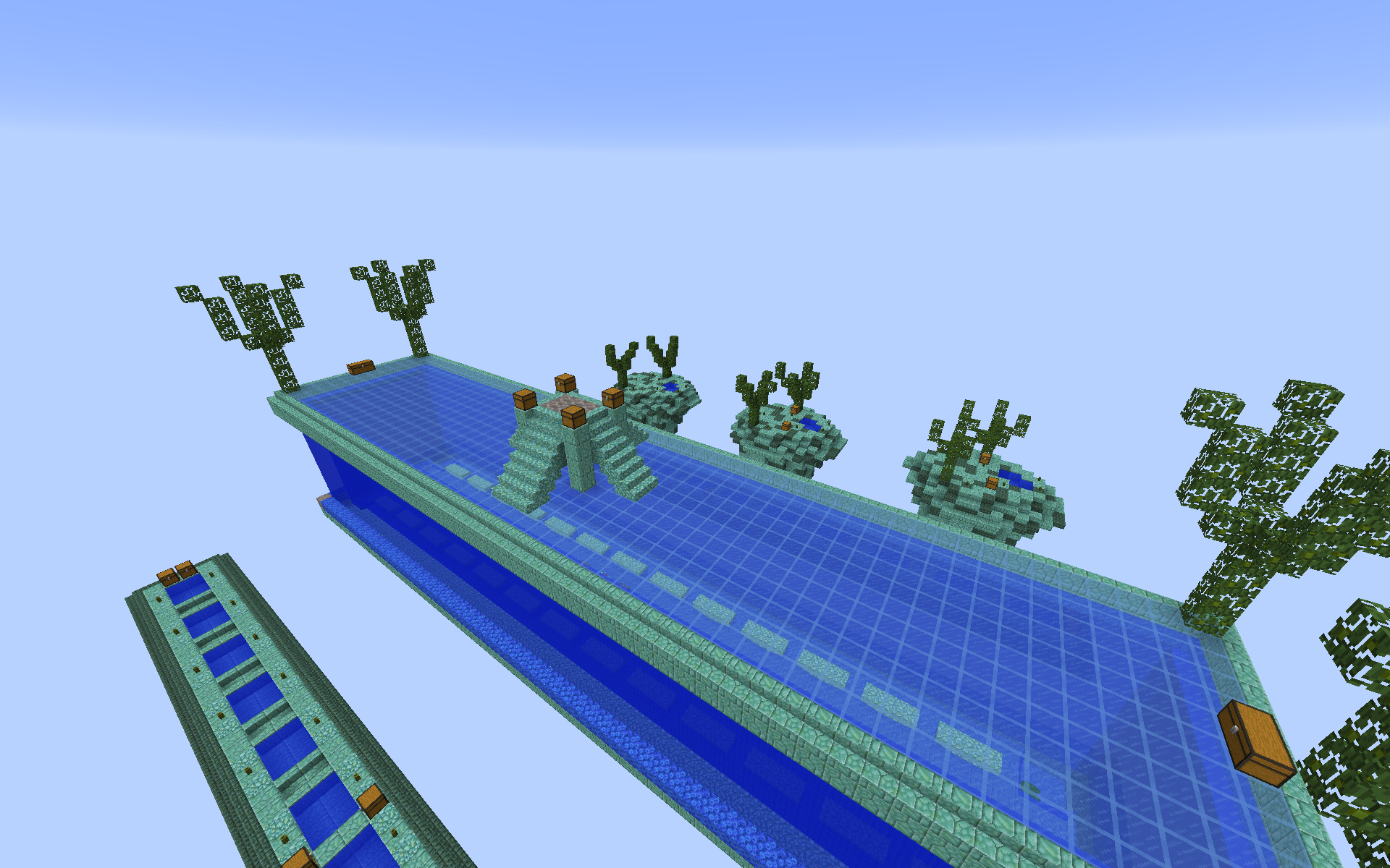
2018-04-22_13.13.25.png


New Design:
2018-04-22_18.27.32.png


More tips and suggestions? Feel free to comment (Pls comment I want to know what you guys think o:

Bye!


schot

Well-Known Member
Dec 12, 2017
334
575
109
20
I like the spawn islands but the mid is kinda ugly Imo
 

Sweetenerera

Forum Professional
Jul 24, 2016
4,925
12,662
619
I really don't like the first and second mid.
Maybe change it too something related to the spawn islands?
Which, may I add, really really love.
 

Troublesomee

Forum Veteran
Feb 6, 2016
2,888
4,146
404
You should include some more things that have something to do with the theme. Currently, the map is practically empty. For example, you could add some bubbles and fishes. I especially dislike the middle. I am aware you wanted to pay attention to pvp space, but honestly, this does not look good. You could change the middle to, for example, a little sea temple.

Also please change the altitude of the islands. Currently, the middle is positioned at a higher altitude than the starter islands. I dislike that. It's of course up to you, but that's what makes the gameplay a bit better too.

The sub-islands and the middle are nothing more than boxes, try another shape. It will certainly make the map look better!
I hope this helps! :)
 
Members Online

Team online

Members online

Latest profile posts

I logged out from my device for no reason.. and got mini heart attack thinking that I am banned from this guild 😂
how to log in on phone
Dang I had no clue how many moderators have left in the past year :(
coolzombiee wrote on ItzJuan's profile.
I don’t think you are old but, I was curious what pioneer rank was in cubecraft and what it did because I found it
coolzombiee wrote on Thjis's profile.
Thank you! I had no clue the player had been banned by anticheat because I crashed before that happened
Top Bottom