Minecraft PC IP: play.cubecraft.net

Should this map be added?


  • Total voters
    19
Status
Not open for further replies.

Fisktratt

Forum Expert
Sep 15, 2018
544
2,681
389
20
Sweden

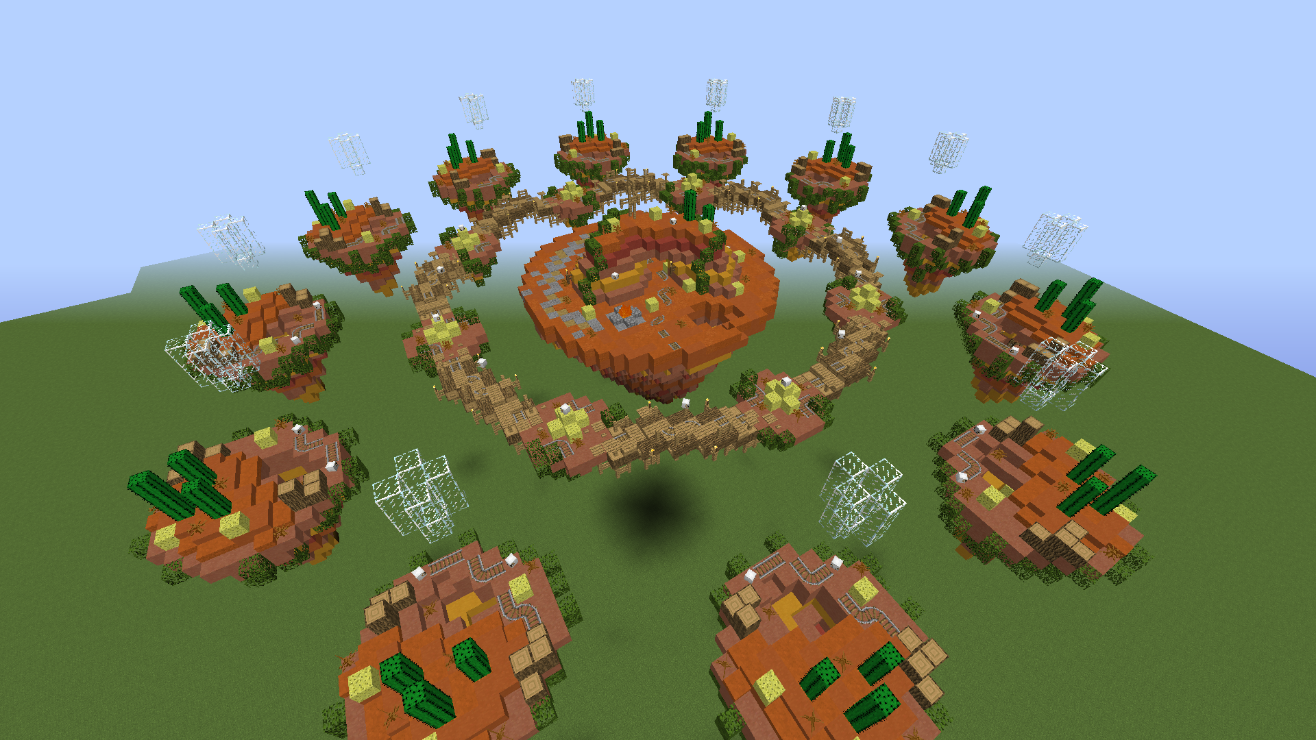
Map name: Badlands
Creators of map: @Fisktratt & @MJ010101

- Map for Solo Lucky Islands
- 12 players
- Inspired by the Badlands (Mesa) biome in Minecraft, with a touch of the Wild West

The birth of this map was thanks to @Fisktratt. “I thought it would be fun to make a project like this with a friend, so I asked my friend @MJ010101 if he wanted to be creative and build a map with me.” Obviously, the vanilla generation of the Badlands biome is way too basic as a map design, so we redesigned it and gave it touch of the Wild Western theme. If you have any further questions, we’d be happy to answer them, as there’s a thought behind almost every design and gameplay aspect.

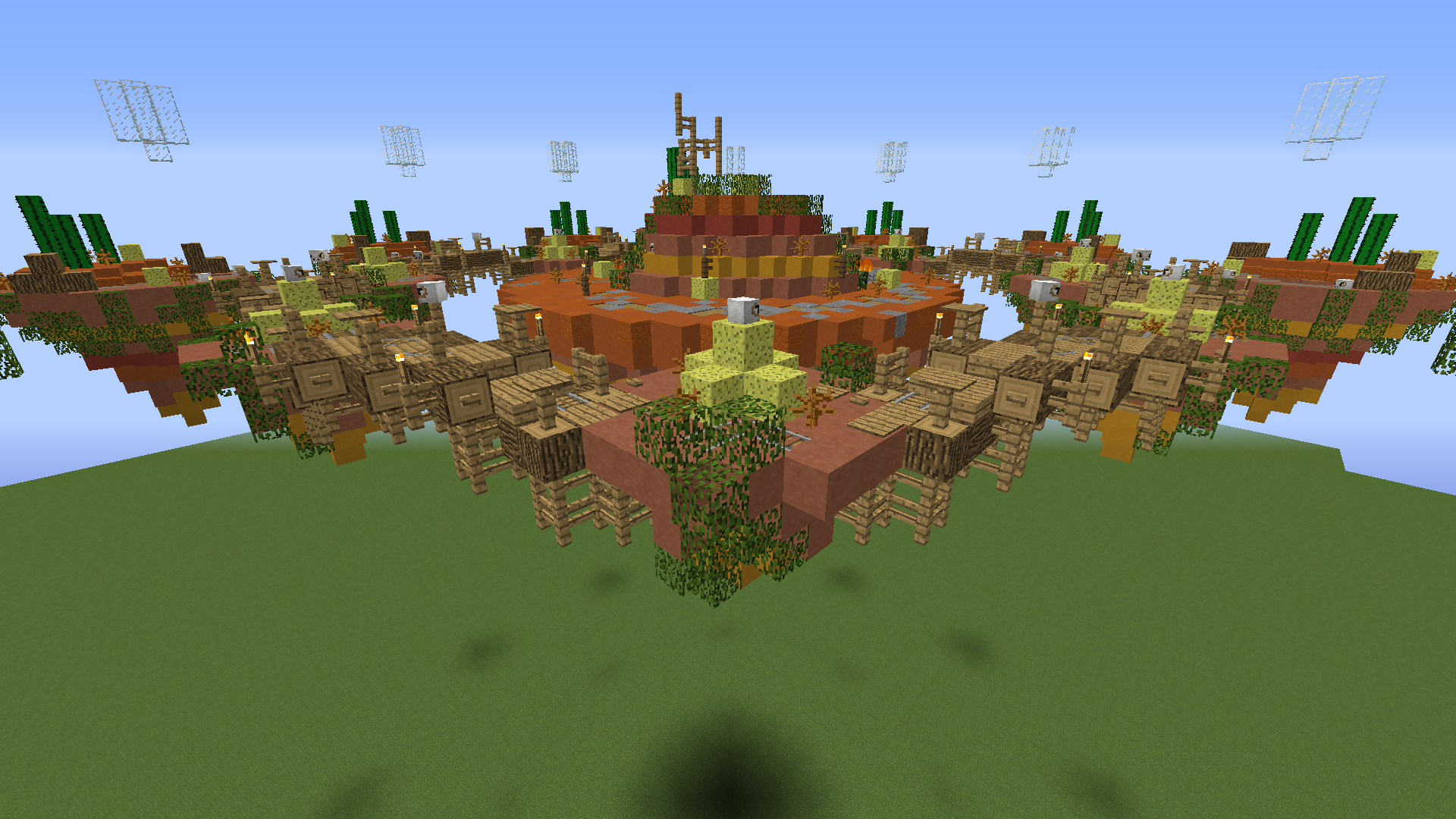
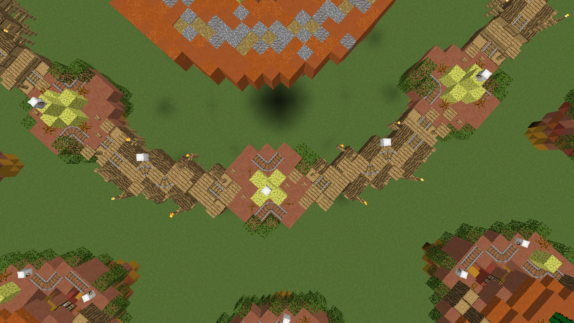
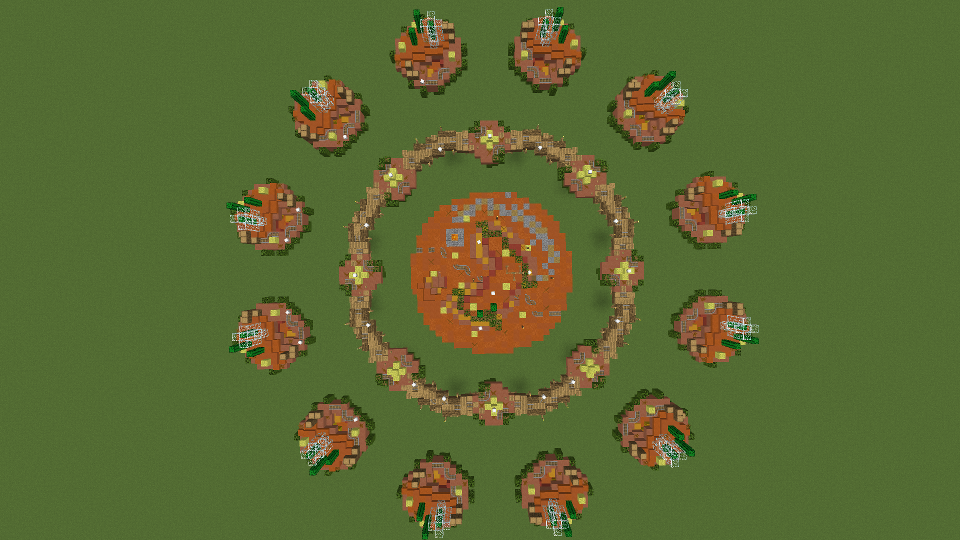
The layout is pretty simple, but we think it will work well both design wise and gameplay wise. There are 12 starter islands, a submid with 8 smaller islands, but they’re all connected with wooden bridges and of course a mid island as well.
upload_2019-11-27_16-6-40.png


upload_2019-11-27_16-6-54.png
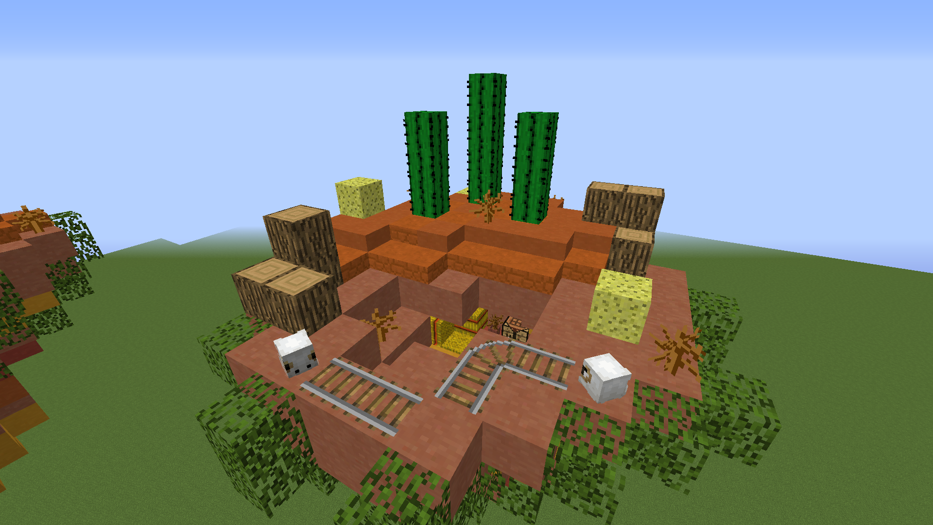
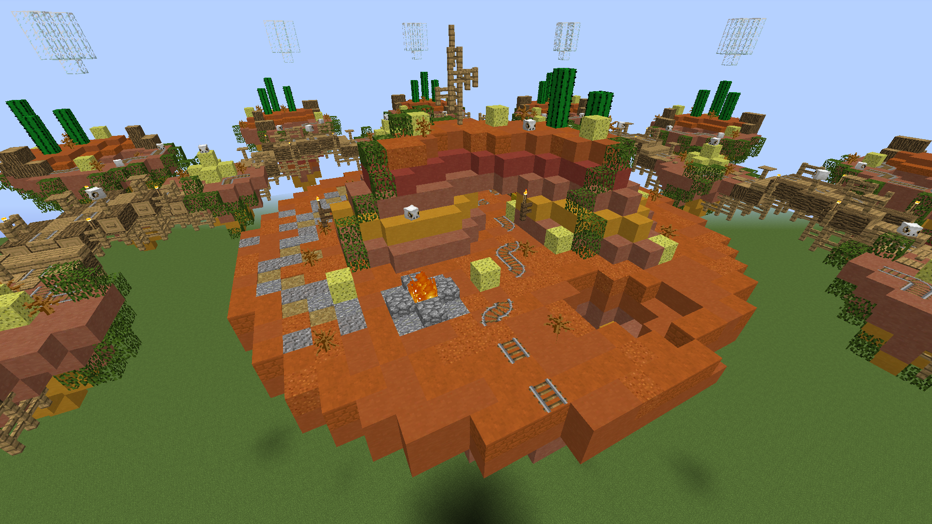
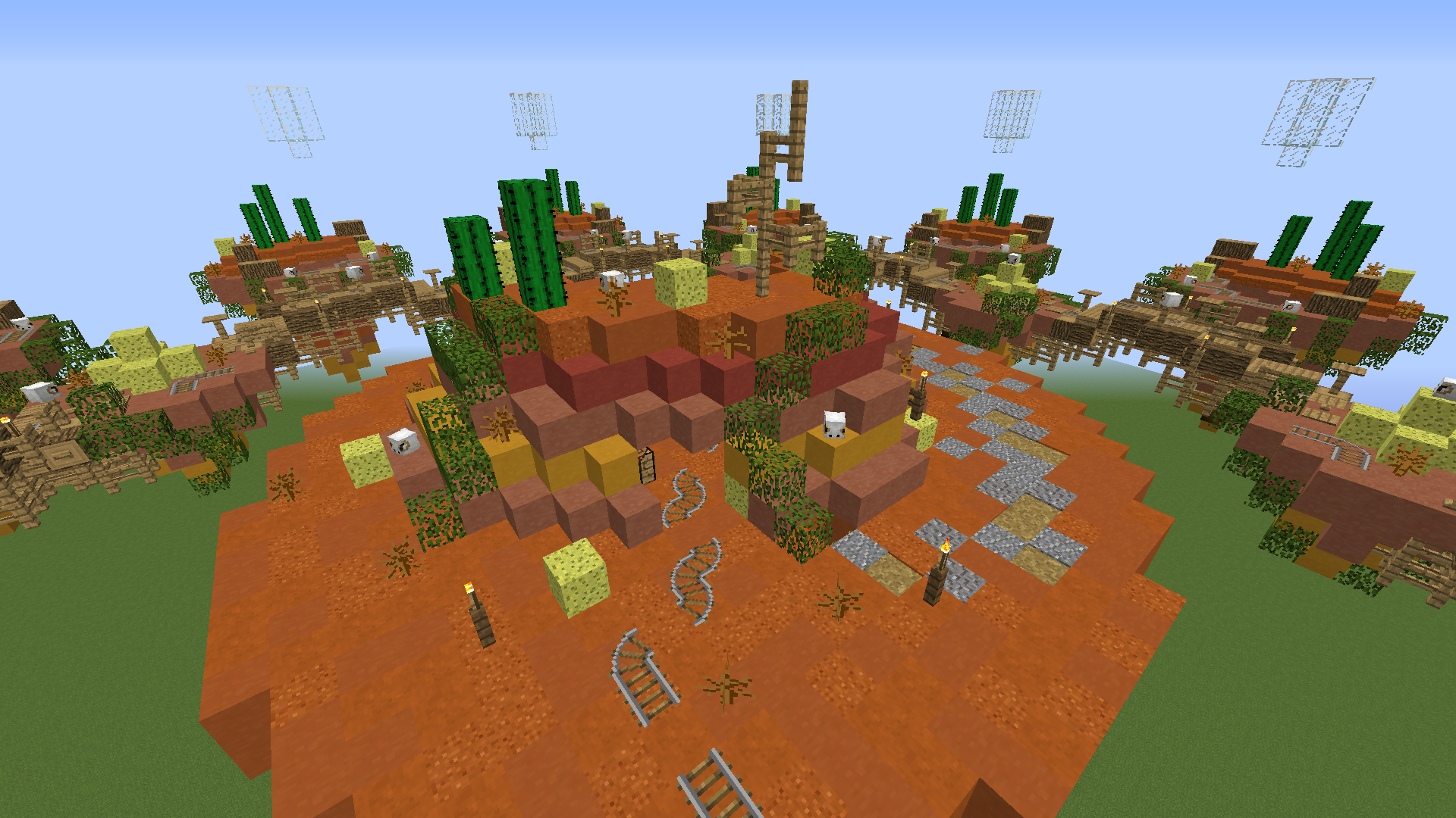
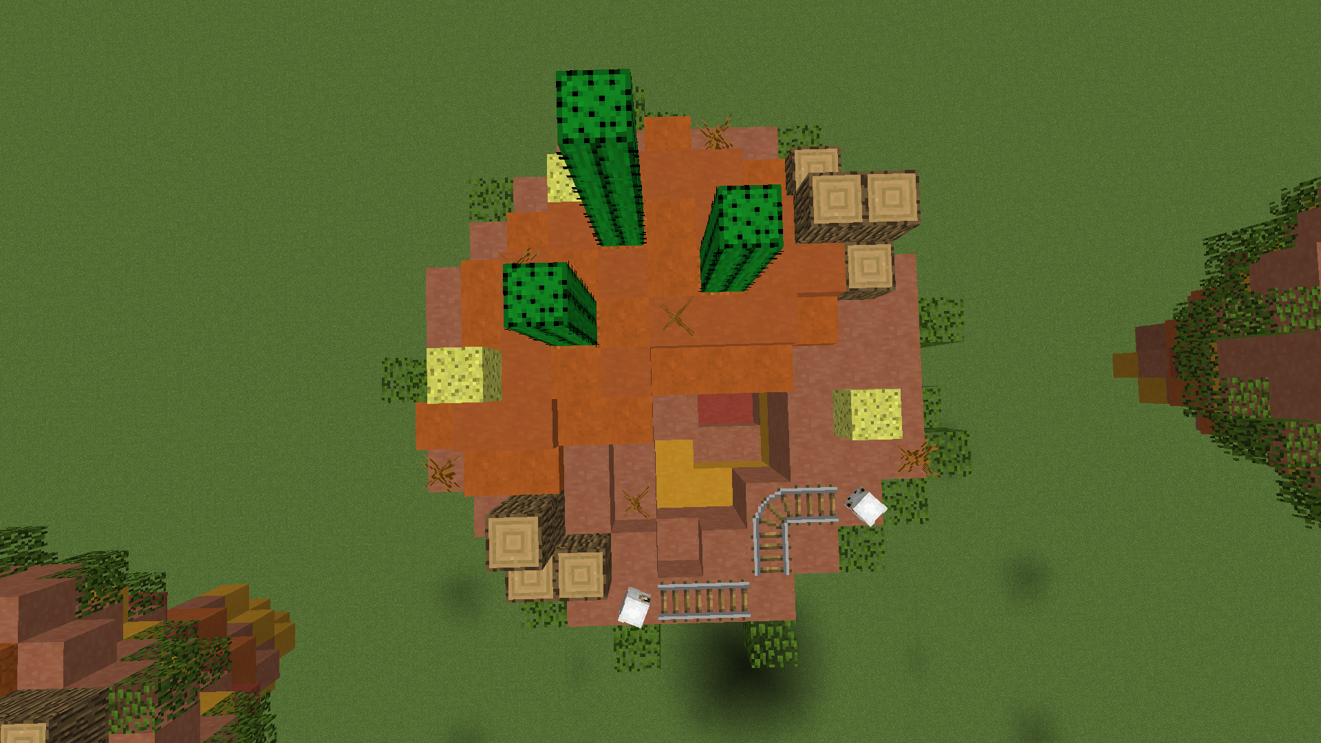
Each starter island has the generic resources that most Lucky Islands maps feature in some way. A crafting table, a total of 7 lucky blocks, 5 hay bales (can be crafted into 15 pieces of bread) and 9 logs. We also included a block of gold. We made a plateau to add more depth and variation of the blocks. The cacti and leaves are there to add some more colour to the mix.
upload_2019-11-27_16-7-14.png


upload_2019-11-27_16-7-24.png


upload_2019-11-27_16-7-37.png
Initially, the submid islands were all we had, but hey, why not bridge them together. Also we utilized a “cluster” of lucky blocks in the form a pyramid shape. You never know if you’ll find gold inside. At the very least, you’ll be surprised at what happens when you mine it. [Hint] hot stuff.

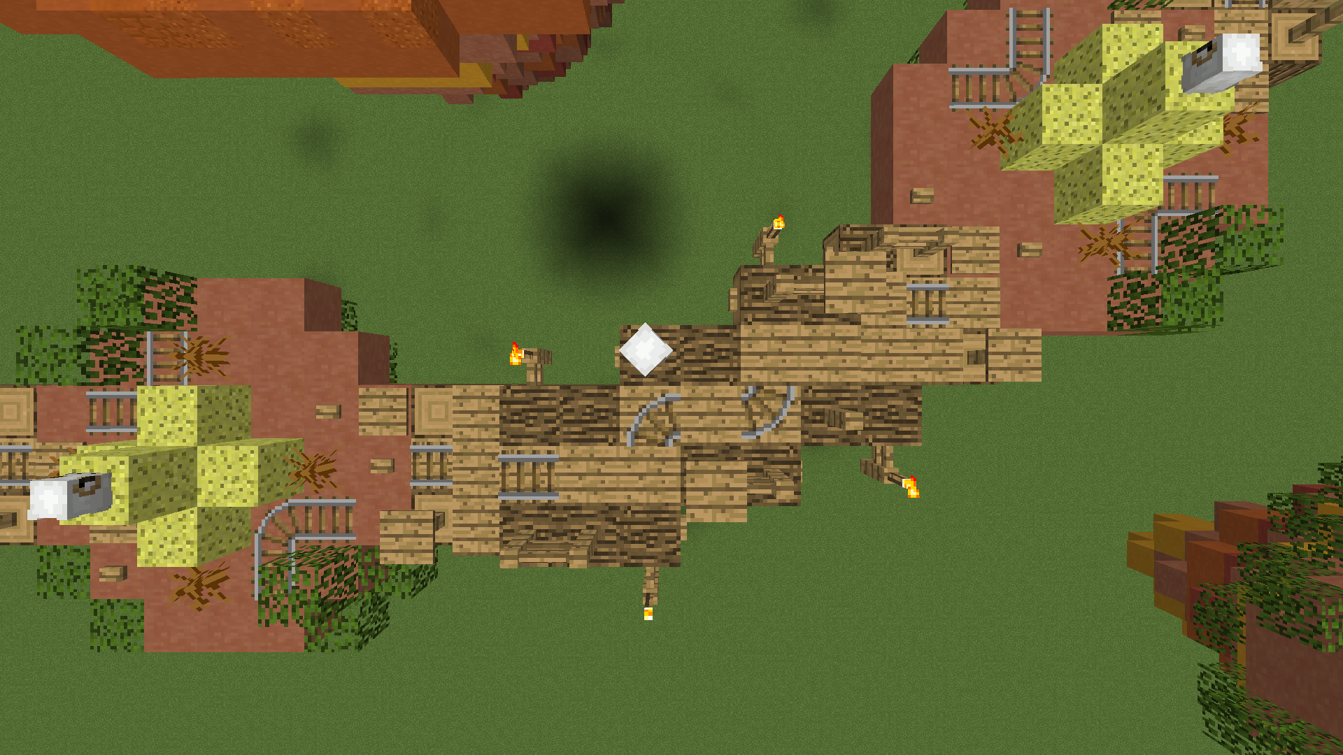
The bridges are there to add more details, depth and connect the map together.
upload_2019-11-27_16-7-50.png


upload_2019-11-27_16-8-4.png


upload_2019-11-27_16-8-22.png


upload_2019-11-27_16-8-37.png
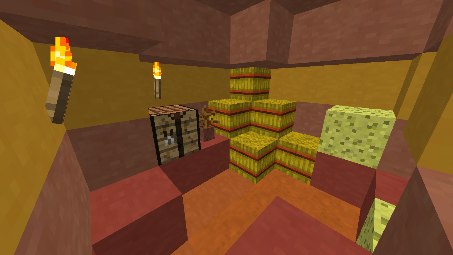
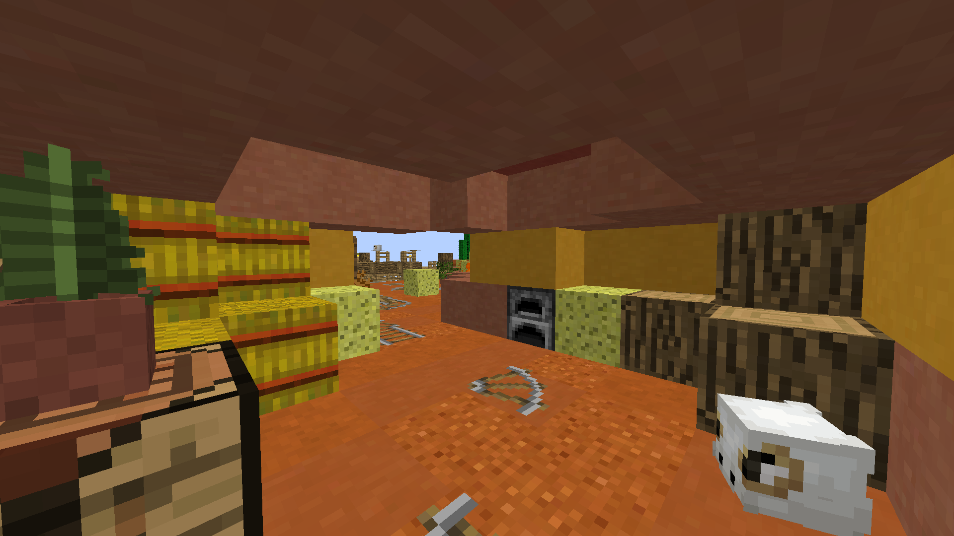
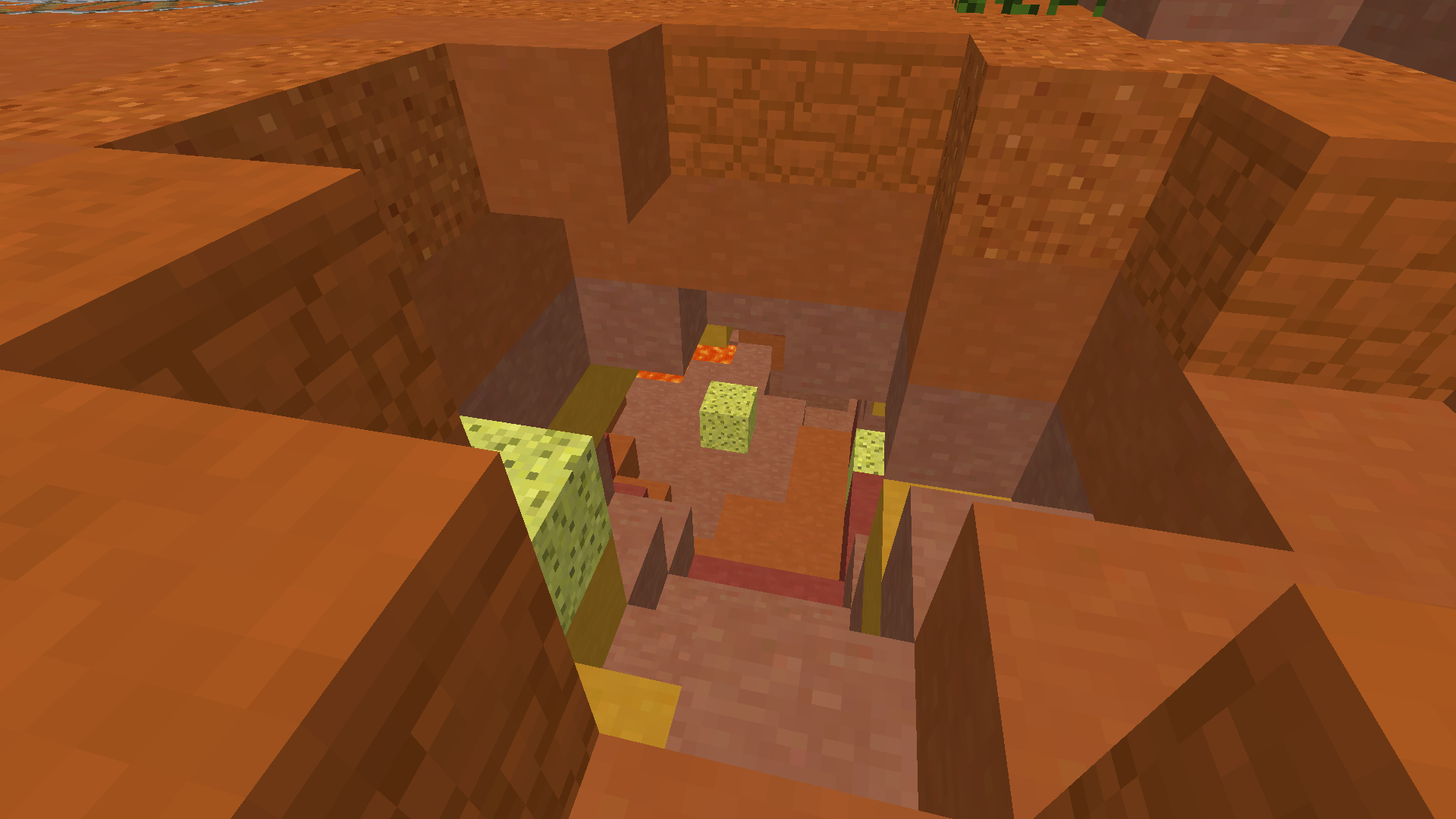
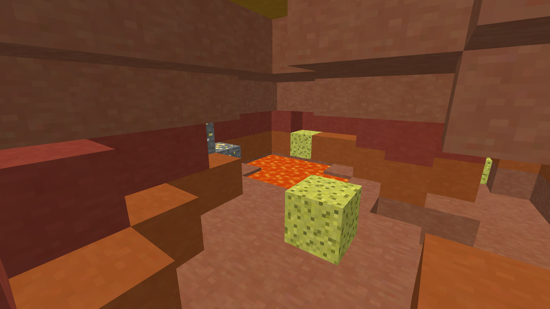
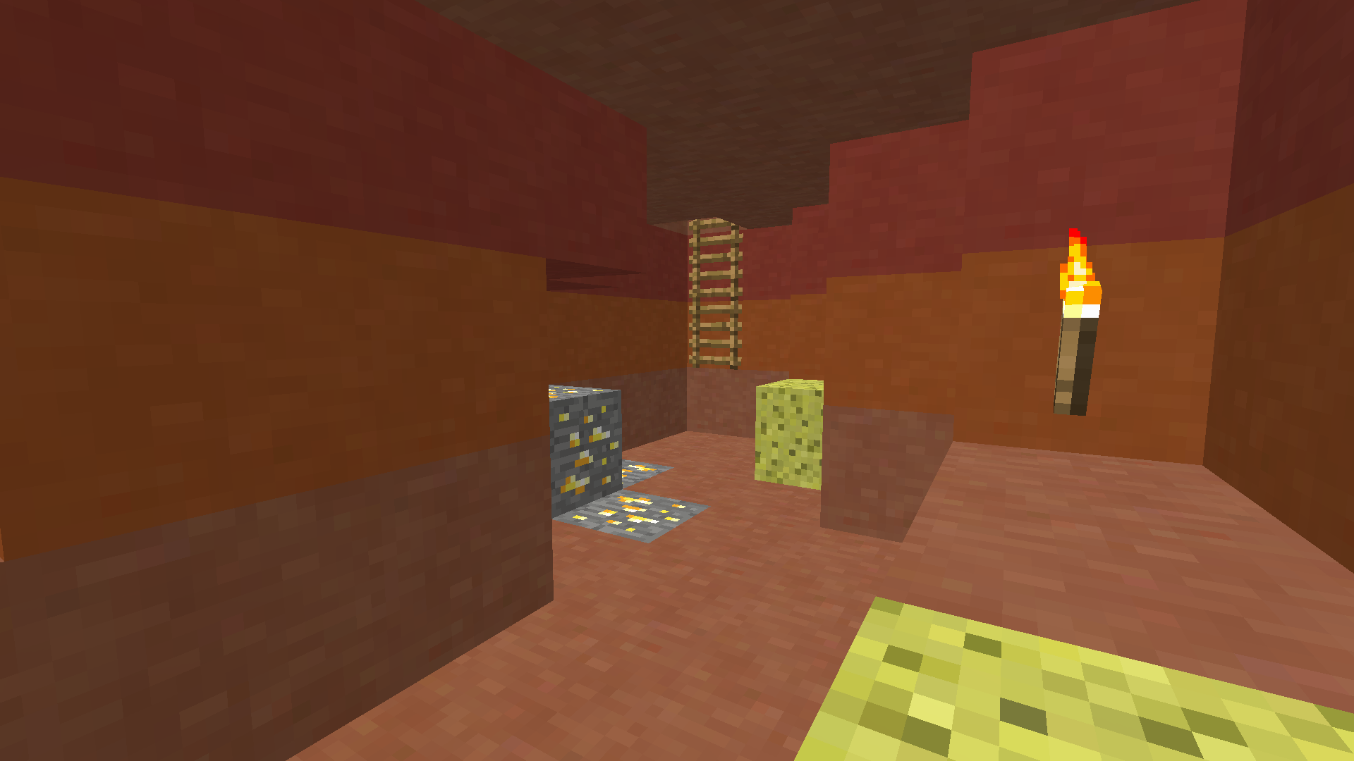
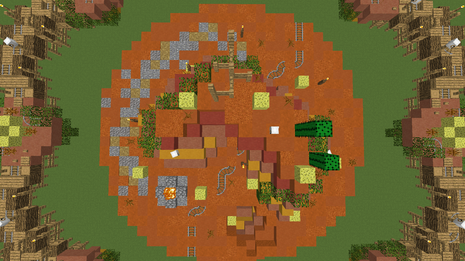
As you probably can see there’s a hill right in the middle of the island. Mid has a furnace, crafting table, 19 lucky blocks, 7 hay bales, 4 logs, 17 gold ore, 7 diamond ore, an iron block (cave included).

There are two entrances to get down to the cave. In the cave, you’ll find some gold ore, diamond ore, lucky blocks and some more hot stuff.
upload_2019-11-27_16-8-49.png


upload_2019-11-27_16-9-1.png


upload_2019-11-27_16-9-8.png


upload_2019-11-27_16-9-17.png


upload_2019-11-27_16-9-26.png


upload_2019-11-27_16-9-31.png


upload_2019-11-27_16-9-37.png


upload_2019-11-28_16-9-59.png


upload_2019-11-28_16-10-17.png
Special thanks to:
@SanCookie - for giving us feedback

We always appreciate feedback!
 

Attachments

  • upload_2019-11-27_16-6-50.png
    upload_2019-11-27_16-6-50.png
    2.4 MB · Views: 539
Last edited:

Dutudy

Forum Veteran
Dec 22, 2016
2,195
7,358
499
19
Sweden ʕ•ᴥ•ʔ
reports.cubecraft.net
The starter islands too close to each other, I honestly don't like too many rush maps (pond, underwater, food, savannah village ) the pre-mid is too close to the middle I think that's all, some improvements could help. just like I said, pre-mid is too close to the middle. I think there are too many lucky blocks in pre-middle, if I did count them right there are 40 lucky blocks which is pretty much for this size of the map. good job though!
 
  • Like
Reactions: _The13thDoctor_

SanCookie

Gameplay Engineer
Mar 18, 2017
2,306
12,764
498
22
the selfie area
bit.ly
Pronouns
He/Him
Map concept and overall is good! But I think that islands are too close from each other. Also they are quite small to pvp at. Inner islands are not wider enough to make room for pvp. Palette is nice tho. Keep up!
How many times have you actually fought someone in Lucky Islands though hahaha, so many people just die from randomness and craziness : p
 

_The13thDoctor_

Forum Professional
Jul 23, 2016
6,089
14,320
629
20
Chicago, Illinois
www.cubecraft.net
Pronouns
He/Him
Map name: Badlands
Creators of map: @Fisktratt & @MJ010101

- Map for Solo Lucky Islands
- 12 players
- Inspired by the Badlands (Mesa) biome in Minecraft, with a touch of the Wild West

The birth of this map was thanks to @Fisktratt. “I thought it would be fun to make a project like this with a friend, so I asked my friend @MJ010101 if he wanted to be creative and build a map with me.” Obviously, the vanilla generation of the Badlands biome is way too basic as a map design, so we redesigned it and gave it touch of the Wild Western theme. If you have any further questions, we’d be happy to answer them, as there’s a thought behind almost every design and gameplay aspect.

The layout is pretty simple, but we think it will work well both design wise and gameplay wise. There are 12 starter islands, a submid with 8 smaller islands, but they’re all connected with wooden bridges and of course a mid island as well.
View attachment 157462

View attachment 157464
Each starter island has the generic resources that most Lucky Islands maps feature in some way. A crafting table, a total of 7 lucky blocks, 5 hay bales (can be crafted into 15 pieces of bread) and 9 logs. We also included a block of gold. We made a plateau to add more depth and variation of the blocks. The cacti and leaves are there to add some more colour to the mix.
View attachment 157465

View attachment 157466

View attachment 157467
Initially, the submid islands were all we had, but hey, why not bridge them together. Also we utilized a “cluster” of lucky blocks in the form a pyramid shape. You never know if you’ll find gold inside. At the very least, you’ll be surprised at what happens when you mine it. [Hint] hot stuff.

The bridges are there to add more details, depth and connect the map together.
View attachment 157468

View attachment 157469

View attachment 157470

View attachment 157471
As you probably can see there’s a hill right in the middle of the island. Mid has a furnace, crafting table, 19 lucky blocks, 7 hay bales, 4 logs, 17 gold ore, 7 diamond ore, an iron block (cave included).

There are two entrances to get down to the cave. In the cave, you’ll find some gold ore, diamond ore, lucky blocks and some more hot stuff.
View attachment 157472

View attachment 157473

View attachment 157474

View attachment 157475

View attachment 157476

View attachment 157477

View attachment 157478

Special thanks to:
@SanCookie - for giving us feedback

We always appreciate feedback!

As said before islands are really close and the starting island could have a bit more detail pvp would also be a bit difficult other then that good map. I’ll change my vote when some things are adjusted!
 
  • Like
Reactions: Slimeyz

Robbedz

Designero
Jan 16, 2018
57
372
134
22
a robbery D:
I like this map a lot, everything fits to the theme, the painting is pretty elaborated and so is the detailing, the map is good looking overall, just some minor gameplay problems i found and going to mention are:
I saw the ring around the middle has to many fences and buttoms on the edges, i would decrease the number of those or just remove all the buttoms that are on the bridges so it's easier to build to other islands.
Those animal heads around the map seem to be in paths where the player may walk by a lot, i would move them to different places, for example, in starter islands they're in the front where players would pvp the most, so i would move them to the back with the cacti.
Personally that's all i would want to be changed if i were to play that map.

Good job, it's a pretty good looking map and you have a yes from me! (:
 

Slimeyz

Dedicated Member
Oct 1, 2016
499
2,207
229
22
Belgium
Did you get your inspiration from the western map in teamskywars? Because the shape of the map and the block chose are almost the same . The only thing whats different is how you placed the islands and the size of it. I like the way how you connected the islands with each other on the mid. Some parts of the map looks like parts from the map railroad(Hypixel) especially the middle (Without the buildings). And there was one map that I can't remember from lucky island(cubecraft)that had the same cave(I don't know how to pronounce the building in the middle) as yours. The leaves that you used on the islands are a nice detail it add something more to the map. I personally think that this map is to simplistic but everyone have theirs opinion. I am not a designer so my feedback isn't that important. Moste of the people wont agree with the moste things I wrote but thats ok.

___________________________________________________________________________________________________________________________________

-Slimeyz
 
  • Like
Reactions: _The13thDoctor_

MJ010101

Well-Known Member
Dec 17, 2017
296
825
108
23
Fjollträsk
To everyone who believe its too compact and small, with islands being too close to each other: We hear you, but there are mixed feelings about this. Some may have voted yes because of that. Considering the overall yes/no vote ratio, we’re thus far not gonna change it. We also share the opinion that we like maps with islands close to each other as well as without.Thanks for the feedback though!

I think there are too many lucky blocks in pre-middle, if I did count them right there are 40 lucky blocks which is pretty much for this size of the map. good job though!
There are actually 32* (33 if we by any chance accidentally placed one in the middle somewhere, but we didn’t :))

Map concept and overall is good! But I think that islands are too close from each other. Also they are quite small to pvp at. Inner islands are not wider enough to make room for pvp. Palette is nice tho. Keep up!
Thanks! Any suggestions how we should make the PvP experience better without sacrificing the design?

As said before islands are really close and the starting island could have a bit more detail pvp would also be a bit difficult other then that good map. I’ll change my vote when some things are adjusted!
What kind of details?

I like this map a lot, everything fits to the theme, the painting is pretty elaborated and so is the detailing, the map is good looking overall, just some minor gameplay problems i found and going to mention are:
I saw the ring around the middle has to many fences and buttoms on the edges, i would decrease the number of those or just remove all the buttoms that are on the bridges so it's easier to build to other islands.
Those animal heads around the map seem to be in paths where the player may walk by a lot, i would move them to different places, for example, in starter islands they're in the front where players would pvp the most, so i would move them to the back with the cacti.
Personally that's all i would want to be changed if i were to play that map.

Good job, it's a pretty good looking map and you have a yes from me! :)
Thanks for your endlessly helpful feedback! The buttons on the bridges are removed. The fences are a big part of the design of the bridges and it makes it harder to get knocked off.
We have fixed the “Cubones” too!

Did you get your inspiration from the western map in teamskywars? Because the shape of the map and the block chose are almost the same . The only thing whats different is how you placed the islands and the size of it.

I like the way how you connected the islands with each other on the mid. Some parts of the map looks like parts from the map railroad(Hypixel) especially the middle (Without the buildings). And there was one map that I can't remember from lucky island(cubecraft)that had the same cave(I don't know how to pronounce the building in the middle) as yours.
Obviously, the vanilla generation of the Badlands biome is way too basic as a map design, so we redesigned it and gave it touch of the Wild Western theme.
To add: This block palette is totally different, with the colored clay. Western has sand and paler colors overall. Tbh it’s almost impossible to make a map that looks totally different from anything else. Any ideas how we could improve the map?
 
  • Like
Reactions: Fisktratt

_The13thDoctor_

Forum Professional
Jul 23, 2016
6,089
14,320
629
20
Chicago, Illinois
www.cubecraft.net
Pronouns
He/Him
To everyone who believe its too compact and small, with islands being too close to each other: We hear you, but there are mixed feelings about this. Some may have voted yes because of that. Considering the overall yes/no vote ratio, we’re thus far not gonna change it. We also share the opinion that we like maps with islands close to each other as well as without.Thanks for the feedback though!


There are actually 32* (33 if we by any chance accidentally placed one in the middle somewhere, but we didn’t :))


Thanks! Any suggestions how we should make the PvP experience better without sacrificing the design?


What kind of details?


Thanks for you endlessly helpful feedback! The buttons on the bridges are removed. The fences are a big part of the design of the bridges and it makes it harder to get knocked off.
We have fixed the “Cubones” too!


To add: This block palette is totally different, with the colored clay. Western has sand and paler colors overall. Tbh it’s almost impossible to make a map that looks totally different from anything else. Any ideas how we could improve the map?

So because you got more yes then no when a lot of people vote yes but still want things changed you won’t take the feedback? Besides many people telling you that size is an issue? And because you guys like islands close together doesn't mean anyone else does. It’s quite annoying to start the game and then die from being rushed by a tryhard. It’s a sure way for people to avoid a map. Smh.

Also more details as in the player island is kind of dull and boring. It needs to stand out and gameplay wise not be your average map.
 

_The13thDoctor_

Forum Professional
Jul 23, 2016
6,089
14,320
629
20
Chicago, Illinois
www.cubecraft.net
Pronouns
He/Him
To everyone who believe its too compact and small, with islands being too close to each other: We hear you, but there are mixed feelings about this. Some may have voted yes because of that. Considering the overall yes/no vote ratio, we’re thus far not gonna change it. We also share the opinion that we like maps with islands close to each other as well as without.Thanks for the feedback though

We'll change it if needed. dont worry

Well which is it? Your not going to be changing it or you might?
 

Yamin

Forum Veteran
May 8, 2016
1,064
4,119
409
the sushi bar
When I think of badlands I think of a landscape with plateaus and lots of big and cool looking boulders. I feel like the map doesn't really capture that interesting terrain.
I think it looks a bit too simple.
The gameplay on this map gives me anxiety: lots of slabs, buttons, heads and rails on the ground which makes it really hard to place blocks. The islands are pretty close to each other so people will most likely rush to a player island, but there is no room for PvP on the player islands. The same goes for the sub mid.
I think the overall idea of the map is great, but the execution needed to be better in order to hit the standard CubeCraft is looking for.
 
Status
Not open for further replies.
Members Online

Team online

Latest profile posts

i’m bored, anyone need a profile pic?
Mr Jii Gamer wrote on NADER KANAAN's profile.
Happy birthday 🎈
BicolourSine41 wrote on Capitan's profile.
Can u necropost in the sticky/pinned threads on the forums part?
Top Bottom