Minecraft PC IP: play.cubecraft.net

Should this map be added?


  • Total voters
    34
Status
Not open for further replies.

bys1

Well-Known Member
Aug 10, 2016
87
39
93
22
Home
- The ground / coloring
I will asume, based on what I can see, you have used a WorldEdit command to create the Granite / Brick islands. The blocks you decided to use, their colors and the way they blend with each other is fine, though the way you added them is not so great. When I take a look at those island I imagine you simply ran the command //replace [block] 33%Granite,33%Polished_Granite,34%Brick and let WorldEdit decide the outcome. At the build team you may notice you never see us color any kind of island / ground this way, unstead we use the GoPaint tool. If you do not have acces to GoPaint, an alternative is the WorldEdit sphere brush.
To give a better visual representation of what I ment, have a look at these 2 images. This is a PVP map submission from ItzEnd3r and he executed my feedback flawlessly. Already looks much better, doesn't it!
rkut2Ir.png


screen-shot-2020-04-30-at-7-52-11-am-png.163655
Thank you very much! I understand what you mean and we will take it into account. We're currently updating the map.

- The prison walls
Your buildings face the same main problem like with the ground, it just looks so messy. From my eyes it seems like again you used the //replace command to make WorldEdit decide at random if a block should be Andesite, Stone, Brick, Moss Brick, etc. I cannot exactly say what kind of stone-material would be best to use, but I recommend making the building out of either Stone Bricks or regular Stone and not spam them everywhere. Though you should experiment a little trying to see what block(s) work best for the building.
- Prison yard
It's also good to point out things you have done well, which is choosing different materials for the prison yard, instead of Granite. Sand works well considering the blocks you used for the islands. Only tip I can give is the same as with the previous advice, it looks a bit messy as if it was just the //replace command.
We thought just one block might not look good, so we'll have a look at what to do. We might also just use one base material with only a small amount of other blocks added.

- The islands look so... blank
There's nothing! Aside from the prison complexes the islands are just empty! What I would recommend is adding small, not too major, scenery. For example you could add small bits of fencing around the edge of the island to simulate a prison fence. You could add some regular rocks made out of stone to give the map more colors, just make sure to make it look more interesting!
By this, do you mean the player islands specifically, or other islands too?
The problem with adding iron prison fences around the whole island is that it will prevent regular eggwars gameplay from happening. It would prevent any usage of (punch) bows at all and players cannot break them. However, adding small bits could be done. We'll have a look.

Aside from the above, do you think the small half mid island/building should be removed / heavily reworked? (Personally I'd like to keep the "guard's room" on there, just looking for opinions)
 

ItzEnd3r

Forum Expert
Aug 18, 2019
1,353
3,931
384
19
Boulder
www.cubecraft.net
We thought just one block might not look good, so we'll have a look at what to do. We might also just use one base material with only a small amount of other blocks added.
you should use just one block but accent it, have mossy bricks coming up from the ground, cracked ones in areas where you would see a lot of stress on a building, not just randomly placed.
 

Efcluke94

👀
Oct 20, 2013
3,000
9,470
678
Hello bys1 thank you for your efforts in submitting this.

Unfortunately, collectively the design team have decided to deny this map submission due to the following reasons:

- Essentially everything Jeroen said. It lacks colour, texture, the visuals that we expect to see in our game maps.
Hey, after a few looks I have noticed some things you may need to take into consideration.

- The ground / coloring
I will asume, based on what I can see, you have used a WorldEdit command to create the Granite / Brick islands. The blocks you decided to use, their colors and the way they blend with each other is fine, though the way you added them is not so great. When I take a look at those island I imagine you simply ran the command //replace [block] 33%Granite,33%Polished_Granite,34%Brick and let WorldEdit decide the outcome. At the build team you may notice you never see us color any kind of island / ground this way, unstead we use the GoPaint tool. If you do not have acces to GoPaint, an alternative is the WorldEdit sphere brush.
To give a better visual representation of what I ment, have a look at these 2 images. This is a PVP map submission from ItzEnd3r and he executed my feedback flawlessly. Already looks much better, doesn't it!
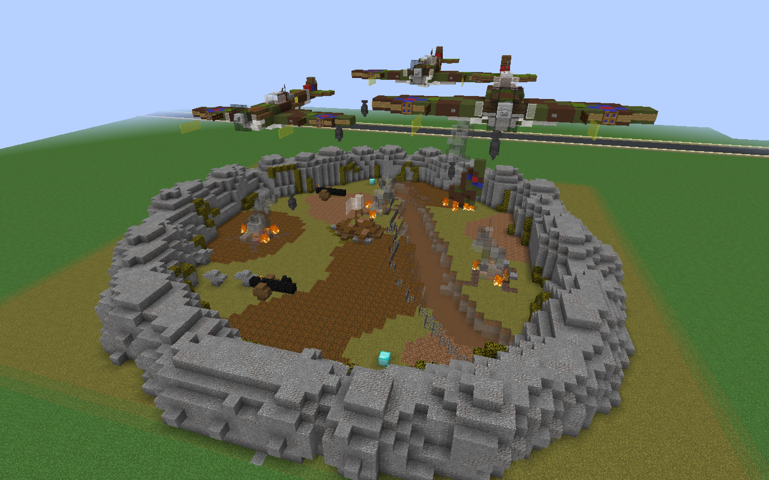
rkut2Ir.png

screen-shot-2020-04-30-at-7-52-11-am-png.163655

- The prison walls
Your buildings face the same main problem like with the ground, it just looks so messy. From my eyes it seems like again you used the //replace command to make WorldEdit decide at random if a block should be Andesite, Stone, Brick, Moss Brick, etc. I cannot exactly say what kind of stone-material would be best to use, but I recommend making the building out of either Stone Bricks or regular Stone and not spam them everywhere. Though you should experiment a little trying to see what block(s) work best for the building.
- Prison yard
It's also good to point out things you have done well, which is choosing different materials for the prison yard, instead of Granite. Sand works well considering the blocks you used for the islands. Only tip I can give is the same as with the previous advice, it looks a bit messy as if it was just the //replace command.

- The islands look so... blank
There's nothing! Aside from the prison complexes the islands are just empty! What I would recommend is adding small, not too major, scenery. For example you could add small bits of fencing around the edge of the island to simulate a prison fence. You could add some regular rocks made out of stone to give the map more colors, just make sure to make it look more interesting!


This is my feedback as far as it goes visually, I do not often build EggWars map (I hate the gamemode lol) so I cannot really say anything regarding the lay-out of the map or the amount of generators on this map and their positions.
- On the positives I feel it would be very PvP friendly, but definitely needs a more unique layout!

Please do not be disheartened by the above comments and take some of the advice on board from Jereon, if you wish to submit another map in future, thanks!
 
Status
Not open for further replies.
Members Online

Team online

Latest profile posts

coolzombiee wrote on NADER KANAAN's profile.
Happy birthday!
IMG_1809.jpg
IMG_1810.jpg

Never playing na op again........
Note: the game was Sky Wars Mega, the map was Lucky, and loot was OP
i’m bored, anyone need a profile pic?
Top Bottom