D
Minecraft PC IP: play.cubecraft.net
Thanks for the feedback, we will take this with us!


Never playing na op again........
Note: the game was Sky Wars Mega, the map was Lucky, and loot was OP
You are using an out of date browser. It may not display this or other websites correctly.
You should upgrade or use an alternative browser.
You should upgrade or use an alternative browser.
Implemented [TEAM SKYWARS] Oriental [ACCEPTED]
- Thread starter Basketman
- Start date
-
- Tags
- map submission skywars
- Status
- Not open for further replies.
im actually obsessed with this map
The map is surely good and has a lot of potential, I voted no because you can still improve the map in its details to make it as perfect as possible.

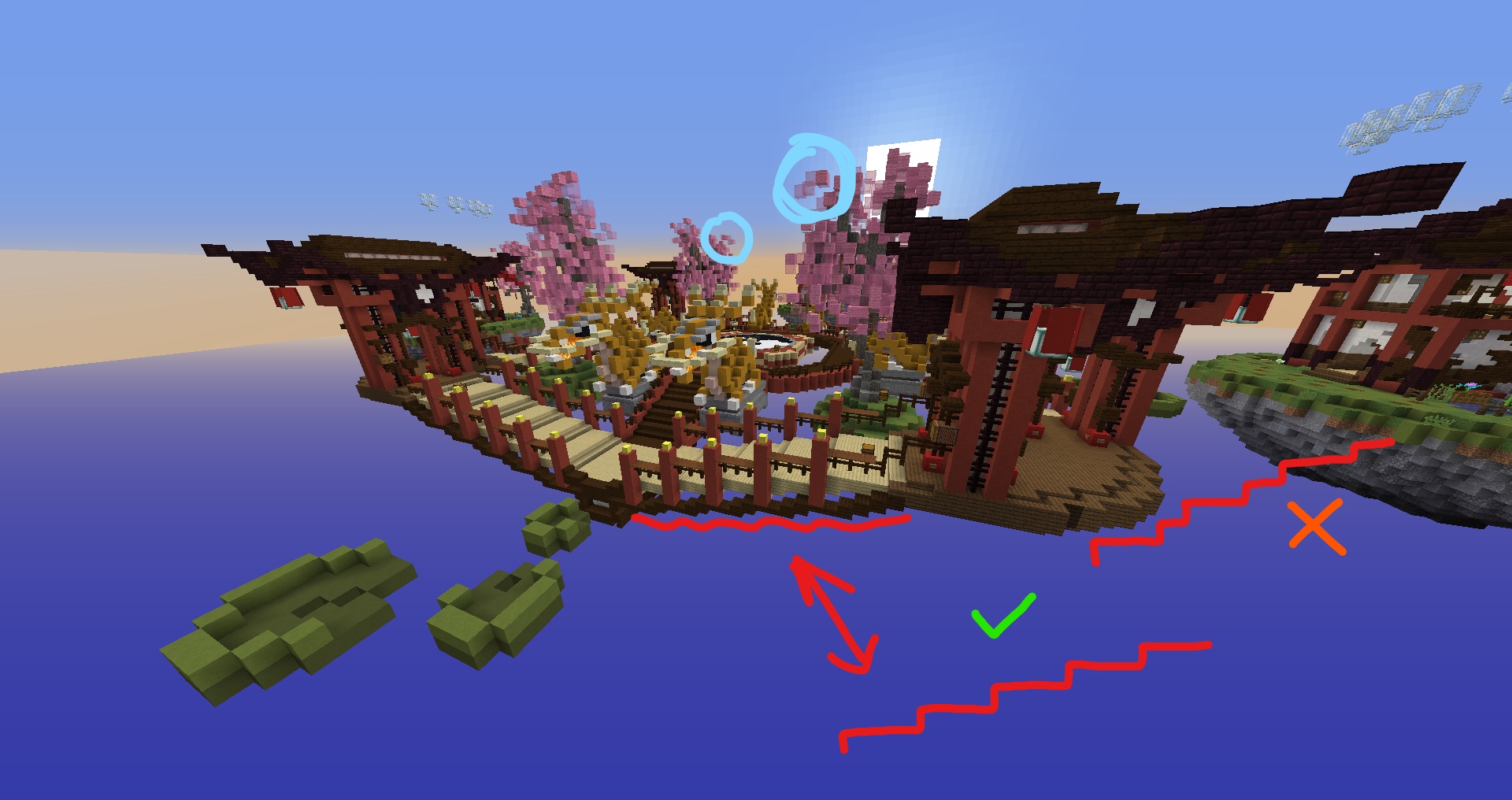
I'd suggest to fix the trees: there are some floating blocks and the bottom is 3 blocks wide and then gets to 1 block wide too soon, you should make the tree a bit fatter, if you look at the base it doesnt look really realistic.
Another thing I'd change is the bridge: instead of placing 3 blocks and 1 slab, place 2 blocks and 2 slabs to give it a straight shape and I think it would be better for the pvp as well.

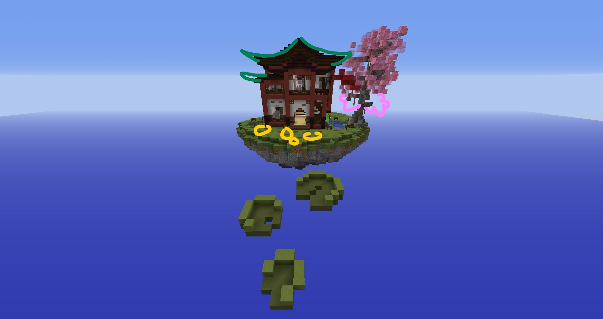
In the starter island I dont really like the outisde design of the house/temple: it looks like a mixture of both structures, I'd suggest making the roof bigger, as the oriental temples have . another thing I dont like are the random podzol blocks placed like that, I'd remove them. Then the tree has 2 branches without leaves and I dont get the reason.
Dont take this comment as too judgy, I've been a builder for years and I just wanna help you to improve the map since it's probably gonna be added.
Anyways, well done and keep up the good work.
I'd suggest to fix the trees: there are some floating blocks and the bottom is 3 blocks wide and then gets to 1 block wide too soon, you should make the tree a bit fatter, if you look at the base it doesnt look really realistic.
Another thing I'd change is the bridge: instead of placing 3 blocks and 1 slab, place 2 blocks and 2 slabs to give it a straight shape and I think it would be better for the pvp as well.
In the starter island I dont really like the outisde design of the house/temple: it looks like a mixture of both structures, I'd suggest making the roof bigger, as the oriental temples have . another thing I dont like are the random podzol blocks placed like that, I'd remove them. Then the tree has 2 branches without leaves and I dont get the reason.
Dont take this comment as too judgy, I've been a builder for years and I just wanna help you to improve the map since it's probably gonna be added.
Anyways, well done and keep up the good work.
The map is surely good and has a lot of potential, I voted no because you can still improve the map in its details to make it as perfect as possible.
View attachment 164081
I'd suggest to fix the trees: there are some floating blocks and the bottom is 3 blocks wide and then gets to 1 block wide too soon, you should make the tree a bit fatter, if you look at the base it doesnt look really realistic.
Another thing I'd change is the bridge: instead of placing 3 blocks and 1 slab, place 2 blocks and 2 slabs to give it a straight shape and I think it would be better for the pvp as well.
View attachment 164082
In the starter island I dont really like the outisde design of the house/temple: it looks like a mixture of both structures, I'd suggest making the roof bigger, as the oriental temples have . another thing I dont like are the random podzol blocks placed like that, I'd remove them. Then the tree has 2 branches without leaves and I dont get the reason.
Dont take this comment as too judgy, I've been a builder for years and I just wanna help you to improve the map since it's probably gonna be added.
Anyways, well done and keep up the good work.
Thanks for the feedback, we will take this with us!
D
Deleted member 469419
Guest
When get this awesome map added? I'm still waiting...
:)
:)
Same, I'd love playing this mapim actually obsessed with this map
Just a beautiful map!
Very thought out and practicle I could definitely see myself playing on this map!
Very thought out and practicle I could definitely see myself playing on this map!
Hello Siftenly, Zuvi, Thijs_PRO and Basketman, thank you for your efforts in submitting this.
Fortunately, collectively the design team have decided to accept this map submission due to the following reasons:
- I'm glad I logged onto your server lol and managed to talk you out of what you originally made. Layout is one of the most important factors of a map. Remembering that and making a map that is both suitable for Bedrock and Java is a huge bonus. As you've now made a map that can be played by 23k+ concurrent players, rather than 5.5k+ concurrent players
- The team were all in agreement that we liked the finishing touches and hopefully you listen to Diav and did those last couple of touches!
- Build quality is great, the bridges and arches are very fitting to the theme. The centre is pretty cool and different with the spacing of the circle.
- We will probably rename the map as a heads up, so any ideas what to name it to, dm me on slack :p
- Community votes wow, 95 yes - seems like a no brainer
Thanks for map submission, excited to see this in game in a future map update!
- Status
- Not open for further replies.
Similar threads
- Replies
- 7
- Views
- 316
- Replies
- 6
- Views
- 672
Team online
-
FlxenMeowderator
Members online
Total: 721 (members: 8, guests: 713)
Latest profile posts
Never playing na op again........
Note: the game was Sky Wars Mega, the map was Lucky, and loot was OP


