Minecraft PC IP: play.cubecraft.net

Does this map have potential to be added?


  • Total voters
    11
Status
Not open for further replies.

UBRE

Well-Known Member
May 30, 2020
273
508
149
Mexico.
By: Wave Master and UBRE.

Fossil is a map that Wave Master had the idea to, I saw that he posted a similar one in August but for solo egg wars, so I think this 1 is different enough.

Teams there (rn at least): Blue, Orange, Yellow, and Red.

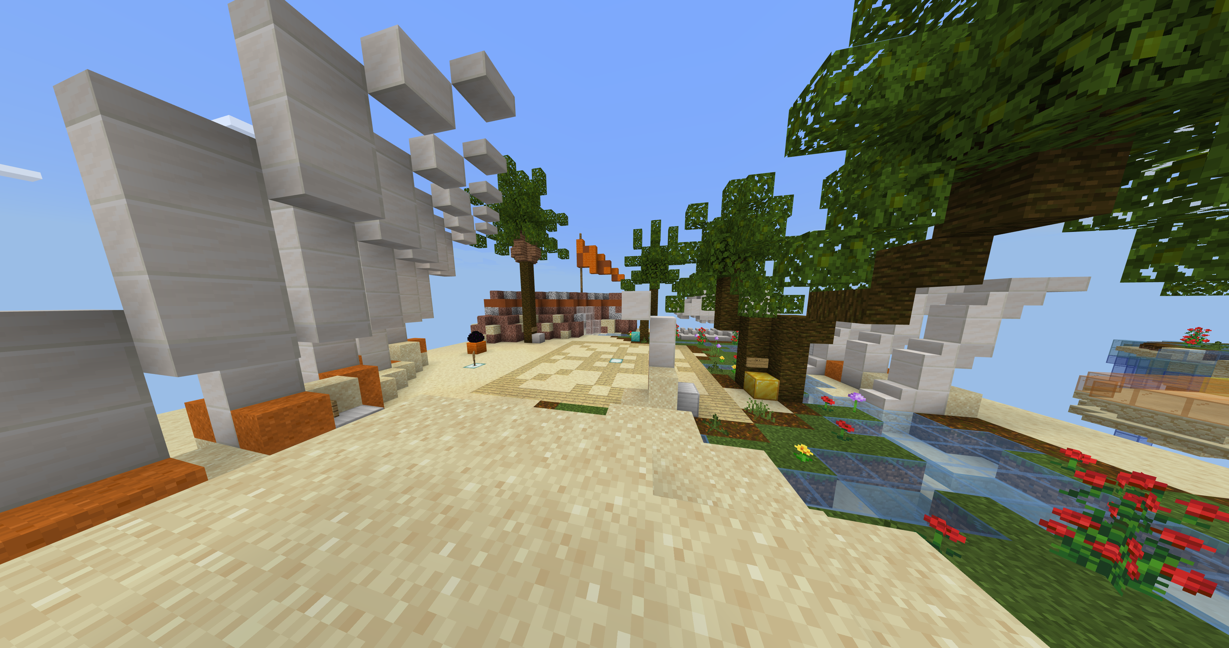
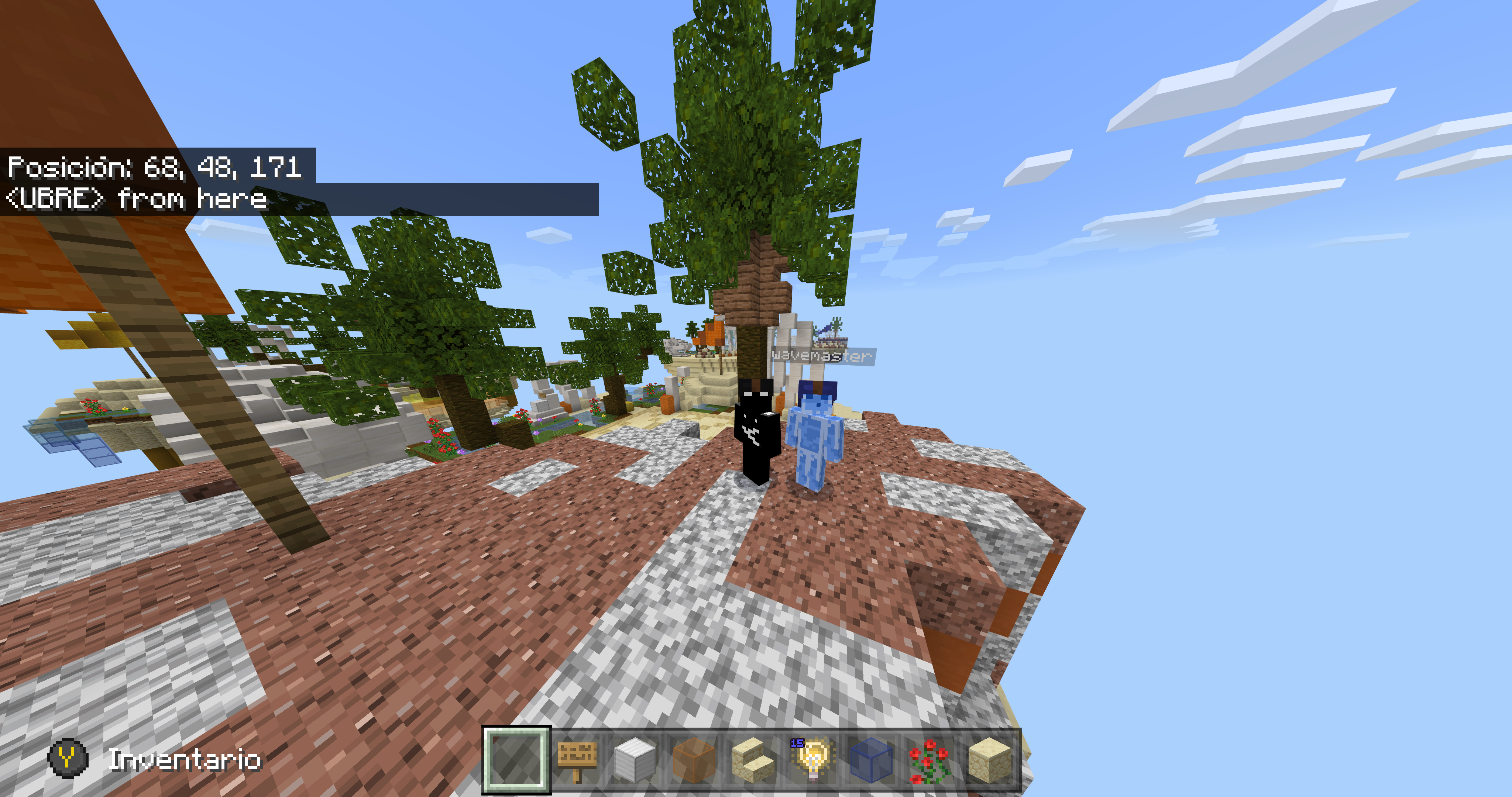
Spawn Islands.
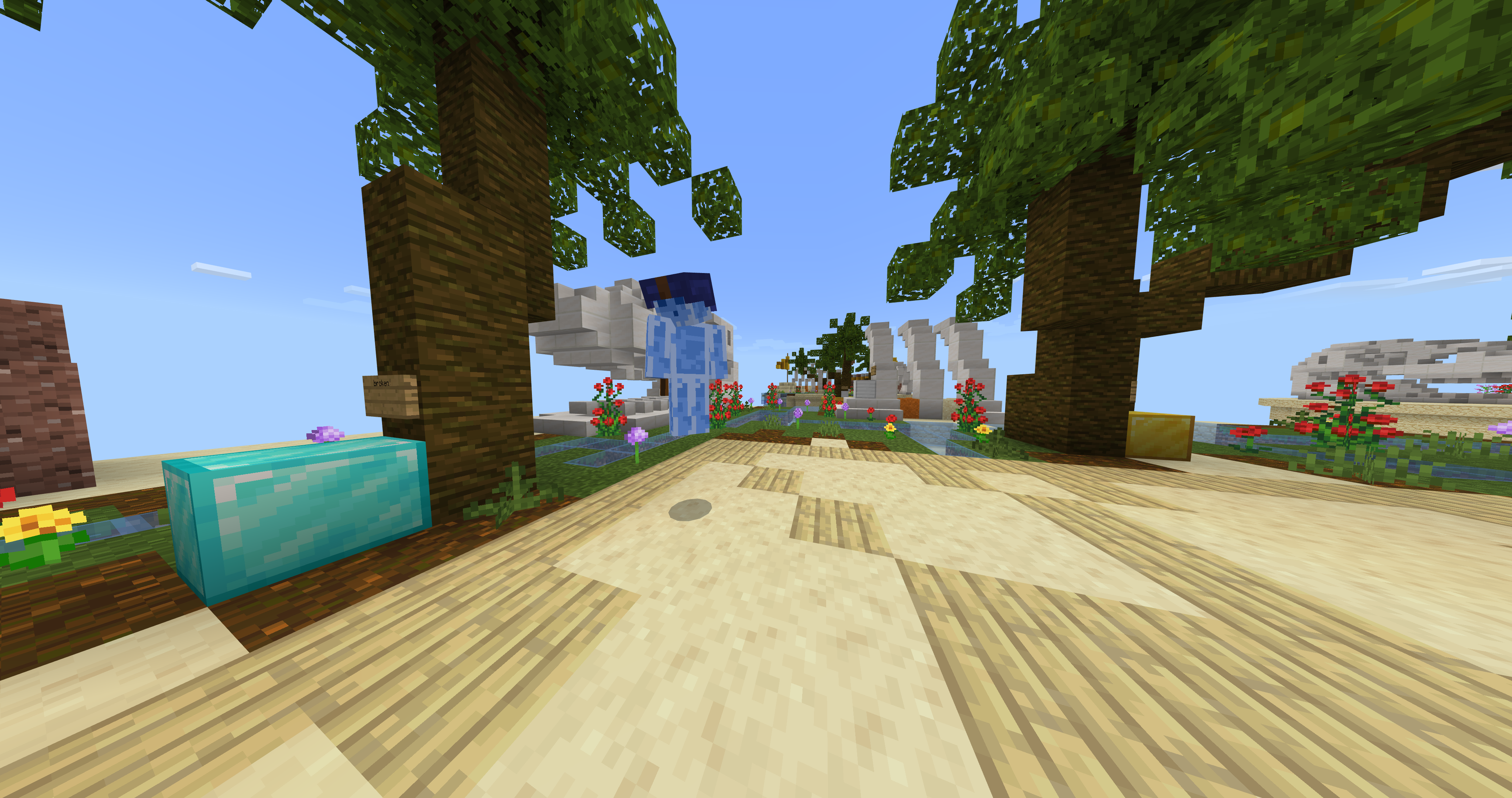
Panoramic horizontal spawn island.png

Spawn island's gens.png

selfie-general view of the island from up.png


They have: Broken Diamond Generator, Gold generator lvl 1, 2 Iron generators (one lvl 2 and one lvl 1).

Sub Mids.
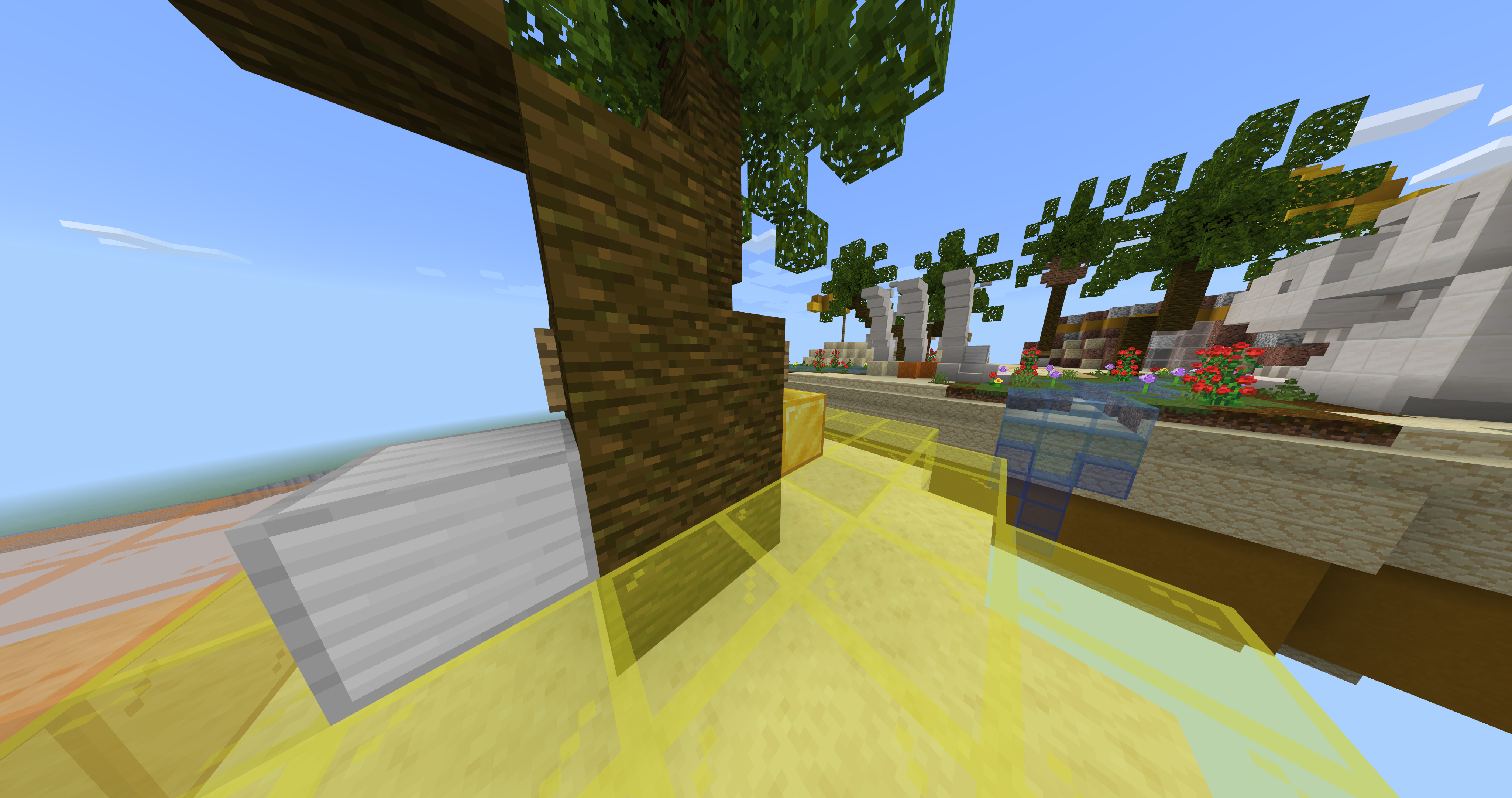
Sub mid fossil.png

2 islands fossil.png


They are divided by half with the teams color that is in their side, they offer:


Iron and gold generator, both level 2.

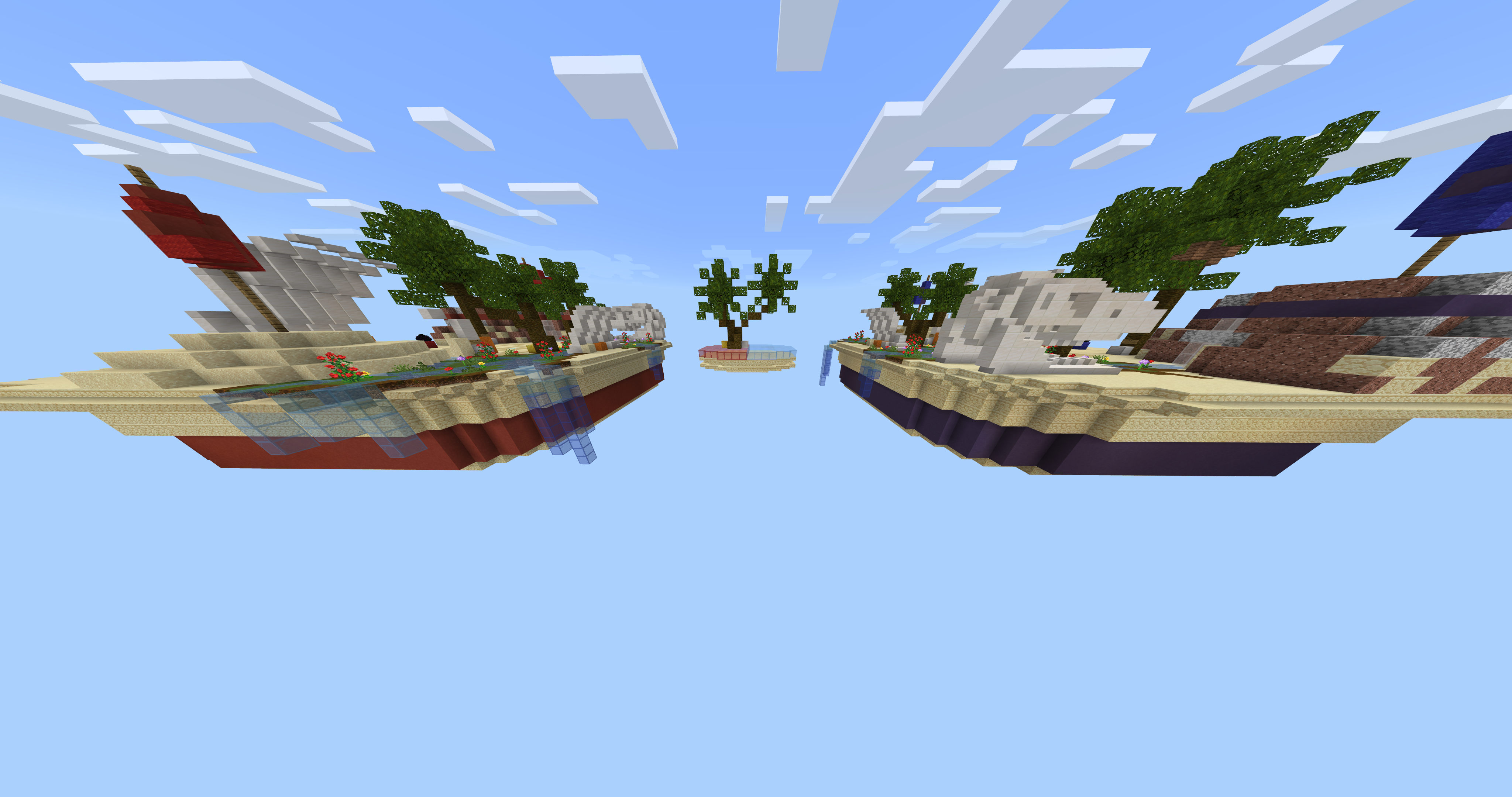
Center.
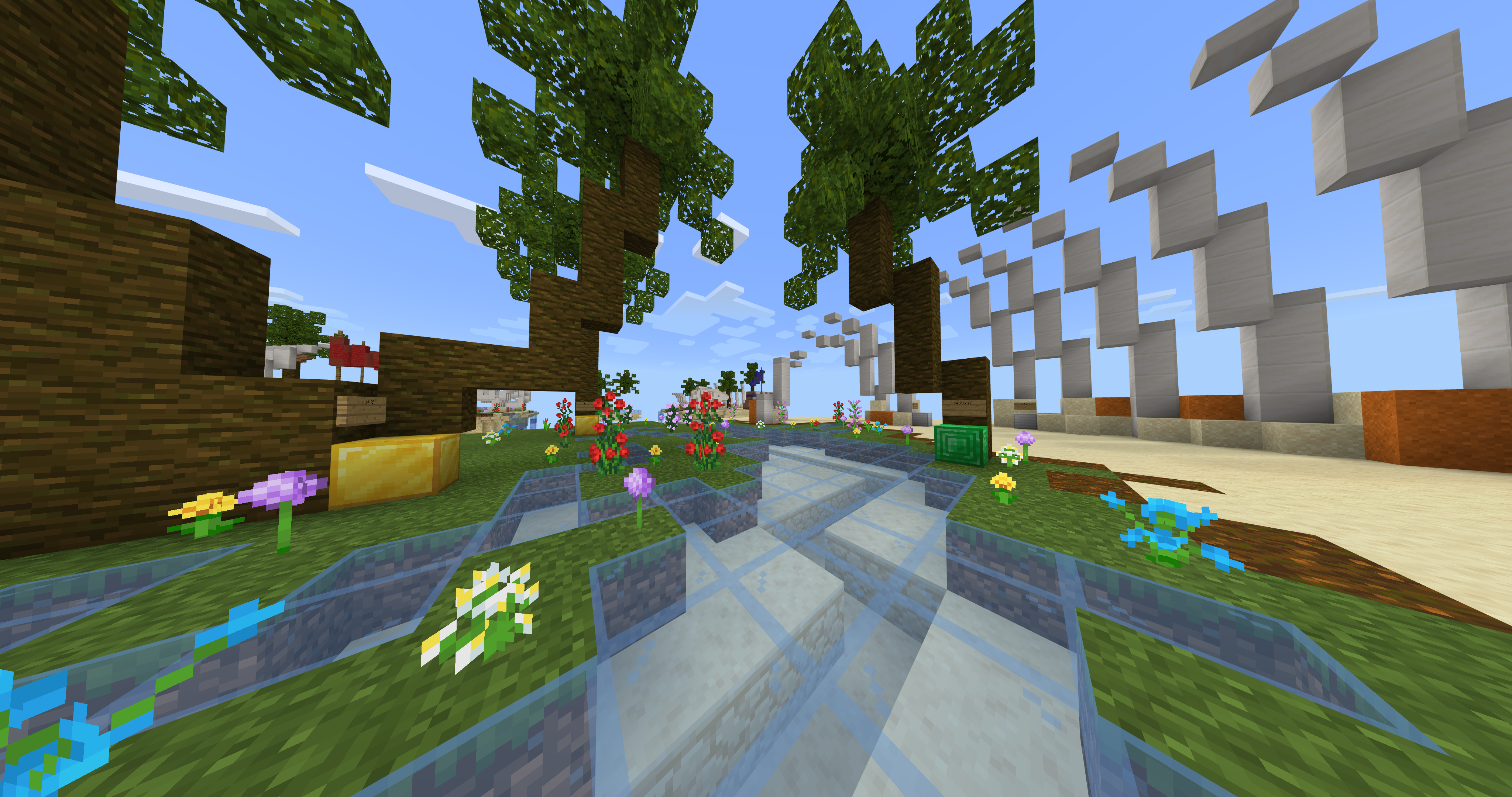
Panoramic center fossil.png

Panoramic ccenter ilands-sub mid.png


As we both don't like "runners", we put a boulder in the flat terrain, but there's flat zone at mid, and you can hide behind palms and other stuff (btw the below part looks awesome for both of us).

Gens: 2 Iron lvl 2 gens, 2 lvl 2 gold gens, 1 diamond lvl 3 gen and 1 Broken Emerald gen.

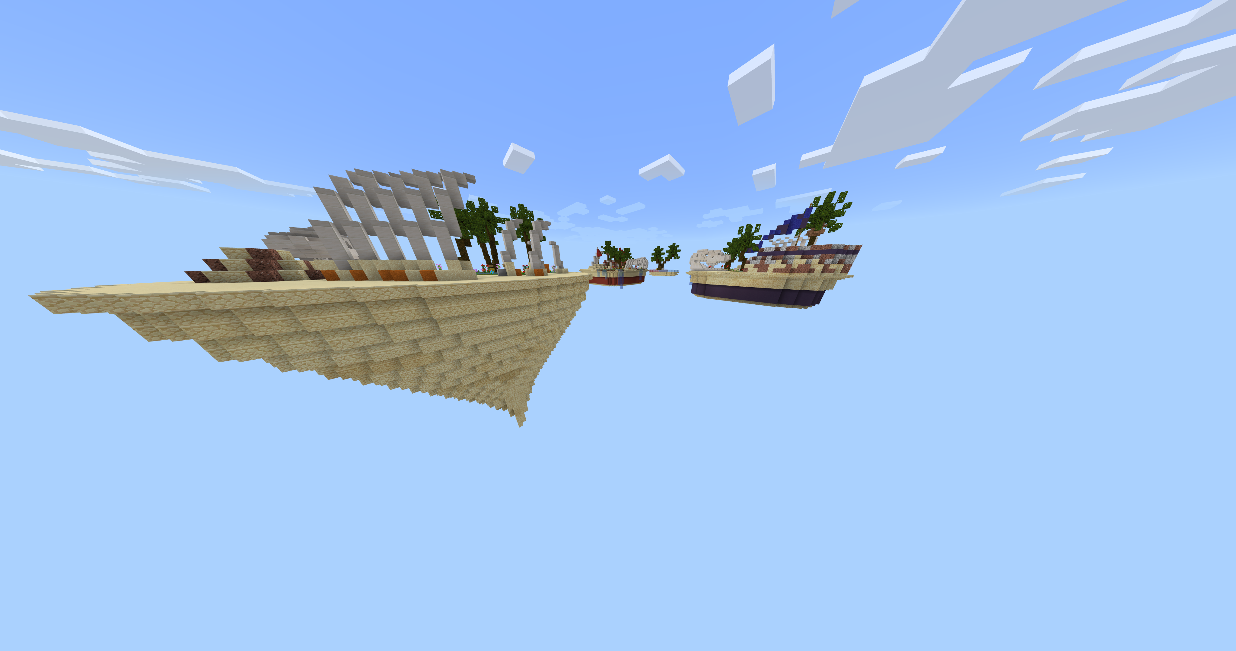
I took an aerial screenshot as well.
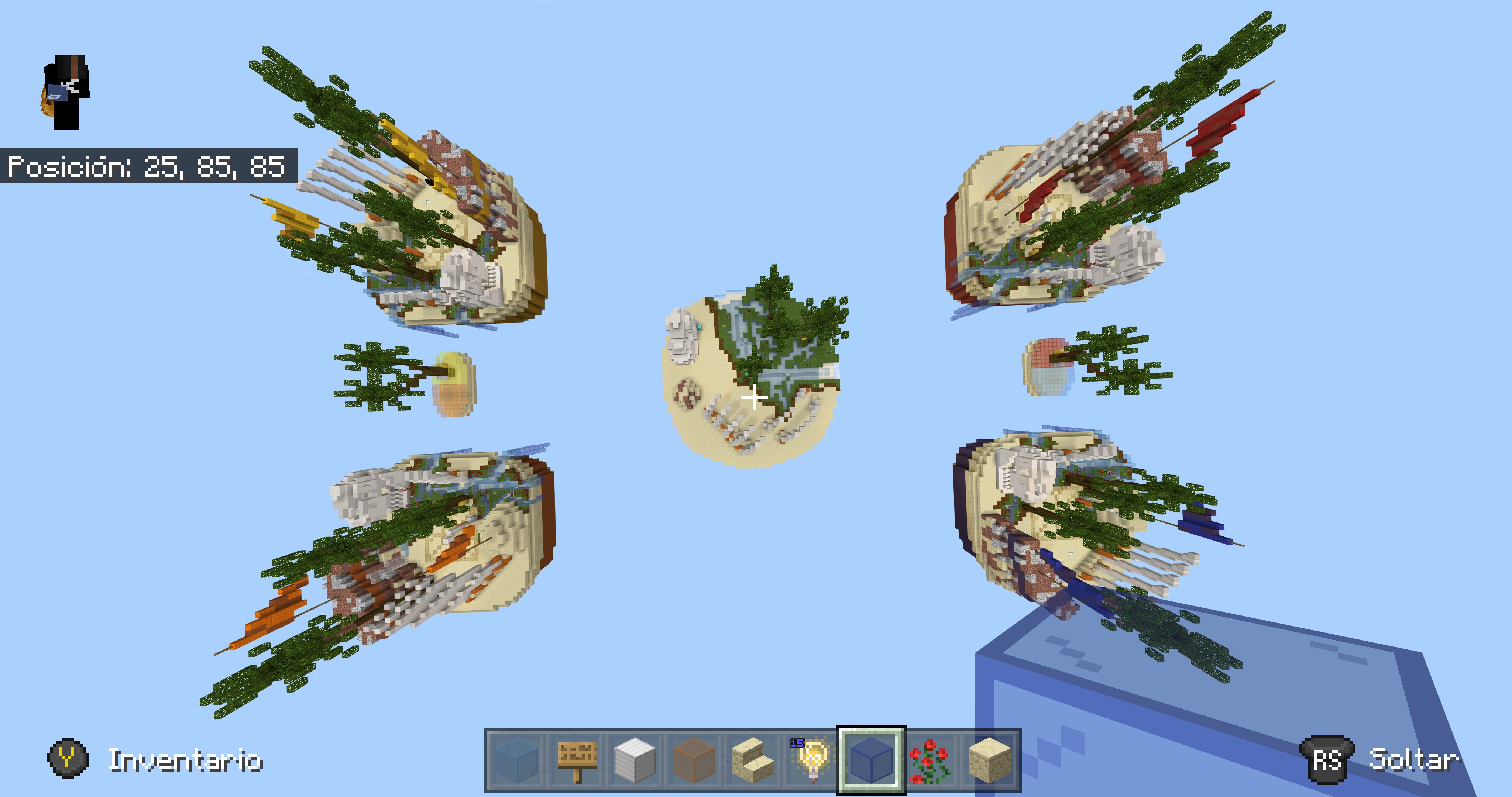
Aerial view fossil.png


We added the waterfalls to block clutch more easily, they are at every island except for sub-mids, Is thought of as a rush map, with near spawn islands (maybe they can be a little bit more apart from each other idk.

Give us some feedback (Is my first time making and submitting a map :D).
 

Dreamer

Forum Expert
Dec 3, 2016
551
1,741
349
Antwerp - Belgium
This looks not that bad actually and with some improvement it will be ready for the game in my opinion!

- The spawn islands are way too close to each other, make sure they have more space
- Maybe add some buildings or caves to make it interesting and more various.
- If you take screenshots, pls turn down your FOV to normal :D
 
  • Like
Reactions: UBRE

UBRE

Well-Known Member
May 30, 2020
273
508
149
Mexico.
This looks not that bad actually and with some improvement it will be ready for the game in my opinion!

- The spawn islands are way too close to each other, make sure they have more space
- Maybe add some buildings or caves to make it interesting and more various.
- If you take screenshots, pls turn down your FOV to normal :D
-We will add that.
-What can be in the caves? (I thought of them but Wave and me didn't do them because there was nothing to put there).
-What's wrong with the FOV? (I thought it will cover more space and for me that FOV is the normal one, but I can always change it.
 

Dreamer

Forum Expert
Dec 3, 2016
551
1,741
349
Antwerp - Belgium
-We will add that.
-What can be in the caves? (I thought of them but Wave and me didn't do them because there was nothing to put there).
-What's wrong with the FOV? (I thought it will cover more space and for me that FOV is the normal one, but I can always change it.
maybe put the diamond gen there (broken) or you can put it in a building. the gens should not all be very easy to access, try and put them a bit further to prevent rushing and OP endgames.

The FOV looks really high in pictures, even when you put it on normal, now it looks all stretched and its harder to calculate distances and it makes the map look weird instead of beautiful in some way
 

UBRE

Well-Known Member
May 30, 2020
273
508
149
Mexico.
The buildings and style look good. But I would recommend to remove the waterfall, it looks easy to camp there rn.
We can solve that by doing a similar thing as we did in the center, the waterfalls will still there because they ain't that big, but the part below the island, maybe do it a bit smaller to prevent camping (unless they do a tower to the void by suiciding but the thing I'm commenting should be enough for most of underbasers.
 

UBRE

Well-Known Member
May 30, 2020
273
508
149
Mexico.
Thx so much for the feedback everyone, we are looking further to implement the ideas you comment on here, atm the sub mids have changed to other style more according to the map, and we are starting the cave @Dreamer commented, @Samixly ur idea is actually not that bad and it will make the map similar to western (actual implemented map), never thought of it, thx so much.

The changes will be published within a week I think :D.
 

Ferrcho

Dedicated Member
Jun 24, 2019
951
855
174
18
Spain
Hello! I really like this map but I think that inside the caves you could put some details, the islands are bigger than the middle and that makes it look a bit weird. I wouldn't add this map, because CubeCraft has a very similar map that is of summer (Whale), at least this map is added in Java, I don't know if in Bedrock too. I value very much this construction, since it will have cost you a lot of work.
 

Wave Master7S

Forum Expert
Jul 31, 2020
836
1,721
264
United States
Pronouns
He/Him
Hello! I really like this map but I think that inside the caves you could put some details, the islands are bigger than the middle and that makes it look a bit weird. I wouldn't add this map, because CubeCraft has a very similar map that is of summer (Whale), at least this map is added in Java, I don't know if in Bedrock too. I value very much this construction, since it will have cost you a lot of work.
How is it similar to whale.Its not though.Please explain how it’s similar to whale.Yes I did get some inspiration from the layout with sub middles but besides that it’s not like whale.
 

Wave Master7S

Forum Expert
Jul 31, 2020
836
1,721
264
United States
Pronouns
He/Him
I just said that the main islands, and the semi-centers look a lot like the original Whale map.
Yes because they have water and palms that’s it and also we’re changing the semi middle to ribs if you didn’t see that.The Map is like more of an oasis theme then a beach one. Yes I know that the river and palms look like whale but they’re completely different.And does whale have fossils or a dinosaur head or a stone ledge or a cave that I’m adding or tunnels just because it has palms and water its looks like whale.Semi middle definitely looks like whale 100% lol
image.jpg
New submiddle!
 

Ben5124

Well-Known Member
Jun 5, 2020
201
435
84
The UK
Cool map, although some of the islands are at odd distances. But nice job in making it, and on Bedrock without plugins! (I assume xD)
 

Wave Master7S

Forum Expert
Jul 31, 2020
836
1,721
264
United States
Pronouns
He/Him
Cool map, although some of the islands are at odd distances. But nice job in making it, and on Bedrock without plugins! (I assume xD)
We used completely vinalla minecraft we used cloned using commands and used /fill.No mods here just build commands and building.
 

UBRE

Well-Known Member
May 30, 2020
273
508
149
Mexico.
Hi, hete second creator, we are calculating distances for other sub mid, @FerminTorno18 ur suggestion is good, we (wave really) added detail to caves but the map is thought as a rush one, I will see with Wave if we can make the center bigger but IDK really, maybe smaller islands.

Anyway let‘s hope we can make it better.
 
  • Like
Reactions: Ferrcho
D

Deleted member 491790

Guest
It looks good, however it feels a little too flat. Don't get me wrong, flat is good, but it just feels a little too flat, could do with some sprucing up imo. Good job though!
 

Soulless_Unity

Well-Known Member
May 22, 2017
106
361
144
Hello, thank you for your efforts in submitting this.

Unfortunately, collectively the design team have decided to deny this map submission due to the following reasons:
-Islands are very close to each other leading to win farming.
-Islands could be textured a bit better using a wider variety of blocks.
-Semi mid seems a little small for the map.

Please do not be disheartened by the above comments, take this as a learning experience. Really hoped you enjoyed building this and have lots of fun in the future!
 
Status
Not open for further replies.
Members Online

Team online

Latest posts

Latest profile posts

Maybe a bit of a dumb question, but do chat prefixes exist on Cubecraft Java like they do on Bedrock?
Eli wrote on llvqs's profile.
I declare your profile officially inaugurated
1000048966.png
i stole this from Reesle
Eli wrote on Flxen's profile.
Flxen appreciation post :)
coolzombiee wrote on Darwin7's profile.
Thank you for the follow! I didn’t notice lol take one back
Top Bottom