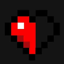
We can all see how much hp this is. It's obviously 8.5 hp.

But... during a fight, it's extremely difficult tell exatly how much health your opponment has. And the purpose with the health indicator is to inform you how much health your enemy has.
But how can you tell how much hp they have if the 'half hp' heart is a heart with a lighter shade of the 'full heart'? The eyes mixes the colors of the hearts together when you're not focused. Which you aren't when you're fighting someone. This is why it's so difficult to know the health of your opponment during a fight. - This may not be a problem for all the players among us, but most of us have troubbles telling the difference during a fight.
My suggestion is to make it easy to spot the difference.
You could let us customize our own heart settings. But if you (cubecraft staff) do not like the customization suggestion... atleast change the half heart to something that is "possible to see during a fight".
Exemples of customizations:
* Changing the size of the hearts.
* Changing the transparency of the black rectangle (the black box that the hearts are glued on).
* Instead of having another shade of red for the 'half heart', make it litterly a half heart please.
 <--
<--
* I'm not saying I want this in the customization setting, but I read other suggestions that are similair and some players would appreciate if you also allowed us to pick between multiple colors for the hearts. Like maybe to make it EVEN easier to spot the difference, we could choose the big hearts to be the color RED and the 'half hearts' could be 'half hearts' + the color blue maybe.
(Just an exemple)
Me and probably other members would appreciate if Cubecraft atleast did something about the health indicator-BAR. Like I said, when you're in a fight, you ually can't tell how much hp they have. Unless you stare at the health bar, which you really can't do, unless you want to lose your fight quicker than the speed of light. ಠ_ಠ
ಠ_ಠ
Thank you for reading my suggestion and I hope I will get full support by the community and the staffs aswell on this! - I also apologize if my english wasn't good. I tried my best! ❤
But... during a fight, it's extremely difficult tell exatly how much health your opponment has. And the purpose with the health indicator is to inform you how much health your enemy has.
But how can you tell how much hp they have if the 'half hp' heart is a heart with a lighter shade of the 'full heart'? The eyes mixes the colors of the hearts together when you're not focused. Which you aren't when you're fighting someone. This is why it's so difficult to know the health of your opponment during a fight. - This may not be a problem for all the players among us, but most of us have troubbles telling the difference during a fight.
My suggestion is to make it easy to spot the difference.
You could let us customize our own heart settings. But if you (cubecraft staff) do not like the customization suggestion... atleast change the half heart to something that is "possible to see during a fight".
Exemples of customizations:
* Changing the size of the hearts.
* Changing the transparency of the black rectangle (the black box that the hearts are glued on).
* Instead of having another shade of red for the 'half heart', make it litterly a half heart please.
* I'm not saying I want this in the customization setting, but I read other suggestions that are similair and some players would appreciate if you also allowed us to pick between multiple colors for the hearts. Like maybe to make it EVEN easier to spot the difference, we could choose the big hearts to be the color RED and the 'half hearts' could be 'half hearts' + the color blue maybe.
(Just an exemple)
Me and probably other members would appreciate if Cubecraft atleast did something about the health indicator-BAR. Like I said, when you're in a fight, you ually can't tell how much hp they have. Unless you stare at the health bar, which you really can't do, unless you want to lose your fight quicker than the speed of light.
 ಠ_ಠ
ಠ_ಠThank you for reading my suggestion and I hope I will get full support by the community and the staffs aswell on this!
 - I also apologize if my english wasn't good. I tried my best! ❤


