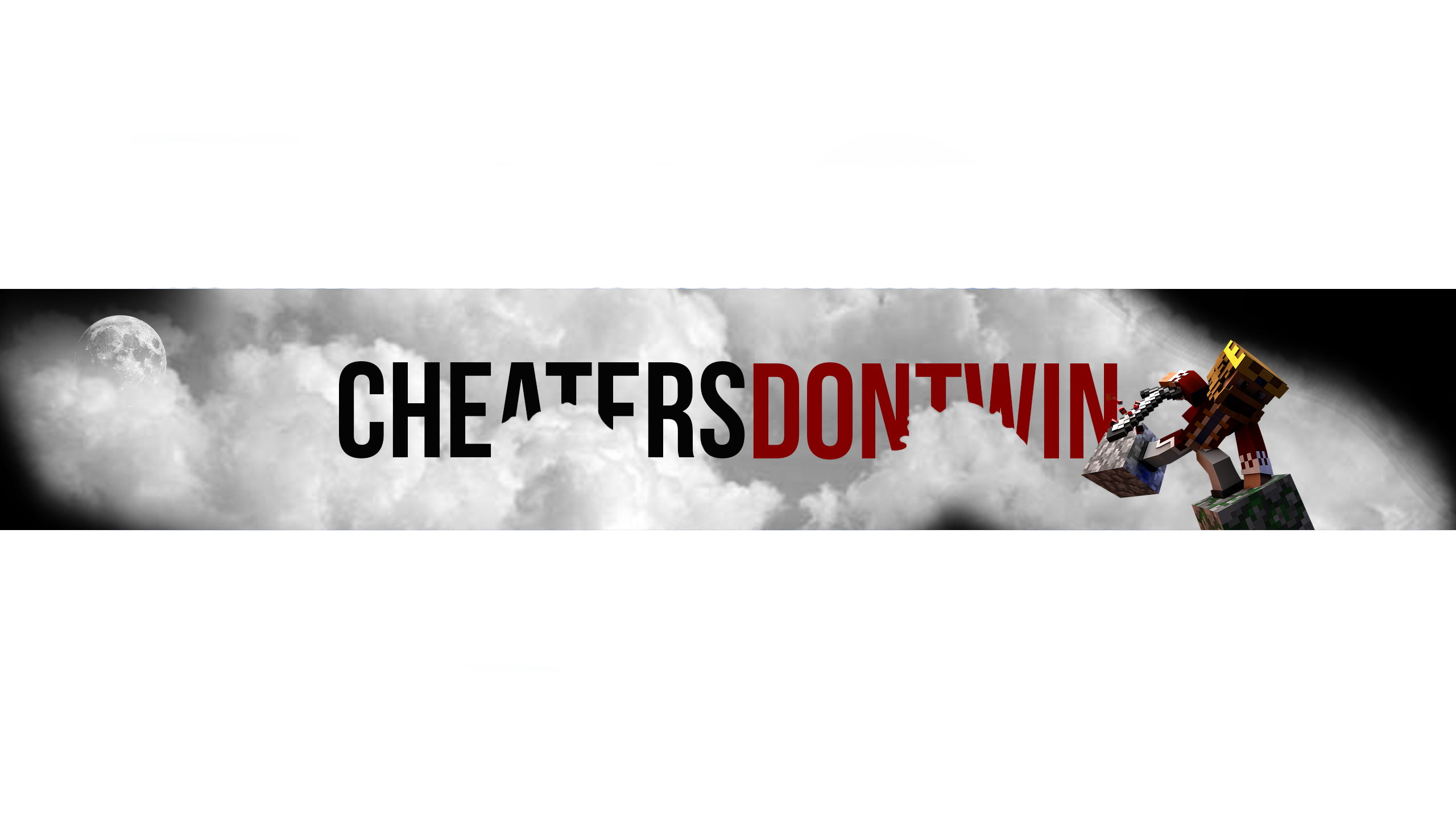
I would say the moon is a bit out of place, very subtle and unnoticeable because it is the same colour as the clouds. Perhaps change the colour of 'win' to black would look nicer (not sure, but give it a go). The character is a bit dark. A soft light on its face will do the trick. Also remove the black spot on the left cloud on the foreground. Perhaps some stars in the black area's might create some depth as well.
Just look at this one zoomed out a bit so you don't notice the horrible mess I made under 'dont', but you get the idea
View attachment 141247
Thank you for all the tips/information. Really appreciate that!
The original moon was actually on the right-side of the banner. But I didn't really liked that because the character was there already. But yes, it's indeed unnoticeable. I'm not sure about that black color on "win". But I will give it a go.
The character is indeed kinda dark. Will make it less darker in the face, like you said. Didn't really noticed that black spot, didn't really triggered my mind I guess :P. But it's indeed, something that need to be removed.
The stars are actually a great idea! Thanks again.
**Notice: this is just a sketch. I'm not sure what banner I would use for my YouTube channel. So it's not detailed or anything else. Will make it more detailed if I get this one as my main banner. But thanks for all the tips, feedback is always welcome! :)


