Minecraft PC IP: play.cubecraft.net

Should this map be added?

  • Yes

    Votes: 24 75.0%
  • No

    Votes: 8 25.0%

  • Total voters
    32
Status
Not open for further replies.

Andyyy

Forum Expert
Dec 7, 2016
1,038
2,065
308
21
Blockwars
Map Name: Magic
Creator: Andyuu


Here I created this map quite a while back but it is my favourite from the bunch I made. It features a bunch of different paths, safe and easy to risky. Here's an overhead view where you can see the magnitude of the awesome spires!
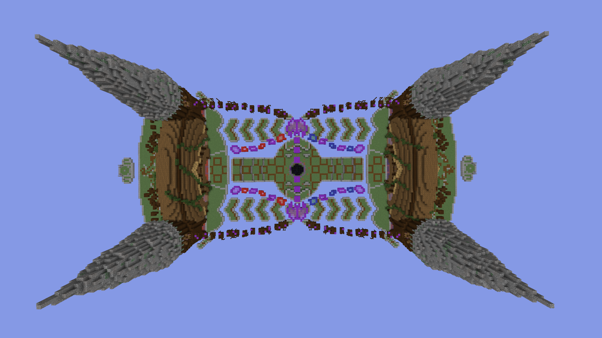
2019-07-03_16.02.06.png

Here we have a side view from one side. The map really feels grand without it being too massive.
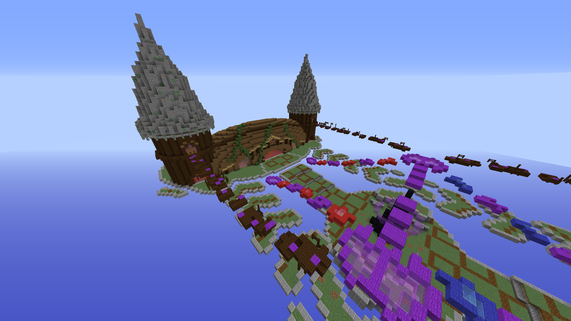
2019-07-03_04.31.40.png


Here's the view from the spawn point. You can see the spiral pathways at the back to get a fun way to the top.
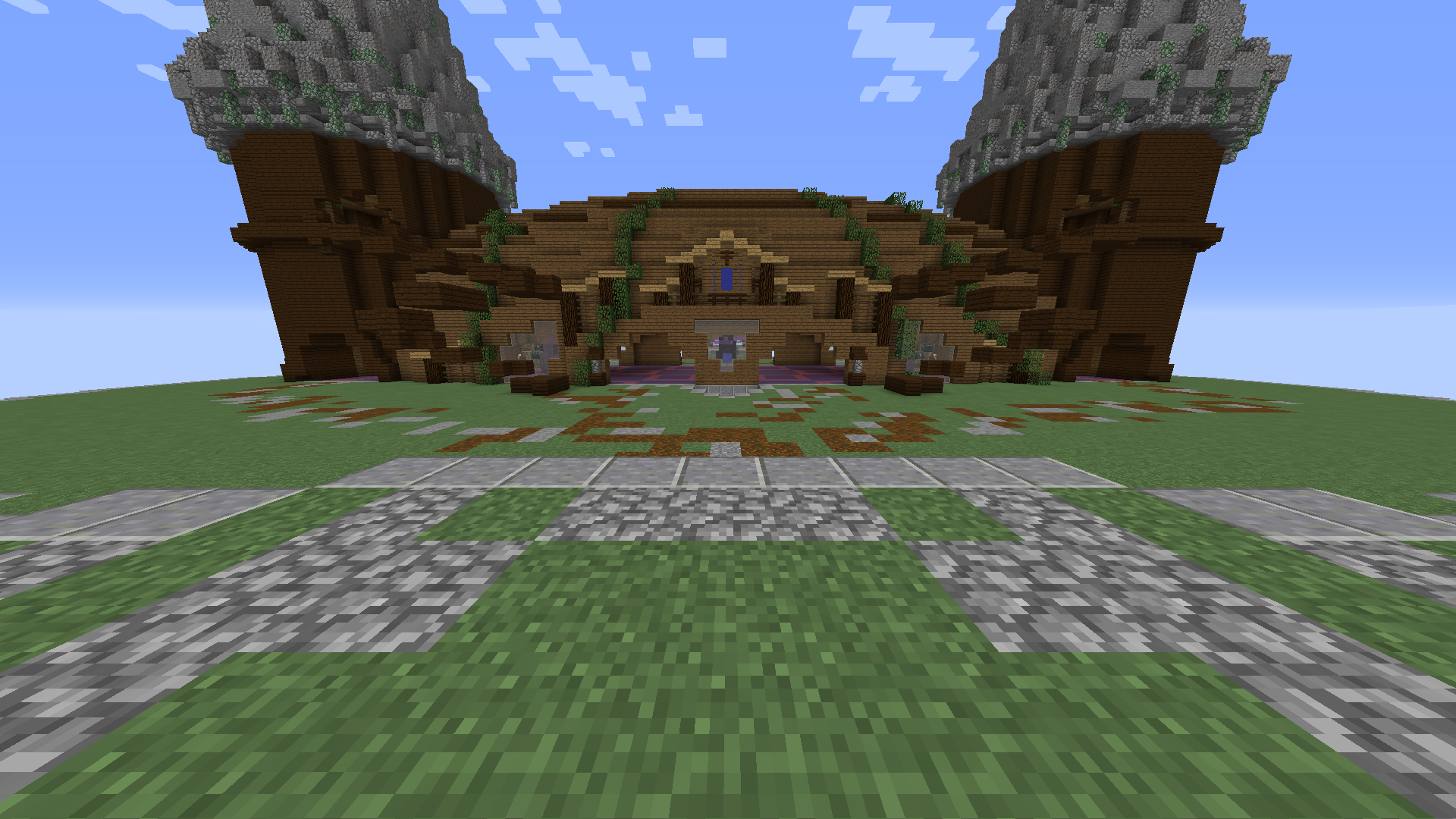
2019-07-03_04.33.50.png

A close up of one of the towers, where you can see one of the riskier paths.
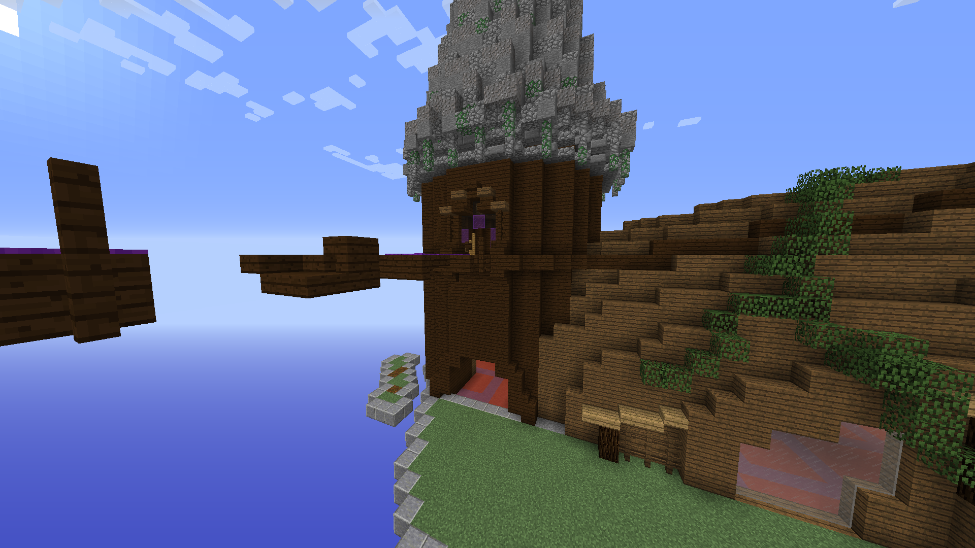
2019-07-03_04.32.04.png

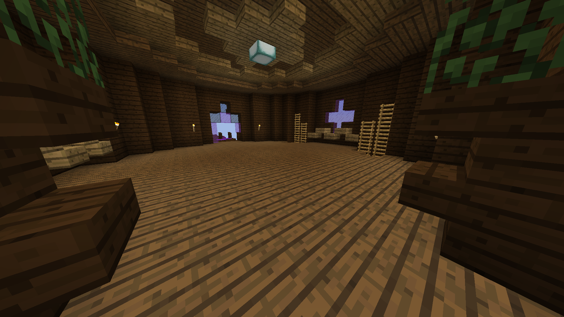
Here's the room at the end of the path with ladders connecting to the bottom.
2019-07-03_04.32.42.png


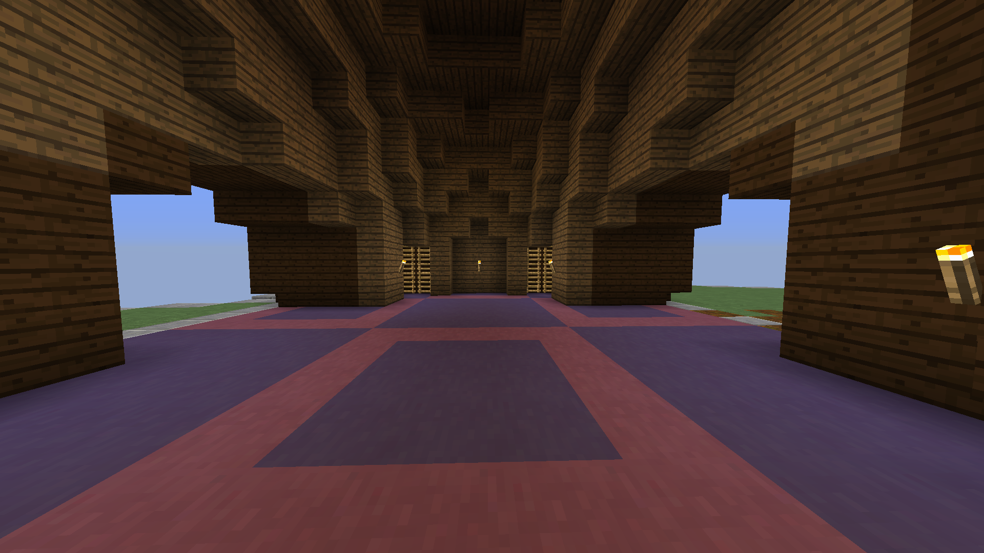
Here we have the downstairs to the ladders which leads to the flag room.
2019-07-03_16.24.23.png

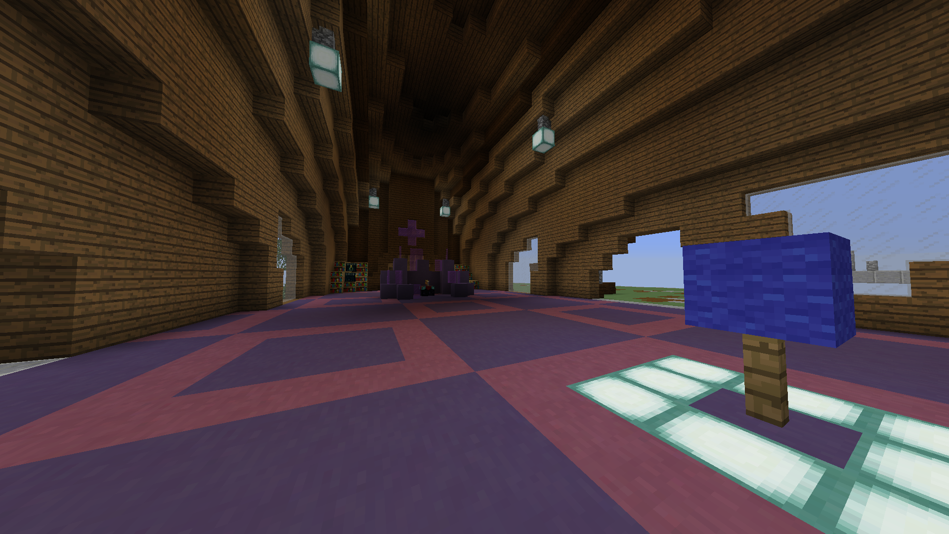
Last but not least, we have the flag area. It's far away enough from the spawn point that teams are not able to camp and is nice and open to be accessible from all paths. It's well lit and quite stylish.
2019-07-03_04.32.58.png


And that's about it. I don't believe there are any non 1.8 blocks here but if there are, please tell me. Thanks for reading!

And obviously thanks to the Blockwars guys for hosting the map on their server!
 

God.

Well-Known Member
Apr 29, 2017
584
610
123
Hell
Wonderful!But don't you need to upload the images or just copying the direction is enought?
 

Andyyy

Forum Expert
Dec 7, 2016
1,038
2,065
308
21
Blockwars
Wonderful!But don't you need to upload the images or just copying the direction is enought?
Both directions are the same apart from random texture bits such as the paths which are different. I did upload the images, they are just not as thumbnails as well.
 

God.

Well-Known Member
Apr 29, 2017
584
610
123
Hell
Both directions are the same apart from random texture bits such as the paths which are different. I did upload the images, they are just not as thumbnails as well.
With direction I mean url of the image(usually after uploading it to imgur),my english isn't perfect sadly
 

Shallidor

Dedicated Member
Feb 2, 2018
789
1,829
229
23
I like the map :)
I don't play Blockwars often, but I think this map will be really nice to play with different options to go to the other flag.
About the aesthetics, I really like the shape of the base, though in my opinion the towers look better if the walls are a bit more decorated than just dark oak planks.
I also like the paths (podzol) to be a bit random (like you did behind the base at the spawnpoint), instead of a pattern (like in the middle). But these two things are just my personal opinion.
The only negative thing in my opinion is that I don't really see the theme throughout the map. Except the purple platforms that look sort of magical and the enchanter in the base, there isn't really a connection with the theme.

Still, I like the map and it makes me wants to play Blockwars again :P
 

Andyyy

Forum Expert
Dec 7, 2016
1,038
2,065
308
21
Blockwars
I like the map :)
I don't play Blockwars often, but I think this map will be really nice to play with different options to go to the other flag.
About the aesthetics, I really like the shape of the base, though in my opinion the towers look better if the walls are a bit more decorated than just dark oak planks.
I also like the paths (podzol) to be a bit random (like you did behind the base at the spawnpoint), instead of a pattern (like in the middle). But these two things are just my personal opinion.
The only negative thing in my opinion is that I don't really see the theme throughout the map. Except the purple platforms that look sort of magical and the enchanter in the base, there isn't really a connection with the theme.

Still, I like the map and it makes me wants to play Blockwars again :p
I decided to use a repetitive pattern for bulk of the map as the random paths can only be used a certain amount before being overdone. The squares do add to the theme of the map a small bit and the name magic is only there as I cant think of anything better ( if you can please tell me) and I'm not sure what other magical elements I can incorporate. The theme is a problem so yeh. I'll all more to the towers but I don't want it to feel clustered. Thanks for the comments :D
 
  • Like
Reactions: Shallidor

Shallidor

Dedicated Member
Feb 2, 2018
789
1,829
229
23
I decided to use a repetitive pattern for bulk of the map as the random paths can only be used a certain amount before being overdone. The squares do add to the theme of the map a small bit and the name magic is only there as I cant think of anything better ( if you can please tell me) and I'm not sure what other magical elements I can incorporate. The theme is a problem so yeh. I'll all more to the towers but I don't want it to feel clustered. Thanks for the comments :D

I don't really have good suggestions for expanding / changing the theme, I'm not a map builder :P
I think you can best ask a Cubecraft builder directly what they would advise about changing / expanding the theme so the map fits the theme.
 

Efcluke94

👀
Oct 20, 2013
3,000
9,470
678
Hi the first part of message will be nice the second part not so much....
Hello so you know a lot more about BW than I ever will, so any kind of gameplay you do will be good. So the kind of paths you have, how kits will interact with that etc. Now the less nice part...

It looks bizarre... it doesn't look magical. If I was going to disneyland to the magical kingdom, this is like it's ugly stepsister. Why wood and cobble?? TOO BASIC! Use the amazing blocks like quartz and lapiz, and nice magical things... make cool spires sticking out! and idk think of tangled, the big tower than she lives in. That's magic to me, also the movie is awesome. But this is like a big lump wood on some grass.. google 'magical spire', 'magic tower cartoon' that's pretty much what I do to get ideas. I just add cartoon or clipart on the end of a theme then make it my own. Hope that helps
 
Status
Not open for further replies.
Members Online

Team online

  • Camezonda
    Release Manager/Team Ops 🏳️‍🌈

Latest profile posts

coolzombiee wrote on NADER KANAAN's profile.
Happy birthday!
IMG_1809.jpg
IMG_1810.jpg

Never playing na op again........
Note: the game was Sky Wars Mega, the map was Lucky, and loot was OP
i’m bored, anyone need a profile pic?
Top Bottom