Minecraft PC IP: play.cubecraft.net

Do you like the new design overall?

  • Yes!

    Votes: 139 82.2%
  • I think it's okay. (requires changes)

    Votes: 21 12.4%
  • I do not like it!

    Votes: 9 5.3%

  • Total voters
    169
  • Poll closed .

Dreamer

Forum Expert
Dec 3, 2016
554
1,750
349
Antwerp - Belgium
hey @Story

I am a discord server designer and I have some suggestions.
The general look is good but there are some details you can only know when you have a lot of experience.

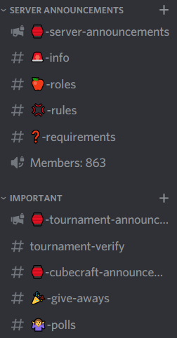
1. The important category looks messy, pls make all emojies same color or matching colors
EXAMPLE from my discord:
Aantekening 2020-09-07 200050.png

Clean color combination and simple layout.

2. Put the most important text channels in 1 place (referring to #nederlands and #espanol) so just add them beneath #english

3. Rearrange some channels so the length is not switching between long and short.
- Put the community games voice chat right beneath the community games text channel
- Put the Nitro general chat under the community games voice chat and end the category with the nitro voice call

(good job on separating java and bedrock, those look great!)

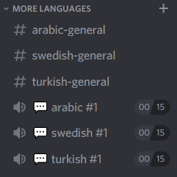
4. You don't want a long channel list so I suggest doing this:
Aantekening 2020-09-07 202203.png

I admit it looks less clean but it'll make a big difference for members who are not very familiar with discord and members on phone since it is smaller and less confusing then 3 extra categories.
 

Story

Forum Professional
Jan 30, 2014
4,574
18,905
679
24
Glasgow
letterboxd.com
hey @Story

I am a discord server designer and I have some suggestions.
The general look is good but there are some details you can only know when you have a lot of experience.

1. The important category looks messy, pls make all emojies same color or matching colors
EXAMPLE from my discord:
View attachment 176816
We could probably only do this for one category, doing this for the entire Discord is improbable.

2. Put the most important text channels in 1 place (referring to #nederlands and #espanol) so just add them beneath #english
Nederlands seems quite popular but again, it breaks consistency and English is only an exception as it's the main language of the server. I'll ask around and get some other feedback but I'd need to see people in mass agreeance to change that.

3. Rearrange some channels so the length is not switching between long and short.
- Put the community games voice chat right beneath the community games text channel
- Put the Nitro general chat under the community games voice chat and end the category with the nitro voice call
I'm quite adamant about having Nitro next to English-general since only Nitros can see it, I can move Community Games next to it's text channel however.

Nitro would work at the bottom or the top, doesn't matter too much.

Dreamer said:
4. You don't want a long channel list so I suggest doing this:
View attachment 176818
I admit it looks less clean but it'll make a big difference for members who are not very familiar with discord and members on phone since it is smaller and less confusing then 3 extra categories.

We had a staff poll on this as well. It was 85% for the design in the thread and not the one you've shown. So I'm going to keep it.
 
  • Like
Reactions: Gregeyy and Dreamer

zzRouxfop / xAkkek

Well-Known Member
Aug 2, 2020
277
386
114
Inside a 老干妈 jar
Hello CubeCrafters, we've got exciting news for our Discord users.

💬 Introduction

For the past week we have been working on an overhaul to the CubeCraft Discord, we passed this through Admins, then the staff team and now we're looking to show it off to you guys before hopefully launching later this week if everything goes well. We believe that the current Discord design layout is not optimal for adding new voice/text channels and we also believe it looks quite boring overall in terms of layout/aesthetic.


🎨 Discord Redesign

View attachment 176808


🤔 What changes have we made?

  • We've changed the voice channels the most, these are now grouped up into their respective categories of interest and not into a massive "voice" section, this makes it easier to minimize languages that you don't speak and also to see voice calls for things you are interested in.
  • We've also added Java/Bedrock sections with their own respective game & voice channels, we found that many Bedrock & Java players ended up in the English voice channels together and confusion was created.
  • We've removed the Nitro section and stationed its channels into new areas to hopefully increase activity within those channels.
  • Added new text channels:
    • Changelog is where we will post all changes to the network from moderation to bugs to major game updates.
    • Report-a-player which has been stationed above staff-help to reduce players attempting to report in Discord to help them get the information they need.
    • Weekly topics which will be a channel used for creating new discussion within the community about various things.
    • Creations which will be used for sharing various things such as screenshots, memes, artwork and Twitch/YouTube links.
  • Media will now be used for off-topic sharing of any sort of media that the community wants to share, however media can be shared in any channel as long as it pertains to the conversation. Links will not be embedded unless in #Media, #Creations, # Announcements, #Staff-Help, or any info-only channels that we have. This is to hopefully minimize the amount of potential spam that the link embedding can cause.
  • New languages categories. We are trialing new language sections, depending on the popularity and moderation of these categories depends on whether we'll add more or keep these.
    • Swedish
    • Turkish

💡 Stuff we've already discussed

Through our testing many things were trialed and decisions were made, so we'd like to write those out to prevent numerous similar suggestions being written.

Stuff we won't be doing:
  • Separating Sr. Mods & Designers in the member list.
  • Moving English-General to the English section below. As the most popular channel it cannot be that far down.
  • Moving AFK to Community Corner as AFK can fill up quite a lot and this would push everything underneath it further down.
  • Adding emojis to the language text channels, we felt that flags were not inclusive of other countries and using them all across the VCs might mislead players into thinking those were only for that country.

🌗 Comparison


This is your chance to get your voice heard for this redesign before we launch it, so please write all of your feedback below and feel free to like suggestions that you agree with so we can make those changes confidently.

move english general so that it's consistent with the other languages, other than that, it looks pretty dope!
 
  • Like
Reactions: Gregeyy

Am4er

Dedicated Member
Dec 6, 2018
335
1,292
199
20
VA, USA
Pronouns
He/Him
That's would be amazing! I haven't see any update to discord server before long time
 
  • Like
Reactions: Gregeyy

TeamTMS

Well-Known Member
Jul 26, 2019
314
377
119
19
New Zealand
In my opinion I really don’t think CubeCraft will be taken seriously with this sort of a layout. Half the channels will not be used, and it looks quite messy and unorganized.
The current design is great how it is at the moment, but the community says they like the new one so let’s see how’s it goes 😄
 
  • Sad
Reactions: Gregeyy

Nqouir

Dedicated Member
Apr 10, 2019
323
719
169
Morocco
It looks awesome already, I like how you added a vc section for the featured languages.
But I am afraid that some players will use the reports channel as if it was made for minecraft reports, after all the new design looks great.
That was everything, enjoy the rest of your day.
 
  • Like
Reactions: Gregeyy and luv!

Naitzirch

Well-Known Member
Nov 12, 2017
78
340
129
24
The Netherlands
Pronouns
He/Him
Here are my thought on the Discord revamp (in three sections):

Personally I would wait and see if the weekly topic channel will work out well. It might seem like a simple idea, but in practice it is a lot harder to come up with an interesting topic every week. If it turns out to be inactive or too much work (or both) then I would suggest to remove it, but this goes without saying ofcourse.

If all changes to the network from moderation to bugs to major game updates are going to be posted in #changelog, then what else will be posted in #anouncements?

Lastly, (and this one might be a bit silly but) the question mark emoji after the SUPPORT category looks kind of random imo and I don't think it is necesary to acompany every word with an emoji. I get why it is there, also for the Staff Help vc's but honestly, it does speak for itself.

Thanks for reading,

~Naitzirch
 

Younisco

Forum Professional
May 13, 2014
8,008
19,695
669
22
london
Personally I would wait and see if the weekly topic channel will work out well. It might seem like a simple idea, but in practice it is a lot harder to come up with an interesting topic every week. If it turns out to be inactive or too much work (or both) then I would suggest to remove it, but this goes without saying ofcourse.
Weekly Topics is something that can be easily come up with, plus we are able to reuse certain topics like Music or Films or something. Alongside our creative staff team, I'm sure it'll keep being active and rotating the topics for a while. :D
If all changes to the network from moderation to bugs to major game updates are going to be posted in #changelog, then what else will be posted in #anouncements?
I believe this was a misphrase, it'll be with smaller game updates that doesn't deserve an announcement, such as if we balance something or change something on short notice. Major game updates & changes will remain in announcements.
Lastly, (and this one might be a bit silly but) the question mark emoji after the SUPPORT category looks kind of random imo and I don't think it is necesary to acompany every word with an emoji. I get why it is there, also for the Staff Help vc's but honestly, it does speak for itself.
But... consistency :sadcat:
On a different note, if you have any ideas about what emojis can replace these, feel free to suggest them! Otherwise, they'll likely stay, ^_^
 
  • Like
Reactions: Gregeyy

Naitzirch

Well-Known Member
Nov 12, 2017
78
340
129
24
The Netherlands
Pronouns
He/Him
Weekly Topics is something that can be easily come up with, plus we are able to reuse certain topics like Music or Films or something. Alongside our creative staff team, I'm sure it'll keep being active and rotating the topics for a while. :D

I believe this was a misphrase, it'll be with smaller game updates that doesn't deserve an announcement, such as if we balance something or change something on short notice. Major game updates & changes will remain in announcements.

But... consistency :sadcat:
On a different note, if you have any ideas about what emojis can replace these, feel free to suggest them! Otherwise, they'll likely stay, ^_^

Hi, thanks for the clarification on #changelog, what you say seems to make a lot more sense.

Maybe instead of the question mark next to the support category you could use the green checkmark? The emoji has got more of a positive vibe just like the word "support" and it is occasionally used as reaction in staff-help when something has been handled right?

Suppose we can leave the question marks next to the voice channels... Grrr.. ;)
 
  • Like
Reactions: Gregeyy
Members Online

Team online

Members online

Latest profile posts

CrystalLegend01 wrote on NADER KANAAN's profile.
Happy Birthday!
coolzombiee wrote on NADER KANAAN's profile.
Happy birthday!
IMG_1809.jpg
IMG_1810.jpg

Never playing na op again........
Note: the game was Sky Wars Mega, the map was Lucky, and loot was OP
Top Bottom