Minecraft PC IP: play.cubecraft.net

Do you want this map on Cubecraft Bedrock?


  • Total voters
    23
Status
Not open for further replies.

Adriko

Novice Member
Jun 26, 2020
10
5
34
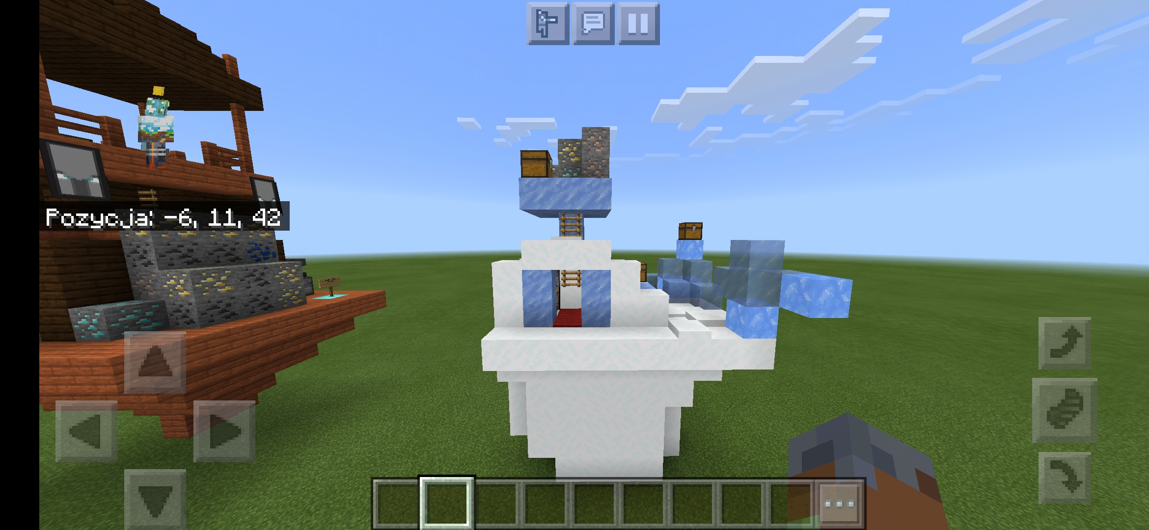
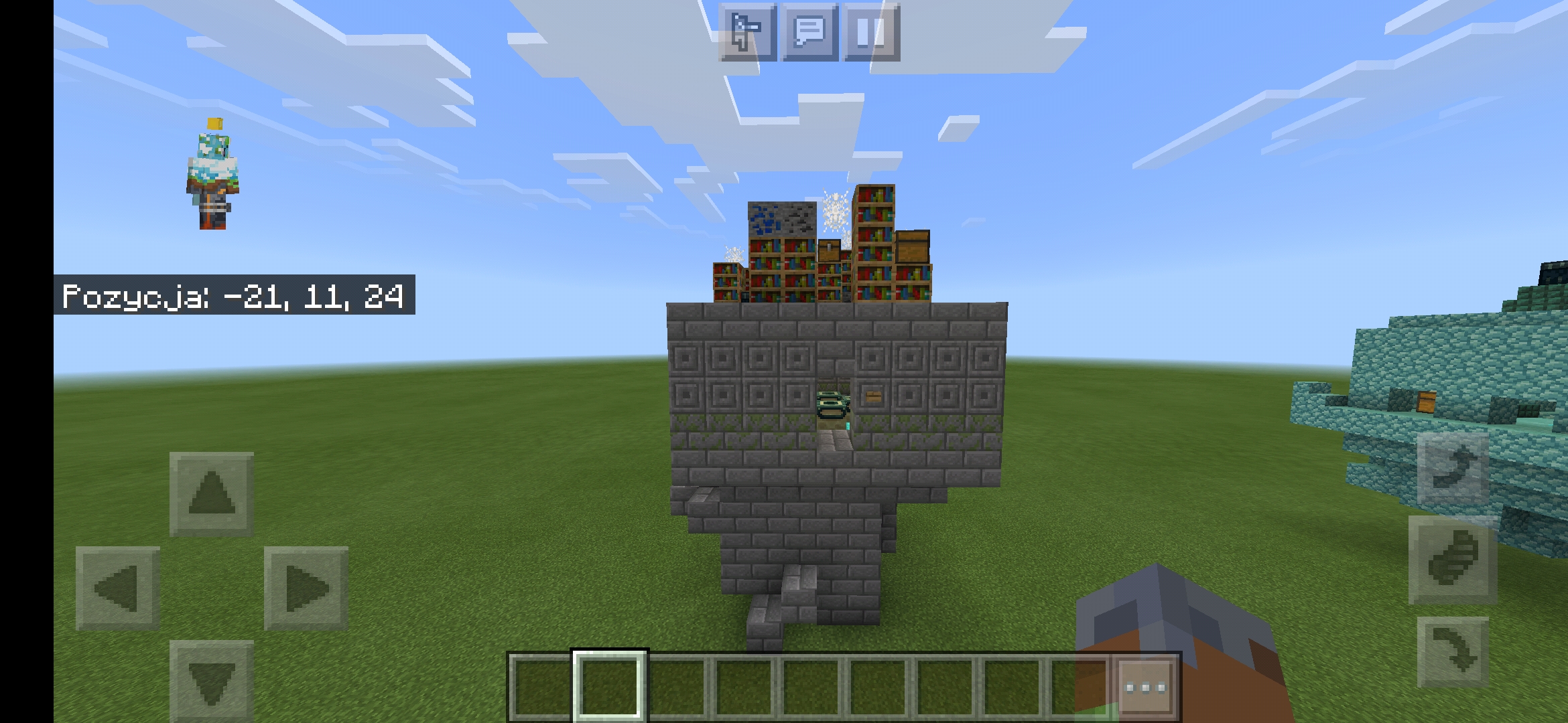
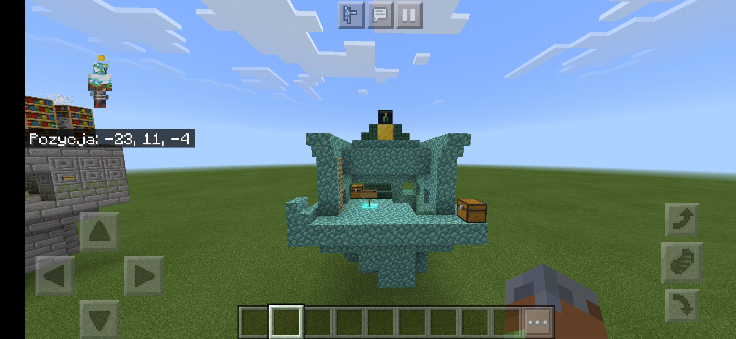
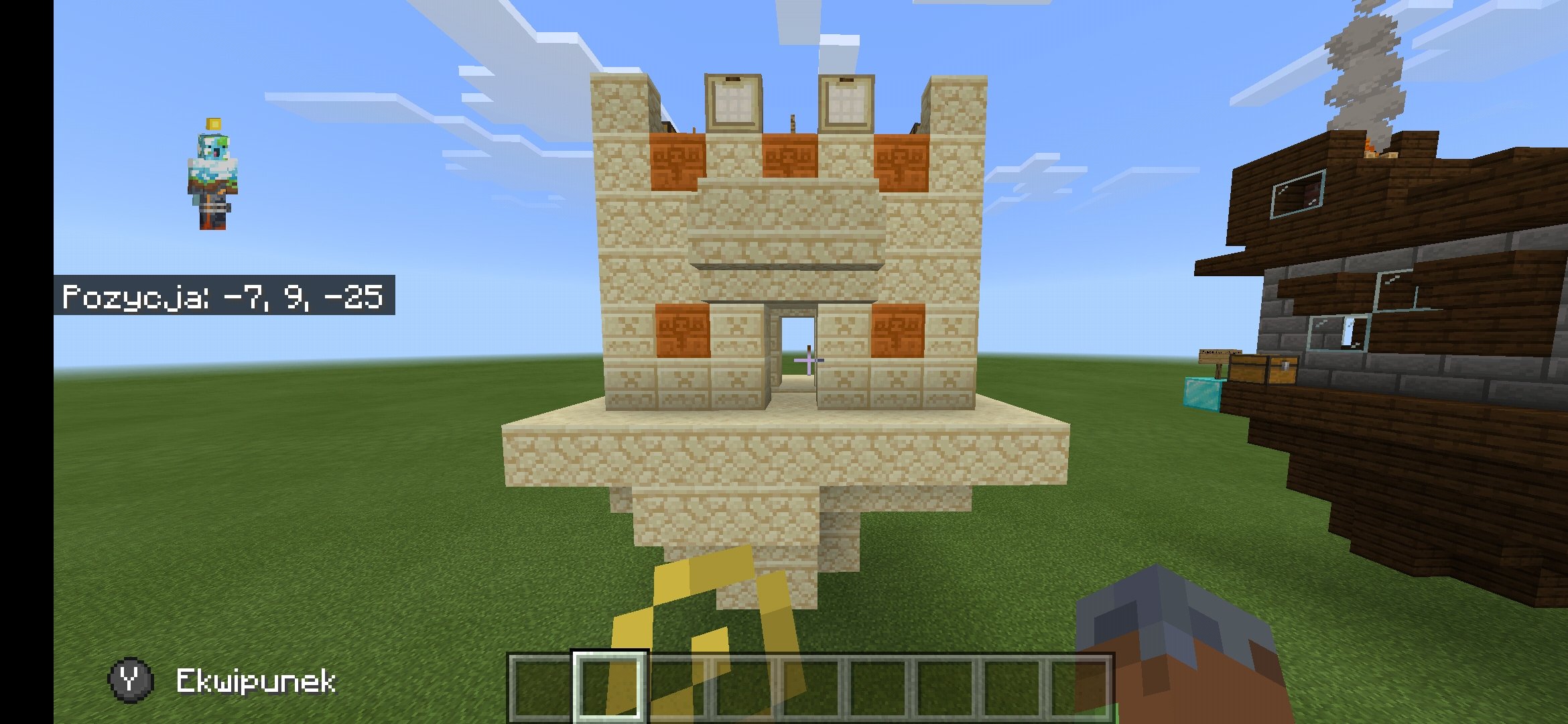
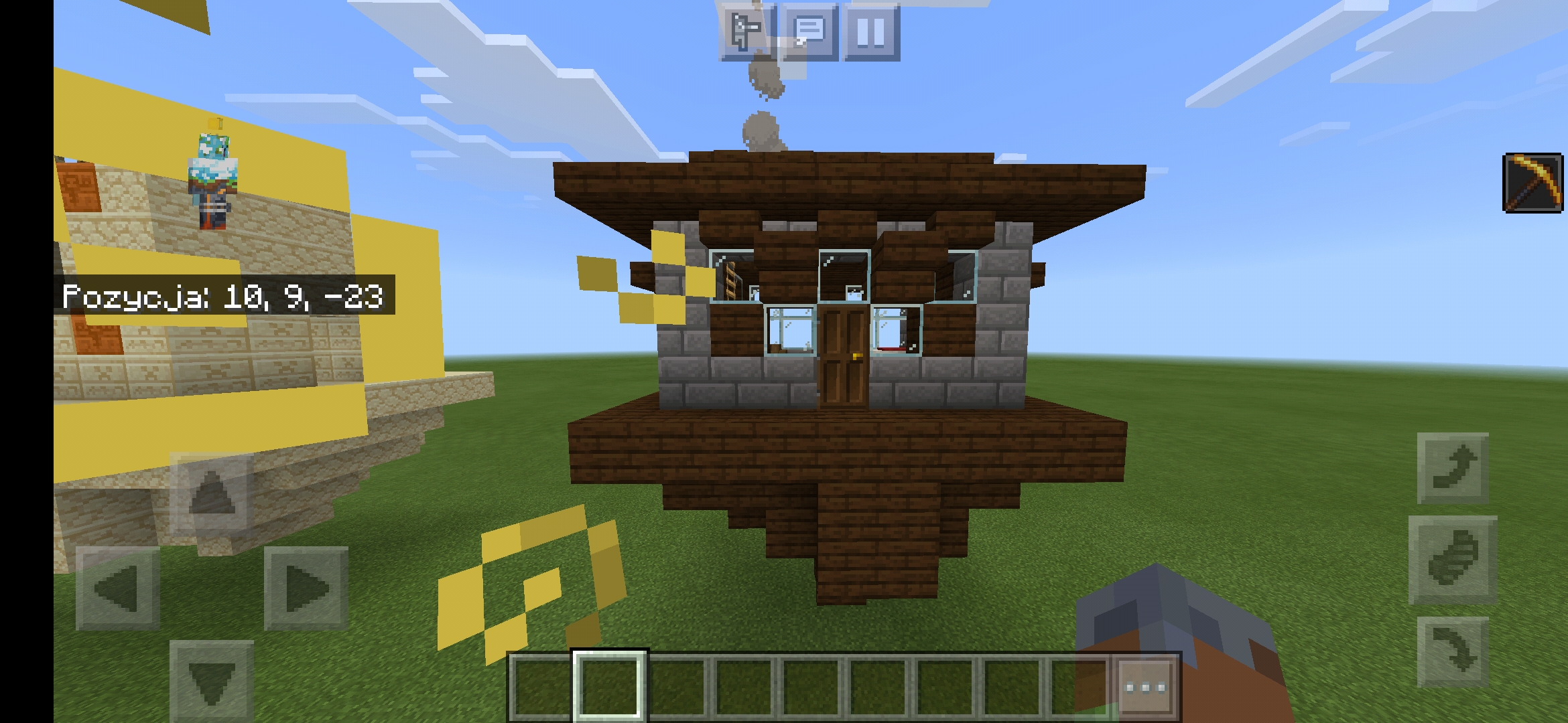
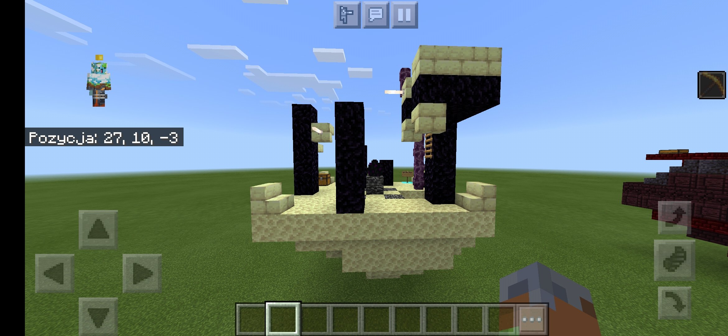
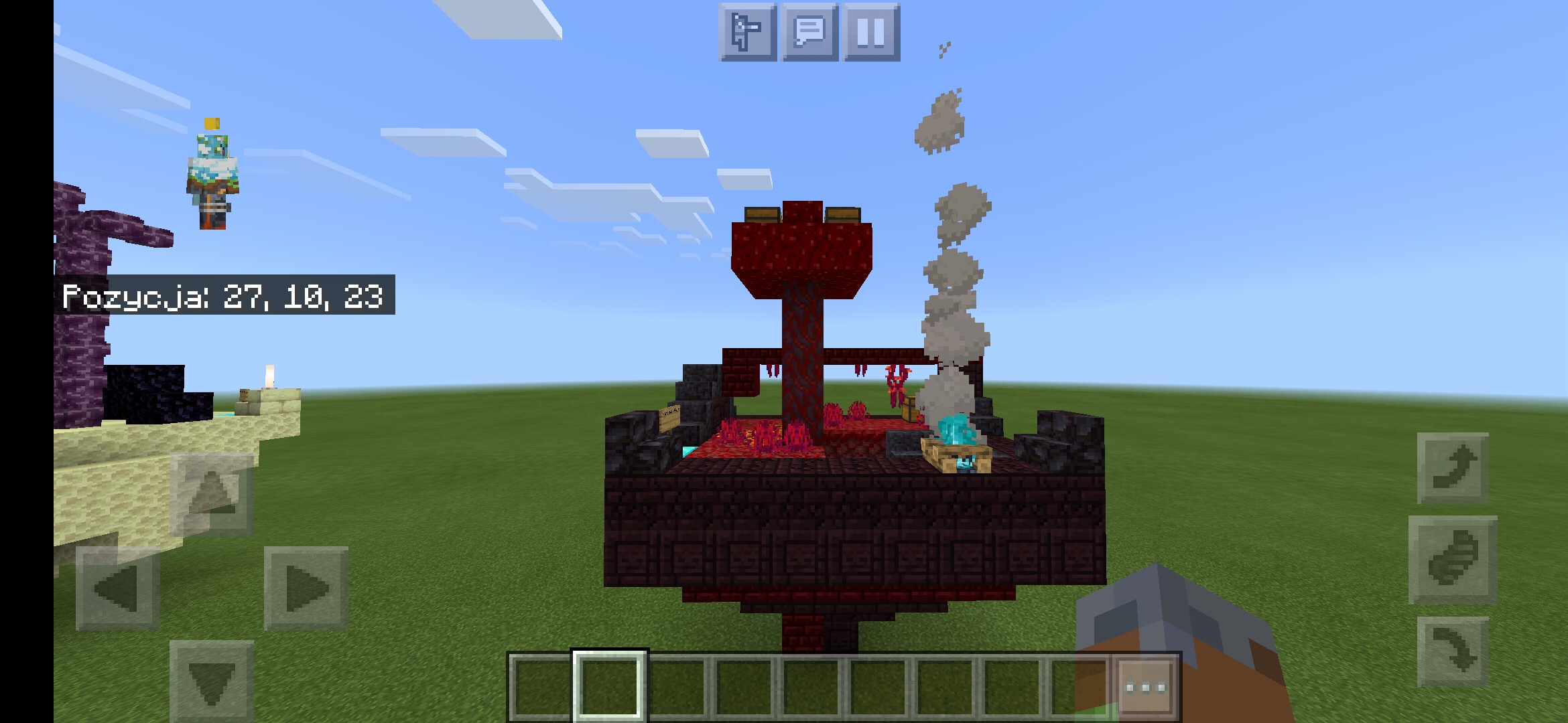
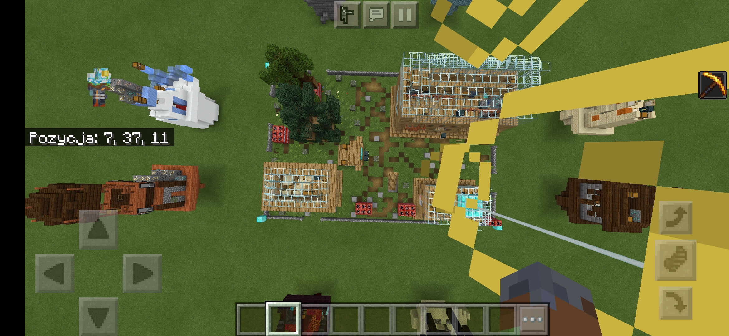
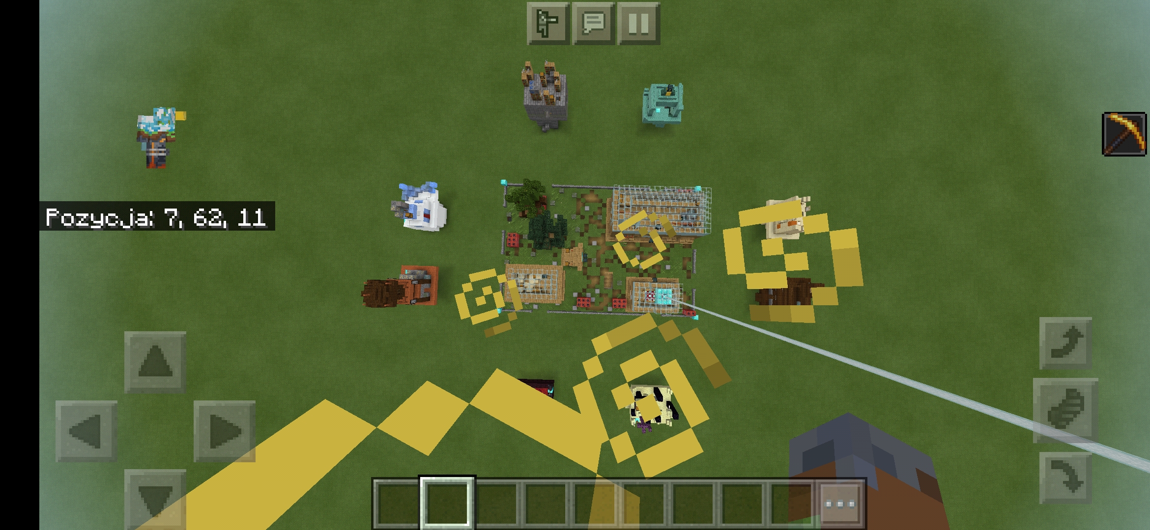
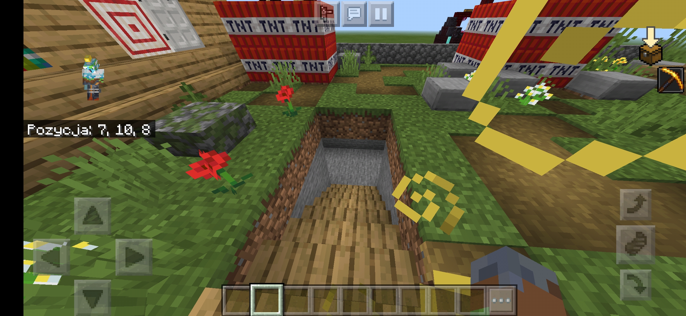
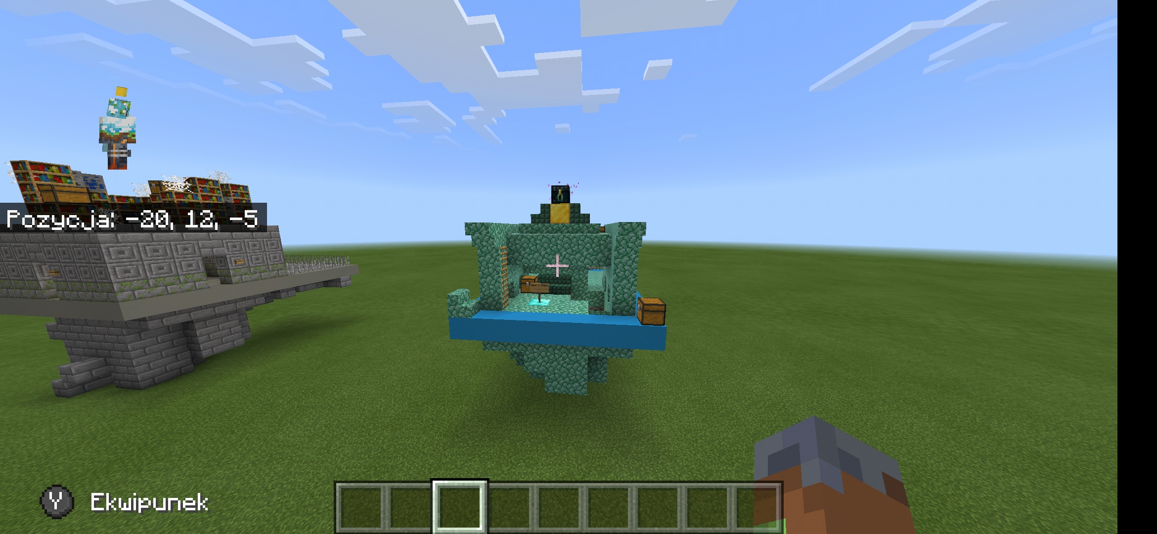
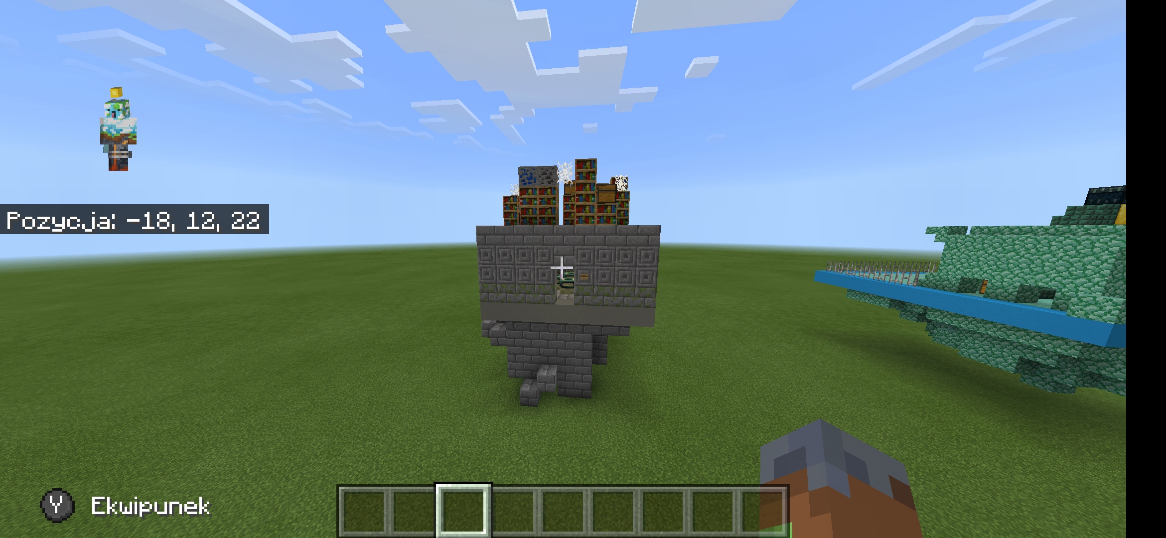
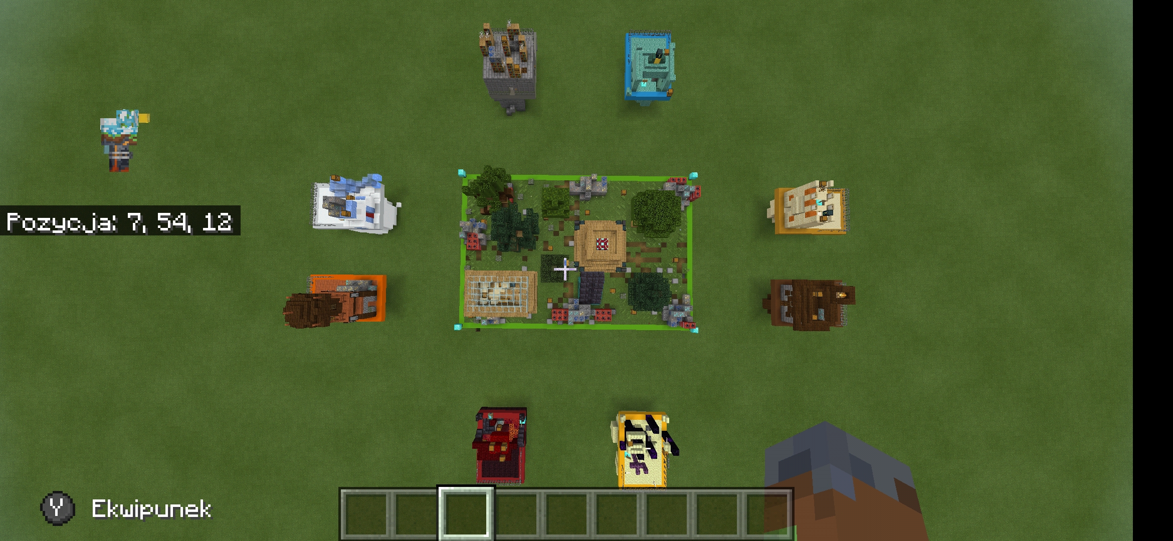
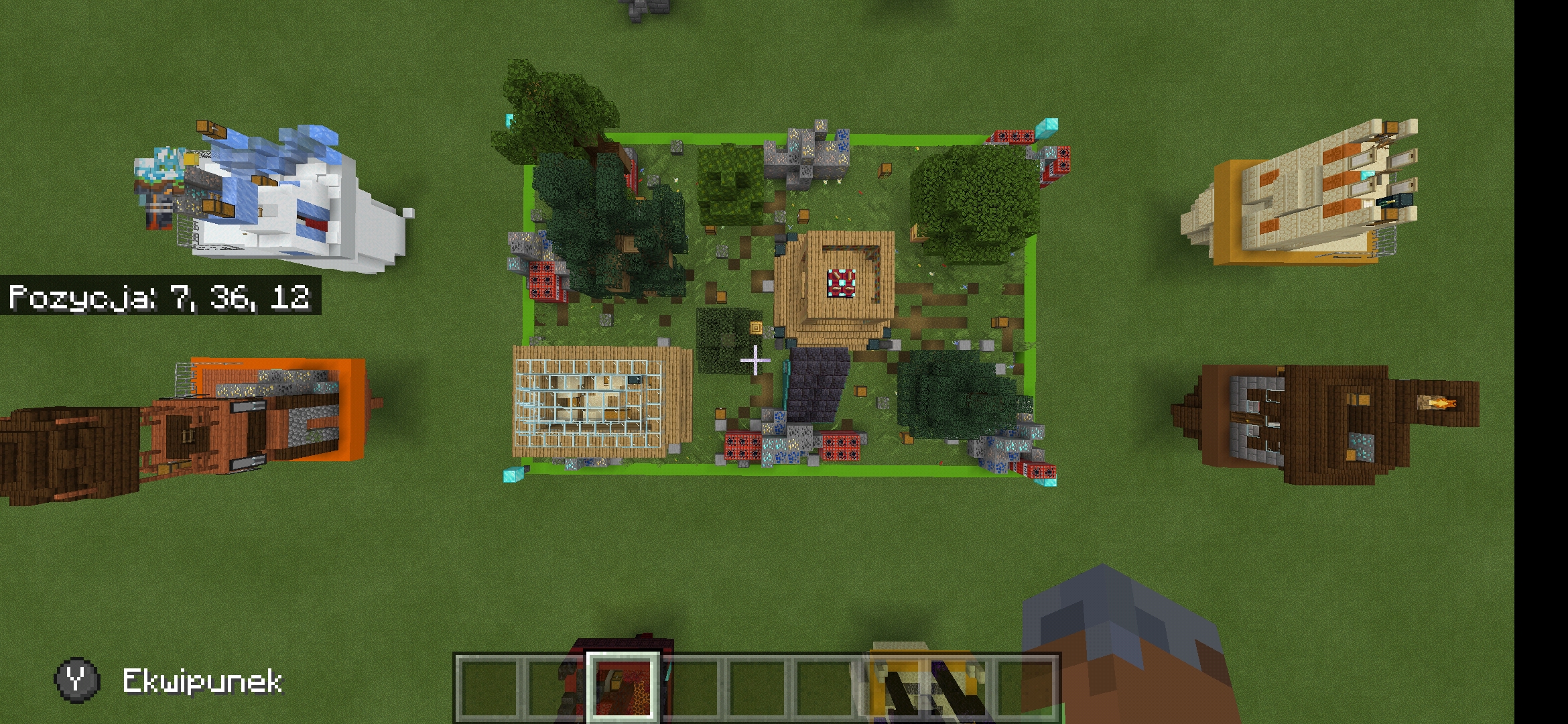
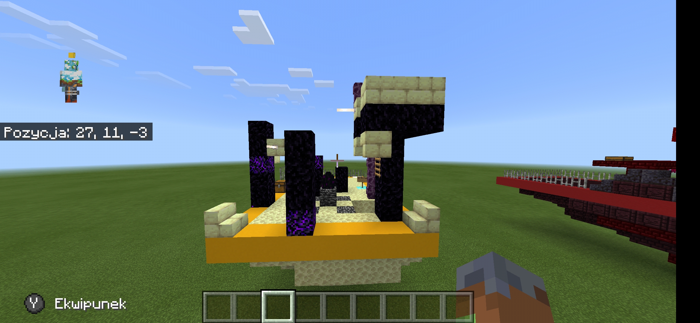
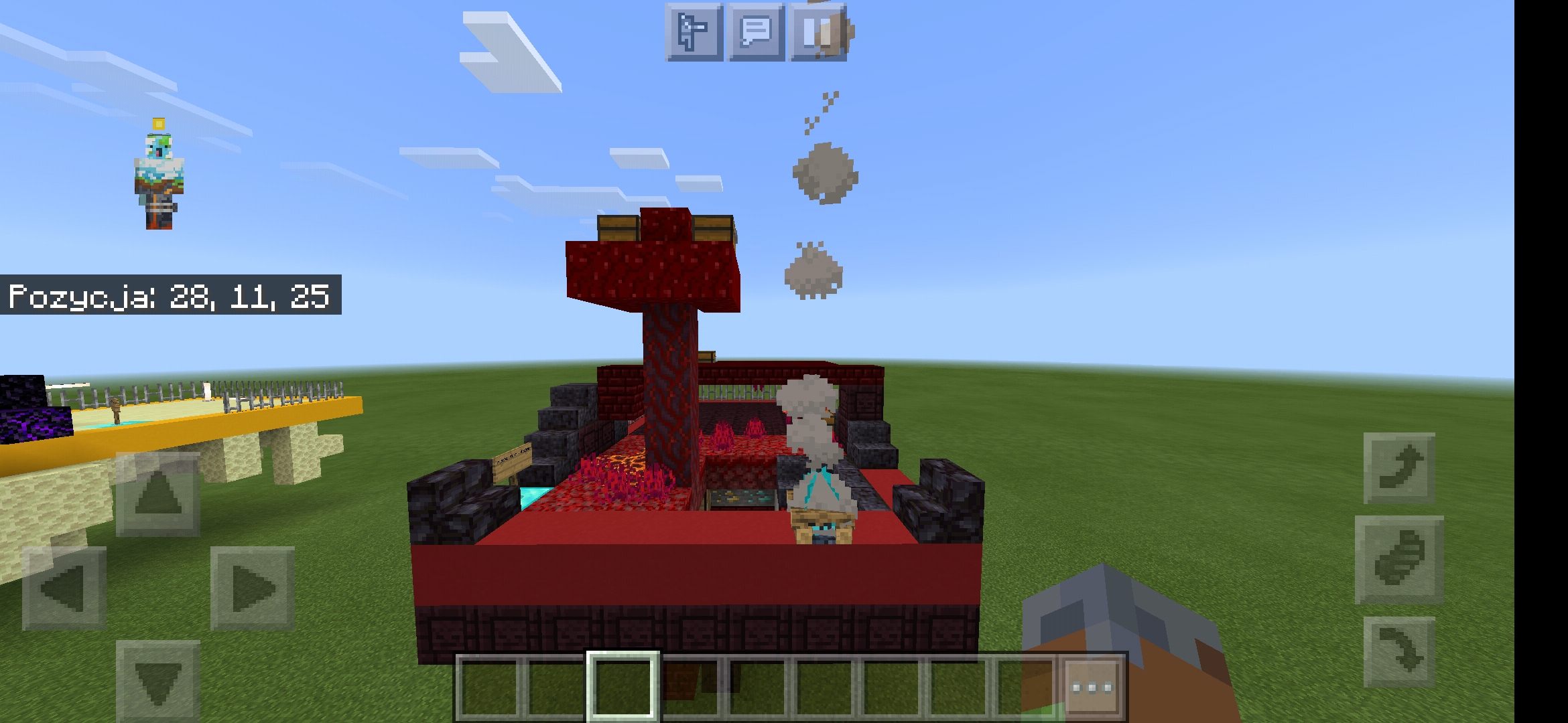
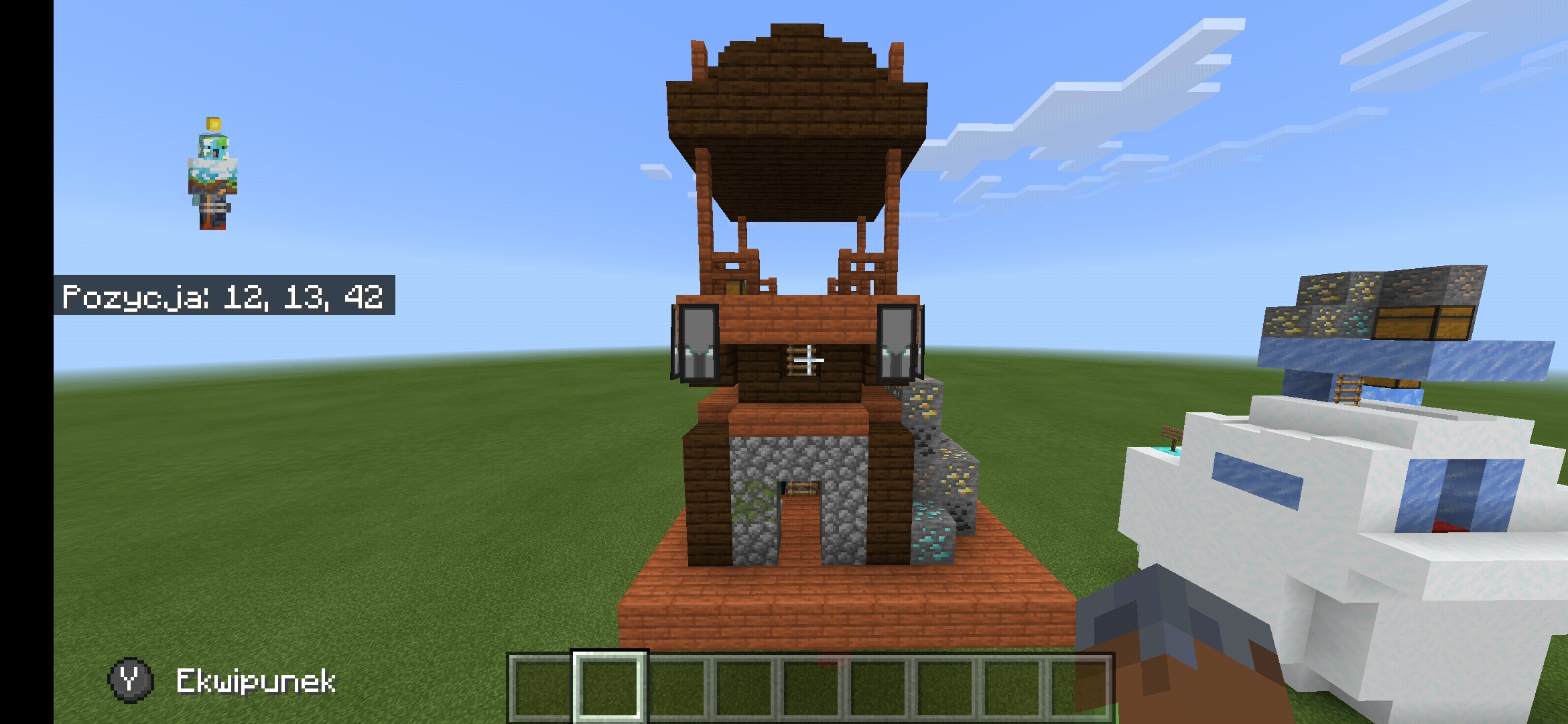
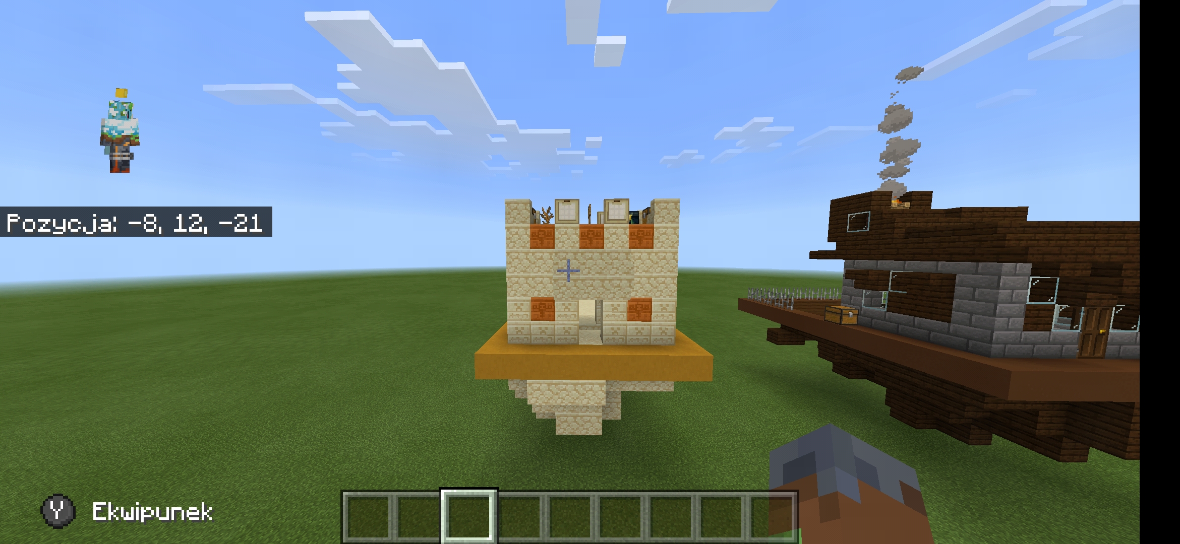
Hello , My name is Adrian and I come from Poland. I would like to present a map for the Skywars team of 2. The map is called "The World" and it was created in Minecraft 1.16.10. Includes Netherite, Anvils, Enchanting Table, and Ender Chests. There are Tnt traps and mines in the middle island (you can easily get out of the world by digging, because there is no stone under the middle island). This is V1 version, I will make V2 with appearance tweaks soon. Number of chests on the map: - On small island 4 (+ Ender Chest) - On a large island: 12 (+ - ender chest) Island layout: One large island, next to 8 small (differing in appearance) They can be distinguished
- Twierdza
- Ocean Monument
- Desert Pyramid
- Igloo
- Pillager Outpost
- Woodland Mansion
- Nether Fortress
- End
Their appearance is presented in the photos.
V1 PHOTOS :
Screenshot_2020-08-06-12-01-29-150_com.mojang.minecraftpe.jpg
Screenshot_2020-08-06-12-01-42-533_com.mojang.minecraftpe.jpg
Screenshot_2020-08-06-12-02-01-423_com.mojang.minecraftpe.jpg
Screenshot_2020-08-06-12-02-14-641_com.mojang.minecraftpe.jpg
Screenshot_2020-08-06-12-03-05-151_com.mojang.minecraftpe.jpg
Screenshot_2020-08-06-12-03-15-730_com.mojang.minecraftpe.jpg
Screenshot_2020-08-06-12-03-35-452_com.mojang.minecraftpe.jpg
Screenshot_2020-08-06-12-03-53-047_com.mojang.minecraftpe.jpg
Screenshot_2020-08-06-12-04-18-569_com.mojang.minecraftpe.jpg
Screenshot_2020-08-06-12-04-31-197_com.mojang.minecraftpe.jpg
Screenshot_2020-08-06-12-06-33-651_com.mojang.minecraftpe.jpg
Map made on a flat world, I hope cubecraft will remove the earth from elevation 4,3,2,1 and bedrock from level 0!


Links to worlds (V1 Google drive): https://drive.google.com/drive/folders/1jVy4rMzZ2jvG19O52Kj-e0Jm1fdADLA3?usp=sharing
Links to worlds (V2 Google drive) :https://drive.google.com/drive/folders/1jVy4rMzZ2jvG19O52Kj-e0Jm1fdADLA3?usp=sharing
Links to worlds (V3 Google drive):-----------------------------------------------------------------
What will be in version V2:
- changed appearance of the main island
- additional spawn spot
- clay fringes around the islands (different colors)
-----------------------------------------------------------------
V2 PHOTOS :
Screenshot_2020-08-06-15-16-28-924_com.mojang.minecraftpe.jpg
Screenshot_2020-08-06-15-16-20-633_com.mojang.minecraftpe.jpg
Screenshot_2020-08-06-15-16-13-568_com.mojang.minecraftpe.jpg
Screenshot_2020-08-06-15-15-03-451_com.mojang.minecraftpe.jpg
Screenshot_2020-08-06-15-15-16-328_com.mojang.minecraftpe.jpg
Screenshot_2020-08-06-15-15-30-175_com.mojang.minecraftpe.jpg
Screenshot_2020-08-06-15-15-45-371_com.mojang.minecraftpe.jpg

Map version V2 :
-Bigger spawn place, better middle island , colors around the islands (photos)

Hello, I have another version of the map on cubecraft, I encourage you to try it on google drive and comment. If there are any comments regarding corrections, I will implement them in V3 .
Adrian
 

Attachments

  • Screenshot_2020-08-06-15-15-54-848_com.mojang.minecraftpe.jpg
    Screenshot_2020-08-06-15-15-54-848_com.mojang.minecraftpe.jpg
    1.5 MB · Views: 87
Last edited:

Ferrcho

Dedicated Member
Jun 24, 2019
951
855
174
18
Spain
This is my opinion.

I did not like the map at all, because it lacks many details, it is very simple, that is, the map is very basic.

There are 6 teams, the islands are very close and at the same time very close to the middle.

The islands have a very strange design.

So, my vote is no. Sorry
 

Adriko

Novice Member
Jun 26, 2020
10
5
34
This is my opinion.

I did not like the map at all, because it lacks many details, it is very simple, that is, the map is very basic.

There are 6 teams, the islands are very close and at the same time very close to the middle.

The islands have a very strange design.

So, my vote is no. Sorry
Thanks , i go to fix the map I move the islands apart. But what doesn't suit you in appearance?
 
D

Deleted member 469419

Guest
Hey!

First of all let me tell you that must be a poll in every map submission thread to know people opinions. You also should make the description in English so everyone can understand you.

About the map, it actually doesn't seem like a solo skywars map:

- The shape of islands looks quite good but they're quite small.
- The islands are really close to the mid and between them.
- The map in general looks quite small, you should add more islands (:

Overall, I've liked the concept and I appreciate it, but you should make the changes commented above ^^

Good job and keep improving your build style! (:
 
  • Like
Reactions: Adriko

Ferrcho

Dedicated Member
Jun 24, 2019
951
855
174
18
Spain
Thanks , i go to fix the map I move the islands apart. But what doesn't suit you in appearance?

The islands are very small, I don't like the blocks you used either, I mean the combination of blocks.
 

sexy

Dedicated Member
Oct 16, 2016
687
1,350
204
19
Spain
Pronouns
He/Him
Hi!
I dont like the map, the reason is the next:
The islands are so small to do a pvp and to be 2 persons in the same island.
And I'm not convinced by the theme.
 
  • Like
Reactions: Adriko

Adriko

Novice Member
Jun 26, 2020
10
5
34
Hey!

First of all let me tell you that must be a poll in every map submission thread to know people opinions. You also should make the description in English so everyone can understand you.

About the map, it actually doesn't seem like a solo skywars map:

- The shape of islands looks quite good but they're quite small.
- The islands are really close to the mid and between them.
- The map in general looks quite small, you should add more islands (:

Overall, I've liked the concept and I appreciate it, but you should make the changes commented above ^^

Good job and keep improving your build style! (:
Thanks :) I know what to do now, please watch me and write! Adrian
 

Adriko

Novice Member
Jun 26, 2020
10
5
34
Hi!
I dont like the map, the reason is the next:
The islands are so small to do a pvp and to be 2 persons in the same island.
And I'm not convinced by the theme.
Hi, maybe you will check back in the future. I'm going to improve the map :) Adrian
 

Adriko

Novice Member
Jun 26, 2020
10
5
34
Hey!

First of all let me tell you that must be a poll in every map submission thread to know people opinions. You also should make the description in English so everyone can understand you.

About the map, it actually doesn't seem like a solo skywars map:

- The shape of islands looks quite good but they're quite small.
- The islands are really close to the mid and between them.
- The map in general looks quite small, you should add more islands (:

Overall, I've liked the concept and I appreciate it, but you should make the changes commented above ^^

Good job and keep improving your build style! (:
Thanks I like People like you. Come back here sometime because map version V3 is coming :)
 

Exarpo

Well-Known Member
Jun 29, 2019
357
361
79
Hi there!
I like the idea - how the islands are each a different style, but there are some things to improve.
Firt of all, I think cubecraft doesn't support blocks/items added in versions after 1.8, so that the map can be played on all versions back to 1.8. Meaning you shouldn't use blocks such as crying obsidian or even concrete.
Also the islands are all squares which usually doesn't look really good. ¯\_(ツ)_/¯
Finally, the islands could be a bit bigger as they are supposed to serve two players.
 
  • Like
Reactions: Adriko

FnigePython

Well-Known Member
Sep 7, 2019
603
452
79
20
the land down under
Pronouns
She/Her
Firt of all, I think cubecraft doesn't support blocks/items added in versions after 1.8, so that the map can be played on all versions back to 1.8. Meaning you shouldn't use blocks such as crying obsidian or even concrete.
1.9 not 1.8 though you can make a version for 1.8
 

Gregeyy

Forum Expert
Jul 21, 2017
808
2,467
349
Spain
I think the map lacks details. It is very simple, try to avoid that in future constructions.
Thanks for taking your time anyway! 😜
 

CedricFresh

Novice Member
May 15, 2020
154
235
49
Sorry, but I just think that, as the islands containt blocks from 1.10+, they would not accept it. Secondly, each map provides different advantages, as they are not all the same. Lastly, I just don't think that this would be suitable for solos, as there's not enough islands and looks a bit messy.
(sry if some of this was responded in replies, didn't read all of them)
 

Hippir

Dedicated Member
Aug 18, 2016
799
882
168
UAE, Dubai
www.youtube.com
Very creative but, doesn't match the regular skywars map themes, and there are blocks from 1.10+ as stated from CedricFresh.

My opinion is it lack details, there are blocks from 1.10+, and it's a -1
 
  • Like
Reactions: wxzzrd
Sep 22, 2020
8
4
4
18
I love the concept and creativity, I just think it lacks detail. It would be great to see you add some depth to the builds as well as some more textures on the exterior, etc. I'd love for you to make me change my vote though! :D
 

InkAsriel

Well-Known Member
Sep 23, 2017
887
905
144
21
The Netherlands
i noticed you are using a target block in your map, im not sure if these are in bedrock or not, but not in java. this means using them isnt the best option :P
 

Soulless_Unity

Well-Known Member
May 22, 2017
106
361
144
Hello, thank you for your efforts in submitting this.

Unfortunately, collectively the design team have decided to deny this map submission due to the following reasons:
-Map size is too small
-Some islands have advantages over others
-Quality of buildings can be improved

Please do not be disheartened by the above comments. We hope you had a fun time building!
 
  • Sad
Reactions: InkAsriel
Status
Not open for further replies.
Members Online

Members online

Latest posts

Latest profile posts

New prediction: We might get news on Winter event next week and it might go into testing the following week. I still believe that they are targeting to release it on the first week of December
UncleSpect wrote on caraMel's profile.
Happy birthdayy mell!!
coolzombiee wrote on Jellei's profile.
Can’t help but notice he kinda seemed to leave in 2021 look at his achievements
Reesle wrote on Jellei's profile.
Happy Birthday! :D
Top Bottom