Minecraft PC IP: play.cubecraft.net

Should this map be added?


  • Total voters
    34
Status
Not open for further replies.

bys1

Well-Known Member
Aug 10, 2016
87
39
93
22
Home
Hello,

We decided to make a new eggwars map for you! Because of the small amount of maps for bigger teams, we have made a 6v6v6v6 map.

Map name: Prison
Map made by: @bys1, @HamsterKazam, thorrie, DylanV255 (in-game names are the same)
Teams: Dark Blue, Red, Dark Green, Yellow
Team size: 6 players

The map consists of 4 player islands, 4 small/half middle islands and a big middle island. The islands have the following generators:

Player islands:
4x Iron: 1x level 2, 1x level 1, 2x broken
1x Gold: Broken
1x Diamond: Broken

Half mid:
1x Gold: Level 2

Mid:
2x Iron: Level 4
2x Gold: Level 3
2x Diamond: 1x level 3, 1x level 2

Screenshots below in the spoiler.
If you decide to vote "no", please explain your vote!

We really hope you guys like the map. If you have any feedback or ideas on what to change, let us know!
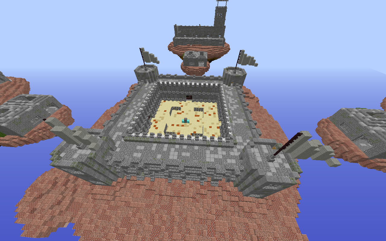
2020-05-01_16.31.52.png
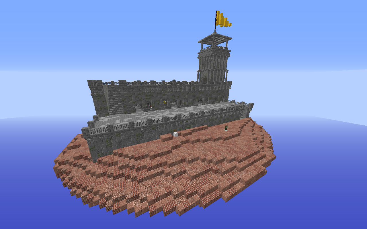
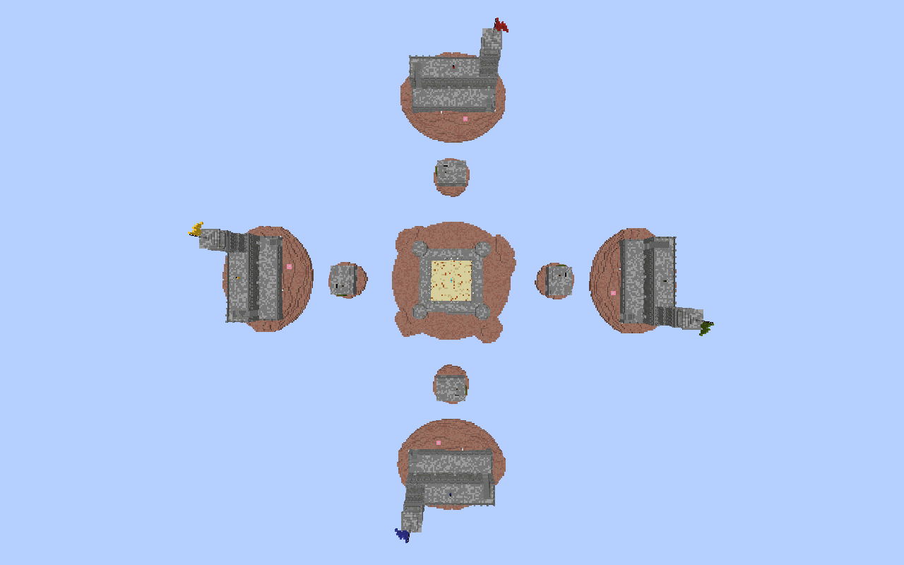
Top view.

2020-05-01_17.45.12.png

Overview of the middle island.
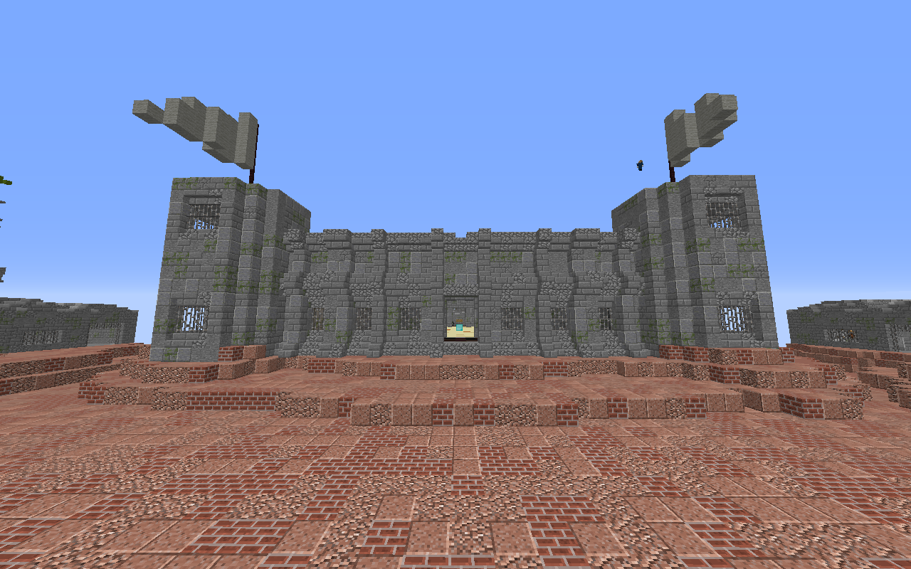
2020-05-01_17.46.26.png

Front/back view of the middle island.
2020-05-01_17.46.37.png

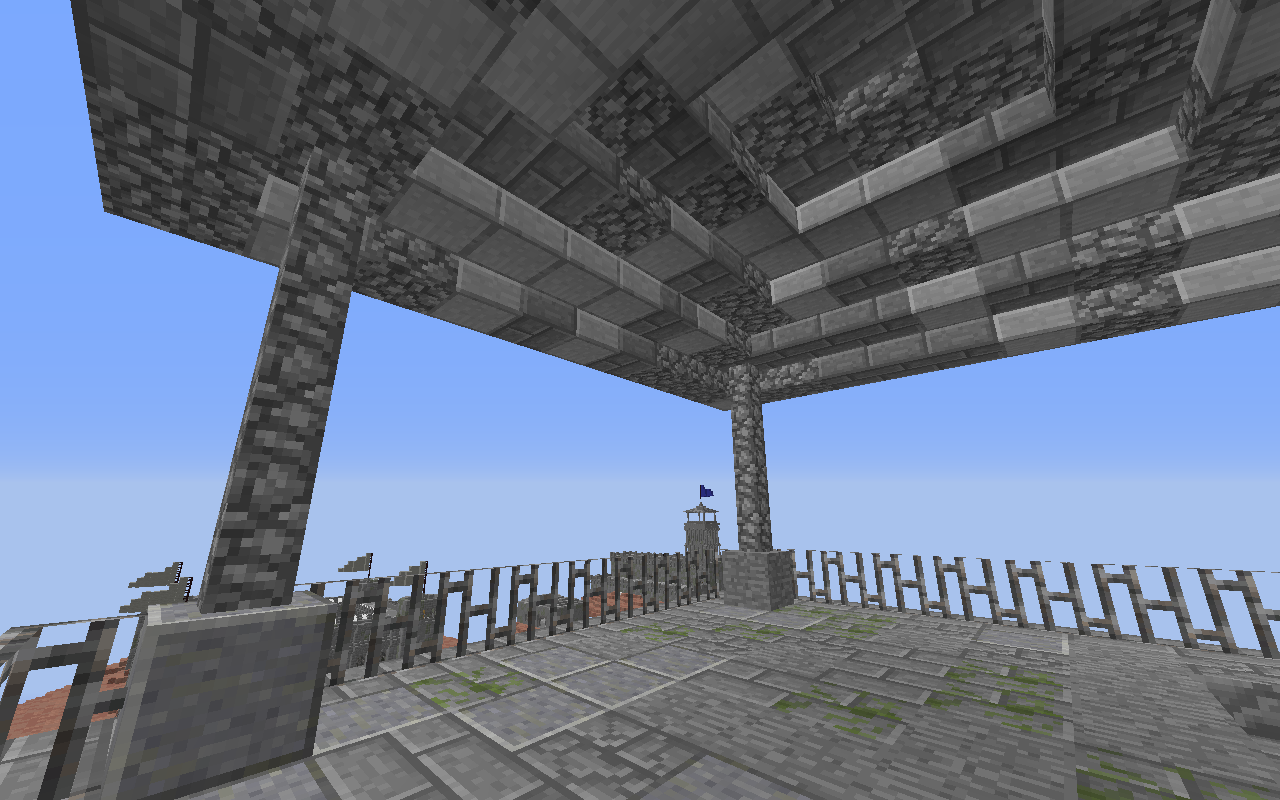
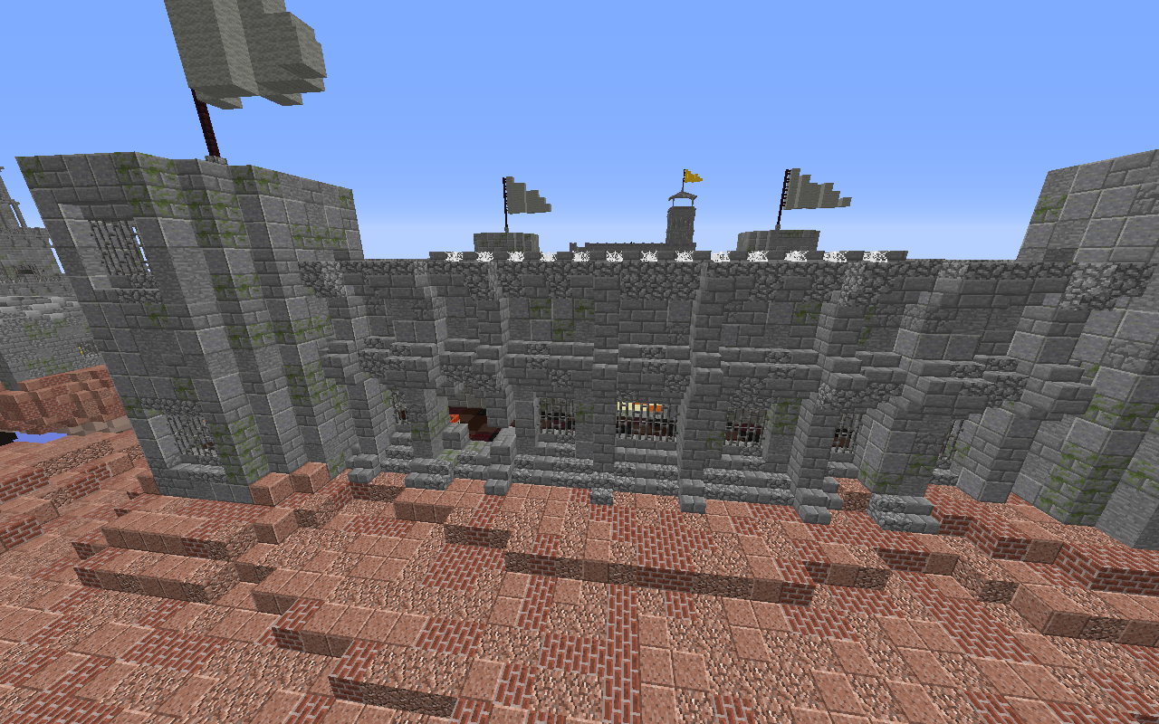
Side view of the middle island. There is no entrance to the prison here, but prisoners have blown a hole into the wall (left side).
2020-05-01_18.10.44.png
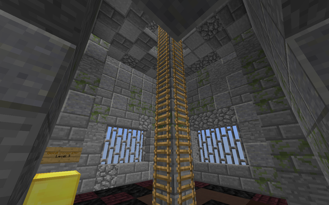
One of the towers on middle island, with a level 4 iron generator.
2020-05-01_18.10.53.png

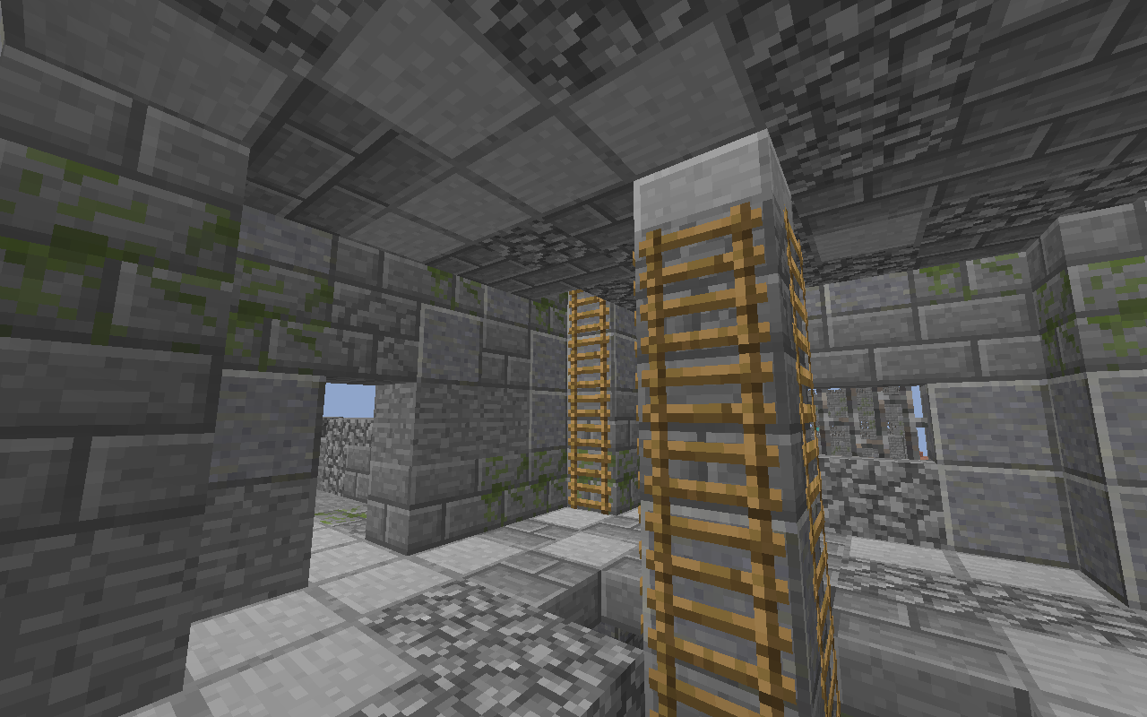
Another tower on middle island, with a level 3 gold generator and ladders to the next floor.
2020-05-01_18.11.03.png

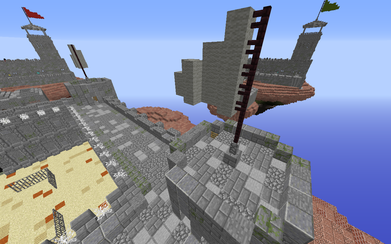
The next floor, with another ladder to get on top of the tower.
2020-05-01_18.11.25.png

Top view of a tower.
2020-05-01_18.11.39.png

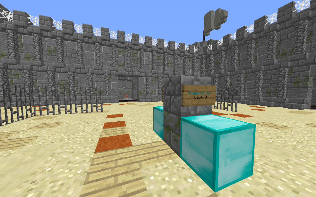
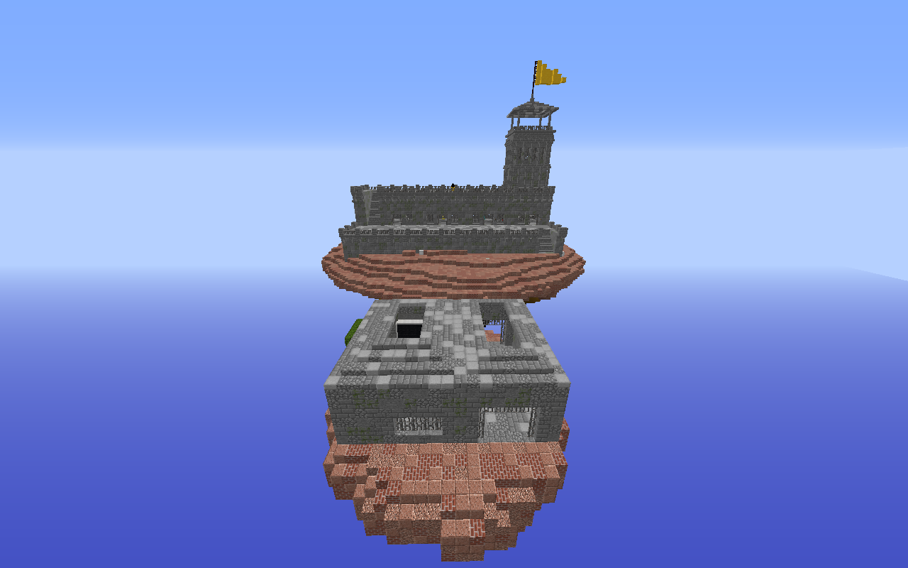
Middle area of mid island, with two diamond generators (level 2 and level 3).
2020-05-01_17.46.55.png

Overview of yellow team's island and half mid.
2020-05-01_17.47.02.png

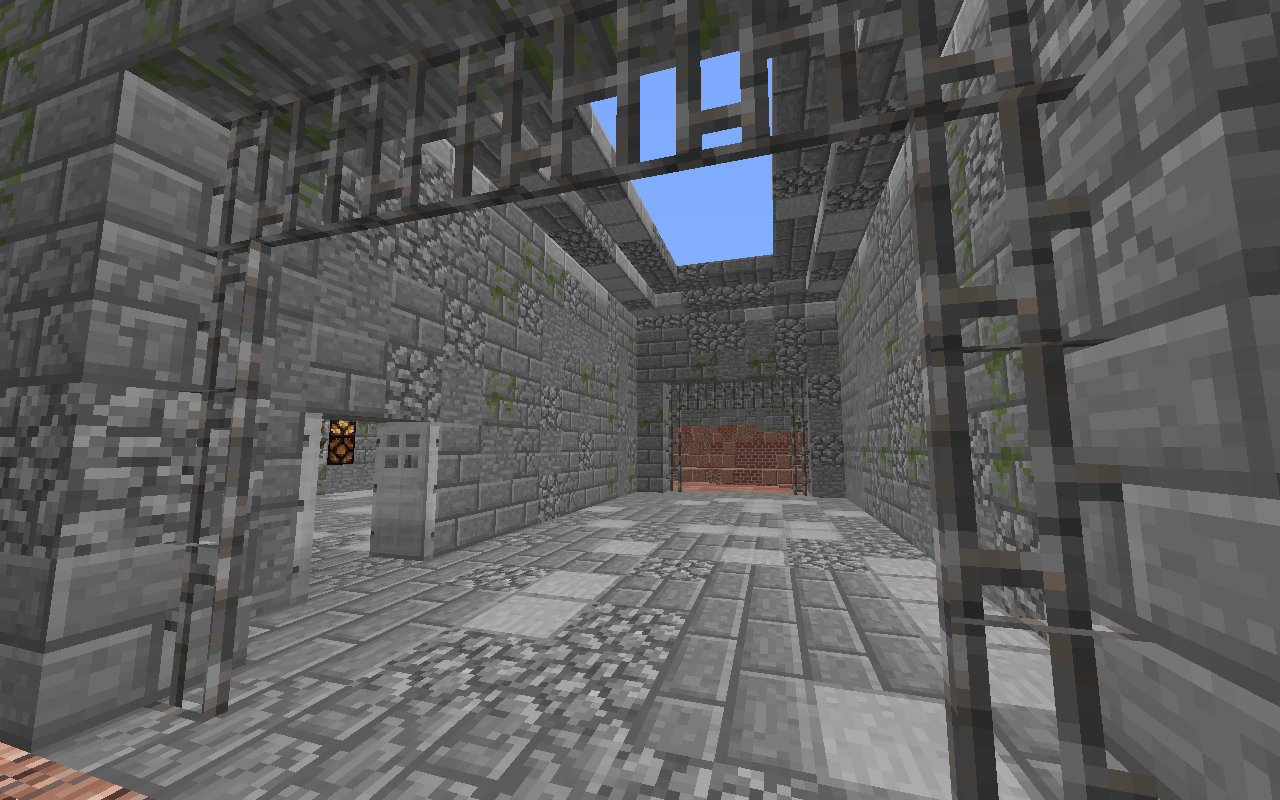
Prison part on half mid with the entrance to the guard's room.
2020-05-01_17.47.08.png

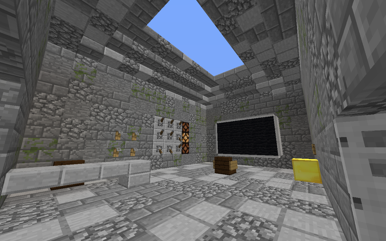
The guard's room on half mid.
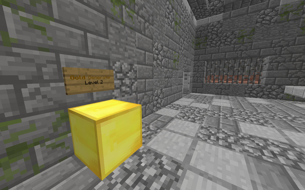
2020-05-01_17.47.15.png

A level 2 gold generator in the guard's room.
2020-05-01_17.47.23.png

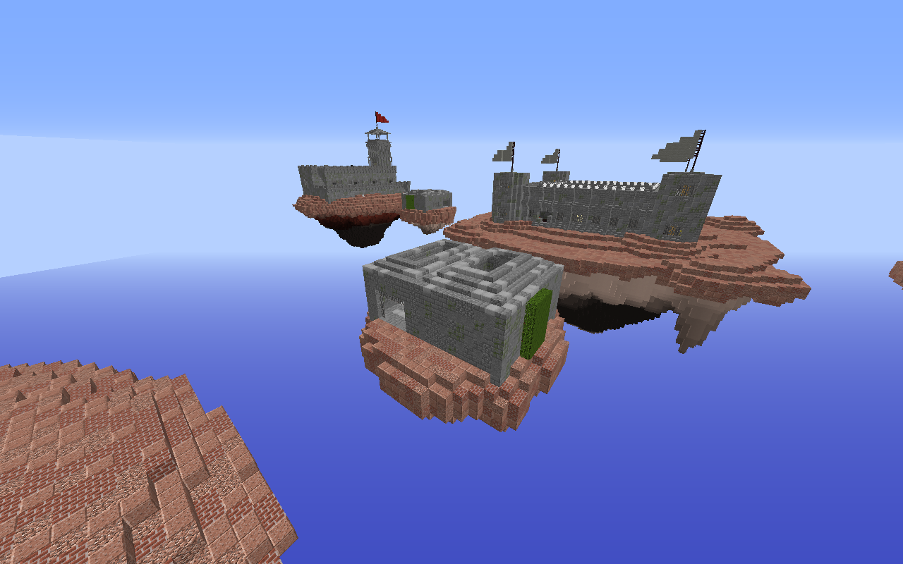
Half mid and mid.
2020-05-01_17.47.48.png

Overview of yellow team's island.
2020-05-01_17.48.10.png

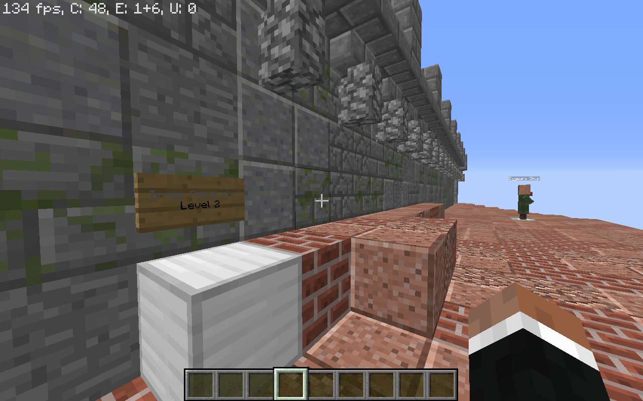
A level 2 iron generator and the shop in the background.
2020-05-01_17.48.23.png

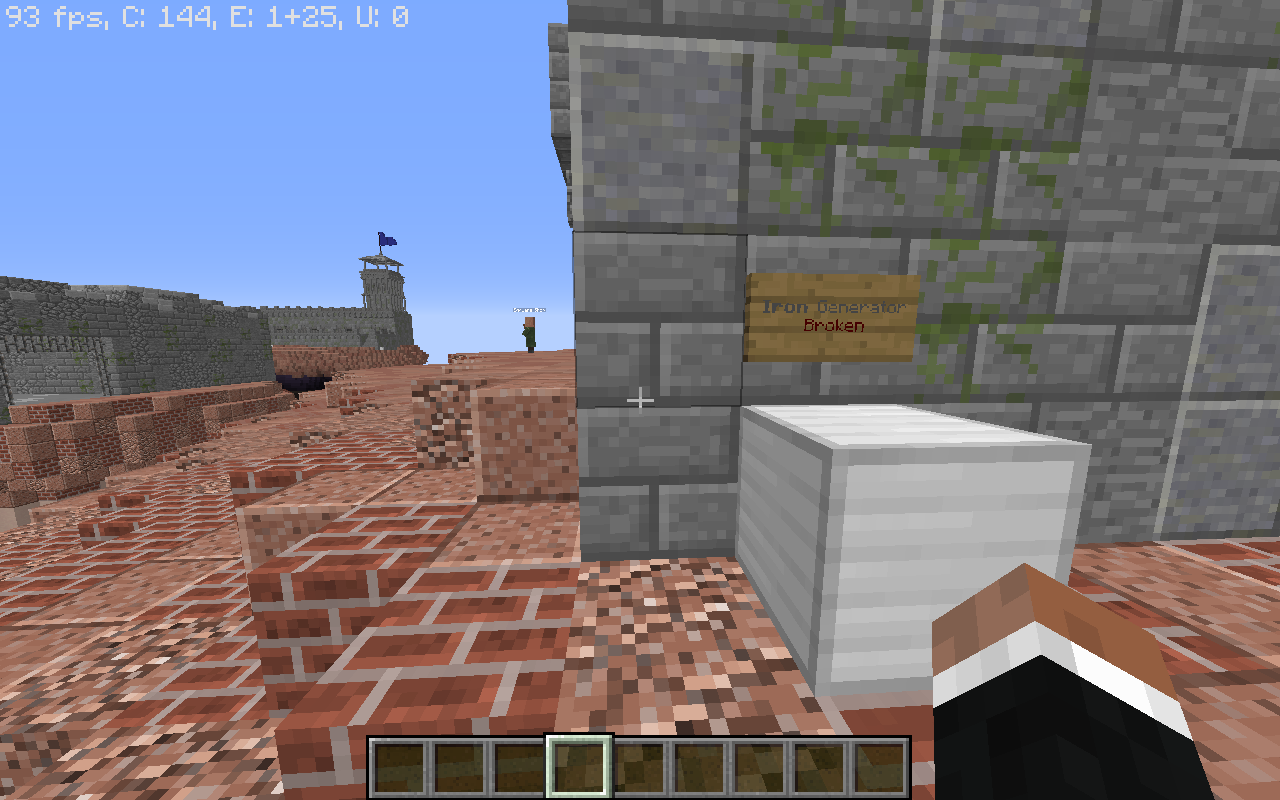
A broken iron generator on the right side of the island.
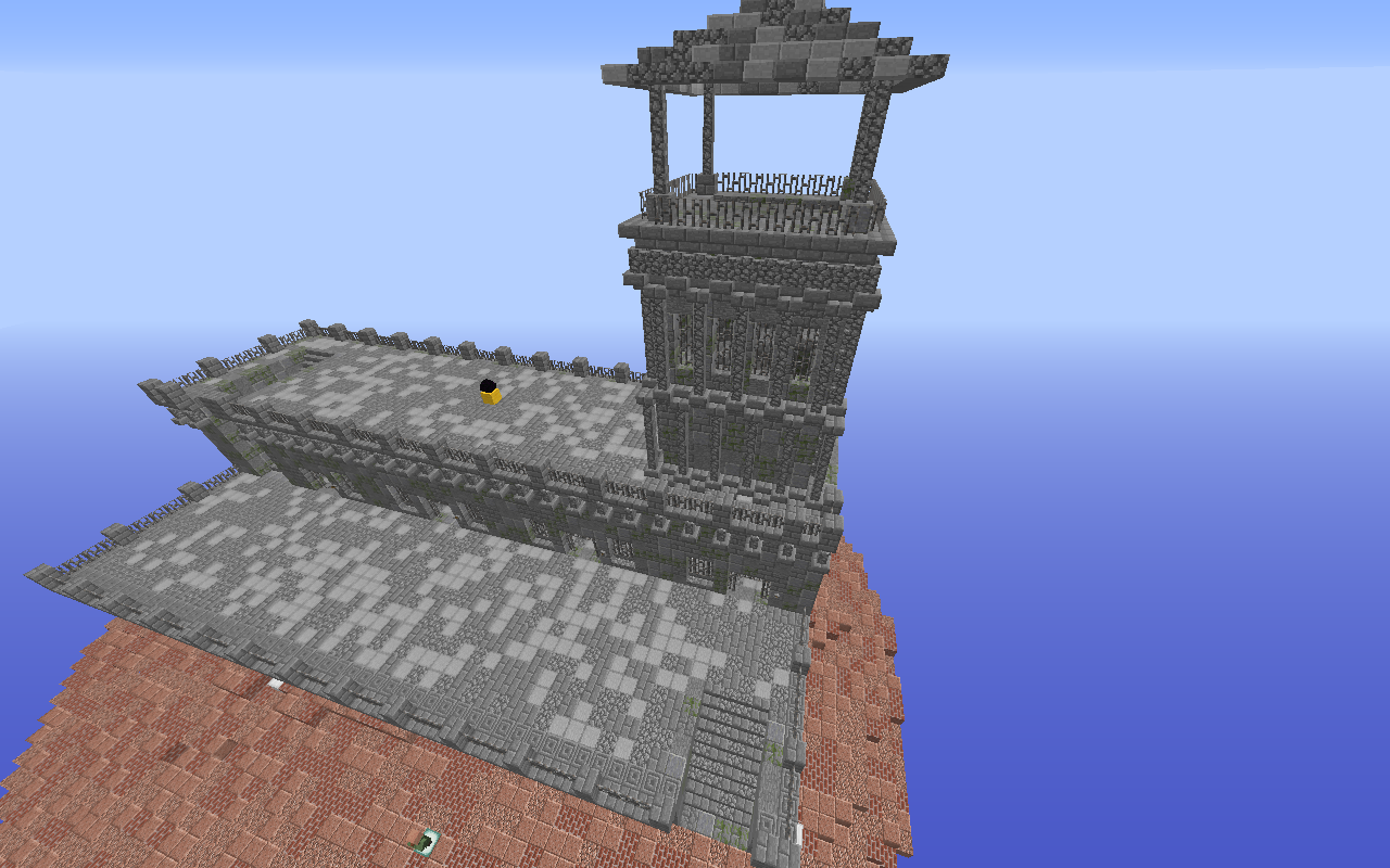
2020-05-01_17.48.33.png

Top view of yellow team's island.
2020-05-01_17.48.51.png

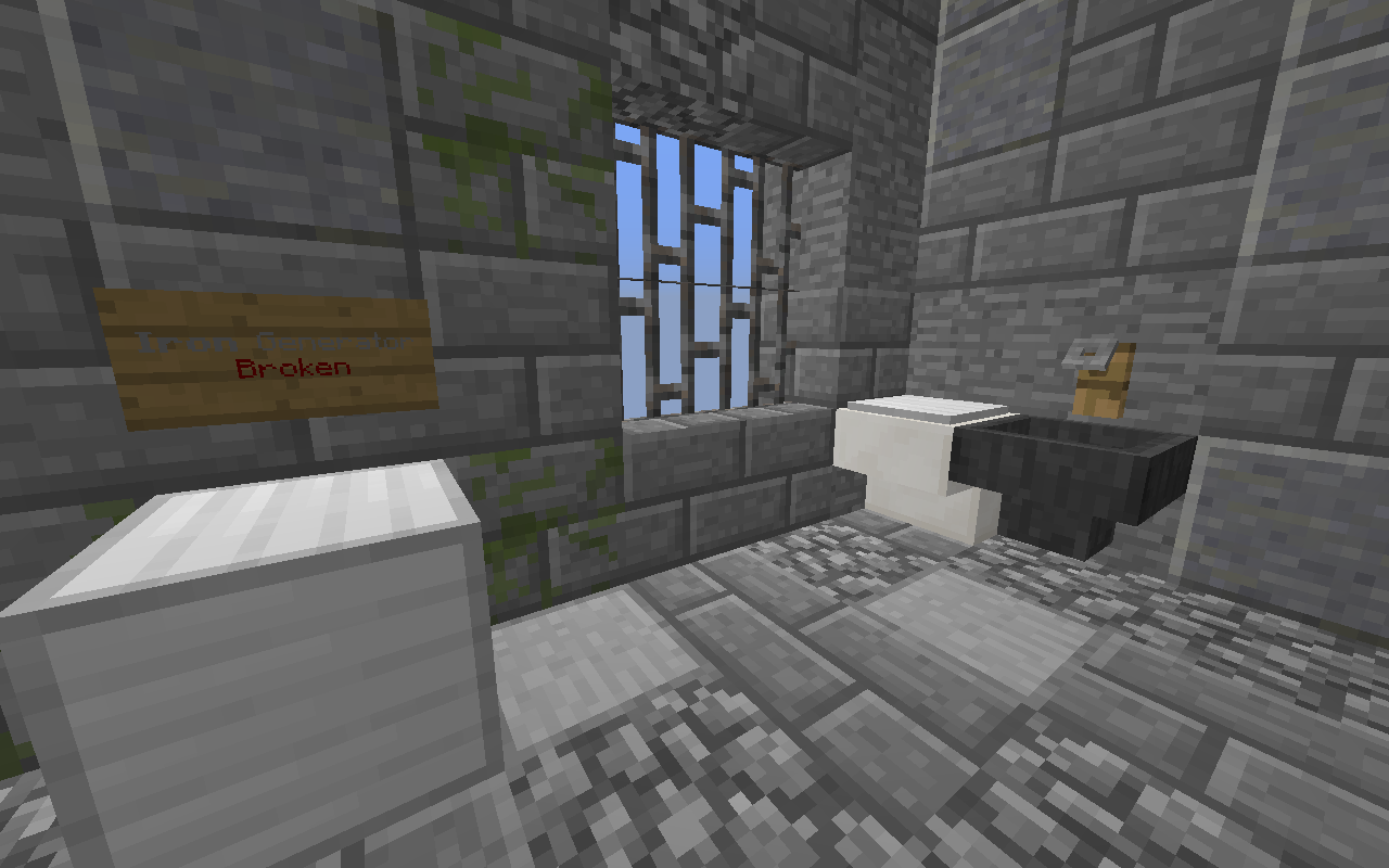
A cell with a broken iron generator and a toilet.
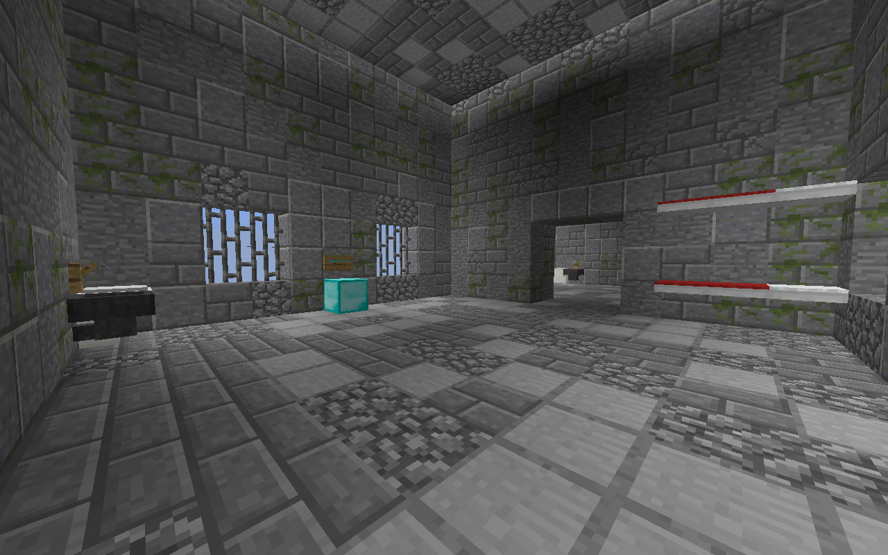
2020-05-01_17.49.04.png

Another cell with a broken diamond generator.
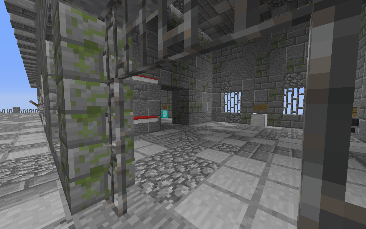
2020-05-01_17.49.14.png

Overview of the cell with broken iron generator.
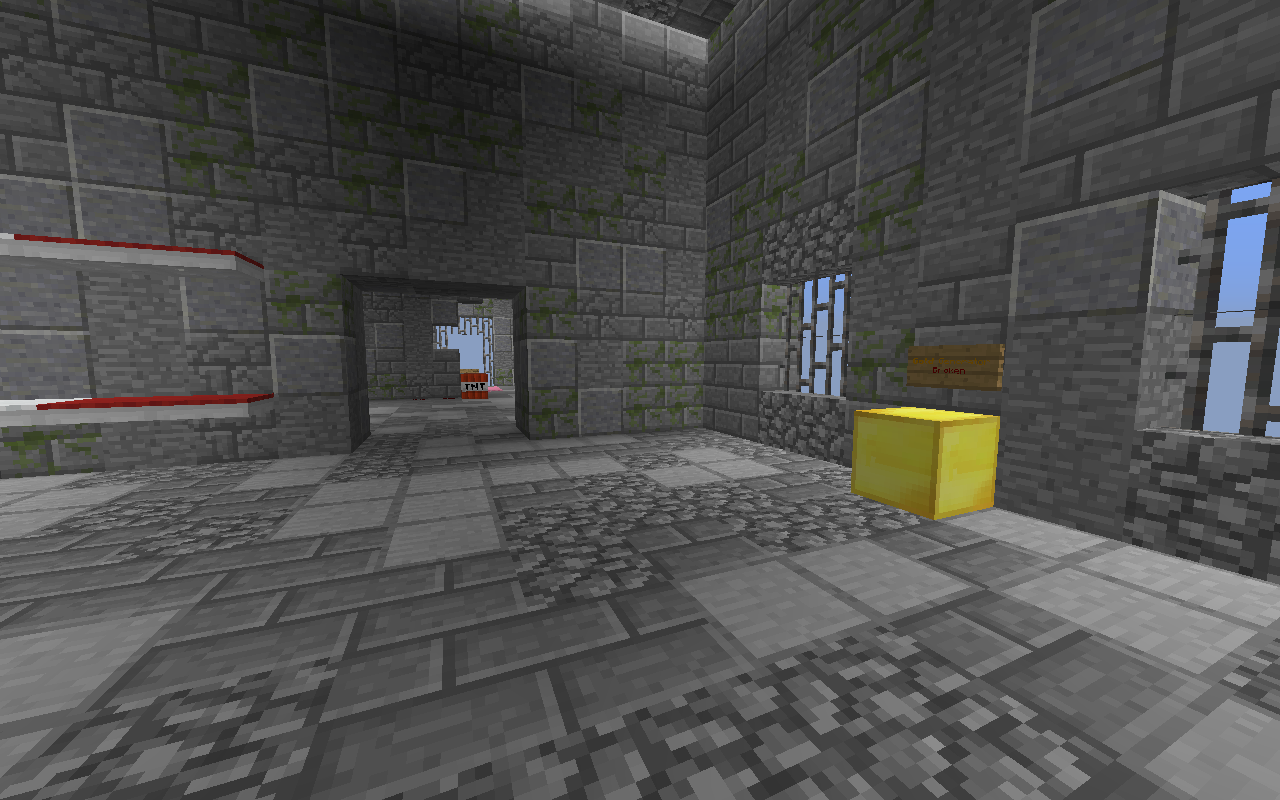
2020-05-01_17.49.31.png

Another cell, with a broken gold generator.
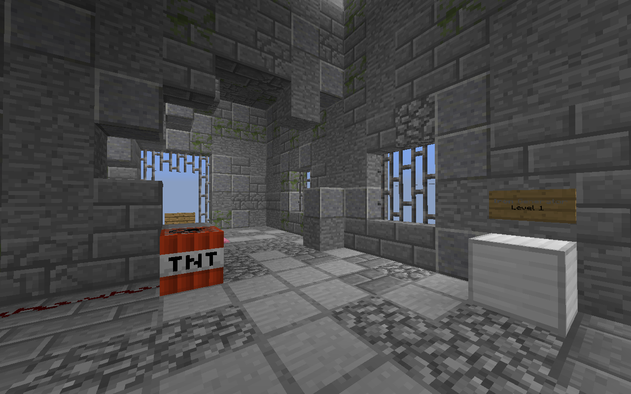
2020-05-01_17.49.43.png

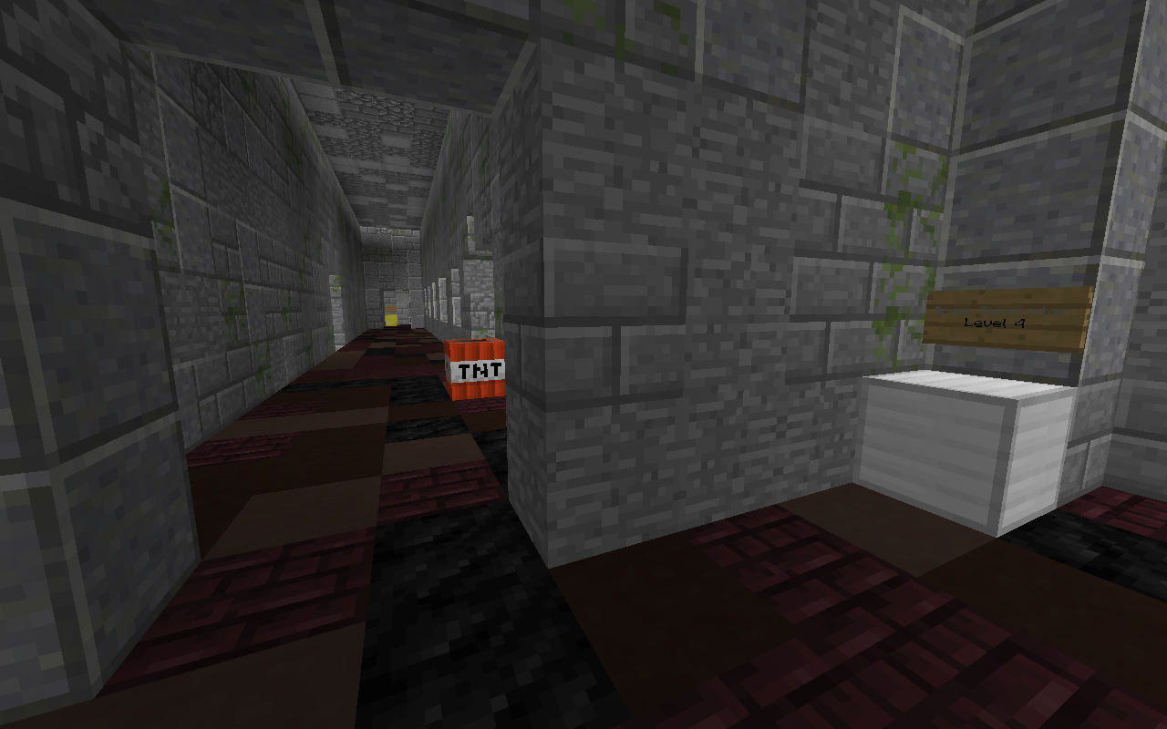
The last cell, with a level 1 iron generator. Some prisoners managed to get some tnt and blow up the wall of the cell.
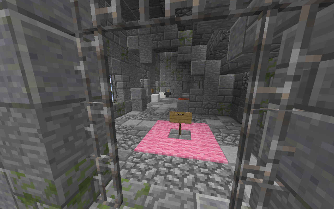
2020-05-01_17.49.52.png

The room next the the last cell, with the respawn point and a side entrance.
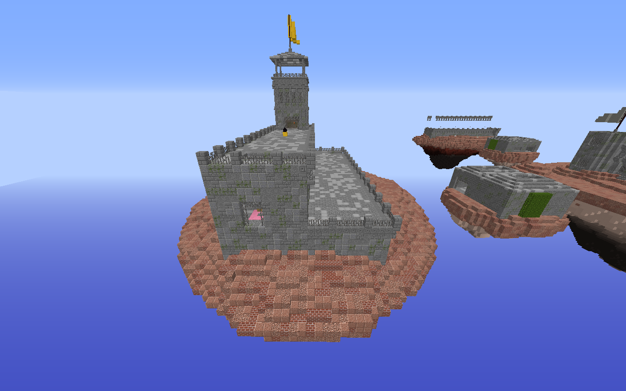
2020-05-01_17.49.57.png

Side view of yellow team's island.
2020-05-01_17.50.07.png

Yellow team's egg and a guard's tower.
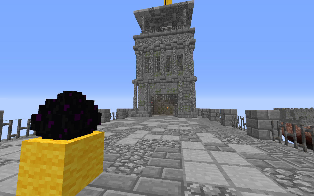
2020-05-01_17.50.13.png

Still yellow team's egg and the same tower.
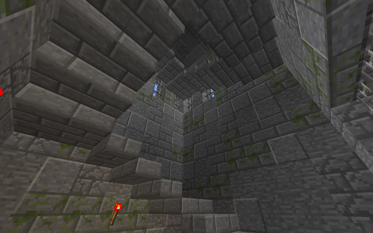
2020-05-01_17.50.20.png

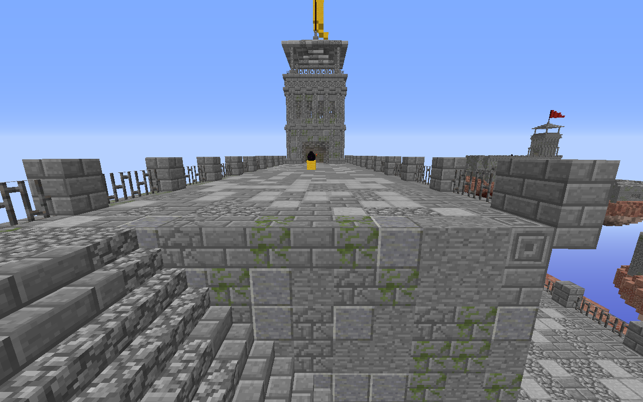
The tower.
2020-05-01_17.50.30.png

Top of the tower.
 
  • Like
Reactions: _The13thDoctor_

Alexxxx

Member
Nov 29, 2017
19
33
29
22
Indiana United States
I do like the idea of this map, Although in my opinion The "middle" islands shouldn't be there. it should be like a straight shot to mid in my opinion just like the Aztec map. so far that's the only issue i see with this map. I would have a better idea if I was able to play the map. So I will give this a YES.
 

bys1

Well-Known Member
Aug 10, 2016
87
39
93
22
Home
I do like the idea of this map, Although in my opinion The "middle" islands shouldn't be there. it should be like a straight shot to mid in my opinion just like the Aztec map. so far that's the only issue i see with this map. I would have a better idea if I was able to play the map. So I will give this a YES.
We decided to give it a small middle island to not have the exact same layout as other maps like aztec, adding a small extra challenge with the gold gen being broken on the main island. But this can of course all be changed.
 

Alexxxx

Member
Nov 29, 2017
19
33
29
22
Indiana United States
We decided to give it a small middle island to not have the exact same layout as other maps like aztec, adding a small extra challenge with the gold gen being broken on the main island. But this can of course all be changed.


I understand that it could be changed completely, This was just my opinion. I never liked the maps the with small islands like the 10v10 maps or the space map
 

ItzEnd3r

Forum Expert
Aug 18, 2019
1,353
3,931
384
19
Boulder
www.cubecraft.net
I decided to vote no for now, mainly because the map is just very messy. Its pretty obvious you just did //replace on the entire map. But also, it is very grey and dull, The only color is in the floor and the tiny flag on top. These are the reasons I voted no.
 
  • Like
Reactions: Nutuu

Nutuu

Forum Expert
Oct 7, 2017
667
2,078
349
Western Finland
The map is way too big for a 4v4 map. The buildings don't have much detail or are repeating the same details all the time. Especially the submid building has no detail. The shape of it is a square and I think it looks boring. The buildings on the spawn islands are wayyyy too big. The colors you have used on the ground are very boring looking and don't fit in. The colors you used on the middle island bottom is only one color, you could have made it for example with stone(s) mixed. The islands have no grass and I believe that the blocks you used are either to make it look like dirt or some kind of stone. The colors on the buildings look a bit boring (i don't know which colors would be better tbh) but especially the mossy stonebricks don't really fit with the other blocks

that's why I voted no.
 

HamsterKazam

Member
Apr 18, 2020
5
2
4
22
The map is way too big for a 4v4 map. The buildings don't have much detail or are repeating the same details all the time. Especially the submid building has no detail. The shape of it is a square and I think it looks boring. The buildings on the spawn islands are wayyyy too big. The colors you have used on the ground are very boring looking and don't fit in. The colors you used on the middle island bottom is only one color, you could have made it for example with stone(s) mixed. The islands have no grass and I believe that the blocks you used are either to make it look like dirt or some kind of stone. The colors on the buildings look a bit boring (i don't know which colors would be better tbh) but especially the mossy stonebricks don't really fit with the other blocks

that's why I voted no.

It's 6v6v6v6
 

Priley

Forum Professional
Jul 6, 2015
4,119
16,204
679
21
reprotland
It's a 6v6v6v6, not a 4v4v4v4, sorry idk if this has been mentioned before!

Sorry for the sarcasm there lol. Anyway, let me give some feedback from the perspective of a regular player (I'm not a builder!)

The terrain variation hurts to look at, there's a lot of blocks combined both for the surface as for the buildings. I'm going to assume this was all done using worldedit, it shows. I'd like to point out I think the general concept of this map is fun, but the execution could have been better.

The middle has a lot of cobwebs, which you should really try to avoid if you're building a map like this :P


I think you could try to take some inspiration from the Team SkyWars map Prison, while not copying it! Still try to give it your own twist! ;)
 

bys1

Well-Known Member
Aug 10, 2016
87
39
93
22
Home
Sorry for the sarcasm there lol. Anyway, let me give some feedback from the perspective of a regular player (I'm not a builder!)

The terrain variation hurts to look at, there's a lot of blocks combined both for the surface as for the buildings. I'm going to assume this was all done using worldedit, it shows. I'd like to point out I think the general concept of this map is fun, but the execution could have been better.

The middle has a lot of cobwebs, which you should really try to avoid if you're building a map like this :p


I think you could try to take some inspiration from the Team SkyWars map Prison, while not copying it! Still try to give it your own twist! ;)
We found it quite hard to pick good-looking blocks especially for the surface. Using stone-like blocks for the surface wouldn't make it better. Would you prefer just using grass for that instead?

oh I'm blind sorry, but still didn't change my opinion. too big.
Aztec is way bigger than this...
 

Nutuu

Forum Expert
Oct 7, 2017
667
2,078
349
Western Finland
We found it quite hard to pick good-looking blocks especially for the surface. Using stone-like blocks for the surface wouldn't make it better. Would you prefer just using grass for that instead?


Aztec is way bigger than this...
yes but Áztec doesn't have a huge building on the spawn island
 
  • Like
Reactions: _The13thDoctor_

ShinyArrow

Forum Expert
Aug 31, 2019
1,046
4,792
364
20
The Netherlands
Pronouns
He/Him
I really like the idea of a prison map, it could be so fun.

But I think this map need some improvement. You could use other colours then grey for the buildings and brown for the ground, now it looks a bit boring. Also in mid you made a huge building, you can add details around it, for example barriers and trees. The building are only square, making it different shapes’ll make it more interesting.

That’s why I voted no
 
  • Like
Reactions: _The13thDoctor_

_The13thDoctor_

Forum Professional
Jul 23, 2016
6,089
14,319
629
20
Chicago, Illinois
www.cubecraft.net
Pronouns
He/Him
Hello,

We decided to make a new eggwars map for you! Because of the small amount of maps for bigger teams, we have made a 6v6v6v6 map.

Map name: Prison
Map made by: @bys1, @HamsterKazam, thorrie, DylanV255 (in-game names are the same)
Teams: Dark Blue, Red, Dark Green, Yellow
Team size: 6 players

The map consists of 4 player islands, 4 small/half middle islands and a big middle island. The islands have the following generators:

Player islands:
4x Iron: 1x level 2, 1x level 1, 2x broken
1x Gold: Broken
1x Diamond: Broken

Half mid:
1x Gold: Level 2

Mid:
2x Iron: Level 4
2x Gold: Level 3
2x Diamond: 1x level 3, 1x level 2

Screenshots below in the spoiler.
If you decide to vote "no", please explain your vote!

We really hope you guys like the map. If you have any feedback or ideas on what to change, let us know!

View attachment 163732 Top view.

View attachment 163733
Overview of the middle island.
View attachment 163734
Front/back view of the middle island. View attachment 163735
Side view of the middle island. There is no entrance to the prison here, but prisoners have blown a hole into the wall (left side).
View attachment 163756 One of the towers on middle island, with a level 4 iron generator.
View attachment 163757
Another tower on middle island, with a level 3 gold generator and ladders to the next floor.
View attachment 163758
The next floor, with another ladder to get on top of the tower.
View attachment 163759
Top view of a tower.
View attachment 163760
Middle area of mid island, with two diamond generators (level 2 and level 3).
View attachment 163736
Overview of yellow team's island and half mid. View attachment 163737
Prison part on half mid with the entrance to the guard's room. View attachment 163738
The guard's room on half mid. View attachment 163739
A level 2 gold generator in the guard's room. View attachment 163740
Half mid and mid. View attachment 163741
Overview of yellow team's island. View attachment 163742
A level 2 iron generator and the shop in the background. View attachment 163743
A broken iron generator on the right side of the island. View attachment 163744
Top view of yellow team's island. View attachment 163745
A cell with a broken iron generator and a toilet. View attachment 163746
Another cell with a broken diamond generator.View attachment 163747
Overview of the cell with broken iron generator.
View attachment 163748
Another cell, with a broken gold generator.
View attachment 163749
The last cell, with a level 1 iron generator. Some prisoners managed to get some tnt and blow up the wall of the cell. View attachment 163750
The room next the the last cell, with the respawn point and a side entrance. View attachment 163751
Side view of yellow team's island. View attachment 163752
Yellow team's egg and a guard's tower. View attachment 163753
Still yellow team's egg and the same tower. View attachment 163754
The tower. View attachment 163755
Top of the tower.

This map has potential, although it's far from being an accepted map I think with the right feedback you take from everyone's comments and doing a rework could make this 100% better. I don't have anything, in particular, to add as most people have covered it but if you'd like help feel free to message me and I'll help you out! :D
 
  • Like
Reactions: Axyy

TheJeroen

Forum Veteran
Dec 6, 2015
2,579
6,236
463
24
the Netherlands
www.planetminecraft.com
Hey, after a few looks I have noticed some things you may need to take into consideration.

- The ground / coloring
I will asume, based on what I can see, you have used a WorldEdit command to create the Granite / Brick islands. The blocks you decided to use, their colors and the way they blend with each other is fine, though the way you added them is not so great. When I take a look at those island I imagine you simply ran the command //replace [block] 33%Granite,33%Polished_Granite,34%Brick and let WorldEdit decide the outcome. At the build team you may notice you never see us color any kind of island / ground this way, unstead we use the GoPaint tool. If you do not have acces to GoPaint, an alternative is the WorldEdit sphere brush.
To give a better visual representation of what I ment, have a look at these 2 images. This is a PVP map submission from ItzEnd3r and he executed my feedback flawlessly. Already looks much better, doesn't it!
rkut2Ir.png

screen-shot-2020-04-30-at-7-52-11-am-png.163655

- The prison walls
Your buildings face the same main problem like with the ground, it just looks so messy. From my eyes it seems like again you used the //replace command to make WorldEdit decide at random if a block should be Andesite, Stone, Brick, Moss Brick, etc. I cannot exactly say what kind of stone-material would be best to use, but I recommend making the building out of either Stone Bricks or regular Stone and not spam them everywhere. Though you should experiment a little trying to see what block(s) work best for the building.
- Prison yard
It's also good to point out things you have done well, which is choosing different materials for the prison yard, instead of Granite. Sand works well considering the blocks you used for the islands. Only tip I can give is the same as with the previous advice, it looks a bit messy as if it was just the //replace command.

- The islands look so... blank
There's nothing! Aside from the prison complexes the islands are just empty! What I would recommend is adding small, not too major, scenery. For example you could add small bits of fencing around the edge of the island to simulate a prison fence. You could add some regular rocks made out of stone to give the map more colors, just make sure to make it look more interesting!


This is my feedback as far as it goes visually, I do not often build EggWars map (I hate the gamemode lol) so I cannot really say anything regarding the lay-out of the map or the amount of generators on this map and their positions.
 
Status
Not open for further replies.
Members Online

Latest profile posts

Casualpoalrbear wrote on PolarBear's profile.
My guy somehow haven't posted a single message or had a single reaction and is somehow a well known member 💀
BicolourSine41 wrote on finnyboy300.'s profile.
wait finny is this a new account here?
BicolourSine41 wrote on kfccaleb's profile.
congrats on novice member!
jamesthesignificant wrote on Capitan's profile.
you are cool
Mr Jii Gamer wrote on Pro Gamer672's profile.
Happy birthday
Top Bottom