Minecraft PC IP: play.cubecraft.net

Should this map be added?

  • Yes

    Votes: 78 90.7%
  • No

    Votes: 8 9.3%

  • Total voters
    86
Status
Not open for further replies.

CrystalDrop

Dedicated Member
Aug 9, 2017
171
577
169
23
USA
Map name: Atlantis

Map creator(s): CrystalDrop with the special help of @Savvy, @iLxgend, @Dubbz, @AssassinJillian

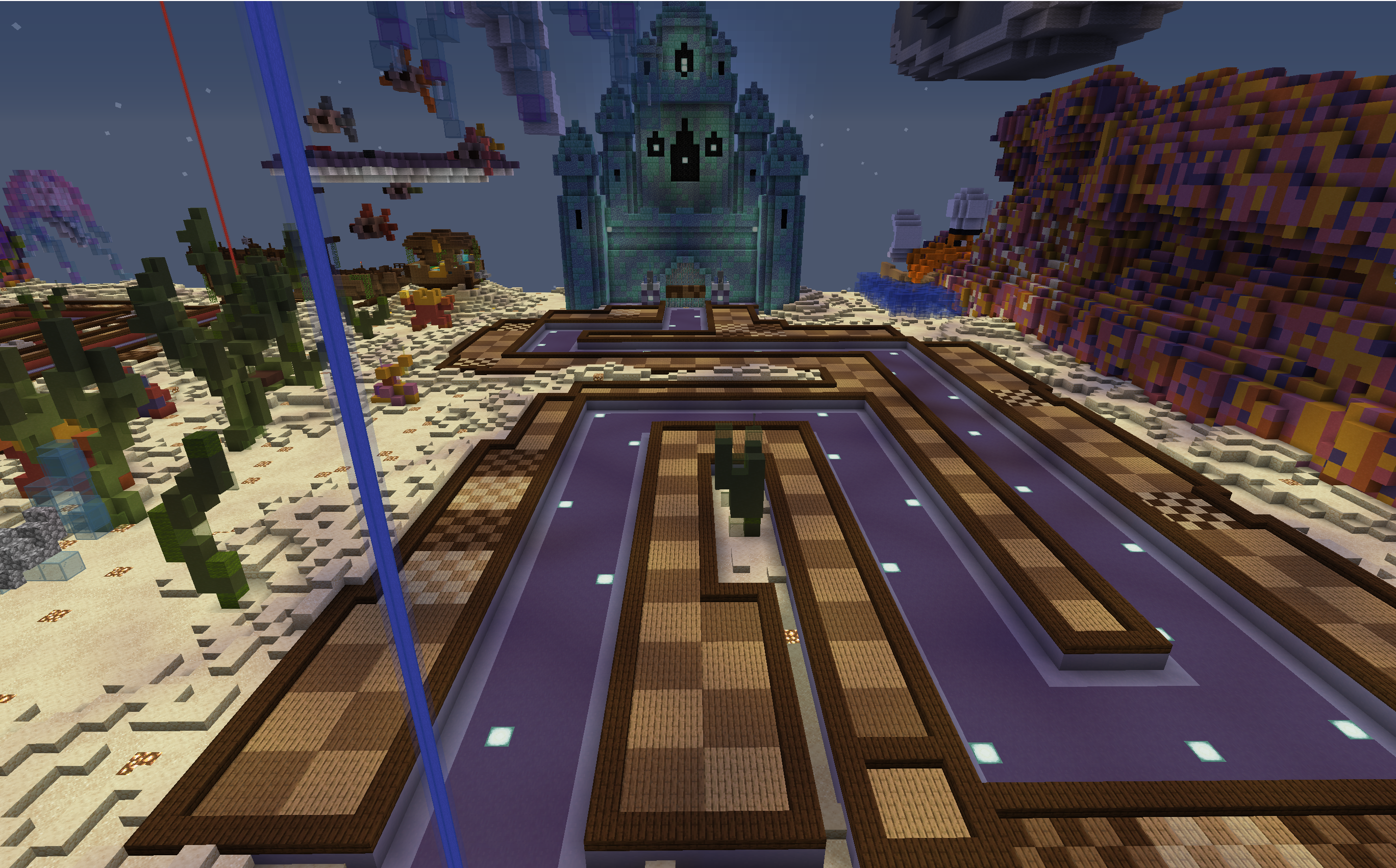
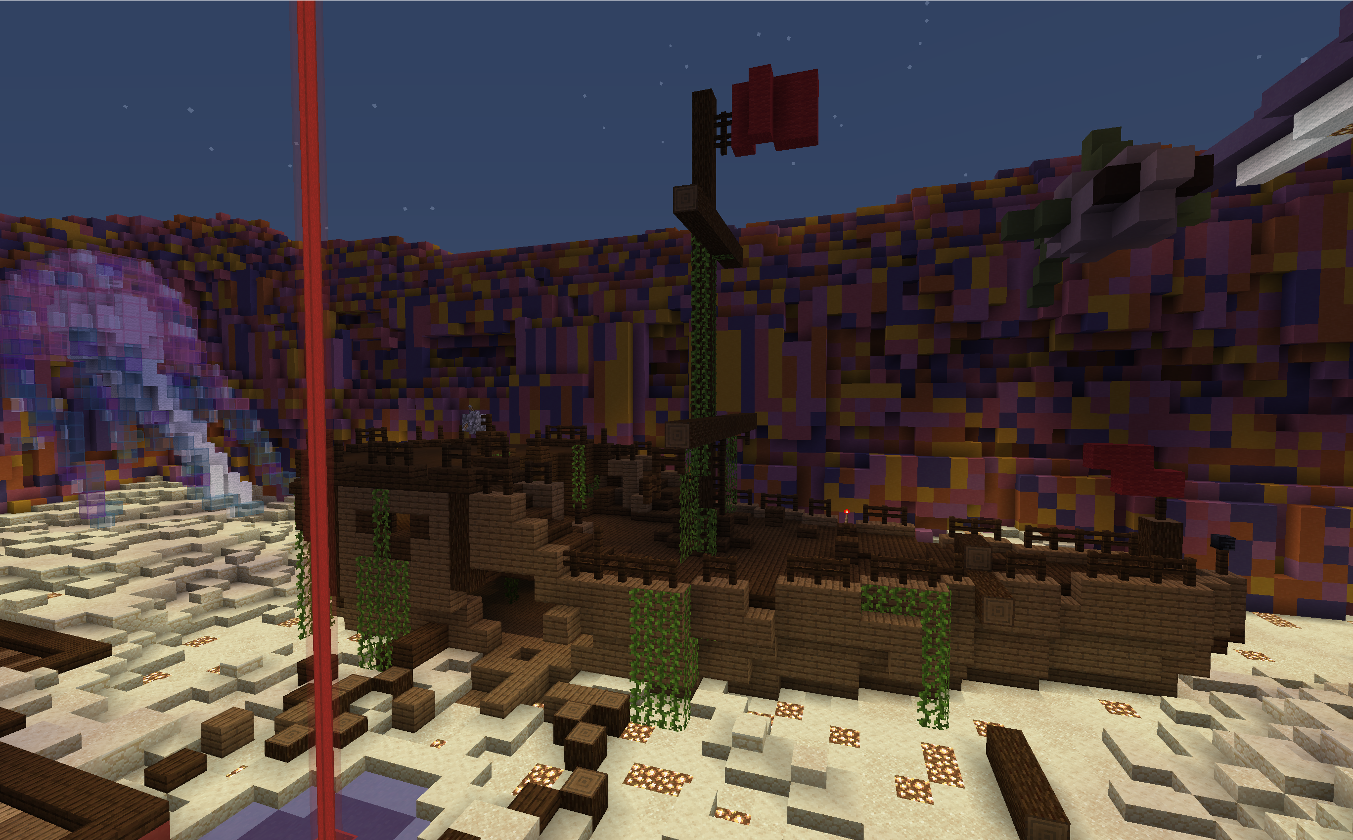
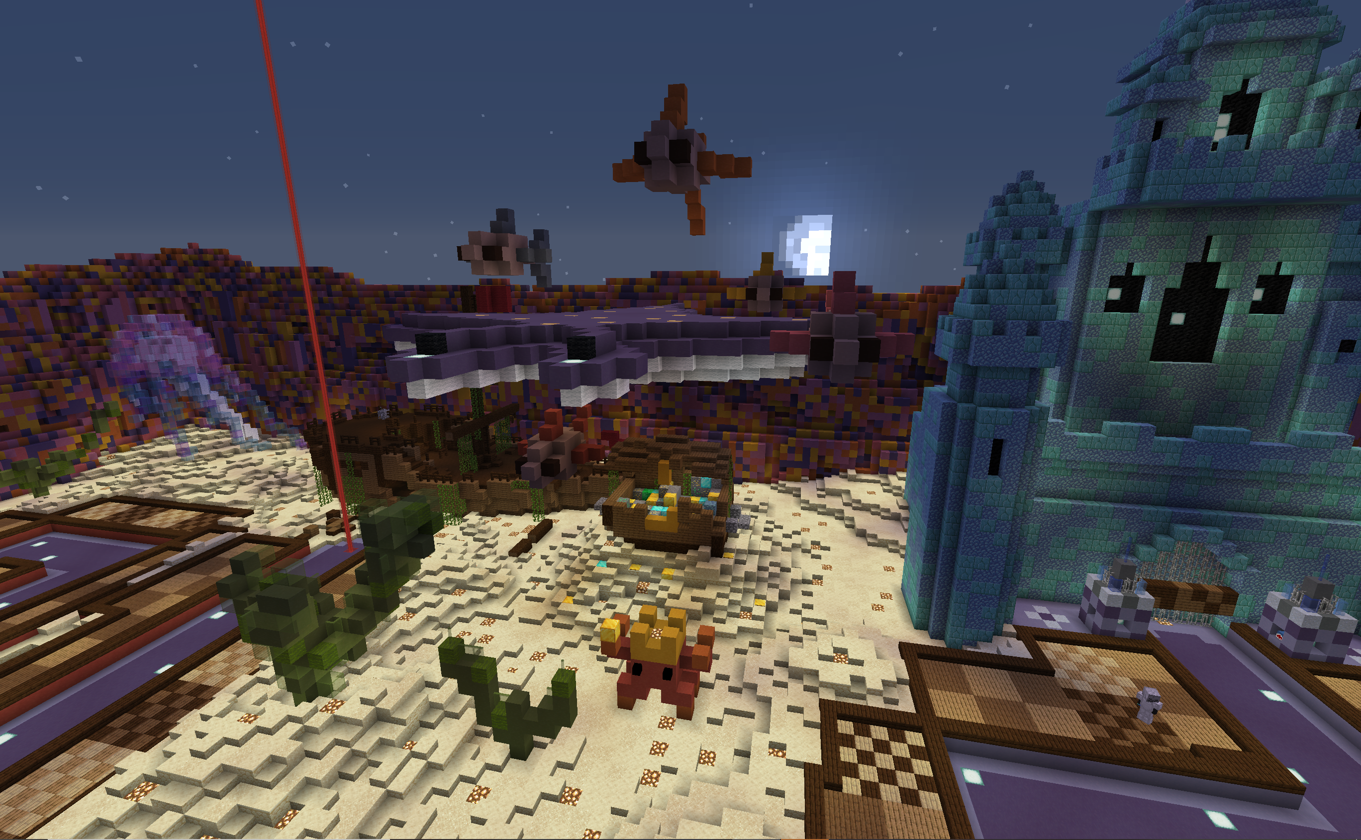
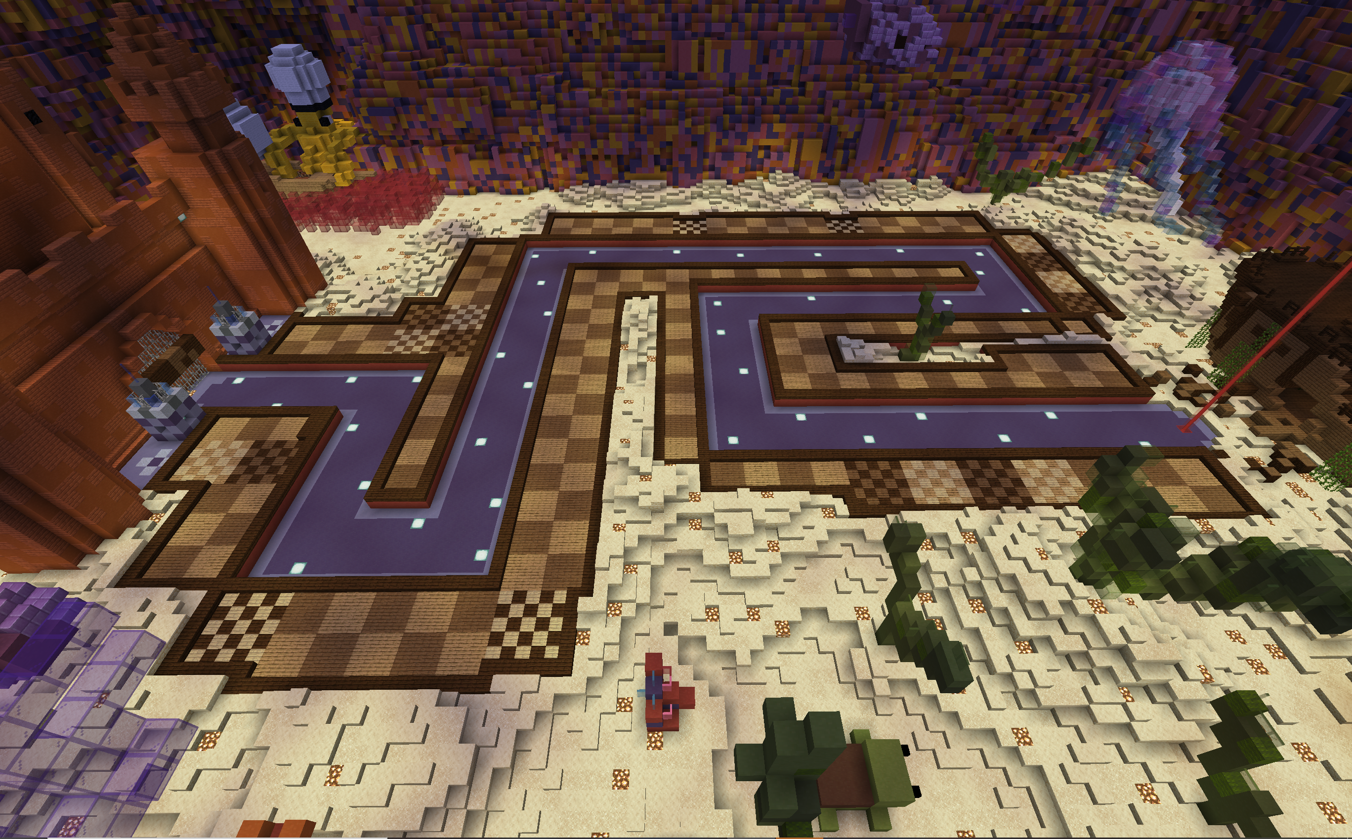
Map Description: This is an underwater-themed tower defense map with a path length of about 280 blocks and a total of 188 3x3's and 19 5x5's. This map looks best with the time set as 23000ticks but that can always be modified a bit to make it a little bit brighter. There are a lot of sea creatures, buried treasure, and hidden spots to be discovered. A lot of hard work was put into this, and I think this would be a very good addition, especially since we haven't gotten a new map for this game in a while. Below is a link to see a full video tour of the map! I hope you enjoy!

*Edit* A few updates of the map have been posted in the comments
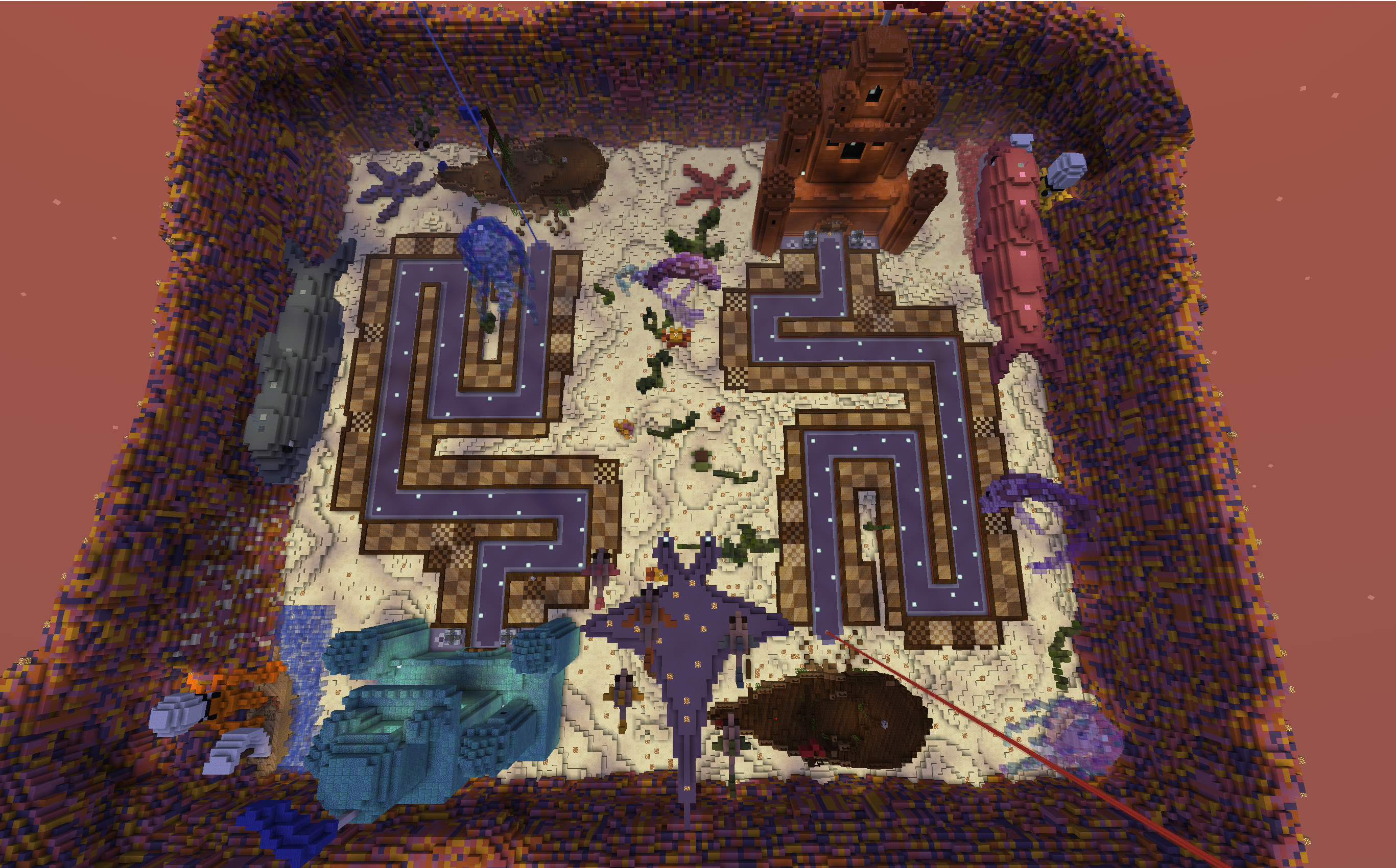
preview 1.PNG
preview 2.PNG
preview 3.PNG
preview 5.PNG
preview 6.PNG


Video tour:
 
Last edited:

Eli

Moderator
Team CubeCraft
🔨 Moderator
Dec 25, 2017
1,437
7,899
408
19
Bogota, Colombia
Pronouns
He/They
Tower Defence maps are such hard projects to carry out. I love every single detail you have put in this map. The theme is well represented everywhere. I love the organic builds! And it's so nice you added a video to the submission. Love every single part of it, hope it gets implemented!
 

Andyyy

Forum Expert
Dec 7, 2016
1,038
2,065
308
21
Blockwars
I recommend you also show this build with the pre 1.14 texture pack as well as a large proportion of players use the older version of the game. Some parts of the map that may look good can be very ugly with the older pack with the best example of that being glowstone, which in my opinion should almost never be used in old pack builds as a foreground block as it was just plain old ugly. Maybe we shouldn't have to worry about older versions one day but for now it's a concern due to the number of players on it. So I'd suggest to touch up the areas that don't work on that pack.

Now for the build itself: I don't think it should be added in it's current state for a few reasons.
First of all: there needs to be more work in terms of terraforming. If you imagine a coral reef (which I assume you are going for due to the block choice on the walls), you don't just get a big wall of it on a boundary, you get corals interlaced throughout it in a forest. With the solid gapless walls around the map, it feels more like they are just there to contain the map instead of being a part of the map itself.

The other part of it is the sandy base which has very little elevation change; making it feel more like a sandbox with a bunch of small toys placed around than an Atlantis. Looking at a real coral reef, you can see the huge differences in height where corals are meters higher than others. Imagine cliffs and overhangs with different peaks and dips. You can have the path on supports or dug into the ground at various points to keep it balanced in the rocky terrain, which I could imagine looking amazing. You have these castles but imagine what the intelligent life will do with their surroundings.

The second issue is with the castles themselves. The blocks used in it are the same throughout so it just looks like a probably is a //replace job. That's fine in selected areas but when it's all the same that's a problem. I'd try using dark prismarine in the spires of it in rings perhaps and vertical pillars to support it more. You need a different palette for different sections.
My third qualm is the tiny amount of attention to lighting. It looks like you have spammed glowstone everywhere in the map to keep it lit but you haven't considered how it fits in with the area around it. The worst offenders I've noticed is the starfish just covered in glowstone at the top where you could try and indent it with purple glass. On the outside wall you have a ring around the edge where parts of it stick out a lot and it very noticeable.

Not everything has to be perfectly lit as darker areas can add more variation. Maybe it's a different story where pvp is involved but remember people can fly and see all the ugly bits that aren't obvious from the ground.

This might be a bit intimidating all of this, but taking it one step at a time helps and I'd love to see progress updates. I'm sure many others would love to provide useful feedback too. (P.S I'm not sure what I did with the font and stuff but like you literally can't change back to the default font size for reasons?? so it gotta be small for now)
 

kaitdaysaweek

Member
May 14, 2020
2
2
4
24
This map needs to be posted ASAP. It is good to see players so dedicated to improving TD. Crystal, Sqvyy, Dubbz, Jillian, and iLxgend are just a handful of people that dedicate a lot of time to this server! I really like the simplicity of it as well as how much detail was put into it. Also, I don't think you should change anything. Maybe some minor changes, but nothing too drastic. If others don't like it, they can build their own map. Also, I hope this page is used for feedback and compliments instead of straight criticism. Go Crystal :)
 

Fesa

Quality Assurance
Team CubeCraft
🧪 Quality Assurance
💌 Customer Support
Oct 17, 2016
1,512
4,096
349
Yoitsu
Pronouns
She/Her
upload_2020-5-25_9-15-3.gif


The only thing that’s missing is a bit of extra decorations on the sand and an accepted tag.

One extra thing; I think you’ve used sandstone slabs. I’m not absolutely sure but I don’t think they exist in 1.9 so they can’t be used I think...
 
  • Like
Reactions: CrystalDrop

Diav

( ͡° ͜ʖ ͡°)
Jan 16, 2020
255
1,049
159
22
Venice
This map needs to be posted ASAP. It is good to see players so dedicated to improving TD. Crystal, Sqvyy, Dubbz, Jillian, and iLxgend are just a handful of people that dedicate a lot of time to this server! I really like the simplicity of it as well as how much detail was put into it. Also, I don't think you should change anything. Maybe some minor changes, but nothing too drastic. If others don't like it, they can build their own map. Also, I hope this page is used for feedback and compliments instead of straight criticism. Go Crystal :)
Andy's comment surely wasn't just criticism but he told them what can be improved and why the map can't be used how it is right now.

I think the build looks interesting and it's clear that you put effort doing it, and that's a point in your favor. Sadly the map can't be used as it is right now.

Terraforming and coloring: You should follow what Andy said previously, the coral reef just looks more like a wall right now. For the coloring I'd really suggest you not to use //replace, it just looks messy and confusing, I think you can see it too. GoPaint is the best for this work, especially the spray and splatter brush, you can make really good looking shades. If you don't have access to GoPaint I'd suggest you to take a tool like a sword and do /br splatter [id][radius] and then use it to color the terraforming with a mask on it (I personally use diamonds blocks to make the terraformings, so it would be /mask 57, since 57 is diamond block's id). If you don't know how to use /br splatter you could use //replace #simplex[numer][ids], it is better than the normal //replace.

Organics: The organics are alright, they could be improved but I know that organics are pretty hard so I'm not being too judgy. A thing I'd say: you copied MegRae's koi fish tutorial, copying the tutorial of a famous youtuber and putting it on a server like Cubecraft isn't suitable. Obviously every builder has copied something during their career and that's alright for private projects, not for projects that would get added into a big server.

These are the things I'd improve in first, then there are some small details but it isn't the main thing to focus on right now.

I really appreciate the effort you put and I think the map has potential, if you want to improve it and follow what Andy and I said and you'd have higher chance for your map to get added to the server.
I'd like to say that I'm not being judgy, I'm giving you tips so that you can get a better result since Cubecraft has pretty high standards for its maps.

Good luck :)
 

Diav

( ͡° ͜ʖ ͡°)
Jan 16, 2020
255
1,049
159
22
Venice
View attachment 165724

The only thing that’s missing is a bit of extra decorations on the sand and an accepted tag.

One extra thing; I think you’ve used sandstone slabs. I’m not absolutely sure but I don’t think they exist in 1.9 so they can’t be used I think...
Sandstone slabs were added in 1.3, so they can be used xd.

A block that can't be used is the purpur block on the fish, since it's been added in 1.9
 
  • Like
Reactions: AssassinJillian

CrystalDrop

Dedicated Member
Aug 9, 2017
171
577
169
23
USA
Sandstone slabs were added in 1.3, so they can be used xd.

A block that can't be used is the purpur block on the fish, since it's been added in 1.9
Thank you for all the feedback! And their post says that we can use 1.9 blocks?

View attachment 165724

The only thing that’s missing is a bit of extra decorations on the sand and an accepted tag.

One extra thing; I think you’ve used sandstone slabs. I’m not absolutely sure but I don’t think they exist in 1.9 so they can’t be used I think...
Thank you!

I recommend you also show this build with the pre 1.14 texture pack as well as a large proportion of players use the older version of the game. Some parts of the map that may look good can be very ugly with the older pack with the best example of that being glowstone, which in my opinion should almost never be used in old pack builds as a foreground block as it was just plain old ugly. Maybe we shouldn't have to worry about older versions one day but for now it's a concern due to the number of players on it. So I'd suggest to touch up the areas that don't work on that pack.

Now for the build itself: I don't think it should be added in it's current state for a few reasons.
First of all: there needs to be more work in terms of terraforming. If you imagine a coral reef (which I assume you are going for due to the block choice on the walls), you don't just get a big wall of it on a boundary, you get corals interlaced throughout it in a forest. With the solid gapless walls around the map, it feels more like they are just there to contain the map instead of being a part of the map itself.

The other part of it is the sandy base which has very little elevation change; making it feel more like a sandbox with a bunch of small toys placed around than an Atlantis. Looking at a real coral reef, you can see the huge differences in height where corals are meters higher than others. Imagine cliffs and overhangs with different peaks and dips. You can have the path on supports or dug into the ground at various points to keep it balanced in the rocky terrain, which I could imagine looking amazing. You have these castles but imagine what the intelligent life will do with their surroundings.

The second issue is with the castles themselves. The blocks used in it are the same throughout so it just looks like a probably is a //replace job. That's fine in selected areas but when it's all the same that's a problem. I'd try using dark prismarine in the spires of it in rings perhaps and vertical pillars to support it more. You need a different palette for different sections.
My third qualm is the tiny amount of attention to lighting. It looks like you have spammed glowstone everywhere in the map to keep it lit but you haven't considered how it fits in with the area around it. The worst offenders I've noticed is the starfish just covered in glowstone at the top where you could try and indent it with purple glass. On the outside wall you have a ring around the edge where parts of it stick out a lot and it very noticeable.

Not everything has to be perfectly lit as darker areas can add more variation. Maybe it's a different story where pvp is involved but remember people can fly and see all the ugly bits that aren't obvious from the ground.

This might be a bit intimidating all of this, but taking it one step at a time helps and I'd love to see progress updates. I'm sure many others would love to provide useful feedback too. (P.S I'm not sure what I did with the font and stuff but like you literally can't change back to the default font size for reasons?? so it gotta be small for now)

The feedback is appreciated
 
Last edited by a moderator:

Wvzy

Well-Known Member
Aug 16, 2017
14
12
79
23
Dnipro, Ukraine
mine.ly
Im playing Tower Defence on cubecraft 2+ years, and for all this time was added only 1 new map - Zen. Tower Defence need new maps, for long/short games. And would be very cool see new maps, and makes tower defence more populary :P Let players build new maps for it :D (Sorry for my english)
 

AssassinJillian

Well-Known Member
Aug 6, 2016
14
12
79
Andy's comment surely wasn't just criticism but he told them what can be improved and why the map can't be used how it is right now.

I think the build looks interesting and it's clear that you put effort doing it, and that's a point in your favor. Sadly the map can't be used as it is right now.

Terraforming and coloring: You should follow what Andy said previously, the coral reef just looks more like a wall right now. For the coloring I'd really suggest you not to use //replace, it just looks messy and confusing, I think you can see it too. GoPaint is the best for this work, especially the spray and splatter brush, you can make really good looking shades. If you don't have access to GoPaint I'd suggest you to take a tool like a sword and do /br splatter [id][radius] and then use it to color the terraforming with a mask on it (I personally use diamonds blocks to make the terraformings, so it would be /mask 57, since 57 is diamond block's id). If you don't know how to use /br splatter you could use //replace #simplex[numer][ids], it is better than the normal //replace.

Organics: The organics are alright, they could be improved but I know that organics are pretty hard so I'm not being too judgy. A thing I'd say: you copied MegRae's koi fish tutorial, copying the tutorial of a famous youtuber and putting it on a server like Cubecraft isn't suitable. Obviously every builder has copied something during their career and that's alright for private projects, not for projects that would get added into a big server.

These are the things I'd improve in first, then there are some small details but it isn't the main thing to focus on right now.

I really appreciate the effort you put and I think the map has potential, if you want to improve it and follow what Andy and I said and you'd have higher chance for your map to get added to the server.
I'd like to say that I'm not being judgy, I'm giving you tips so that you can get a better result since Cubecraft has pretty high standards for its maps.

Good luck :)

Thank you guys for the feedback! If this map isn't accepted as it is now, we have a good start, and now know what direction to go to improve it!
 

ItzEnd3r

Forum Expert
Aug 18, 2019
1,353
3,931
384
19
Boulder
www.cubecraft.net
Alright, so I like the map, but I did vote no. This vote could easily be changed with a few quick changes. ok so first, I dont like the temple thing at the end of the track, it is missing details and looks messy with the randomized blocks, i would suggest detailing it more, and placing the block more purposefully. and 2, all the animals (except for the jellyfish) are very plain imo, there is absolutely no detail in them, It would be awesome if you could give them some texture or at least a little shading. If these things get changed my vote could easily become a yes.
 

CrystalDrop

Dedicated Member
Aug 9, 2017
171
577
169
23
USA
Thank you everyone for the suggestions! Especially @Andyyy and @Diav for putting so much work into the replies. I have read through everything carefully and we made corrections to the map. Below is a list of things I changed so far with new pictures! (this time the pictures are in the older texture pack instead of the new one) Some things I did not change and I will explain my reasoning. Please feel free to reply to this comment with new feedback. Thank you!

The castles: A lot of people did not like how the blocks looked, I can see why, so we added more detail and changed the blocks so it looks more simple but fancy at the same time.

Lighting: I understand that glowstone does not look as good in the original Minecraft texture pack and it looked a bit random the way it was placed in the map. I solved this problem in a simple way. I removed all the glowstone in the sand. Instead, I remembered that the tower defense map, Portals, applies the night vision effect on players once they join the game. If possible, I would like this to happen for this map if it was to be published. (It might also be cool if the water breathing effect could be added just to help with the illusion a bit.)

The barrier: So the coral wall was indeed meant to serve as a wall. Since it looked a bit random and messy and I lacked some coral that matched it on the floor, I decided to change it to a blue. This is meant to represent water enclosing in but again, mainly to keep the map enclosed. I do think this looks a bit cleaner though.

Terrain: So I was able to move some things around, and add some new things, however, I do not think many hills or extra things are needed. This is because I want the pathways to be easily visible for both sides, and to make the map a little less cluttered. I have been playing TD for years and I feel like this is a judgment call. I did not realize the fish were from a Minecraft video, I had the creator fix them and they are more original and still cute! Thank you for pointing that out, we have no intentions of copyrighting anyone. I am sure new ideas for sea creatures/coral will be added as we wait if people still feel like it needs more detail.

I do hope some of these changes help, it would be a shame if players couldn't find all the buried treasure ;D I also understand if the design team wishes to add a few edits. If not I hope this at least inspires some people. New TD maps are needed.

*another edit* extended the track a bit more near the end
 

Attachments

  • new castle -red.PNG
    new castle -red.PNG
    4.4 MB · Views: 135
  • night vision.PNG
    night vision.PNG
    83.6 KB · Views: 115
  • new castle blue.PNG
    new castle blue.PNG
    4.7 MB · Views: 141
  • barrier.PNG
    barrier.PNG
    6.8 MB · Views: 118
Last edited:
Status
Not open for further replies.
Members Online

Team online

Latest profile posts

Watching the sun set... 🌅

1732368294873.png
Hello Guys i had been playing cubecraft for 1 year and 2 months and i got pretty good at it. i am good at games like CTF And Bridges
CalvinxKlein wrote on ItzJxrry's profile.
jerry egril or egirl?
Mappoe wrote on JokeKaedee's profile.
thnak you for the follow kae!! have it back
Top Bottom