Minecraft PC IP: play.cubecraft.net
I think the builders are using internet from the 90s, the screens must still come through! Goodluck! :P
EDIT: http://www.evermotion.org/excluziv/troy/image013.jpg
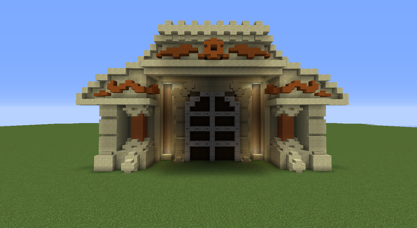
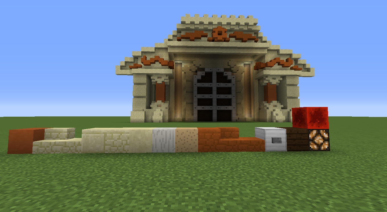
I will go into deeper detail later when I make a full tutorial. But, here's what I mean by cleaning up your block palette. Rather than removing blocks make them look good together, make them complement their colours by using other colours that work well together with them. I used the gate picture as shown in Hb's post to throw together my interpretation of the blocks you could use to recreate the structure you were doing.I used blocks that compliment each other regardless how hard they clash together when thrown together in a random palette. Utilize your lighting as well, the #1 issue I see in every single map well almost... Is that there is no lighting throw lights in spots to bring out those shapes and create depth in your build. Just in that single wall there is 11 blocks of depth, There is so minimalistic detailing to that pretty much anyone can do it.


You are using an out of date browser. It may not display this or other websites correctly.
You should upgrade or use an alternative browser.
You should upgrade or use an alternative browser.
Builds Troy Map - Team Skywars
- Thread starter Superherolinker
- Start date
- Status
- Not open for further replies.
@Undead (I think you´ll reply) :p
I think the builders are using internet from the 90s, the screens must still come through! Goodluck! :P
Ah yes, Troy... So I've spoken to Roehban about my complaints about this map. Your color palette is WAY out there, there's way way way to many colors here. stick with just sandstone or just red sandstone. Just not having it splattered throughout the entire thing. Same thing with the terra on the island, it's just splattered blocks everywhere. Get down to blocks that looks similar and put them together to sort of create just more texture. For example Mushroom blocks, Sandstone, A full slab sandstone block. They all look very similar so it creates just little texture.
What to work on in my opinion :
Other than that no other comments.
What to work on in my opinion :
- Pick a palette and make a clean design not splattered blocks
- Work on the terra
Other than that no other comments.
Was I?? **** I really have to close my browser when going to sleep :)@HuracanFTW You're online ;)
So we should remove grass and put mushroom blocks. We put some grass because it looked boring with just sandstone but if we think about it, we could get some cool.ideas. We've put a lot of effort.in this map and we dont want it to just dissappear. imo, we must work on it so it can be added. What do you think guys?Ah yes, Troy... So I've spoken to Roehban about my complaints about this map. Your color palette is WAY out there, there's way way way to many colors here. stick with just sandstone or just red sandstone. Just not having it splattered throughout the entire thing. Same thing with the terra on the island, it's just splattered blocks everywhere. Get down to blocks that looks similar and put them together to sort of create just more texture. For example Mushroom blocks, Sandstone, A full slab sandstone block. They all look very similar so it creates just little texture.
What to work on in my opinion :
- Pick a palette and make a clean design not splattered blocks
- Work on the terra
Other than that no other comments.
We built the wall from an image, and on that image the wall was in both orange and normal sandstone. I will edit this post if I find the picture again.Ah yes, Troy... So I've spoken to Roehban about my complaints about this map. Your color palette is WAY out there, there's way way way to many colors here. stick with just sandstone or just red sandstone. Just not having it splattered throughout the entire thing. Same thing with the terra on the island, it's just splattered blocks everywhere. Get down to blocks that looks similar and put them together to sort of create just more texture. For example Mushroom blocks, Sandstone, A full slab sandstone block. They all look very similar so it creates just little texture.
What to work on in my opinion :
- Pick a palette and make a clean design not splattered blocks
- Work on the terra
Other than that no other comments.
EDIT: http://www.evermotion.org/excluziv/troy/image013.jpg
Let me throw a little example together for you which would make it a little more subtle ;)... I'll update my post so just check back in about 20.We built the wall from an image, and on that image the wall was in both orange and normal sandstone. I will edit this post if I find the picture again.
EDIT: http://www.evermotion.org/excluziv/troy/image013.jpg
We built the wall from an image, and on that image the wall was in both orange and normal sandstone. I will edit this post if I find the picture again.
EDIT: http://www.evermotion.org/excluziv/troy/image013.jpg
So we should remove grass and put mushroom blocks. We put some grass because it looked boring with just sandstone but if we think about it, we could get some cool.ideas. We've put a lot of effort.in this map and we dont want it to just dissappear. imo, we must work on it so it can be added. What do you think guys?
I will go into deeper detail later when I make a full tutorial. But, here's what I mean by cleaning up your block palette. Rather than removing blocks make them look good together, make them complement their colours by using other colours that work well together with them. I used the gate picture as shown in Hb's post to throw together my interpretation of the blocks you could use to recreate the structure you were doing.I used blocks that compliment each other regardless how hard they clash together when thrown together in a random palette. Utilize your lighting as well, the #1 issue I see in every single map well almost... Is that there is no lighting throw lights in spots to bring out those shapes and create depth in your build. Just in that single wall there is 11 blocks of depth, There is so minimalistic detailing to that pretty much anyone can do it.
I will try to rebuild the wall in a couple days ;)I will go into deeper detail later when I make a full tutorial. But, here's what I mean by cleaning up your block palette. Rather than removing blocks make them look good together, make them complement their colours by using other colours that work well together with them. I used the gate picture as shown in Hb's post to throw together my interpretation of the blocks you could use to recreate the structure you were doing.I used blocks that compliment each other regardless how hard they clash together when thrown together in a random palette. Utilize your lighting as well, the #1 issue I see in every single map well almost... Is that there is no lighting throw lights in spots to bring out those shapes and create depth in your build. Just in that single wall there is 11 blocks of depth, There is so minimalistic detailing to that pretty much anyone can do it.
View attachment 80095 View attachment 80096
Please, read this if you have not done it before: https://www.cubecraft.net/threads/official-forum-rules.74962/Is this a 4 player map?
- 5- No Necro-posting, pointless posts that do not contribute to the topic in any way (Single word posts such as k, +1, ok, cool etc...), threads that the last post has been posted more than 2 weeks ago are not allowed to be revived (does not include forum games threads).
U
Unipotato
Guest
- Status
- Not open for further replies.
Similar threads
- Replies
- 27
- Views
- 2K
- Replies
- 14
- Views
- 652
Team online
-
CamezondaRelease Manager/Team Ops 🏳️🌈


 !
!